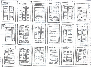
I began my wireframes by first focusing on grids and experimenting with different ways of incorporating grid structures into my final outcome. I felt that there was not enough room for 4 columns so I stuck to variations of 1, 2 and 3 column outcomes. I also considered where I might place heading, subheading and body text within these grids structures. My favourite includes a variety of 1 and 2 column layouts as I feel these break up the format in an interesting way without overcrowding it.

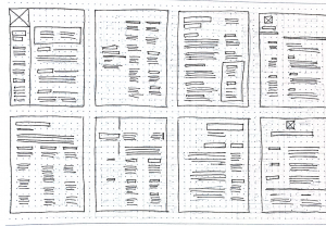
I then created eight more detailed wireframes to help me better consider text and content placement. In the above layouts, I became more drawn to the three-column layouts. Seeing the outcomes in a slightly larger form made me feel that this approach might actually be quite effective in displaying more information clearly in a smaller area. I also really liked having sub-headings spanning one column and body text spanning two columns as I feel this adds a clear structure that may make the CV easier to skim read.