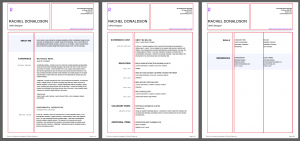
I began creating my CV on illustrator using a grid layout. I wanted to combine a variety of 2 and 3 column layouts as well as provide 2 span columns for larger amounts of body text. I chose to present my Name in a larger text size to help it stand out from the rest of the document. I also highlighted my portfolio website address in purple to help it jump out against the rest of the content as well. Further to this, I followed the guidance provided in our lecture on the top and removed skill level indicators, did not include an image and added page numbers to the bottom of each page.
First Draft
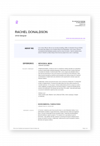
During a one to one tutorial on the first draft of my CV the following feedback was given.
- The overall content included in the CV was good
- Skills should be moved to the top
- I should consider adding to the information in my bio
- Remove social media information in the footer
- Reformat the footer so that it doesn’t look like a printer setting outcome
- Reformat header so that it doesn’t take up as much room
This was really great advice and I addressed each point when creating my second draft.
Second Draft
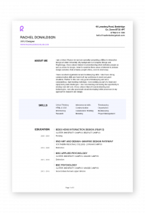
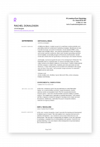
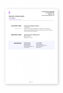
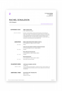
In this draft I decided to change my structure slightly, I added more skills to my outcome and placed them in a blue box rather than my Bio. This was effective in splitting up the format and making the three-column listing of my skill look more intentional. I reformated both the header and footer. I made the header smaller but stuck to the column structure with right and left alignments used in corresponding columns. In the footer, I removed the social media addresses and centred the page number. I also added more information to my Bio.
The feedback on this was very positive with the only suggestion being that I experiment with the text placement in the header and attempt to follow the structure of the below text.
Final Draft

When attempting to adjust my header to produce an outcome more in line with the rest of the document. I felt the above centre outcome looked a little strange with the left columns right alignment matching the rest of the document. The problem that I felt arose from this was that the R monogram was now placed at the top in an off-centre position. I, therefore, tried left aligning the left column as shown in the right outcome above. I felt this was stronger however I thought it still appeared a little cluttered. This encouraged me to remove my home address from the outcome creating a cleaner and better-spaced outcome shown top left. In this outcome, I decided to highlight the type of roles I would be applying for rather than highlighting my portfolio website address. This was also helpful as I felt the colour below my monogram gave the outcome a more intentional and balanced feel.
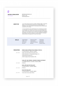
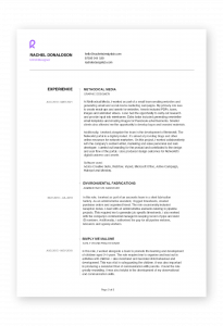
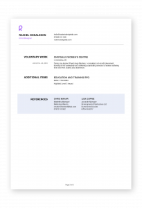
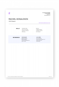
Above is my final outcome. In the above outcome, I darkened my blue box to make it visible in my printed outcome and amended my header to match the structure of the text throughout the rest of the document. Overall I am really pleased with my CV as I feel it is well structured and can be easily skim read. I am also pleased with the incorporation of my brand and how I was able to pull items from my portfolio site into my CV such as the blue box used to create clear sections throughout the CV.
My only concern is that my CV has gone over the recommended 1 to 2 pages. This is something I intend to work on in future versions of my CV and as I progress throughout my career. I feel it will be less necessary to define my roles in my CV as I take on established positions that an employer/ hiring manager will already have a clear understanding of what the roles related to the position are and how they will benefit their company.
Final outcome: rachel-donaldson-cv
Hard Copy

While I have handed in a hard copy of my CV I could not get the label to print correctly and did not include the brand sticker. The above image is a mock-up of how would have liked to have presented a hard copy of my CV going to a potential employer.