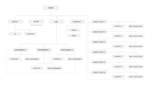
After having completed my website content audits I created the above site map. This was a great way to visualise the flow of navigation. The first problem I wanted to tackle was the feeling of hitting a dead-end at the bottom of each case study. I have solved this by adding a view next case study to the bottom of each case study page. I was also advised in feedback to expand on the lab theme. I have attempted this by adding a lab page to my website that will feature experiment and design tasks I have completed.