In this blog, I’m going to look at ten portfolio/studio websites that blew my mind!
1. Cleverbird Creative
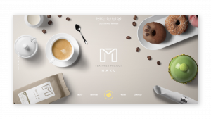
I was particularly drawn to the impact of the imagery used in Cleverbird Creative’s website and its bold full page grid structure. I also really like the vertical text placement in the hero section and the use of slide show. The website also includes nice sections of content including the studio’s process, team and testimonials.
2. Dawson Andrews

Dawson Andrew’s has created a really clean and minimalistic website that I love as it really allows the work to speak for itself. The text-only hero and grid layout of projects is a structure that I had adapted in my previous portfolio website and am a massive of. I really like Dawson Andrew’s choice and use of typography and the hover effect included in the project images. Dawson Andrew’s work/ project pages are split up beautifully with body imagery and strong typography. This creates an excellent information hierarchy that highlights important points, figures and testimonials.
3. Alex Coven
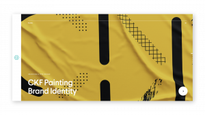
What drew me to Alex Coven’s website was the use of full-page imagery and left-hand nav bar, a trend I have noticed on a number of portfolio websites. I really like how Coven has included a pdf of his CV in his about section. This is something I definitely want to include in my own portfolio website. The navigation to look at the next project at the bottom of each project page is another really nice feature. I also love the minimalist design of his contact section which states “Start a project with me” at the bottom of each project which contrasts the bold imagery above it.
4. House of van Schneider
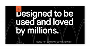
I love the playful banana favicon used on this site which contrasts the otherwise very formal feel of the website. For me, the big highlight of this page is its use of bold typography and beautiful layering of imagery and text. I also really like the inclusion of information like client, role, date, projects and links to demo’s.
5. Kuon Yagi
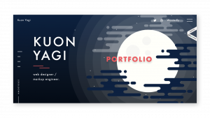
In Kuon Yagi’s portfolio site there’s is a nice hover effect included in the hero illustration as well as seamless scroll animations which give the site a really nice interactive feel. I love the inclusion of navigational signals such as the scroll down prompt at the top of the page and bars to the right indicating how far down the page you are. The inclusion of elements such as these suggests time has been taken to consider the user experience. The project page included displays really well-presented prototypes and mockups.
6. Miki Twersky
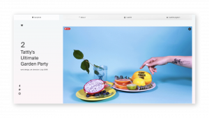
Miki Twersky’s portfolio website includes playful icons like a hand pointing down to indicate scroll, a leg and foot illustration as a literal representation of the footer. A dog illustration is included on the about page demonstrating Twersky’s love for dogs. These illustrations bring with them a level of humour and personality that adds a creative and personal touch to Twersky’s site. The rest of the site is beautifully laid out with a minimalist feel and really nice imagery and gifs.
7. Jung Hoe
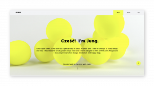
Jung has included lots of animated clips and functions throughout the site as well as really nice hover effects over images. The site throughout has a minimal feel and incorporates a right-hand navigation guide on each project page letting the viewer know exactly where they are on the page. I really like the use of typography throughout the website and how Jung has added little yellow highlighted areas grabbing the viewers attention.
8. Zulaik Hasalim

I think this website is an amazing example of just how effective the right typeface can be. I love Hasalim’s use of Oranienbaum in the websites hero section and for header text throughout. The couples with strong imagery and the typeface is reduced in size on project pages letting the project images and outcomes speak for themselves.
9. Lital Karni
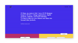
I love the bold use of colour on this site. The imagery is really strong throughout. I also really like the inclusion of Problem and Solution topping some of the case studies. The glow effect around the logo is also a nice way to help the logo stand out against dark backgrounds without having to change the colour to white, however it may have been helpful to have the link text changed the white as they become very difficult to see on dark backgrounds.
10. Sophie Britt
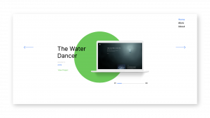
I really like the crisp and minimal feel of this website. The strong green, blue and red highlight colours that run throughout the website offset the white beautifully, leading this site to become one of my favourite outcomes so far. I also love how the typography is placed at the top of each case study and the use of prototype clips throughout. Another nice element is the bar and numbers 01-06 indicating how many projects are there to be scrolled through. Finally, the use of elemental shapes brings a really simple and effective tone to the outcome and brightens the minimalist style of the website contributing as nice little points of interest.