Gumption Coffee was originally founded by Hazel de los Reyes and Clare Lim in 2013 in Australia. The coffee shop grew in popularity as it’s founders won numerous competitions for their roasting skills. In 2018 2 locations were opened in New York and Lippincott, the designers of the Starbucks logo updated the original branding.
What I found really interesting about this podcast was the level of involvement the founders had in the updated brand and how greatly Bethany Lesko and Elizabeth Bakhash where invested in the story behind the coffee shop.
What I also think is pretty remarkable is that the wordmark logo remains largely unchanged and yet the customisation of the preselected typeface has such a strong impact. For me, this is a testimony of how adding simple custom elements can be so effective and make the lettering itself become a work of art. I love this updated brand and feel that it fits with the story behind the coffee shop and its previous brand image.
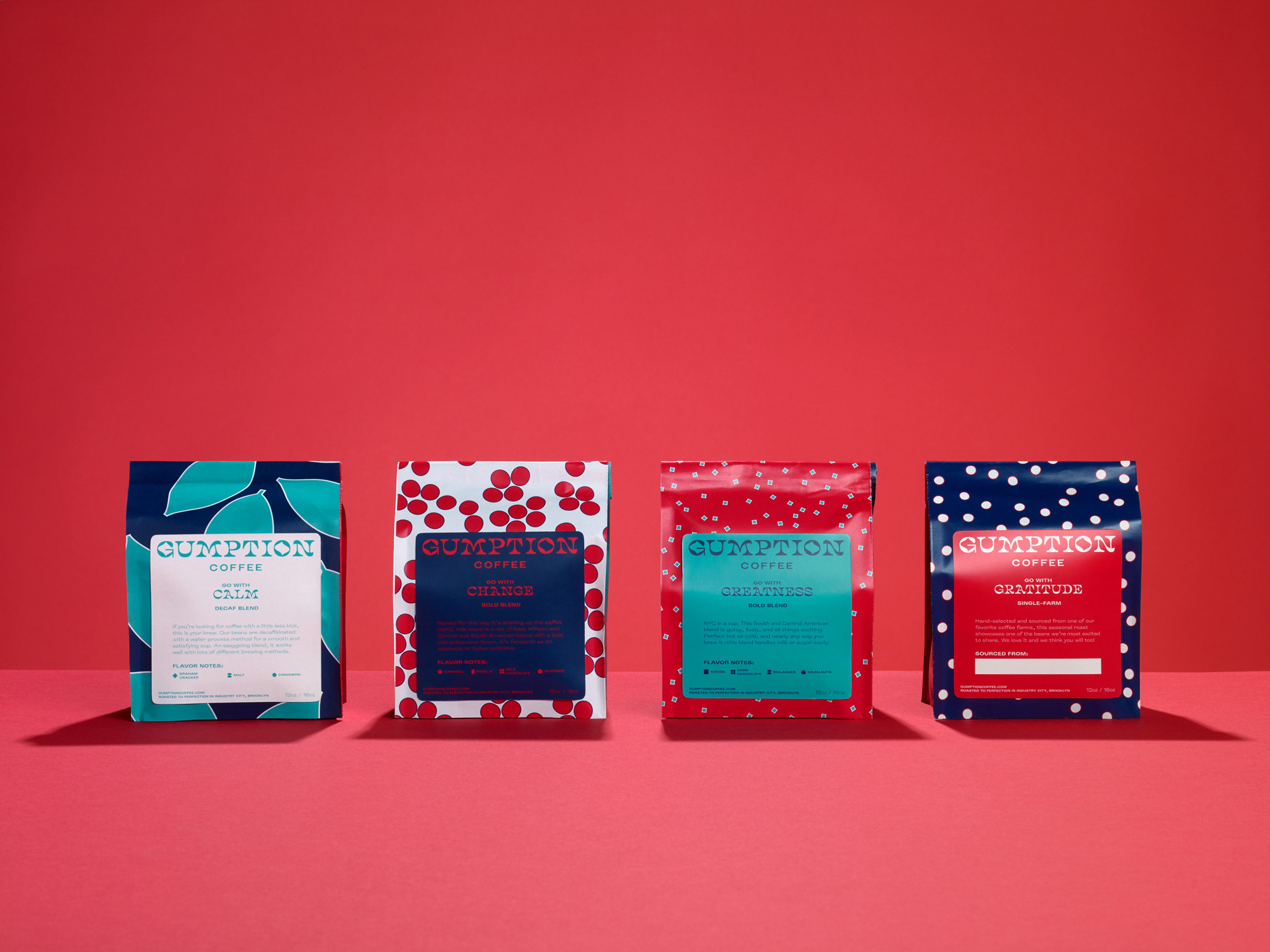
It’s also interesting to note that the customisations were then extended to include the full alphabet so that it could be used on packaging. And that the original patterns used in the packaging were carried into the updated identity. I like the colour palette and boldness of these patterns and while it sounds like this decision was pushed by the original founders of the coffee shop I think it was a good decision. I love the combination of the wordmark logo, custom typeface and pattern used in the final packaging as shown below.

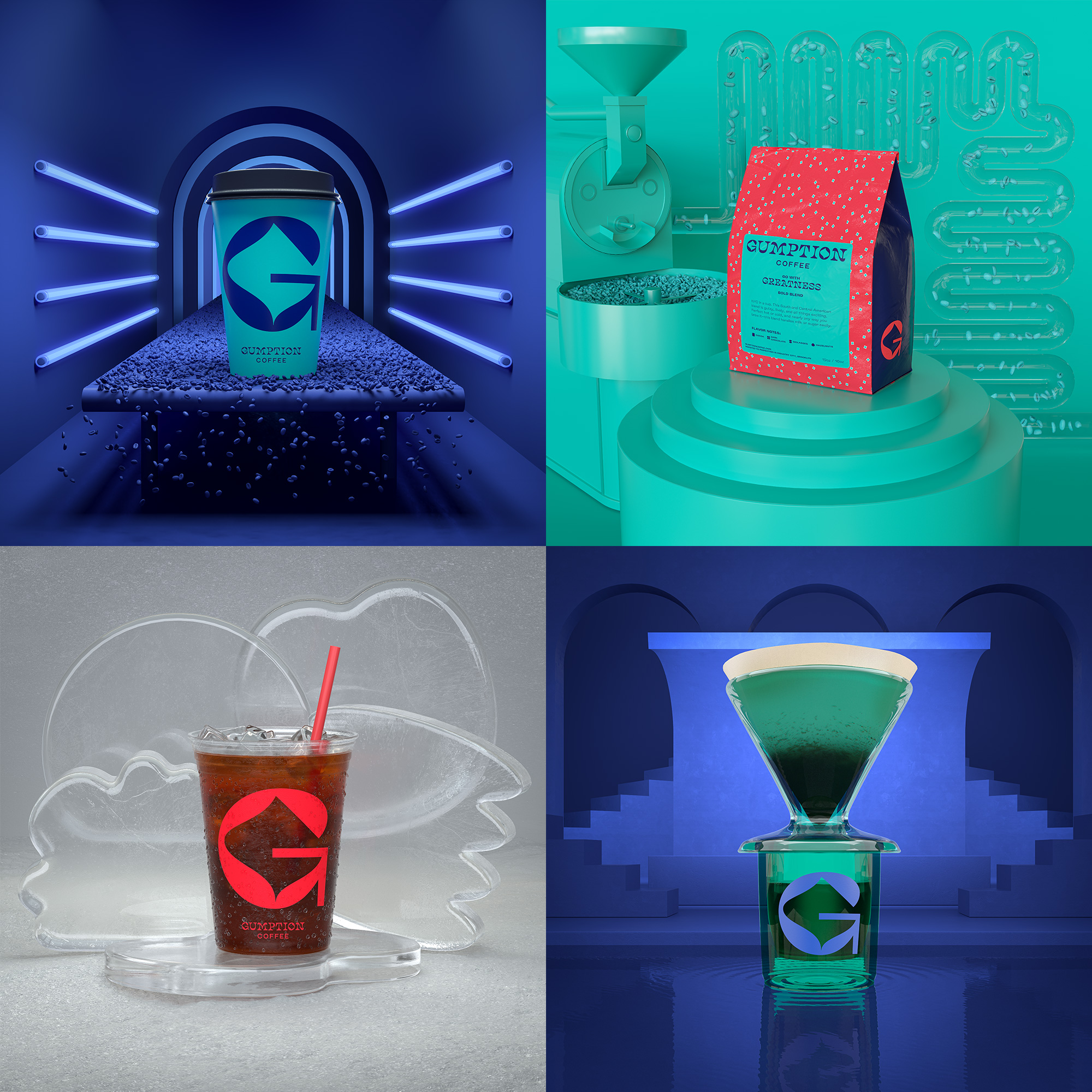
It is also interesting how they make use of the G, one of my favourite letters along with the M, on the packaging and how the logo can be broken down and remain recognisable. As I continue to research and look into branding I now seeing that the ability for a logo to be broken down in this way is a large part of what makes it a success particularly in instances such as this where the logo needs to be presented in different forms. To be able to generate and present the logo in different ways gives the brand life and makes it multidimensional adding further personality to the brand image.

Overall I think this is a really strong brand update and while only small changes where made I feel these changes have had a large impact on the final outcome injecting flair and personality into the brand image.

