Adjusted animation
This week I adjusted my animation after talking with Patricia Miller and gaining some feedback. Patricia suggested a few small this to edit that would make my animation look better, such as during the walk cycle not to dip the character as far, also to adjust the leg of the character when she strikes her pose as she looks like she will fall over.
The original is on the left and the edited one is on the right. I first roughed out the new actions and then completed the line art.
I defiantly think these adjustments make the whole animation look better and more natural.
I also worked with my group to create a presentation with our animations on it and we had to talk about our experiences and things we have learned this semester. For the animation we had to give in as much as we had so I handed in the coloured version.
Colour Animation
This is the coloured version of my animation.
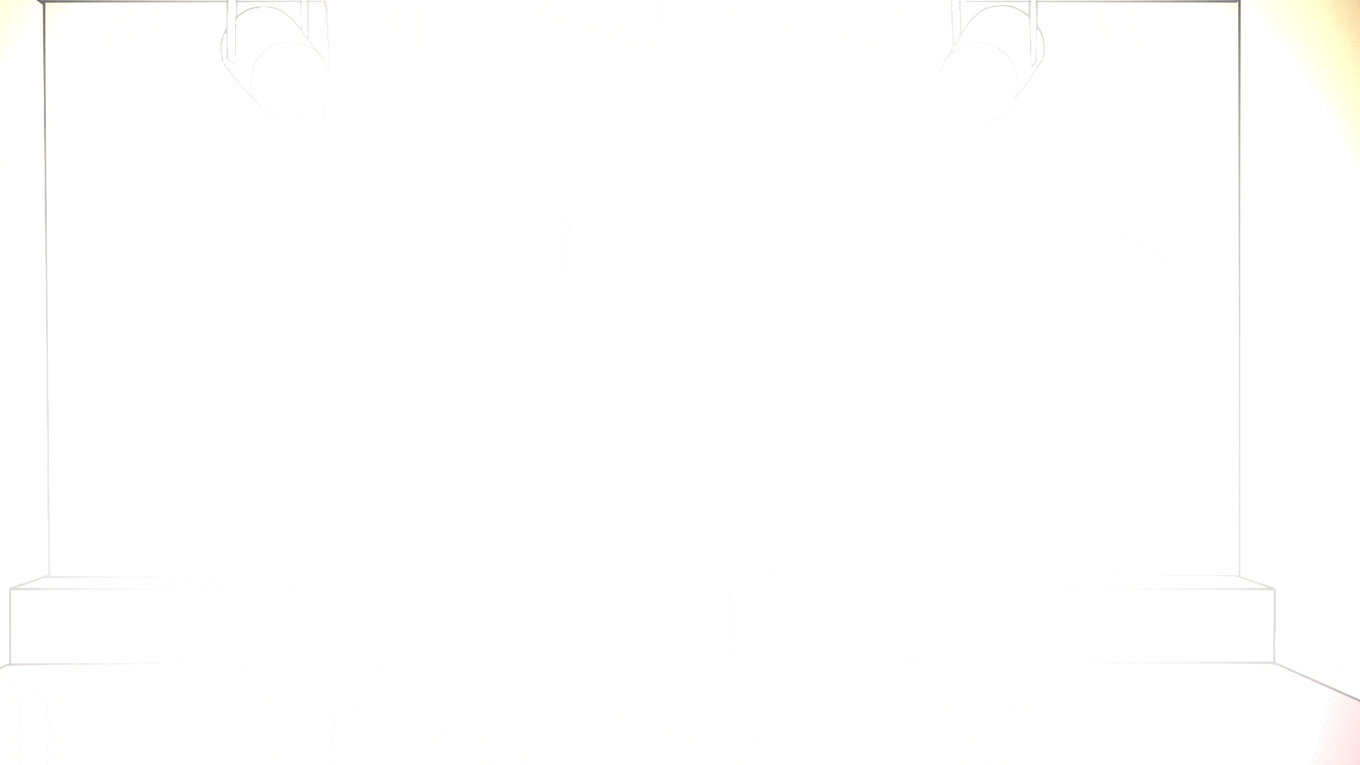
I am very happy with how the colours turned out; I spent a lot of time trying to make sure the colour went right to the edge so there would be no white spots.
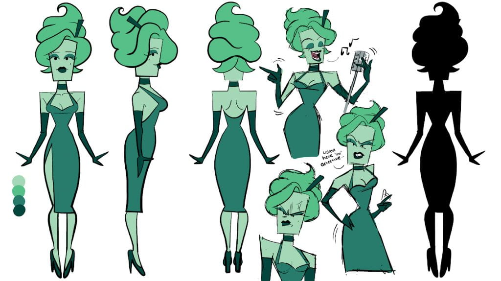
The colours that I used for Frappuccino are based on both the original art work of her and the redesign of her.

What I have left to do is to add the spot light and the shadows on the character. I also have to add a crowd in front of the stage.