So for the walk cycle I used a YouTube tutorial from Alessandro Camporota. I used the same technique that I used on the run cycle. Working only on one side and one part of the body first, completing the cycle, and copying and X,Y and X rotations. I did run into a problem however. While working on the right leg, I copy and pasted the entire key frame then change the rotations. But when I done this the animation wouldn’t spline correctly. For example the foots position would go further than the next key frame, then would jump back to the right position once it reached it. To fix this I deleted the entire frame, then added the rotations without copying the frame. I left the walk cycle to last as I thought it would be the easiest and require less time. That was a mistake. I didn’t have much time before the deadline to finish the walk cycle which means it wasn’t properly polished. It feels very ‘jolty’ or stiff and not very natural. Overall I’m kind of disappointed in this one but I think the other two are much better.
Reference:
Final outcome:
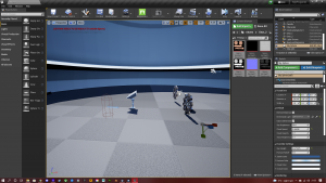
Run Cycle:
Second was the run cycle. Again I used a YouTube tutorial from the same creator to help me. I tried to give to run at least a little bit of a different style so it wasn’t a straight copy. So I started with the key poses then added some in-betweens. To give the animation more consistency I would chose one part of the body then work on one side. So I started with the Left leg. Once it was done I would copy and paste the X,Y AND X rotations to the opposite leg and opposite key frames. I done this for the rest of the body as well. I then added a slight rotation to the waist and head to make it a bit more natural. I think there’s a little bit of stiffness in the arms. I also think I could have done a better job looping the animation and you can see a slight jump, although its not too distracting. Overall I’m pretty happy with how it turned out.
Reference:
Final outcome:
Body Mechanics:
So for body mechanics I instantly knew what I wanted to use as a reference. I love Star Wars and I’m a huge fan of Kylo Ren, so I wanted to use the fight between kylo and Rey against the praetorian guards. I think it shows a good range of motion and weight while not being overly complicated. I learnt the Choreography and tried to keep the timing as close as I could. After a couple takes I decided on this one. The timing is a little off but is close enough. I started the animation by picking out the key poses and replicating them with the rig. I thought it would be best to use the azri rig as it came with a sword which I could use in place of a lightsaber, to give the animation a bit more context. Once I had all the key poses I started to add in-betweens. I soon realised that I was struggling to get the timing right, which made the animation either too fast or too ‘floaty’; without any weight. To help with this I opened the reference in premiere pro and switch the time scale to frames. This allowed me to see exactly where certain frames should be. The clip starts in slow motion, so to try and fill those frames to fit with the timing I added the sword being lifted. After my first pass I noticed there were a few things that needed to be changed to stay true to the reference. For example the movement of the legs, How the sword interacts and the ducking pose. After a few changes and a couple more passes I was happy with the result. I still think it could be better and for now I’m happy with it, and I definitely had the most fun with body mechanics.
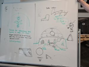
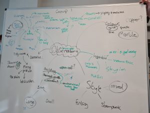
When I first found out what this assignment was I was very excited, as its the exact area I’m interested in. I had also been practicing creating environments in unreal engine 5 using quixel so I already had some experience with the software and task. Once we had split up into our groups, we started thinking of different concepts and styles for how to observatory would look. We put all of our ideas on a whiteboard. After we had settled on designs and style we decided to create a list of all the assets we would need for the environment and delegate them between us. This would then be put into a spreadsheet so we could keep track of our progress. After we settled on an art style, I started working on some concept art on how my assets would look.
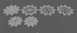
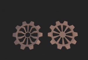
Draft Models:
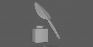
Once I had an idea of how I wanted my assets to look, I began modelling. All of the props were created in Maya except from the candle, which was sculpted in blender. I decided to sculpt to candle in blender so I would be able to achieve a better look and shape. This was straight forward and once the candle was done I imported it to Maya to retopologize it. This is where I ran into a problem. When ever I tried to do anything within the Maya scene like scaling or even opening the project, it would take a very long time to load. I first thought it was because the mesh was high poly but my computer has been able to handle much higher poly meshes in the past. After some time I realised it was the objects history that was slowing the project down. Once it was deleted, it was fine again. Originally I modelled different variants of the gears. I quickly realised these would be quite time consuming to UV. So with the team we settled on two designs.
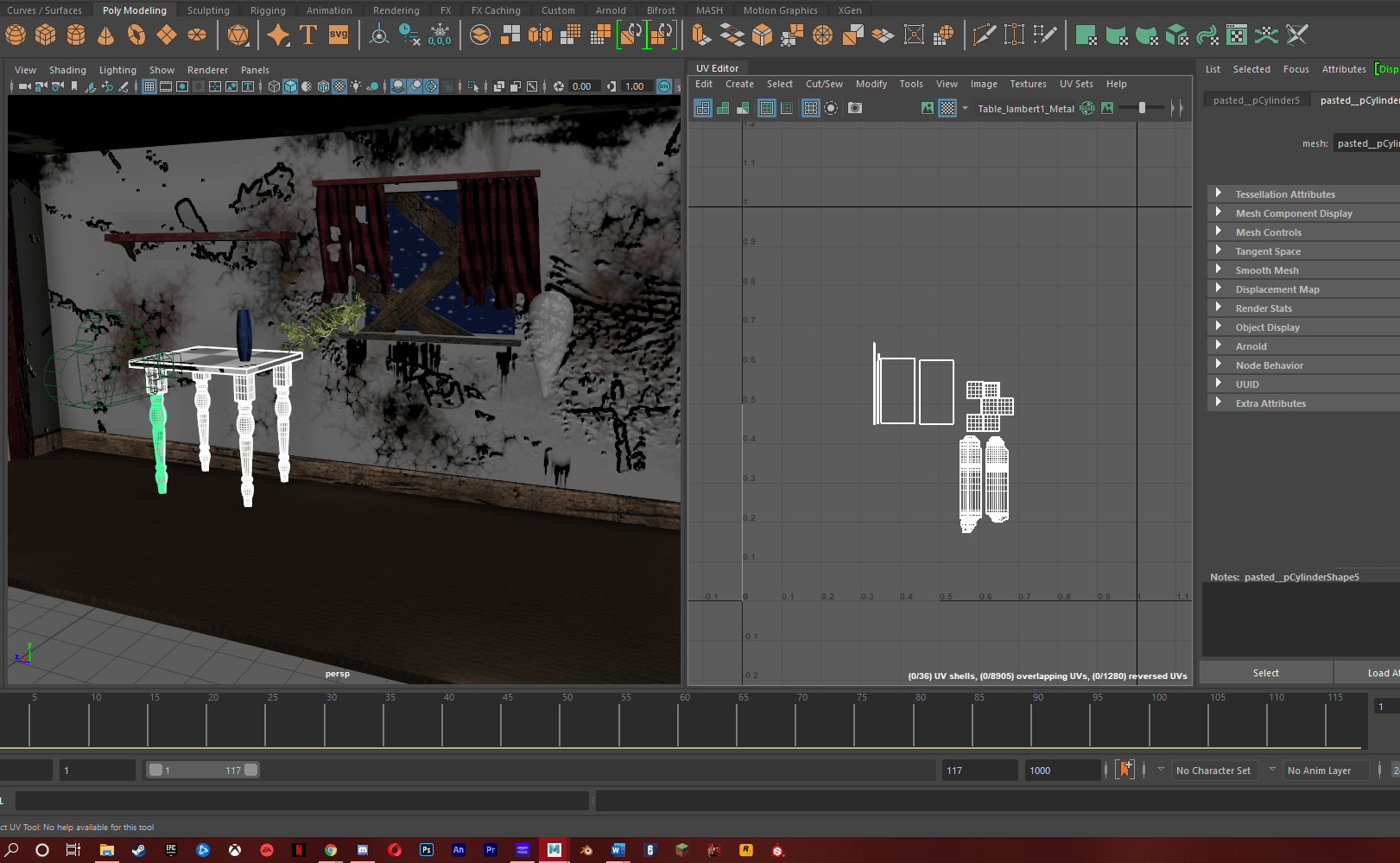
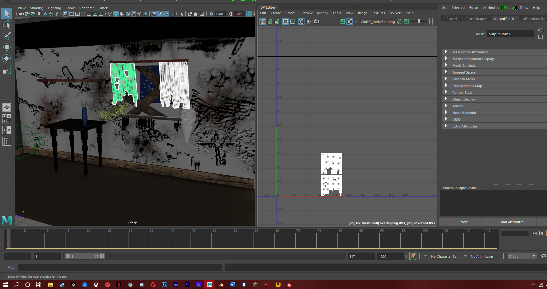
UV’s:
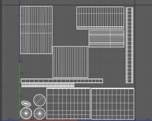
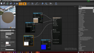
A big problem I had last year was with my UV maps. I struggled a lot to create good UV’s which resulted in my models having bad textures, as they were distorted and stretched. I spent some time over the summer creating assets and practicing my UV mapping, and I think it has paid off. My UV’s and now much more clean and straight. While practicing I found a technique that works for me. Basically I start my deleting the default UV’s then create a new one by camera. I then select the vertices where I want my seams and cut, then unfold. Usually this is the point where I struggle, but now I rotate and scale the vertices about until I create a roughly straight UV. I then use the straighten UV function and straighten shell. I then finish by completing the layout. I’m actually quite proud of my progress as its something that really bothered me, and asset creation is a big part of the role I’m looking into. Once the UV were finished the next step was to import them into substance painter and add some smart materials. I didn’t want to do anything to crazy with it as I’m still quite new at Substance, but I still think they turned out nicely.
Below is an example of my old UV’s, and beside it is an example from my current work.
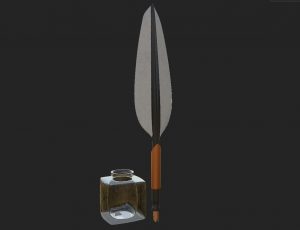
Finished assets:
Importing to unreal:
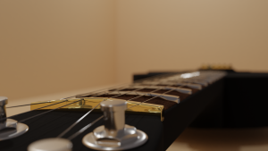
Once all of my assets were finished, I created a new unreal project and started importing both my assets and my teams. My next step was to scale all of the props to the right size. After I got them all to roughly the right scale it was time to add all of the textures. Once All of the textures had been setup it was time to set the layout of the scene. I wanted to differentiate my scene from the rest of the group, so I went for a slightly different layout than what we had planned. I placed all of the smaller assets together on one side of the room to emphasise this is where someone had been working and studying. Bookshelf’s are placed around the room to help break it up a little. Then the main asset is placed directly in the middle of the room. Once everything was setup, it was time to do post processing and render.
Post processing and rendering:
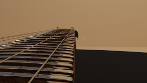
So I knew I wanted to have the scene take place at night. I began by searching for a HDRI night time picture and using that for my sky. Then I added a post process volume and change the max brightness to 7.0 and minimum to 5.9. I had to make the scene darker than how I actually wanted cause a render test show that it was turning out slightly brighter than the actual scene. I had already picked out royalty free music I wanted to use for the cinematic so I already have a an idea for the tone I was after. I also tried to add some flickering lights around the candles. I did this by creating a light function and used a series of nodes. I could then control the speed to my liking. Once the lighting and post processing was done I set up some cameras and played about with the depth of field and different types of shots. I referenced the music so I knew what types of shots i wanted and where to cut. I used a 21:9 aspect ratio as I feel this gives a more cinematic feel. After My shots were rendered I began editing in premiere pro. Below is the final outcome.
I really enjoyed working on this assignment, along with my team and I think I’ve made some progress in quality in certain areas of my work. However, I don’t think the final outcome is as good as it can be. Watching back I can see a lot of areas to improve upon. Such as the post processing, lighting, layout and camera work. But these point can also be improved upon over time and I will be doing so in my own personal work. Overall this assignment has helped improve my work towards the career I want to follow.
The job I have chosen to research is an environment artist. An environment artist is responsible for backgrounds and environments, such as buildings, foliage, furniture and landscapes. They are typically responsible for creating and texturing assets, referencing from storyboards, creating ‘blockouts’ and researching for references. They also work in such software as maya, zbrush, unreal engine and unity.
While researching this job I was able to find a Graduate Environment Artist role at Ubisoft. This role advises having only 1 year of experience in an internship or placement year, Which I intend to do. This role is located at the Ubisoft studios in Newcastle upon Tyne. If I were to ever apply to this studio, it wouldn’t be much of a hassle to move as I lived there for a year while studying, so I already have experience there and know my way around the city.
Ubisoft is a French videogame development company founded in 1986. Its is currently the third most valuable independent development company and is built up of 26 studios divided across 18 countries. It is also the second largest developer to have a large amount of staff; 6900. Ubisoft have developed some of the most popular franchises in gaming, including; Far cry, assassins creed, Tom Clancy, Rayman, Watchdogs, The division and are currently working on an open world Star Wars game.
Some of the responsibilities within this role are:
With guidance, assist in planning out the space, with consideration of narrative and visual storytelling, while documenting intentions
Create functional assets, which can be shared across the project in respect of the technical and artistic constraints
Ensure the technical and artistic quality of the project by collaborating with Technical Artists and Senior Artists, and make changes when necessary
Implement and incorporate feedback from Art Director and project leads into work
Here are some of the required skills and knowledge:
Good interpersonal and communication skills;
Ability to create interesting, detailed and visually appealing environments;
Ability to adapt to new processes and pipelines;
Working knowledge of industry leading 3D modelling packages and techniques;
Understanding of composition visual story telling;
Knowledge of level editors;
Artist research:
The artist I have decided to research is Anthony Vaccaro, who is an environment artist that worked on some of my favourite games including, The last of us part 2, Uncharted 3/4/the lost legacy and Halo Reach. He started his career at Bungie working on Halo Reach after graduating and obtaining his bachelor degree in Video Game Art & Design. After leaving bungie he then joined Naughty dog and has been working there for the past 7 years.
Anthony Vaccaro’s portfolio:
https://www.artstation.com/autocon
When creating a portfolio for this role I came across a post by Jared Sobotta who is also an environmental artist at naughty dog studios. Within this post he described how to create an effective portfolio. Firstly its important to keep your portfolio solely focused on the role you actually want. As Environmental artist are responsible for things like modelling, texturing and lighting, it wouldn’t make sense to then include things like character design or animation. Its also important to keep a consistent quality throughout the portfolio. For example adding in work from the past when your skills weren’t as developed. This will not show your potential and hurt your chances of getting an interview. You also shouldn’t include any work in progress or unfinished work. Its also a good idea to tailor your portfolio to the style of games you like, to show the studio you have a similar art style to them. Other areas to consider in your portfolio are: originality, composition, lighting and workflow.
Research, design choices and development towards industry facing materials
CV:
I went with a more simple design for my CV as I didn’t want to make it extravagant or crowded as I thought this would be too distracting to anyone reading. I think this helps keep it more clear and concise. Firstly I took a look at a few examples of CV’s so I could start thinking of how I wanted to lay mine out. Once I knew I wanted to have a banner on the left side I tried to land a colour. First I chose green as i thought it felt more natural on the eye and also gives off a positive feel. I later decided to change it too purple. This was to help it stand out more as purple is a more vibrant colour creating a better contrast, plus purple is also my favourite colour. After this I started planning how I would lay out my information. On the banner I would include my name, role, contact details, skills and a link to my portfolio. On the main body of the CV I wanted to display a profile, my experience, education and software experience. For the software experience section I went for the logos of the software. I thought this would make the CV more visually appealing to the employer. I tired not too include too many as this would become distracting, overcrowd the CV and to maintain a more professional look.
Below is my first draft of my CV and beside it is the finished version.
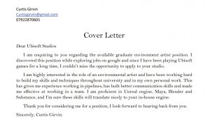
Cover email:
So for the cover email, again I based it upon the graduate position I found at Ubisoft, since its for the role I’m after. I wanted to keep this short and to the point, as its the first impression you make on an employer I didn’t want to bloat this out with unnecessary information. I split the letter into three sections as advised. The introduction, the main body and conclusion. I tried to keep my grammar and sentence structure very formal to convey a professional appearance. For the introduction I explained, why I was writing to them, How I found the role, and tried to incorporate some flattery by expressing that I have been a fan of Ubisoft for a long time and how I couldn’t miss this opportunity. Within the main body I wrote about my skills and how I had built upon them; relating them back to the job posting to target what they were looking for. I also stated what software I have experience in and that they would be interchangeable to their own in house software. For the conclusion I simply thank the employer for looking over my application and stated that I was hoping to hear their response.
Showreel:
For my showreel I am aiming it towards the role of an environment artist so thought I would follow the advice of Jared Sobotta for the portfolio as it still applies here. So first I gathered shots from different projects I’ve worked on, in both uni and personal work. I took some of my assets into blender and rendered some ‘cinematic’ shots in an attempt to show off the quality. I also done some turn arounds of my assets as well. I then found some music that I thought would fit with the reel. Next I edited the reel so that it would fit with the music and give a better flow, using cuts to fit the rhythm etc. I tried to cut most of the shots short to fit within the time limit and not let the reel feel too long; quickly display the asset, then move on. To finish off, I added title cards to the beginning and end using the tutorial below. The title cards allow you to see through the text to the reel. I feel this gives a nice look and feel right at the beginning without being over the top with any crazy transitions.
Below is a link to the final outcome:
Portfolio:
I decided to include a portfolio which I have created on art station. Following the advice of Jared Sobotta, this portfolio will only include relevant material to my chosen area. For example different assets I have created or environments. I only want to present my best work and at the moment I don’t have a lot to present but I will be working to build up this portfolio over time.
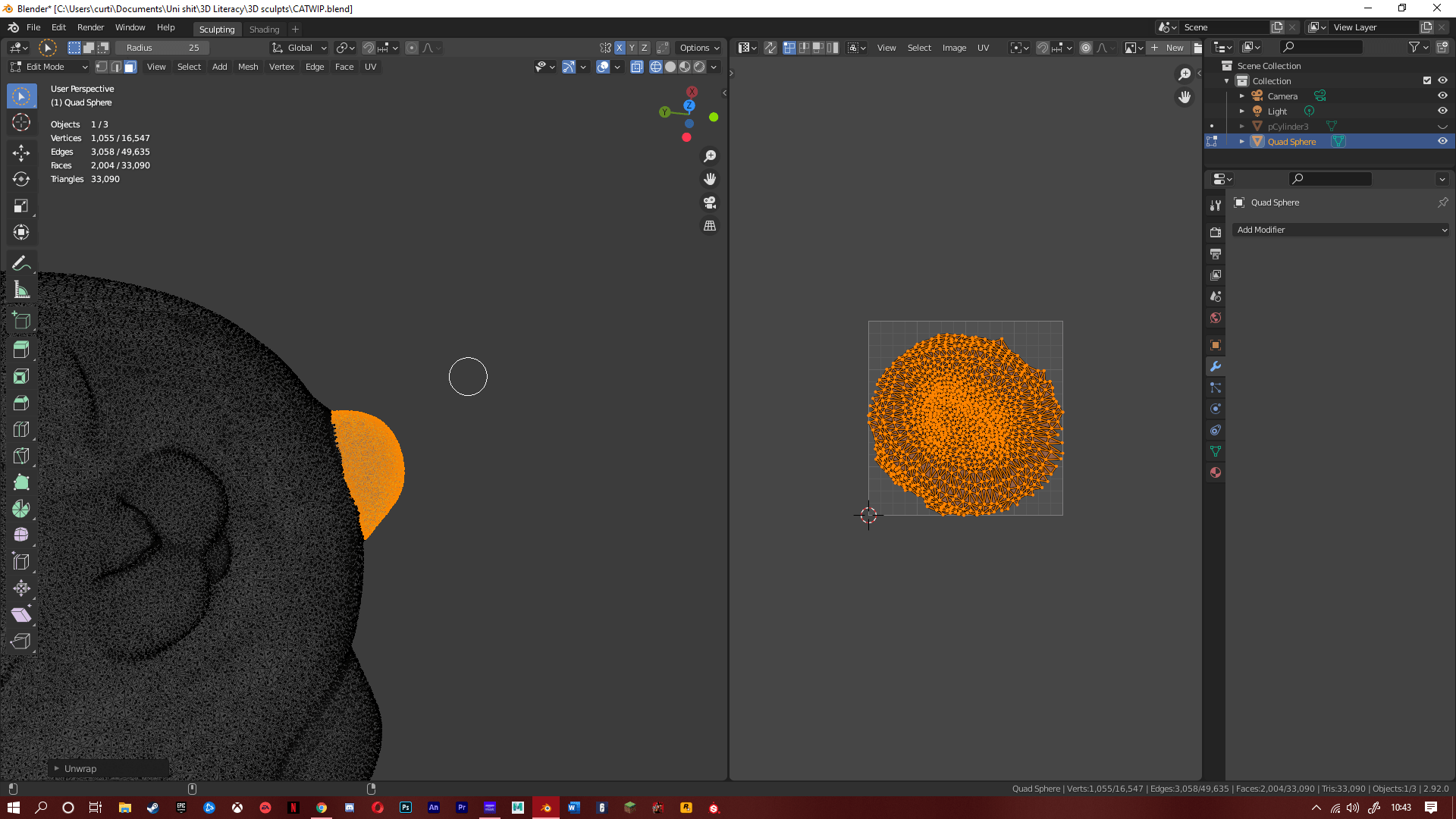
So for this assignment we were given the task to model/sculpt, UV unwrap, texture and present a ‘Cute Character’ of our own choice. We also given a limit of 40000 polygons for the scene. Immediately I thought of an Instagram account for a cat called Bone Bone. He a fat cat with big eyes and usually wears a backpack. Now in one of his posts the owner of the account photoshopped a cowboy hat on to his hat. And this gave me my idea for my model.
Development:
I began by doing some quick concept art for the model and assets. I then started in blender to block out the model to get a rough idea of the proportions. Now this is where I started to struggle; as I was used to using maya for all of my modelling I now had to use a different software. This made my workflow quite slow and frustrating. And because of this I just couldn’t get the proportions right on my model so I looked up tutorials on YouTube to help me. In doing so I found a tutorial for a cat sculpt. I decided I was gonna try to follow the tutorial but add and change things to make it my own. This made the whole assignment much more enjoyable. After I had sculpted the cat, I then went into maya to create the hat. To create the flow of the brim I turned on soft selection which would move other vertices around the selected one. I then ran into a problem where the top side of the brim had black faces, meaning they wouldn’t show up in substance of blender. I realised I created this issue early while making the hat. So I made another but this time added another layer around the brim to give it another face. Next I UV unwrapped it and imported to substance, again I ran into another problem where I couldn’t get the model to export while smooth. This was an easy fix, I just had to covert the polygons to the smooth mesh preview. Once the Hat was textured and ready, I went back into blender to UV map the cat. This was when I realised that I was way over the limit for polygons; around 800,000. To cut this number down I added a decimate modifier. Once it was under the limit I UV mapped the cat and imported it to substance for its textures. The model was then basically done so I uploaded it to sketch fab and also done a quick render of the cat in blender.
Overall I have really enjoyed doing both hard surface modelling and sculpting. I did struggle a bit with sculpting, particularly in the beginning of this assignment. Because I was now used to the UI and shortcuts for maya it was a little frustrating switching to blender. But I’ve a good bit more knowledge in it now. But in the end I think I was able to produce a decent model; with the help from the YouTube video. I think the area I’ve improved most in would be UV unwrapping. I struggled with it during assignment 1 but through practice and our group animated shorts, I’m confident in it now. I really enjoy the modelling aspect of animation and I cant wait to see what we do in the future.
For our last assignment in Animated narratives we where split up into groups of five and where given the task to create an animated short between 15-30 seconds, based on the theme adventure. During the idea process we quickly decided on the idea of a ghost within an abandoned house. One of our early ideas was for the ghost to be getting ready for a date, and once he met his date they were sucked up by a ghost buster like machine. We then settled on the idea of the ghost going into the kitchen, where he finds a fridge and floats through it. He would then emerge from the fridge with a sandwich floating inside him, it would then fall to the ground. The short would end with a tear drop from the ghosts eye.
Research/References:
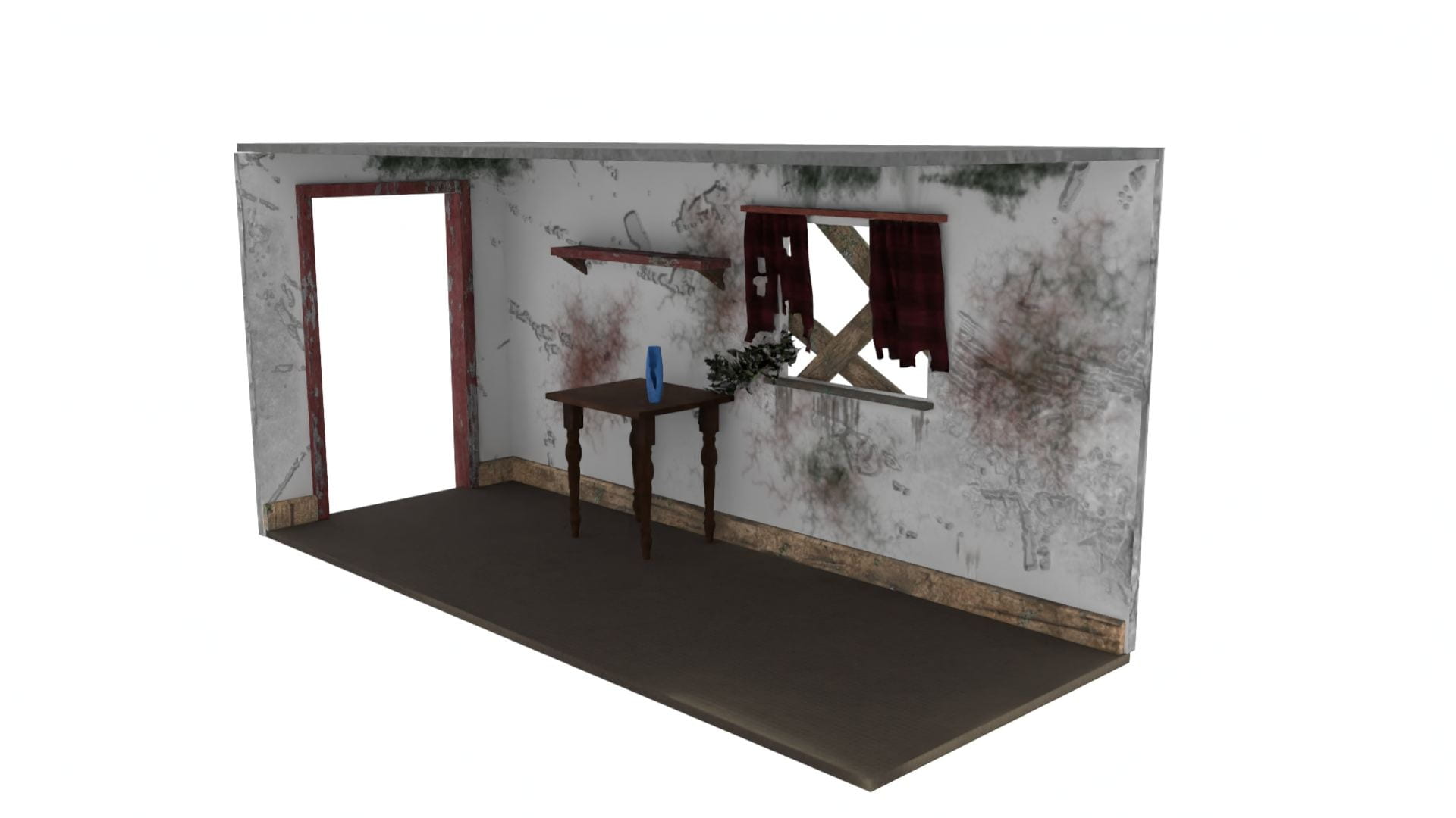
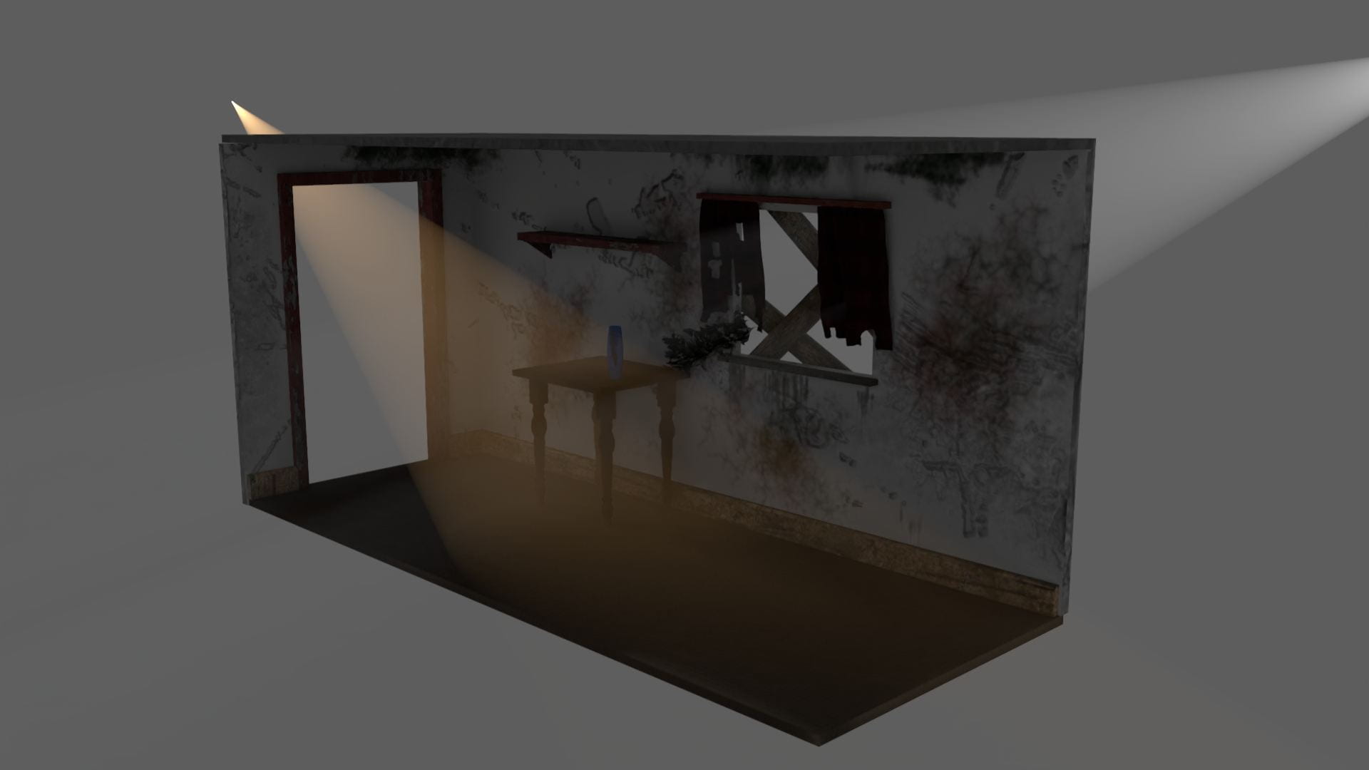
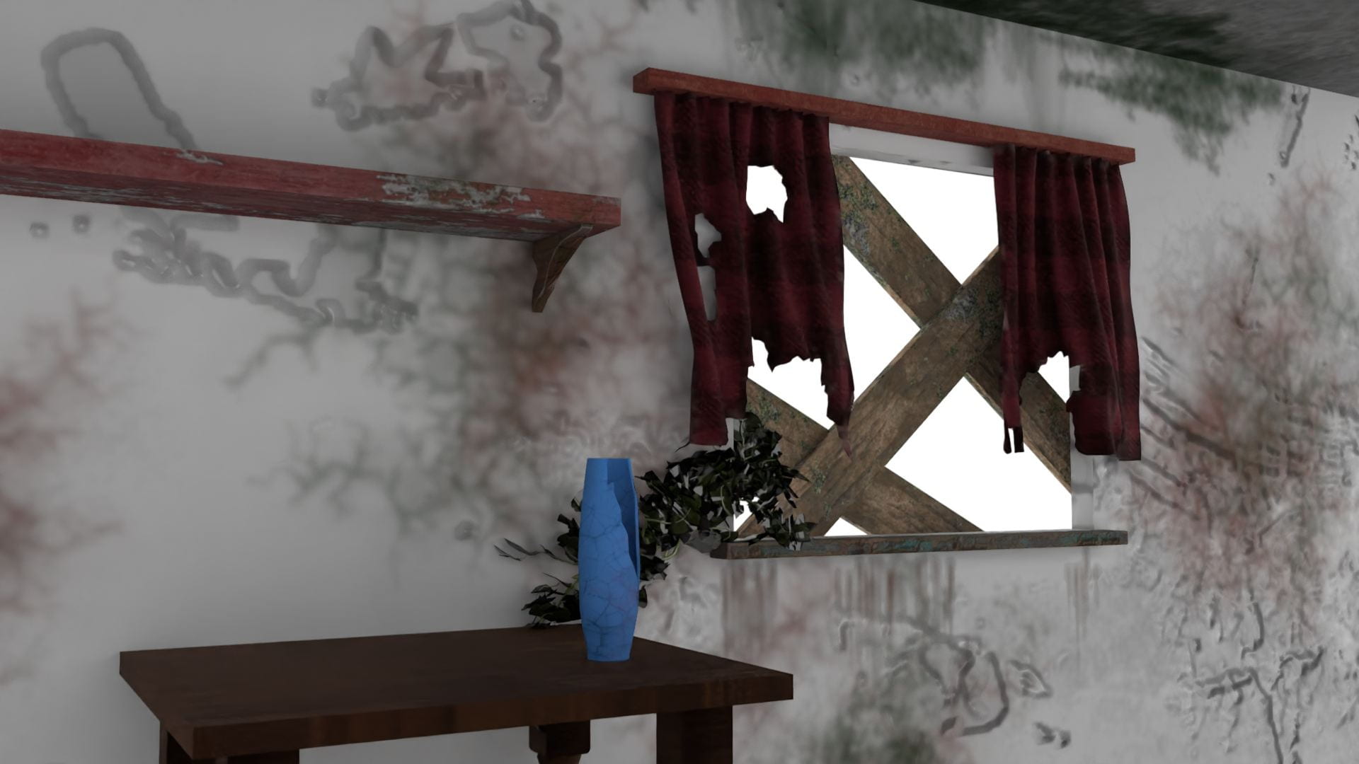
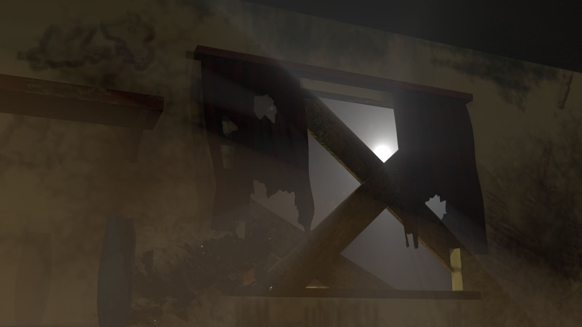
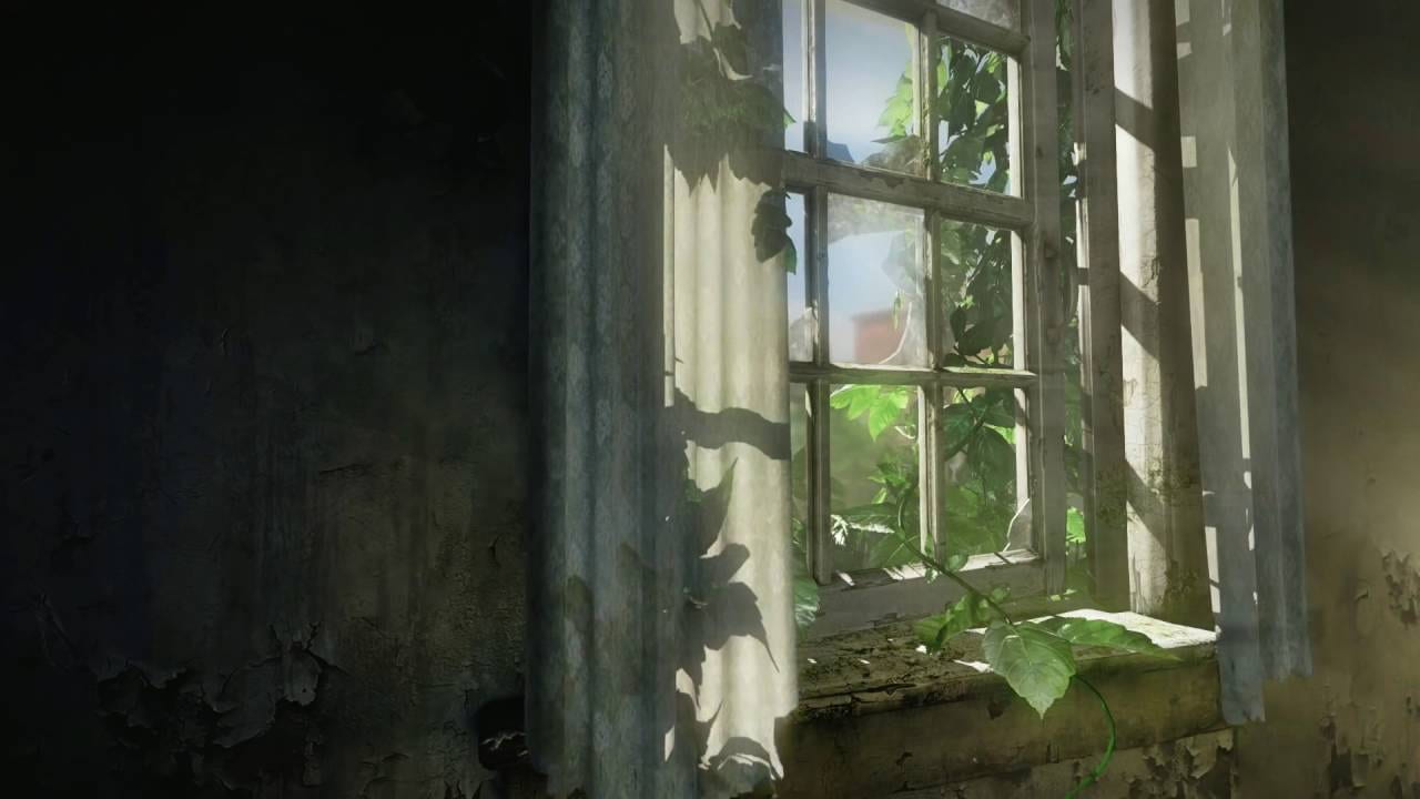
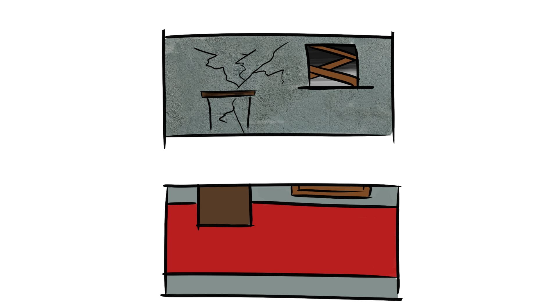
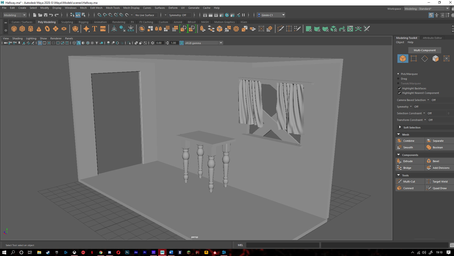
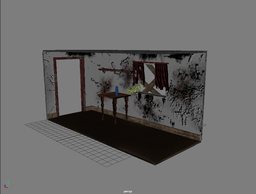
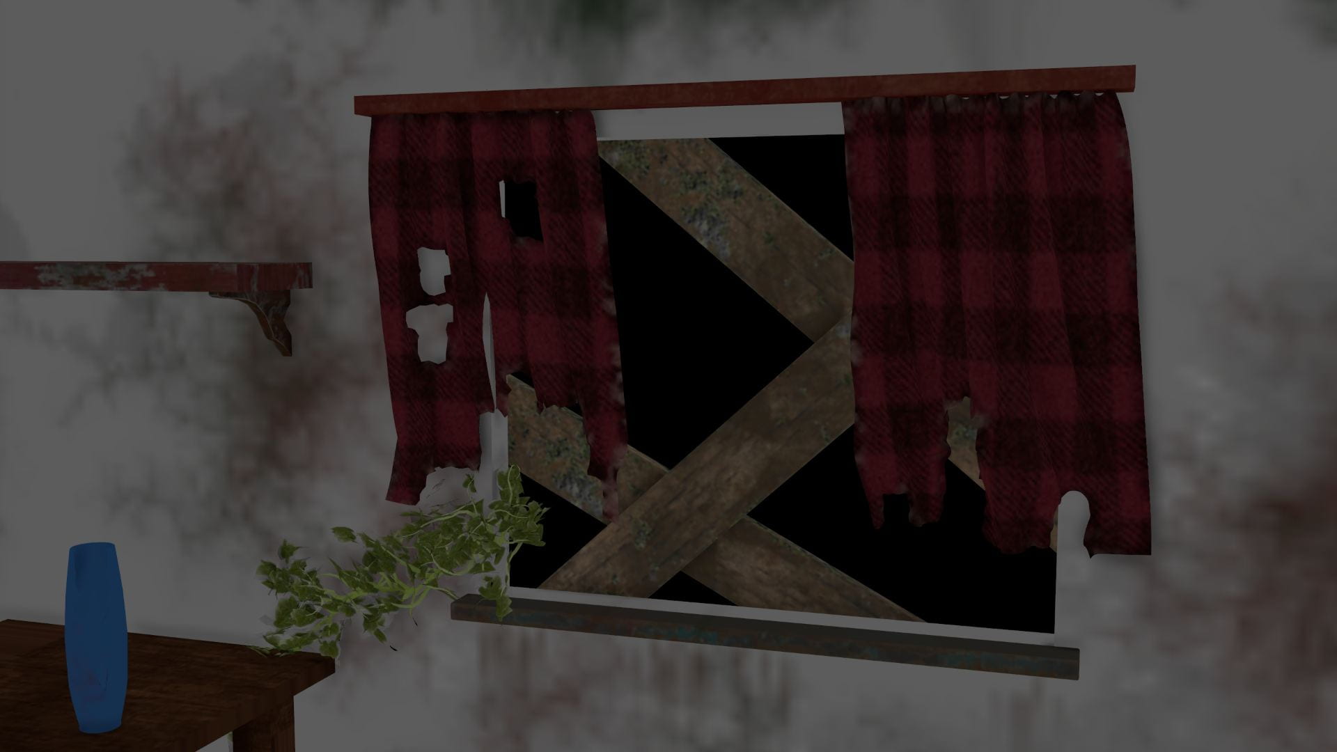
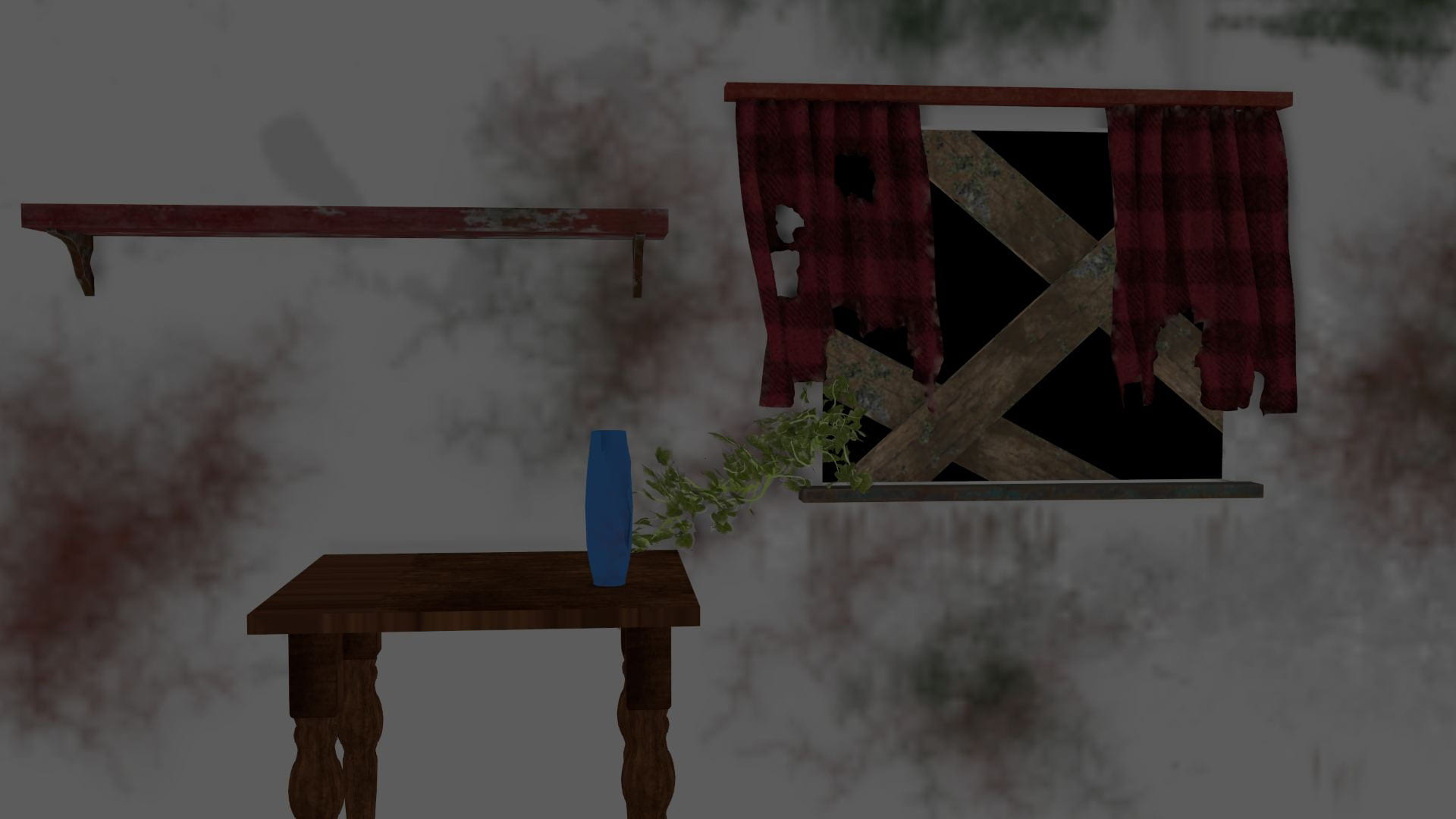
In our team I was given the task to model and texture the hallway, as well as animating the first shot of the short. As soon as I was assigned the hallway I already knew what I wanted it to look like. My favourite game is ‘The Last Of Us’, and the main menu shows a window within an abandoned house with overgrown vegetation. This is where I took my inspiration from for my hallway model. I then done a quick concept art of the hallway to get an idea of how it would look and the colours I could use.
Production:
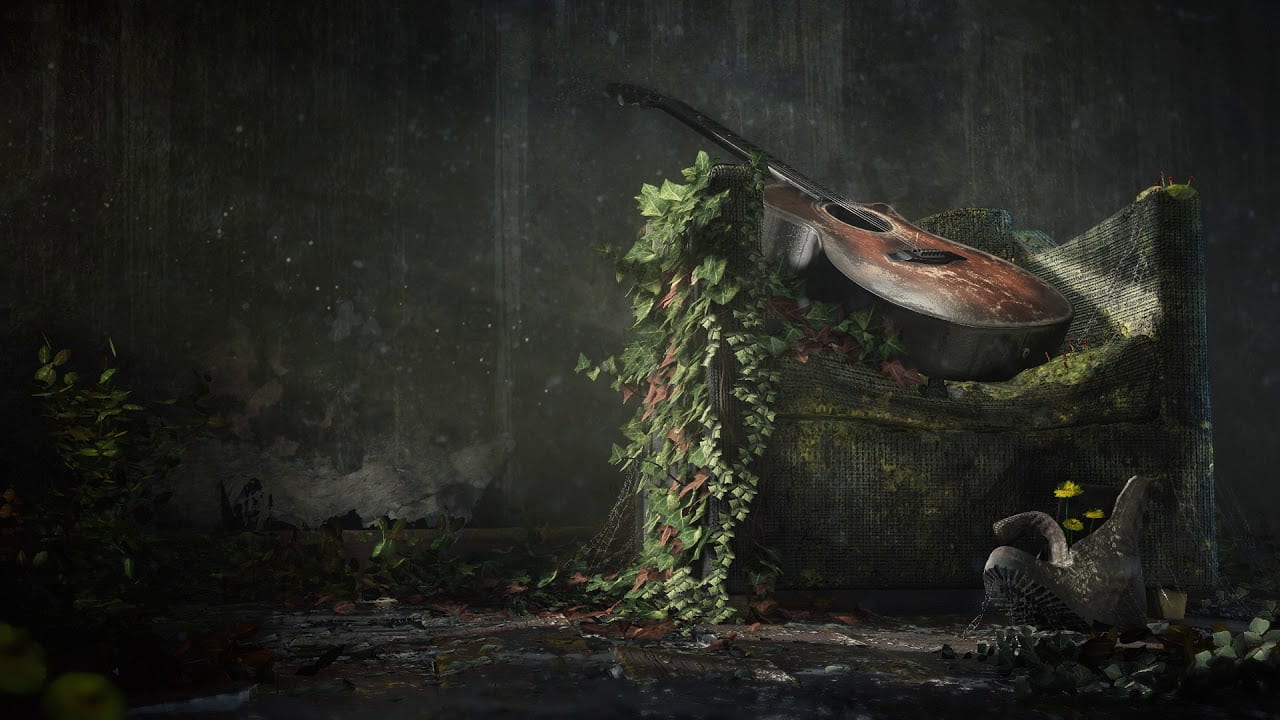
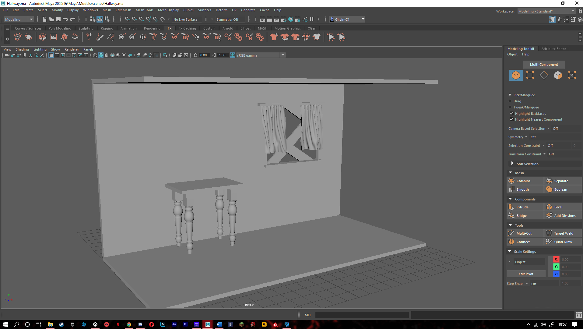
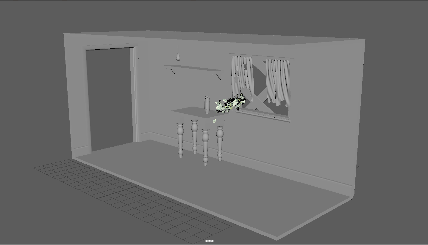
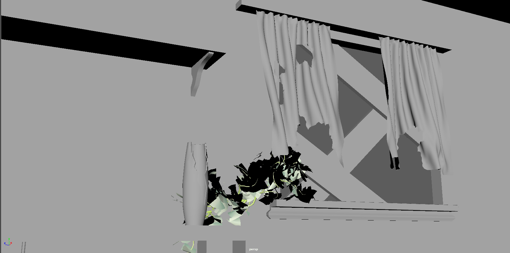
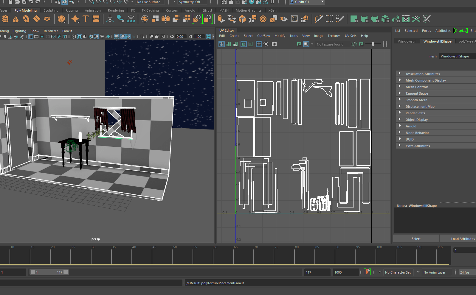
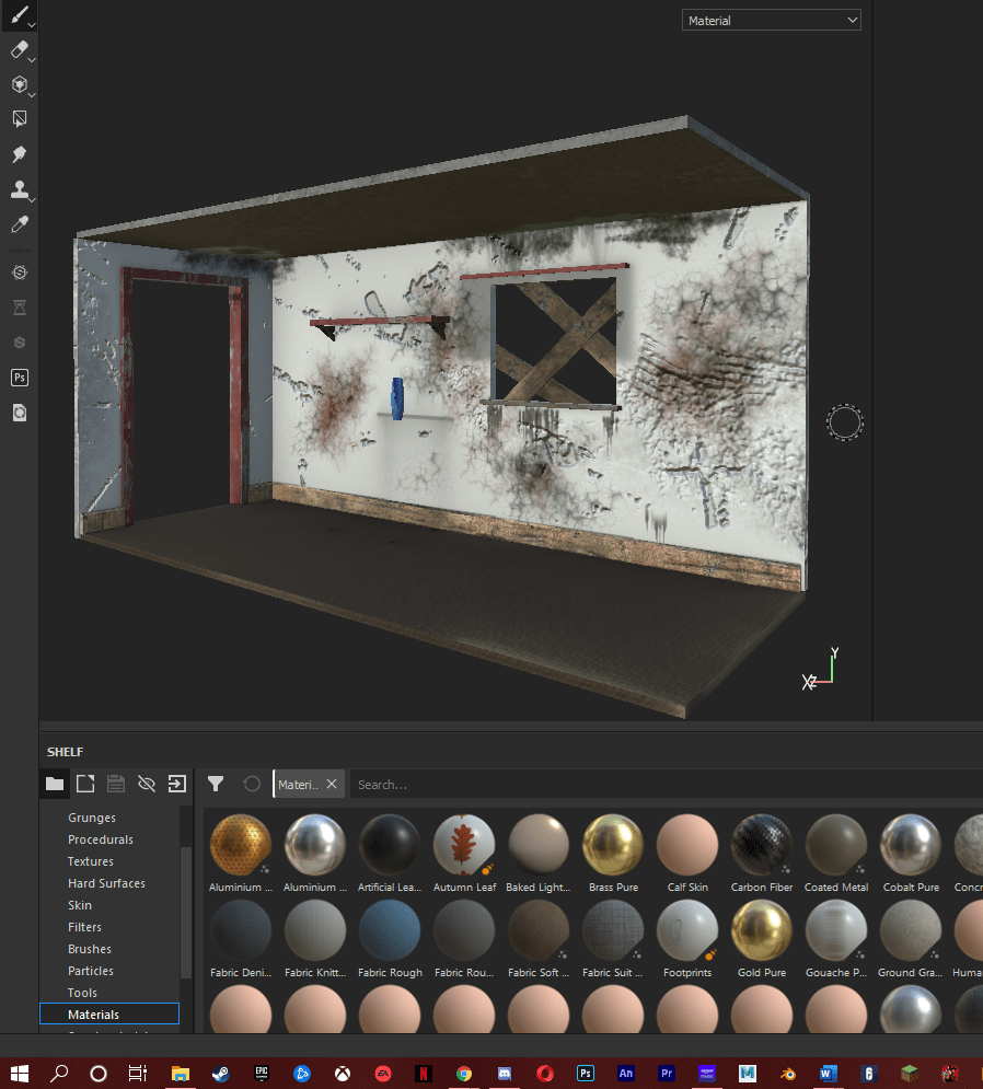
So I began by creating a basic hallway with a window and a doorway leading into the kitchen. I then went back into it and added more like the skirting board, shelf & supports, window sill and wooden planks. I then added curtains by using a plane and a ncloth simulation. I pivoted the plane to a support so it wouldn’t fall, I then made the support smaller so that it would push the plane together to create to wrinkle effect. Lastly I paused the simulation and duplicated to make an object. To add more detail I removed parts of the curtains to make them look ripped. Early in the year we had already created a vase and table for the development of our modelling skills. So I decided I could use these assets within the hallway. Next i wanted to add the vine coming through the window of the hallway. To help me do this i used the following video. https://www.youtube.com/watch?v=xKvOPklNCOY. Firstly I created a path for the vine to be created upon. I then created an ivy mesh and used the attribute editor to tweak it to my liking. I then applied the mesh to the path. I did have a problem where the mesh wasn’t showing up in the render but this is because I had forgotten to convert it to polygons. Once I had finished modelling the hallway I then moved onto UV mapping. Now UV mapping is something I struggle with but I think I’ve improved a lot since my last assignment. Using YouTube tutorials I was able to create clean and straight UVs. I still think I can do better, but I have definitely improved. After I had finished UV mapping, I then moved onto the textures. I exported the scene as an FXB file and imported it into substance painter. To achieve to look I wanted, I downloaded and imported custom materials From ‘Substance Share’, such as; ‘Peeled paint wood’, Broken old brick wall’, ‘Mossy pine’ and ‘old painted wood’. There are separate textures for the table as I already had textures done for the table when I previously modelled and rendered it. Once The hallway was modelled and textured, it was time to start my part of the animation. Another member of my group was modelling and rigging the ghost, so I got the model off her and imported it into my scene. This is where I found a problem. For my shot there was no change in expression of the ghost but, the model has its mouth open by default and there was no control for this. This was easy to fix though. I done this by unfreezing the transformations on the model, then using the face select tool to close the mouth of the ghost. I then added keyframes to the ghost and camera so they would move smoothly together. I tried to replicate a typical cartoony ghost, that would float up and down while moving. I spent some time trying to get the timing right. To me its smooth enough but could be better. Once the animation was finished, another member of my group gave us the backdrop and lighting setup so that it would be consistent throughout. When I imported the lights, They were slightly off because of the scale of my model. So I made some slight tweaks to match mine. The scene was then complete and all I had left to do was render the animation.
Outcome:
Below is my final render of my section for ‘Midnight Snack Adventure’.
And This is the final ‘Midnight Snack Adventure’ render.
Conclusion & Reflection Throughout the year:
I really enjoyed this assignment as it combines different aspects of 3D work, such as modelling, and animating. I feel like this is the big assignment that we’ve been building up to, so it was fun working in a group and to finally create our own 3D short. I particularly enjoyed modelling and texturing the hallway. This has made me want to develop my skills, focusing more on environments. Overall I have really enjoyed my first year in animation, and because of that this year has flew by. Previously I was studying cyber security but decided to change course as I wasn’t enjoying it. I am very glad I made that decision. This year has taught me the basics of 2D and 3D animation. This was my first experience with any form of animation, so it was a bit daunting trying to learn all of the new software and techniques. But I think my work is pretty on track for a beginner. My favourite section of the year was definitely 3D animation, and this is where my interest lies and I cant wait to develop my skills further. I also enjoyed the problem solving aspect of each assignment, through the use of forums, videos and exploring the software. This gave me a sense of accomplishment, and I think this will be a good skill to have in the future. In general I think my work is to a decent standard, but I could try a lot harder to improve the quality. I had a few personal matters along with COVID which really impacted my motivation. But I can wait to see what’s in store next year.
For this assignment we were tasked to create two 3D animations. One had to be a study in the weight of motion and body mechanics. The other was a study of emotion / personality of a character. We were given the choice between two rigs, The Monty rig or the Ultimate walker rig. I chose the Ultimate walker. After doing some research and looking at references, I started making animatics so I could get a rough idea of what my animations would look like. Below are the animatics
Animatic for Animation 1- Emotion
The idea is that walker would look suspiciously behind him as if he had heard a noise, He would then turn back around in a resting pose. A box would then fall beside him, startling him. He would lift his leg to and use his foot to cover his head. He would then slowly move his foot so he can see the box, place his foot down then slide up to the box. He slowly moves his foot towards the box and hesitantly pushes it. He stops to see any reaction. Another box then falls on his head and knocks him out.
Animatic for Animation 2- Weight
I wanted to keep the weight animation short so I could focus on getting the timing and positioning right to be able to effectively show to weight of Walker. So my idea was walker would throw his leg forward causing him to slip on to his back. He would then use one of his feet to push him so that his feet would be pointing to the sky. He would then push both his feet out and use the momentum to lift up and land back onto his feet. I used the following YouTube video as reference for the ‘Kick up’.
Development
I first started with animating the weight task and then the emotion task, as I thought expressing emotion would be harder and as this is my first time 3D animating, starting with the weight would give me more practice. Both of the animations were pretty straight forward to animate. I had some problems with the timing of the keyframes, were they were either too fast or too slow in certain areas which hurt the flow of the animation. With time and manipulation i was able to smooth out most of the timing issues to a satisfying degree. The final animations are below which have been rendered with the Arnold engine.
Animation 1-Weight
Animation 2- Emotion
Conclusion
Overall I really enjoyed working on the 3D animations as I prefer it over the 2D style. I definitely see some areas which need improvement. I feel the animations still have a little bit of a floaty feel to them, which gives the impression that they don’t carry any weight. I also found it a bit hard to convey emotion with a character made up of only a ball and legs; with no face. However I enjoyed the challenge. I think I done an alright job with the rig we were given to convey emotion but looking back I believe I could have used specific movements and used timing more effectively to better express emotion. I can also see some clipping in both of the animations. But I think with time more practice I will be able to Implement more weight in my animations and overall improvement my 3D animating skills.