Major Project

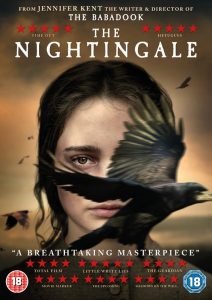
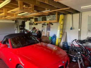
Right from the beginning of the major project I was very excited as I knew exactly what I wanted to do. While I was studying in Newcastle and eventually decided to switch to animation, I started for ideas of an animated short film that I wanted to eventually make. So I’ve had this idea for around 4 years and finally had to skills and knowledge to start working on it. The idea was based of a story inspired by one of my favourite games; The Last of Us. However I figured id have to make a few changes to my original idea. The basic idea of the story is of a man taking revenge after the death of his girlfriend. The story would take place during an apocalypse. I wanted to use this setting as I love the environments within The Last of Us with the use of rust, dust, damage and overgrown foliage. I began by gathering reference for what I knew I wanted to include. I knew two of the environments that I wanted to use for certain, one would be of my garage and the other was my uni accommodation I stayed in during my studies at Northumbria. I then gathered a bunch of references of post apocalyptic; with overgrown foliage and moss, as well as screenshots from both The Last of Us part 1&2. Art station was another useful place where I found other artist interpretations of post apocalyptic environments. I also knew that I wanted to include a graphic death involving one of the characters, receiving blunt force to the head. So I also gathered references of various cuts and two scenes from TLOU part and The Walking Dead with a similar scenario. Henry also suggested gathering reference and diagrams on how bruising developed around the face. As for the track, I wanted to use something that would give a great emphases to the tone of the short. I decided on a track from The Last of Us Part 1, ‘The Choice’. I think having the track already planned before any production really helped as it allowed me to plan out my shots more accurately with timing and frame counts.


Research

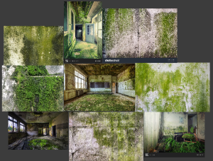
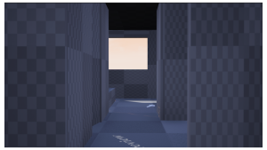
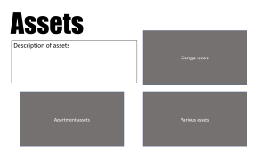
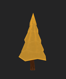
Garage and apartment reference


Early Block outs

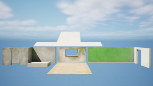
After I had finished research and gathering references, I started to create rough block outs for both of the environments. I first did this in Unreal Engine so that I could get the correct scale by using a metahuman as reference. I then exported the block outs and took them into maya so I could start modelling with the correct scale. I waited until after I had finished my block outs to do the storyboards, as I felt I could get a better structure to the short if I was able to plan out my shots within the environments with a metahuman. It also gave me a better Idea on how the final shot would look. Within the short I planned to have two shots take place within a car. I decided to change this as I thought that modelling the interior of a car would create to much workload. I also didn’t want to use a pre existing model as I wanted as much of the work to be own as possible. During the storyboarding stage I also noticed that my original idea for the short wasn’t long enough. So I added a few extra shots at the end of the main character at the grave of his girlfriend. I thought this would be a fitting ending and give the short a little bit extra runtime. After this I submitted my pitch presentation. Within my feedback I received Henry suggested that I look at the first cyber punk for reference on cinematography and storyboarding. It was also a good reference in terms of style, I wanted to keep my short almost like still images with slight animation. I also took Alec’s suggestion of downloading a pre made mega scans environment which I included in my reference sheet and reverse engineer the lighting within the scene to get a better idea of how I could build the lighting within my scene. Henry also stated  that the short starts to abruptly. He then suggested that I add a few shots at the beginning to set up some of the later scenes and give a little extra runtime.

Storyboards

Animatic

Character Models

Props

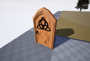
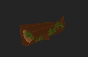
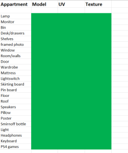
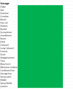
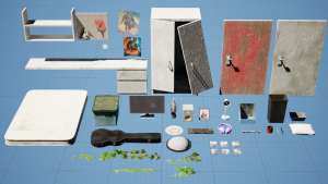
I knew I would have to make quite a few assets to fill each of the environments so I created a excel sheet to keep track of the progress of each asset. I split the list into two sections, one for the apartment and one for the garage. I then made three columns for each stage of the model. Modelling, UV and texturing. When I started my modelling I first began with the main structure for each of the rooms; walls, floor and roof. I exported the block outs I used in unreal engine and used them as a reference to model on top of in maya. This gave me the correct scale to fit with the metahuman. Once I had done this for both the apartment and garage I UV mapped each section then got ready to texturing within substance painter. The texturing was mostly straight forward regarding the apartment, However with my first pass at texturing the garage walls, Henry pointed out that the moss effect looked too flat and didn’t fit with the realistic style I was going for so I went back and redid the textures. After the Main structure of each room was finished I started modelling the props to fill each one up. I started with the bigger assets, doors, wardrobes, desks cupboards etc to get the main layout quicker. Then moved on to the smaller props to fill up the environments. Again most of the modelling and texturing was straight forward apart from a few issues I was able to sort out, mainly with baking high to low models.

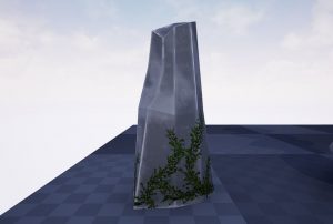
I wasn’t super happy with how the apartment environment was looking. So I decided to use moss decals to help add more detail and I think they add a lot to the scene. They give a much more run down and abandoned feel.

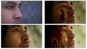
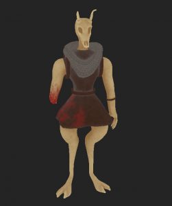
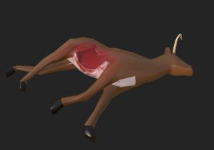
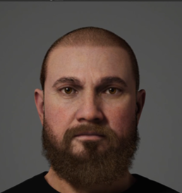
As I wanted to keep the focus of my work on the environments, I decided early on it would be best to use metahumans for my character models. Once my animatic was finished I then made my three characters models. In the extra shots at the beginning, the villains face is only shown by his hand followed by a shot of his eye. Henry though thought this was a little confusing to follow as when the villain is shown at the end of the short it was hard to make to connection that it was the same person. So to fix this I decided to give the character a scar over his eye and change to close up shot of his face slightly. To do this I exported the mesh of the metahuman head and base colour map. Then imported these into substance painter and lower the height on my brush to create the scar. I also added some blood to his face as this takes place just after killing the girlfriend.

Rendering


Once both environments had most of their props added in, I did a quick render to put together to see how the final outcome was going to look. When I showed this to Henry he thought so of the shots look too still and could use even a little bit of animation to help. So I added some animation to a few of the scenes. I started with the close up on the main characters face, I tried to give a shocked expression as if he was trying to process everything that has happened. I also slightly moved his mouth to give the sense he cant even get any words out. The next shot following this is his hands covered in blood, here I just added some simple shake. Within the memory sequence I added a shot of the main character raising his hand towards the girlfriend. This then cuts to the girlfriends hand covered in blood after she has been killed. Here I made one of her fingers twitch which I feel just a very unsettling feeling and creates a strong parallel between the two shots. to Adding the animation definitely help some of the longer shots look less awkward.

After I had added all of the blood decals I rendered out some of the shots to see how they would look with the rest of the short. Then I noticed an issue with a shot of the main character with blood decals on his face. The decals wasn’t moving with the model when it was animated. Meaning when the character moved the decal wouldn’t move along with the skin resulting in a weird floating effect. Henry was able to trouble shoot this by editing the blueprint of the metahuman Head. I was then able to apply the same fix to the blueprint for the hands of the metahuman following Henry’s method.

Within the apartment environment there was a broken window which I had set up using a glass material which I found in a YouTube tutorial. However Whenever I tried to render any scene which the window was visible, it had this weird effect of reflecting the environment and also magnifying it. I tired various render settings to try and fix this but nothing work. I then decided to try another set up for glass material which eventually revolved the issue.

When it came time to start setting up the cameras, I already had quite a few of the shots planned out in my head. I got the general layout of the cameras set up in the early block out environments so I could see how each shot would look. Then I could make any changes needed to each shot to help the short flow better. After I had all of my cameras set up, it was time to start colour grading. I decided to do all of my colour grading using the camera settings within Unreal Engine. My favourite movie is Blade Runner 2049, which is known for its cinematography and colour theory by Roger Deakins. It also won the Academy Award for Best Cinematography, so this was a big inspiration for my short. The first three shots of the short where the villain has killed the main characters girlfriend, takes place early morning. I increased the temperature and gave each of the cameras a slight tint of a blue/purple hue. This was to emphasise the lighting during that time of day but I also feel it gives the short a more unsettling look to the situation. The blue/purple hue is reminiscent of the busies Vivian has developed within the third shot. All of the cameras within the apartment were roughly using the same camera settings with slight variations for each. I turned up the temperature for all of them and added a slight green hue to match with the greenery of the vines. I also added a white light facing the main character from the direction of the window and turned down the intensity. I think this gives a really nice tone for the close up of his face and is definitely one of my favourite shots. For the next sequence with the main characters girlfriend I wanted to make it feel as though we are in the main characters head looking back on his memories. it as him looking back on a good memory, almost like a dream sequence. To do this I set the scene at sunset, this way I was able to use a warm colour palette. I also increased the size of the lens flare and positioned the sun so that it would slightly cover her face and used depth of field to bring her face in and out of focus. I think this two elements really add to the dream like feel. I also used the camera settings to increase the temperature and add a slight orange tint to help emphasise how the main character sees this memory. When I was listening to the track I had picked and trying to plan out my shots. There was one part of the track that I knew instantly what I wanted to do with it, (1:25 in the final short) Because of the quick progression and drop in tone I thought this would be perfect to show an environment decaying over time.


Final Outcome

Conclusion

Overall I’m quite proud of the final outcome of my major project. I did have to make some changes to my original idea which I wanted to keep, however these changes reduced my workload and allowed me to complete the major project on time. The final outcome is still very similar to how I imagined it. There are some things I would go back and change however. I think the short would have benefitted with more animation, even if it was slight. I also think I could have done better at showing the garage environment decaying over time. For instance the texture for the walls stays the same between each time jump when I could have made three sets for each version. I also could have added vines around the windows in the later version like in the apartment, which I think could’ve added a nice connection. More variety in assets could have helped to really tie the environments together, especially within the garage environment, however for my portfolio I’m going to focus on one area within each environment to add extra detail and more props. In conclusion, I really enjoyed my time working on the project, it may have been more beneficial to me to do a more portfolio based final project but it was really cool to see something I had planned years ago come to fruition.

End Of The Year Show

I wanted to keep my display very simple. I had my main poster for the short framed and up high in the middle of my display. Below it I wanted to show off some stills from the short so I decided to display each element of the short. Below the poster would be three stills of the three characters within the short, and below them would be two stills of each environment. I decided to rework the majority of the design deck as I wasn’t happy with the layout. I own a few art books from game and movies so I took a look through these to get some ideas. I removed the majority of the text but I think the layout allows the viewer to easily follow the shot breakdowns. I also changed to font to Perpetua Titling MT so that it is consistent through out my poster etc. For my business Card I was pretty happy with the front side with my contact information. All I needed to change was the photo on the back to the completed environment. Based off my feedback on the rough designs assignment, I added more experience to my CV to relate more to an environment artist role. I included that I worked on a vertical slice project with the game development course as a 3D modeller and texture artist. I have also been using my Instagram page to promote my work. The page contains personal work that I do for practice, my work from previous years and my recent major project. After I had set up end of year display I posted a photo of it on my story and had a few people reach out to ask when the display was open to view.

Im still pretty set on a environment artist career path. After uni I’m planning on moving to California to work with my brother for a few months and during this time I am going to continue working on my portfolio and improving my skills and be on the look out for any environment artist jobs in the area.

Final Display

Design Deck

CV

Business card

Instagram

Rough Designs – End of Year Show Materials

To research for my poster design I looked at movie which shared a similar theme to my major project. The concept of my project is a man trying find peace within grief and violence. While the themes of the project are post apocalyptic, revenge and vengeance. So I looked at movies such as The nightingale, Prisoners, Django Unchained and The last of us part 2, which my major project is heavily inspired by. After looking at some of these movie posters I started to put together some rough designs using the curved based systems. The first poster features a hammer in the centre covered in some blood using a negative space style. The hammer is used in my project as one of the murder weapons. The second design features the main characters eyes covering the bottom half of the poster, in an attempt to convey an emotion state. This is to give the viewer a better idea of the tone of the project. The third design is a bit more graphic as it features the character Vivian’s death. Within the story she is killed by blunt force with a hammer to the head. The poster would then be a half and half style with Vivian’s face covering the right side. I think this gives a much more powerful impact on the viewer.

Rough Poster Designs

Feedback 

I met with Alec to receive some feedback on my poster and business cards. He felt the font needed to be bolder and stronger to help fit with the theme. The word ‘Left’ should be aligned with ‘whats’ to help give a stronger impact. Having ‘left’ not aligned gives the font a more softer feel. It would also help if I added a subtle shadow or vignette around the edge of the poster, just so it wasn’t just a block colour. My name should also be a bigger font to fit with the title and I needed to experiment a bit with the placement of all of the text. Another improvement was the hammer itself. At first it took Alec a second to realise it was a hammer, when it should be an instant connection. To help with this I needed to try a few different angles with the hammer or add certain highlights to emphasise the shape more. With the business card all of the text on the front needed to be aligned to line up with each other. The art station link also needed to be moved up slightly as it was to close to the bottom. On the back of the card Alec thought it was a better idea to move the QR code either to the left or the right side as it was blocking too much of the environment behind it, which I agree with.

Poster Design – before feedback

Poster design – after feedback

Business card Design 1- before feedback

Business card design 1- after feedback


I also met with Henry to get his feedback on my designs. Firstly with the poster he shared the same concern with Alec about the readability of the hammer. He suggested that I create a second poster with a close up render of the main characters hand holding the hammer with a blurred background. He told me to use the ‘Logan’ movie poster as inspiration. He also thought it would be better to use a more ‘blocky’ font and maybe even include a texture to create more of an impact and fit with the theme of the animation. When I tried this I realised it was too close to the title font of The Last of us, so I decided to not use a texture. For the business card he didn’t like the use of the white spaces so he suggest using only one of the rendered environments to fill the entirety of the back of the card. The front of the card should then match with the green wall within the environment to keep a more consistent look. Also to help with this the font on the card should match with the poster and across all my materials. To help create a better presentation of the text on the front Henry suggested I use the ruler tool within photoshop to keep everything aligned correctly. The front of the card would now also include the QR and my phone number.

Business card design 1- after feedback

Poster 2


C.V Design

I started by taking my previous C.V I created for second year of uni and comparing them to other environment artist C.V’s I could find online. I removed the symbols as I think it looks more professional having them listed. I also moved my name, role and contact information to the top of the C.V as I think it creates a better layout. I decided I didn’t like the use of purple and I wanted to keep it more simplistic. I also showed my previous C.V to Henry and he suggested to add more information and again to keep the font consistent with my poster and business card. I think the updated C.V stills needs a bit of a rework but is in a better state than my previous C.V.


Design Desk- Rough Design

Assignment 2 – Personal Development Project

Research:

For the animation style, I didn’t want to go for any specific style especially anything too exaggerated. I wanted to keep the animation style more basic. I think this helps improve my basic animation skills and also gives me practice for my idea of my final year project.

reference:

So for my reference I thought it would be best to record myself playing out the scene in the way I had imagined so that I had footage to base my animation off. The scene was pretty basic, I didn’t want to copy the original breaking bad footage exactly. However I did use the original scene as reference for the mouth animations as the footage is much clearer and its easier to see how the mouths were moving. There is one point of the dialogue; ‘You’re Heisenberg’ which is kind of hard to see the mouth. To get round this I just recorded myself saying that one line then slowed it down.


Development:

I first started out by laying out the scene, I imported the two buzz and woody rigs along with the table and chairs. Then just spent a bit of time posing the rigs and trying to set up camera angles. Once the scene was ready I started with the head movements of woody, so I took the reference footage and imported it into premiere pro, this allowed me to go frame by frame. Once I had the head movements down I wanted to finish the body animation which was just the pointing scene. I didn’t put too much time into the arm lifting as I knew I was gonna to make a slight cut to this later, so I mainly focused on the hand pointing. Next I went back and started working on the lip sync. I started with the shortest bit of dialogue then worked my way up to the longest. I used both of the reference footage to copy the mouth. Some of the dialogue was easy enough to match but other parts were tricky. The timing was hard to get right, I tried going frame by frame and and listen to when each sound was pronounced. Once woody was finished I created a new layer for all of buzz’s keyframes. I took a few more passes again to try and refine the animation. I then added some simply lighting and tried rendering, although in the Arnold preview I noticed a problem with the textures. Both rigs were extremely shiny so I went into the hypershade and change the reflectiveness of all of the textures.

Final outcome:

I’m not sure what happened to the colour in the final render, as the Arnold preview displayed a different colour. While the rendered clip seems over saturated. I also only noticed after the render that the textures for the table and chair weren’t working right. However I didn’t have time to try and fix the lighting and re render, but I think the final outcome was decent anyway.

Assignment 1 – Vertical Slice Group Project

Week 1:

I was really excited when I heard we were going to be working with the game development course to create our own game. I’ve always been interested in that area and also considered choosing that course before I decided on animation. In our first week we were put into pre chosen teams and had to come up with ideas for our game. The basic idea of the game was a breath of the wild/ God of war type game but with a more Irish folklore theme. The idea went through many iterations and once we had a rough idea of the narrative we were ready to start planning the animation side of things. Once we had got a rough idea of our game; each member thought of a task they could complete that would fit our game and also ‘the room’ task which we had been given. I had decided to model a door that in the style of our theme that the character could exit the room through. Later on after class we had a group meeting over discord so we could talk further and start to get concrete plans. We also created a miro board so we could keep all of our ideas organised.

Models:

So before any of the animation members started work on models, we thought it would be a good idea to pick someone to be the ‘Head of art’, this would be Benny. The responsibilities of this role was to give the modellers a guide to what the art style should be, and how textures and models should look. Originally I wanted to go with a more realistic style as that is what I’m most comfortable with, but the rest of the team decided they wanted a more low poly look; Although this would end up causing me some issues. I had the idea in one of our group meetings to create a spreadsheet with a list of all of the assets with needed with various stages, eg concept art, model, uv, texture. This allowed us to keep a more accurate track on the progress of each model. Once the spreadsheet was finished we filled it with all of the assets we needed, I believe I was completed the most assets, again as its what I believe my strong point is.

The first model I made was the door for ‘the room’ task. The door was straight forward enough. It was modelled in maya then textured within substance painter. I wanted to add a Celtic symbol to go with the theme of our game. To match our low poly style I thought it would be best to hand paint the wood texture on the door and frame as most materials substance had were more realistic. Dylan and Benny as later decided that we should just use Base colour and normal maps. Again in attempt to keep a more consistent style. Next I thought I should do the rock models as they should be easy enough and I could get them out of the way. I used some of bennys images as a guide and a YouTube tutorial to help me get the right shape. I created the rocks by first starting with a platonic solid shape, then changing the primitive to tetrahedron. Then adding some divisions and using soft selection to help create the right shape. After I had done the UV maps it was time to texture. So to give the rocks a low poly look, I used the same three layers for each. I started with baking the mesh maps and painting the uv’s grey. Next I added two fill layers, one with a slightly darker grey and one with a lighter grey. I then added a ‘soft dust’ mask on the darker layer and a ‘edges strong’ mask on the lighter layer to give the impression of highlights along the sharp edges. I then tweaked the properties a bit then repeated this for each rock.

Next up was the trees. These were basic to make, I started with a cylinder and lowered the amount of divisions, then make multiple cuts across the cylinder. Scaled out the vertices shorter as they went up the tree to create the cone like shape for the leaves. I then made the trunk from a separate object and simply joined them together. To make the tree look more organic and give it a better shape I played with some of the vertices by scaling and twisting. The UV’s were straight forward then it was ready for texturing. I used the same idea as the rocks for this asset too. Again Baked the mesh maps then painted the wood on the trunk, then used two fill layers for two different shades of green. And again used the same masks on the layers. Using the same method of texturing help keep my models consistent. We discussed how we wanted the game to take place around autumn time, so I created four variations of the tree but for autumn colours. To give a bit more variation to the environment I also made a tree trunk by it self or ‘fallen tree’. This was also pretty basic, starting with a cylinder scaling, inserting cuts throughout then using the vertices to give it its shape. I also used the circularize tool to add some branches to the trunk. Once again I used the same workflow to do the textures however this time I added a ivy decal around the trunk, to give the impression it had been sitting there for a while. I think this helps give the environment a bit more life.

Now that I had the easier models out of the way it was time to start the deer model. I found the deer quite hard to model. I struggled to hit the low poly art style we were going for. I started by looking up a 360 reference of a deer and using it to create the basic profile of the deer. I then scaled the vertices along the body to try and achieve the right curves and overall shape of the deer. Again I used the circularize tool to add antlers onto the head. Once I was happy enough with the model I started to rig it. I was very inexperienced with rigs so I followed a YouTube tutorial for a quadruped rig. I thought the rig would be hard to create but I actually found it quite easy to follow. However I think my model could have used more topology around the legs as the model would stretch in an unusual way with the rig. In class I received some feedback on the rig and model of the deer. I was told to soften the edges of the model and told to use curves for controllers instead of shapes. After the rig was done I started to unwrap my model. This is were I ran into a problem, I kept getting an error ‘two polygons are connected by their interior edges’. I spent a while searching how fix the problem but nothing was working. So I sent my Maya to Alec to see if he could find the issue. While creating the model I accidently added a face on the inside of one of the legs. Once the face was removed I was able to continue unwrapping. The same texture workflow was once again applied here. I also created a second deer model but this time as a carcass. I simply extruded some faces and tweaked the vertices to make it look as if a chunk was missing from the deer and added blood in substance painter. Overall I think the Deer model is alright, it could definitely have stayed closer to our art style.

Lastly I created the enemy model. This is were I believe my quality of work really dropped. I had to make the enemy last as Benny was creating the concept art, although eventually she had to pass the task onto Nicole so I received the concept late. Originally I started making the model inside of maya. Once I had a basic shape of the creature I thought it would be better to sculpt it. So I used the basic model I had already made to give me a base to sculpt on top of. As I had never made a character before the sculpting process was a bit frustrating. I was using symmetry to help and getting the right shape was a bit of a struggle, especially in the hand. I think it just looks downright bad. I used a stretched sphere to build the fingers then sculpt and blend them together. I also thought It would be best to cut off one of his arms. I thought this gave the creature a bit more character. Next I took the model back into Maya, reduced the faces then retopologized. Now I don’t have a lot of experience with retopology and I was in a rush so I used to retopologize tool and save some time. This gave me a good but not perfect topology. Next I did the UV unwrapping which was straight foward then took the model into substance for texturing. Again this was straightforward, I gave the creature a bone texture to make it a little more like a skeleton and added some blood around the arm that had been cut off and dripping onto the clothes to give the impression as if it had happened recently. the last step was to create the rig. Because I was in a rush to get the creature done I used mayas auto rig tool to create the rig. It didn’t give me a perfect rig, some of the joints were in the slightly wrong place but I think its good enough for our purpose. There was a bit of weird stretching happening with some of the joints so I spent some time fixing the skin weights; like the joints they’re not perfect but will do the job. I think my biggest mistake with this task was trying to rush it. I think I could have produced a much cleaner model and rig if I had taken more time with it. I didn’t want to mention every problem but I did run into quite a few issues while trying to make this model, most I was able to find a fix for by searching online.


Door:

Rocks:


Trees:

Animals:

Team:

Our team was made up of 10 members. Karl, Dylan, Nicole, Jessica, Eamonn, Ben, Benjamin, Benny, Fionnula and me. Overall I think the team communicated pretty well throughout the project. Some weeks were more productive than others, but we still managed the achieve most of what we had set out to do and on time. Most members of the group carried their fair share of work for the game. We had a good collaborative way of working, through the discord server, google drive, spreadsheets and miro board. However I think there were a few things that hindered us.

Conclusion:

Overall Im not really sure how to feel about this assignment. There are areas of my work were I definitely could have done better. I don’t think my quality of work was up to the level I wanted, I think this was due to me struggling quite a bit with keeping a consistent low poly art style throughout my work and other team members works. My enemy model is something I definitely could have done better with. This is a area I need to improve upon, especially for working in a team in a future job. I also found it a bit difficult to work in such a large team, however project to work on and gave me a rough idea of what its like to work within a game development team.