IXD103 – Element Collage/Style Tile

After researching about element collages and style tiles from various companies and brands I then made a start on mine. I wanted mine to be fun and alive with imagery and information. I stuck with small red detailing and just wanted to keep it red and white – my colour scheme. The image below is my final style tile/ element collage.

I included all I thought was necessary:

  • Monogram
  • Wordmark and typeface
  • Buttons for my portfolio
  • Colour scheme
  • Imagery
  • Icon set

I feel like that is all I need and want to show in my element collage because those are the main parts of my brand and elements people will see when they come to my portfolio immediately.

Could anything be worked on?

I think yes, even though this is my finished element collage, I feel like there can always be room for improvement. I am sire my brand will change over time, this may result in changes to this element collage. For example,

  • I plan on adding for imagery to add to my business card so I have a range of them, this will come with time and trial and error. So far I have those images but I will definitely need more.
  • I think I could possible work on my buttons too and create more examples of them.
  • I could have dismaying my icons in a more graphic way like I have done in my portfolio, but I wanted to show the method. This is something to think about.

How will this help with the production of my portfolio?

I think this will help a lot, it has given me a platform to get all necessary imagery, colour etc into one space and allowed me to see how everything blends together. I am not aware of all that is needed for my portfolio and what to expect. This element collage has given me a good guide for my portfolio and has allowed me to see what the buttons will look like against my logo and wordmark.

IXD103 – Refining my Colour Scheme

After the group critique Daniel mentioned that he thinks I should take out the yellow from my brand. I agreed, I knew something was off with it so when he mentioned it was the yellow I knew he was right. I initially wanted yellow because I thought red and white on it’s own was too boring because I want my brand to be very bright, creative and fun but he reassured me that red means energetic and along with my multi-colour imagery is enough.

This is where my colour scheme was 

Why doesn’t this work?

  • Too much is going on
  • My wordmark is hard to see with the red background
  • Doesn’t look very professional
  • Isn’t the vibe or message I want for my brand

My colour scheme now

Why does this work better?

  • It looks more professional and makes my brand appear more solid and strong
  • It highlights the wordmark and monogram nicely and doesn’t take away from them
  • Simple yet effective

Overall I am so glad I got Daniels opinion because it does look so much better, I have been on quite a journey with my colour scheme and its nice to see it finally finished. I feel now that all elements of my brand will blend much more better and just look complete.

IXD103 – Week 11 – Group Critique

This week we had our group critiques, we had to present to our selected group our entire brand. This was a great opportunity to get other class mates feedback and I go to see all of their work too. Daniel had placed out 6 pages onto a miro board and we had to place our work out on them. Everyone had to present for around ten minutes and talk about their work and the other group members were asked to put post it notes around your work giving their opinions too.

This was my board:

I added in everything I have done so far, my monogram, Wordmark, imagery, a screenshot of my brand guidelines, website link, beyond the brand mug, icon set and business card.

These were the groups thoughts on my brand:

What elements did people like:

  • The m&m business card/ imagery because it looks ‘fun’ and ‘welcoming’
  • The red and white colour combination
  • The mug addition and the red detailing on the inside
  • How the brand looks playful/colourful and fun
  • My icons
  • The continuous feel to my monogram

After getting this feedback I had to ask myself why were these elements working and not others? The red and white icons and red and white mug works so well because it is simple. Daniel remarked that my recent work is the best, and my recent work is those elements – the mug and the icons. I liked the way the white worked on the red background and I liked how well my monogram worked on the white mug. If these worked so well then I have listen to this, and. repeat it for all parts of my brand. The simpler the better.

Daniel was giving me advice on what to I should change/alter and I took note of these, here are the main ones:

  • Remove the colour yellow completely from the brand because the red and white works better and is enough.
  • Only use some of the imagery from my selection because some do not work. Maybe work on the multicolour images, they look the best.
  • Change the layout of the back of my business card.
  • Do some more of the beyond the brand perch because they really work.

What is my next step:

  • Going through my elements and removing the yellow.
  • Editing my brand guidelines to make sure only red and white is featured.
  • Edit my website and take out the yellow in the navigation.
  • Find inspiration for more beyond the brand ideas e.g keyrings etc.
  • Experiment more with multicolour objects for my imagery for eg, use all green m&m’s etc.

Overall, I think this was a very informative and productive lecture for me because I have things to change, I really appreciated all the feedback because it it turn will make my brand better and more successful. I am eager to change things that don’t work and make changes so that they do.

IXD103 – Lovemarks by Kevin Roberts Book Analysis

Daniel recommended that we should take a look at Lovemarks by Kevin Roberts because it related a lot to our last lecture on ‘Beyond the Brand’, This book, like the lecture, revolves around understanding the emotional connection between people and the brand. Kevin Roberts believes that love is the way forward for a business, and he has that mentality of high love and high respect like Daniel talked about.

I started reading and he beings by talking about how his successful career in marketing and founding his business ‘Saatchi and Saatchi’. He talks about so many things in this book and what also interesting mw when was reading it was how every page was different, I mean the design. Every page has a different colour text or different style of imagery, this made the book very interesting to read and kept my attention the whole way throughout. There were certain areas that stuck out to me in particular:

  • Emotion and Love
  • Loyalty beyond reason
  • High love + High respect

I was reading to get the the beyond the brand section and how to take your brand further – because this is what I want to find out more about.

Emotion

‘In my 35 years in business I have trusted my emotions. I have always believed that by touching emotion you get the best people to work with you, the best clients to inspire you, the best partners, and the most devoted customers’. It is clear to see that Roberts holds a strong feeling towards the importance of having emotion and emotional connection within a brand. ‘Human beings are powered by emotion not reas on’. He then moved on to ‘LOVE’ because he stated it was the most important primary emotion of them all.

Roberts discusesed songs he loved and facts about love which all led up to how he began to incorporate love into his work and brands.‘I knew love was what was missing. I knew that love was the only way to ante up the emotional temperature and create the new kinds of relationships that brands needed.’ This was interesting to me, the fact that he took peoples love for interests and hobbies and he found a way to use that within brands.

He also said that ‘lovemarks’ of this new century will be the brands and businesses that create genuine emotional connections with the communities and networks they live in. This means getting close and personal, this makes sense to me when I read it because when I think of the brands that I love and admire, they have a very good emotive language to it, very good customer service and all around have a good emotion connection to their customers.

Loyalty beyond Reason

This was another big part of what Daniel talked about, you want your customers to be loyal to you and love sometimes if the only thing that will keep them there. This part of the book was interesting because Roberts discussed loyalty to brands and what makes them stay.


He gave this example on Apple – ‘With loyalty beyond reason Apple could make mistakes and still be forgiven. This is the reward for a Lovemark. Only love will get consumers through the bad times when commenting sense tells them they should change. Because Apple users loved the product, they were committed to it as an idea for themselves. They were Apple people.’ This was quite relevant I think even for todays society, that people will stay through times when they shouldn’t if they love the product enough.

The Love/Respect Axis 

This is another popular section of the book that deserves recognition, as I read some reviews and people agreed that this was an important chapter, it is mainly what the whole book is about – high love and high respect.

How did this axis come about? Roberts wrote that he was showing his boss his new idea of how brands could become more successful because the essence of a brand is fading away. He drew a line on a napkin starting from love at the right and ending in respect to the left, he placed brands near love, stating that more love needs to be in brands ‘high love’. Products would stay at the left of the line ‘low respect, low love’. Then his boss fixed this axis by drawing another line horizontal, that is how the respect/love axis came about. The axis showed love as the goal above and beyond respect because a brand needs both to succeed.

‘Now we can show the ongoing importance of Respect and the urgency of moving into a relationship based on love. Love of design, love of customers etc’


I really enjoyed the imagery used demonstrating the axis and showing it in use, where you want to be and where you don’t want to be on the axis. This helped me to understand the concept more. After reading this chapter I now know why everyone thinks it is so important for a brand to have both high love and high respect. I then thought about the brands I love and everyone loves, they are so well received and well liked because they have both of these aspects – love and respect. Brands like Nike, Starbucks and Mercedes have love and respect from all of their frequent customers, they keep coming back for more.

What did I learn from this book?

  • I learned the importance of emotion within a brand, that the client has to feel some sort of emotional connection with you or the brand.
  • I learned the High love And High respect concept and its importance within a successful brand.
  • I learned how love is also needed. If I do not love my brand and the work I am producing then how should I expect others to love it.
  • I learned that quite sensual and intimate words can be used to describe all parts of a brand or company( which I have never seen done before) for example, passion etc. Further highlighting that emotional connection that everyone needs from a brand they love.
  • I learned that respect is so important. People go back to what they respect and like what they respect.

How am I going to use this information for my own brand?

  • I have to now look closer at my brand guidelines and ensure I use a correct tone of voice, a tone that evokes feelings of emotion and that I truly care about what I do and produce.
  • I must ensure my work is a the highest quality possible to ensure respect from my target audience, high quality work shows I take my work seriously, earning respect.
  • I must also make sure that it is visible that I love my brand and what I am designing so I can receive that high love factor. If I don’t love my brand then how do I expect others to.

IXD103 – Selecting Imagery for my brand

I have decided that my brand needs some sort of imagery to reinforce my values which are, creativity, productivity, fun, energy, positivity etc. Now that I have my colour palette that I have selected and altered now fits with my brand personatliy. Now all that is missing is my brands imagery. I found this blog post on 99design on ‘How to select the perfect brand imagery for your business’ by Meg Reid. This was just what I was looking for because I have had some ideas but am unsure on where to start.

What is Brand imagery?

This post stated that brand imagery is ‘is the result of all the visuals that represent your brand identity. The images that make up your brand imagery can appear in a variety of forms, from billboards to Instagram, websites to print ads. These images are more than simple visuals—they convey an emotion in the viewer (known as “brand feelings.”). This often occurs on an intangible level, building trust and confidence over time and repeated exposure.

This got me thinking about how I want people to perceive my brand, and I know my brand values and aims but how will other people.

‘You can view brand imagery as an opportunity to visually communicate with your potential customer’, this showed me just how important brand imagery is.

How do you create the best brand imagery for your company?

In this case my company is me and my brand. Reid went on to answer this question by advising that you should think of your perfect customer and their what is important to them etc. If you can visualise the customer then it is easier to better source imagery for the audience. This article then went on to give an example, a good example in my opinion, of two cars that are different brands. Both brands sell cars but they are attempting to sell to two different audiences.

. It was good to see what she was saying being put into images, this made it easier to digest. I also am aware now that even though these companies are selling the same thing, they can make the product look different, appeal to different audiences by thinking about the following:

  • Colour
  • Compositions
  • Typography
  • Content
  • Style

This article also mentioned another good example of a brand that has very successful brand imagery – Go pro. Go Pros instagram is very successful and aesthetically pleasing in my eyes.  Above is a screenshot from the article and what Reid showed to portray her good thoughts on the brand. All the images have the same theme, so it works. They use images of happy and active people filming their wild adventures. This is consistent with the brands identity and overall aims. This is good inspiration for me and my brand and really shows me how to be consistent with imagery.

Meg Reid then goes on to say that imagery doesn’t always have to be photography. This is important to understand as a designer because my work is my imagery, all of the projects I have done throughout the year is technically considered my brand imagery. As, this is the work that will be on my portfolio, however I think I want to include photography and some other imagery to reinforce the creativity that my brand represents. An example the article gave for their use of imagery through illustration was the mediation app:

Headspace

I like the use of shapes and little creatures throughout this brand, it really reinforces a sort of calmness for me but in a fun and enjoyable way.

This article was very helpful and has made me think about a lot of things:

  • Who is my audience
  • How do I want my brand to be perceived
  • I need my imagery to be consistent
  • Will I include photography alongside my own work

Thinking about imagery for my brand:

To begin looking into imagery, I started on paper. I made a big a3 page to try and figure out what I should select as part of my imagery. I had previously talked with Daniel about this because I had some ideas but I needed to get them onto the page before I started properly.


So the items I selected were falling into three categories:

  1. Fun
  2. Creativity
  3. Productivity

These are three elements that I want to be all over my brand. Three sections of my brand that stick out and people can see your my main goals and aims for my brand and my work. I came up with some examples for each section – Sweets for fun, art for creativity and office supplies for productivity. I have an image in my head of using these everyday objects to recreate my monogram. This is what I want my brand imagery to be.

Why these items:

  • They reflect the original words nicely
  • I could find them in colour to add more colour to my brand
  • Every day things – to show my logo could be made with anything and emphases creativity in our everyday lifes
  • Will hopefully be successful in making my monogram

Why do I want to use brand imagery?:

  • To add another element to my brand
  • To add colour to my portfolio page
  • To show customers that I am creative and my work is fun
  • To encourage others to look at life creatively too
  • To bring my brand to life
  • To explore photography and photoshop
  • Imagery for my business cards

What could go wrong?:

  • I may not be good a taking pictures professionally
  • They may not turn out as I planned
  • The colours may clash with my portfolio
  • I may not be very good at photoshopping the images
  • They may not look right on my business cards
  • The objects may be hard to manoeuvre/ mould into my monogram

I am aware that I will have have some set backs with this project and that it may not turn out like I want it to but I think I should try because I want to make my brand the most successful it can be and I feel like adding fun imagery like making my monogram out of colourful objects will create an emotional and fun relationship with my clients.

Whats the next step?

  • To start sketching on paper my ideas
  • Get supplies
  • Take the pictures
  • Start editing the pictures if needed


IXD103 – Colour in my brand

Revisiting my brand and talking with Daniel I wasn’t happy with the colour of my brand, something wasn’t right or something was missing, so I started to look at colour again. First of all this is my starting point and what my brand looks like now,

I don’t think this looks bad, I just think it doesn’t match my brand values and really screams ‘fun and creative’. Talking with Daniel, he recommend that I should stick with the yellow and perhaps a red/pink instead of the purple.

Why does this not work?

  • Purple reflects royalty, knowledge and spirituality, these aren’t my main values or aims for my brand
  • These colours don’t make my brand look fun, creative and spontaneous (in my opinion)
  • The circles on the business card don’t work for me, I think I can make my brand imagery more exciting

I took a look at the colour wheel and what colours I could use and what they mean, I then tried lots of colour combinations out digitally to see what they looked like in action. These are some colour combinations I tried with my monogram:

Analysing my favourite and also taking into consideration of what Daniel said, I came to the conclusion that the red and yellow was my favourite, but I wasn’t sure so I tried out some more red colour combinations.


My favourite from this selection is still the first one, the yellow and red. I also think the white goes nice with the yellow and red. This will be good when it comes to making my portfolio because there will need to be white space. Now I want to look at what those colours mean and how they will reflect within my brand:

Red = Excitement and energy

Yellow = Creativity and happiness

These are all words that I wrote down for my brand at the start of this project, so this makes much more sense to use. Using colours that represent my values and aims makes my brand more reliable and trustworthy.

Putting it all together 

Now I have my colours chosen I have to apply it to all aspects of my brand.

What do I like about this?

  • I like how the yellow really pops on the red.
  • I like how the combination looks fun and creative.
  • I like that these colours reflect my brand values and aims perfectly
  • I think these colours bring it to life

What needs work?

  • The business card needs work
  • Perhaps try a brighter yellow, although it still has to be dark enough to be read easily

Overall I think that my colour development and changes will really help my brand and really inspire my portfolio also, this colour palette makes me feel like my brand will be successful, as now I can see it come to life and really portray what I want it to. Furthermore exuding my aims and values perfectly.

IXD103 – Designing my brand icons

To being designing my icons, I had to start on paper, I started by sketching all the icons I wanted to include out roughly just to see what I was working with. Since my icons are my visual mark, I wanted them to be really successful

My whole idea for creating them came about because if the unique way I made my monogram, this was the process of how I made that so it is easy to see where I got my idea from, So I wanted to use this method, the method of circles to outcome, to create a range of icons that I can use for my portfolio or anything really.


I started out on paper and these are some of my initial ideas for icons.These are my sketches for how I would go about creating them with the use of circles and the same monogram method:


I think that my overall sketches look successful and look as though they will be successfully digitised. I think what I have to remember is to keep in mind the circlular edges, so to reflect the starting point of each icon. They all start as circles.

Why do all my icons start as circles?

I chose this method because it was the same method I used to create my monogram, my monogram ended up being very successful, so I wanted to carry through this method in other elements of my brand.

What or who inspired me? 

For the actual inspiration for the placement of circles at the beginning of each icon came about from a book I read called ‘Visual Grammar’ by Christian Leborg. He explores shapes ‘circles’ and their abstract form/structure and so much more. His demonstrations helped me when placing the starting structure or skeleton for my icons, this image in particular the section on Visual Distribution, under the chapter on Formal Structures.

Seeing the image above, made me think of the icons I want to create and how I could use circles for the bases of my icons. This was tricky thinking because most icons are not circular  in any way. But seeing this image sparked something in me. I needed not think of using circles to create the icons but use their formal structure, the outside of circle, and trace the lines they create. The circles above are in a formal structure, in line with one another and I seen a square when I saw it. This made me think I could do something similar for my icon designs. My blogpost for my analysis of this book can be found here.  I feel like my monogram also inspired me to use circles because I did the same thing I did when creating my monogram.

Why is the method important? 

The method of creating my brands icons is a very important part of the process, in my option the process is more interesting that the icons themselves. I think for me, since this is my chosen visual mark I want people to see how simple shapes like circles can be used in the creation of something non circular for e.g, an envelope.

What do I need to do now?

  • I need to start to create my icons on Adobe Illustrator
  • I need to think about colour
  • I need to start to create digital prototypes of what my icons will look like soon my website

IXD103 – Colour Ted Talk – ‘The Language of Colour’

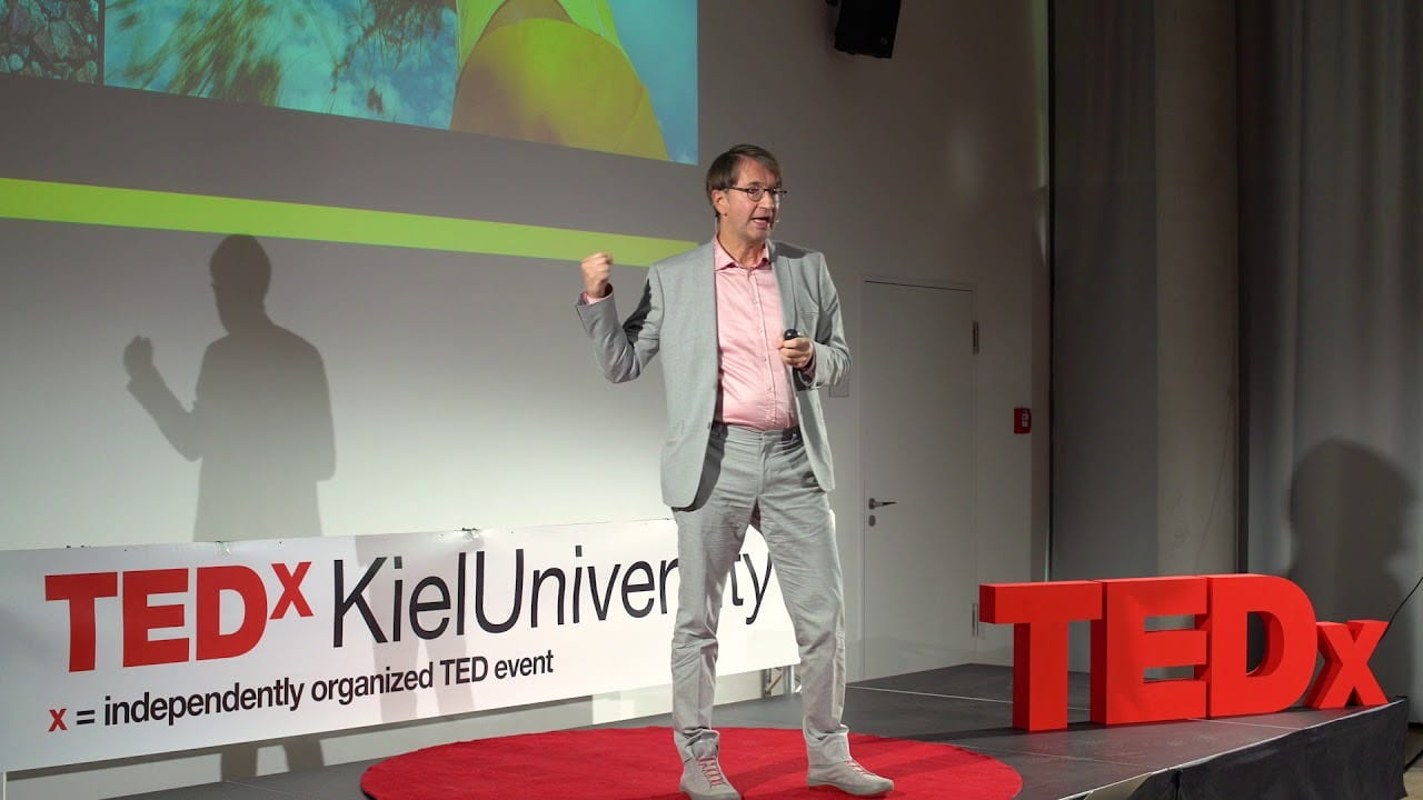
Before I look at colour in my brand or revisit it I wanted to get a broader insight into colour in everyday life, so I went own a hint to find something to help me. I then stumbled onto this ted talk by Axel Buether called ‘The language of colour and the effects of colour on our experience and behaviour”, This was perfect.

Who is Axel Buether?

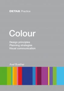
First I had to look up who he was and why I should listen to what his opinions on colour were. Axel is actually a German architect and has published a very successful book on colour called ‘Colour: Design principles, planning strategies and visual communication’. So he knows what he is talking about and this ted talk reflects parts of this book and his research.

Why do I want to learn more about colour?

Colour intrigues me, however I feel like I lack the ability to chose good ones in my work at times, so I want to learn how we experience colour in everyday life so I can have a deeper understanding for when I choose colours for my work. I thought that watching a ted talk like this would benefit me in that area.

The Ted talk itself

These are my quick notes and scribbles from the ted talk.


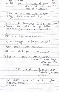
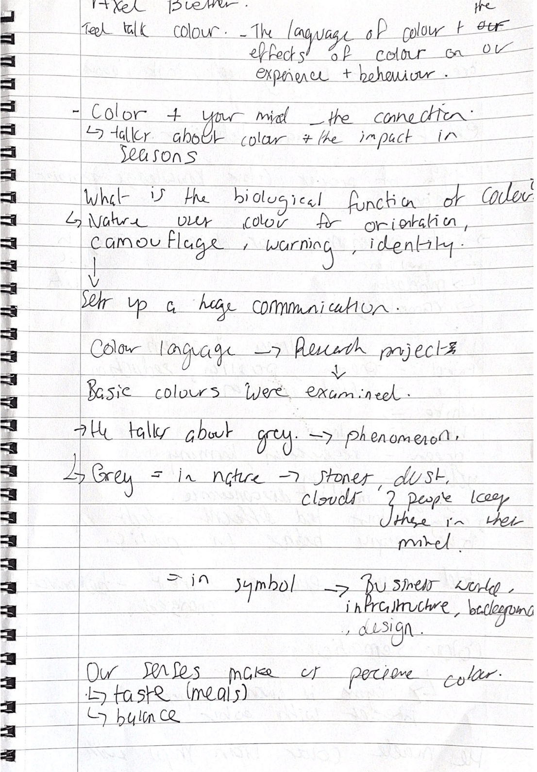
Axel started out by stating how in this ted talk he will be connecting colour and your mind, and focusing on the connection, he then referred to the gloomy rainy image he took on the way into the ted talk and how this image could be seen as sad or depressive because of the gloomy grey colour. He then talked about how the colour in every season is so impactful.

Axel then asked the question what is the biological function of colour?

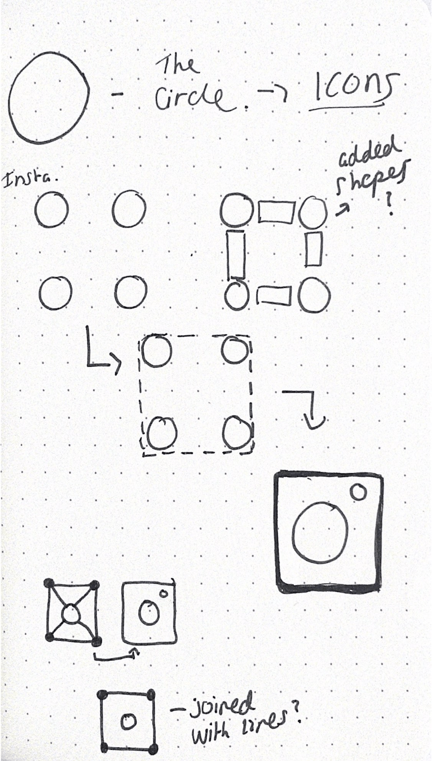
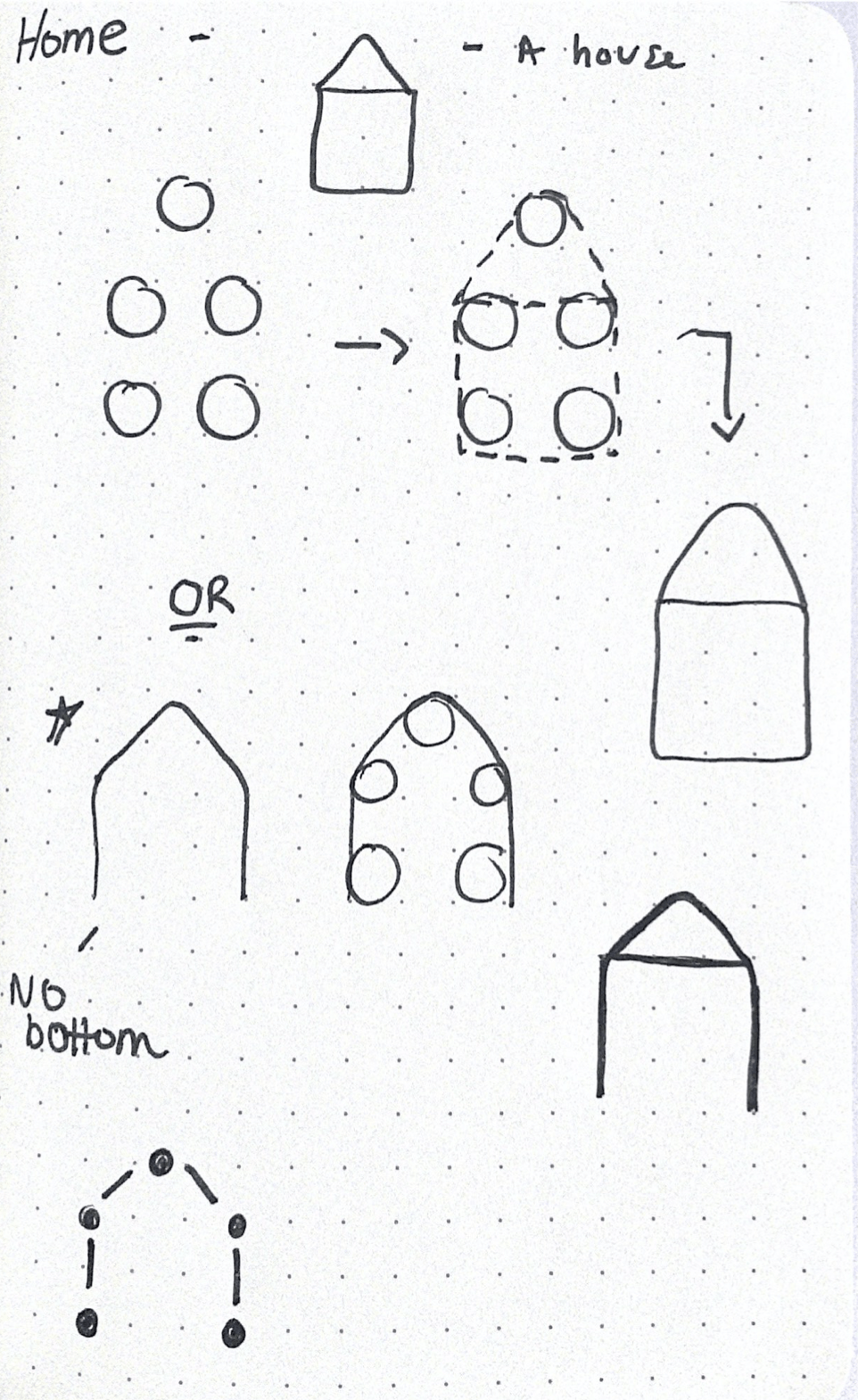
The answer was explained in four parts, orientation, camouflage, warning and identity. The identity part really caught my attention because we are focusing on identity in ixd103, our brand is our identity. He then talked about how colours sets up a huge communication in all parts of life.

Colour Language

Axel moved onto his big experiment research project that he conducted, all basic colours were examined and the main one he chose to discuss throughout the ted talk was – grey. He firstly looked at how grey was perceive in nature:

  • Stones
  • Dust
  • clouds, People keep these in their mind without even knowing it.

Grey was then looked at in symbols:

  • Business world
  • Infrastructures
  • Background

and again in food:

  • Tastless
  • Bland

Axel then reflected on how our senses make us perceive colour, for example our taste, eyes and smell all prepare us for having a meal.

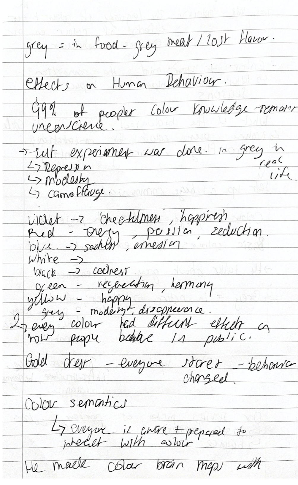
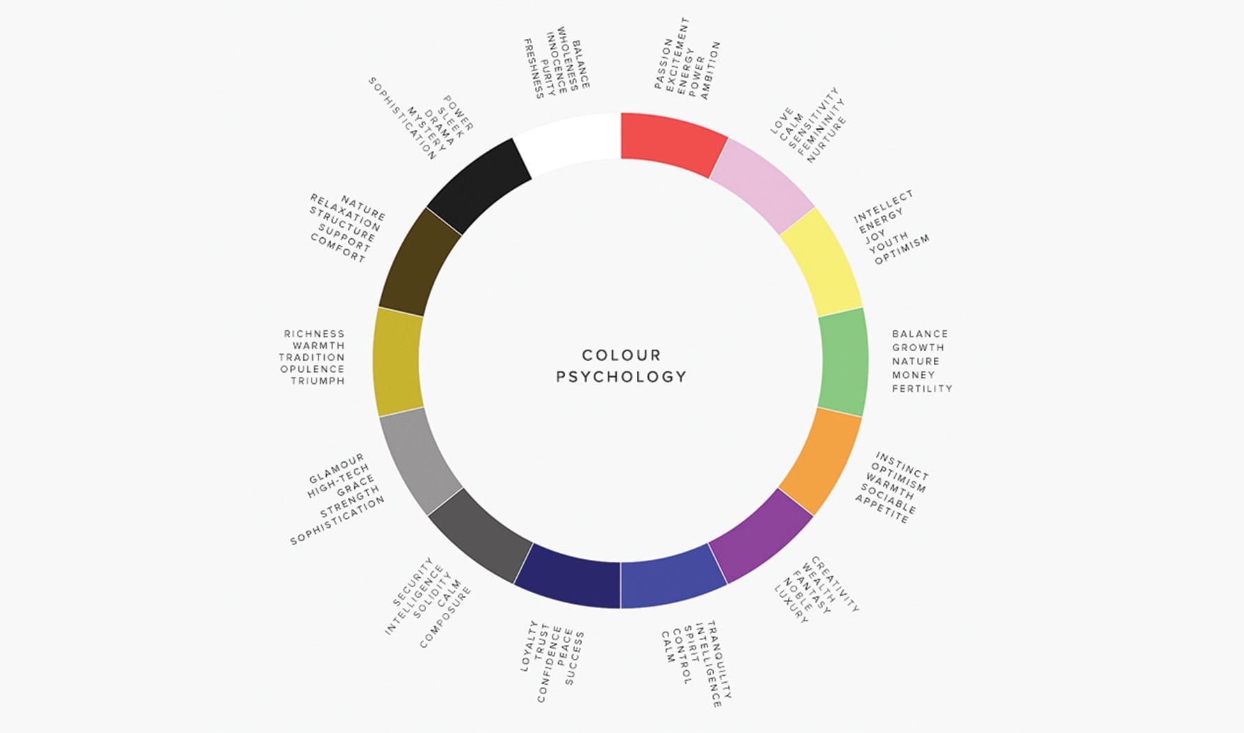
The experiment he conducted was that he watched different groups of people in different colours and watched them play in a park. This was to show the effects of Human behaviour in colour. 99% of peoples colour knowledge remains unconscious. The people that were wearing,

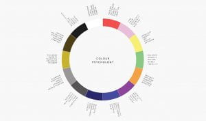
Violet = cheerful and happy

Red = energy and passion

Blue = sadness and emersion

green = harmony

yellow = happy

grey = modesty and disappearance

The results were that every colour had a different effect on how people behaved in public. He gave a good example of how if someone was walking down the street in a gold dress everyone would look and this would then effect the individuals behaviour they would either be shy and eager to change clothes or be proud and confident with everyones attention.

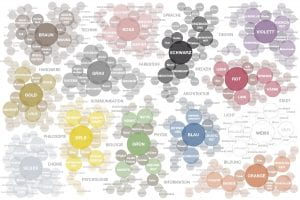
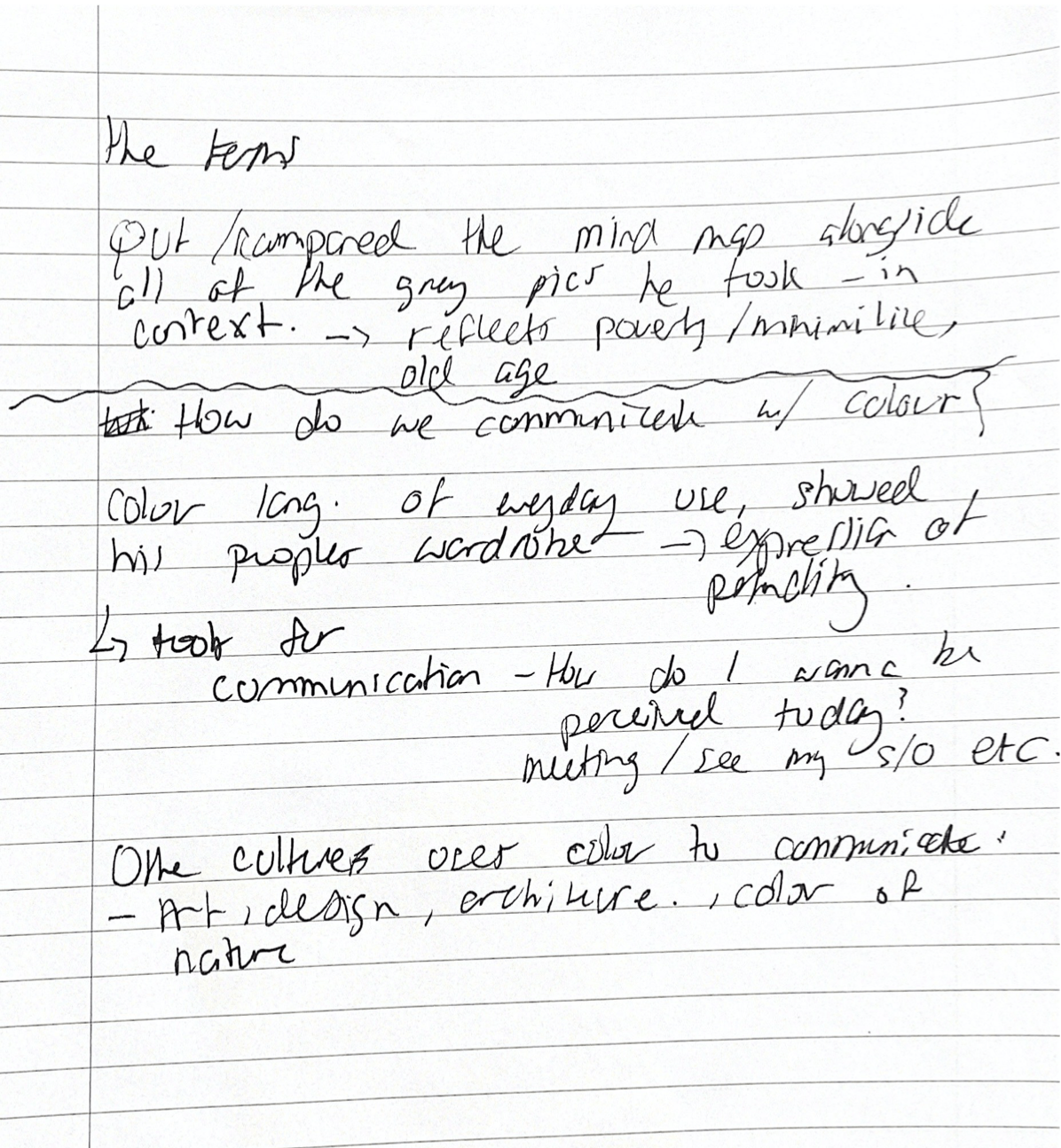
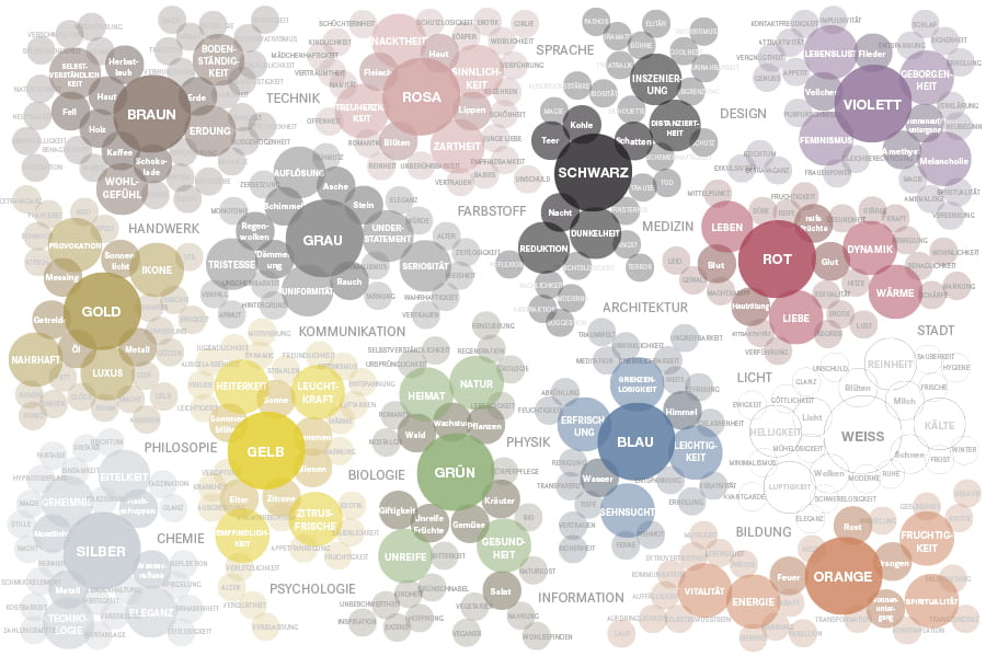
He then showed his results for the experiment on colour brain maps, all of these colours were surrounded by the adjectives people used to describe them, it was interesting to see the difference. The image above is fro this book, something similar was shown in this ted talk. He then compared all of the grey image she had taken himself and put that wheel next to the grey brain map ago show the comparison. The images reflected poverty, old age, minimilstic etc.

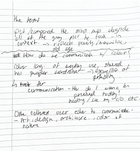
The final part of the ted talk was on ‘How do we communicate with colour?’. This section of revolved around clothes aswell. This is because colour language of everyday use is showed easily in people wardrobes. he got the people around him to make a colour wheel of their clothes they were all week. This was to show expression of personality. Peoples clothes and the colour they choose every day is a tool of communication. Axel went on to explain people think every day subconsciously ‘How do I want to be perceived today?’ and this changes with every day for example if someone has a business meeting or if they are going on a date etc.

He then reflected on other cultures and how they use colours to communicate, art, design and architecture are all utilised for communication but he ended by coming back to nature and how it always comes back to the colour of nature. Overall I am very glad I watched this ted talk because feel like I learned a lot and also achieved my goal – which was to learn about how colour effects our experience and behaviour. This will help me in deciding which colours to choose for my brand.

What did I learn from this ted talk:

  • What the biological function of colour is
  • That our senses make us perceive colour
  • That every colour effects our mood/behaviour, even when we wear it
  • We can communicate through colour every day – e.g through clothes

How will this knowledge help me moving forward in IXD103:

  • Learning that colour has its own language will benefit me in picking colour for my brand because I know am aware of how colour can affect behaviour, so example, I want my brand to stir feelings of joy, fun and creativity in peoples minds, therefore I will stay clear of colours that tend to bring people feelings of sadness or disappearance like grey or blue.
  • I know now that everyone is aware and prepared to interact with colour, so now I will use more of it and be braver and bolder with my colour choices.
  • I know now that everyone responds to colour wether its subconscious or not, so I need to include more of it in my work and my process.
  • The connection between mind and colour is so strong, therefore the impact of it is strong, I want people to have a strong connection to my brand and my brand values, therefore, I need to choose my colours wisely, to reinforce this connection.
  • Colour is a tool for communication. I want this to be an important brand value of mine, therefore my colour selection m must be representative of this. I need to include colour in all aspects of my brand for this to be successful.


IXD103 – Christian Leborg – Visual Grammar book analysis

I wanted to read a book that would help me in all projects this semester, as most of them require visual illustration or creative visuals I though that this book ‘Visual Grammar’ by Christian Leborg would be a good starting point. Within both areas – IXD103 and 104 I am exploring shape. For example, my branding project, I am creating icons from shapes for my visual mark. This requires me to look deeper into all shapes like circles and see how I can make a circle create all icons. This is tricky so I felt like reading this book helped me to understand visual grammar and how I can use shapes, lines and spaces to my advantage when designing.

The book is  about two main areas:

  • Abstract
  • Concrete

Both subjects are divided up into chapters, devaluing deeper into the world of all things abstract and concrete, there are so many images of shapes throughout this book, with every definition there is a relevant image or shape displaying what is implied.

The first section was on abstract objects, for example point, line, surface, volume, and format etc. This was like a recap from first semester when we learned about these elements of design from Paul. The term itself was described, Abstract Objects – Abstract objects are ideal shapes that cannot be physically created. When you try to draw a point for example, you do not end up with a point but a surface. I thought this was interesting and I wasn’t actually aware of this definition, so it was nice to know this for the future.  It was a nice refresher to see all these elements and their definitions and included diagrams/images, this was easy to understand and helped me to have a better understanding of each one.

Reading through the chapter summaries I wanted to look at one main title – Abstract structures. I wanted to zoom in on structures because I am designing structures for my brand – icons from shapes. So, I thought this chapter would help me the most.

What is an Abstract structure?

Placing objects in relation to one another will establish a structure. We can only describe a structure if we are able to recognise its pattern. A structure that does not have a visible structure line is called abstract.


All of the images above interested me because the shape I chose to make icons with was circles and some of my structures look like this. It was nice to read the definitions and understand what different structures were, I didn’t know that all of these structures have names, for example informal and formal structures.

Another part of this book that interested me was Concrete Objects:

This section allowed me to exmplore form and all the different types of form there is in design, for example:

  • Geometric forms
  • Organic forms
  • Random forms

The image above shows the forms in action and it is easily comprehended. The next image, below, shows these forms in other shapes that are well known, for me it was interesting to see how the geometric form slowly sort of melted into the random form. Further highlighting how straight lines can affect the overall look of a shape.

‘Objects are perceived within defined limits. These lints are called contour lines. The contour is what defines the shape, or the form’.

There were so many other elements of visual grammar showed in this book. The author went into so much detail on every single form of visual grammar, for example the whole book in my opinion is a visual dictionary of terms on abstract and concrete concepts. Here are some other images and description I really liked, not only for the image but also the term.

Not only was this book extremely informative but in my opinion beau are of the contents it was very easily read. There wasn’t copious amounts of information and paragraphs to sift through. It was straight to the point and Leborg did a great job of displaying the terms and topics and describing them, so everyone can understand them

What did I learn?

I learned a lot from this book but my main takes from it were these:

  • There are three different types of form
  • Objects are defined with contours
  • Without an interaction (balance) between elements, a composition is static and not dynamic
  • Inactive structures (invisible structures) are used in design all the time

Overall, this book has help me understand terms I didn’t know or hadn’t heard from and now I can use in my development for my icons for my brand. Not only were then visuals very helpful and informative, but also were a great way to help me to understand the importance of visual grammar in design because all of these elements are needed in some way for a successful design.

Leborg finished with this quote on the back of the novel  ” without a basic understanding of visual language a productive dialog between producers and consumers of visual communication is impossible” I really liked this because it sums up the need for the book and also explains why understanding visual grammar and using shapes, space and line etc is so important in design.

IXD103 – SFCD Case Studies

During a lecture Daniel advised that we should try and find good case studies to review and look at for inspiration. He recommended a few but one that stood out to me was the SFCD case studies. He said that they have very good ones so I had to take a look. Not only is this research good for case study examples but also good inspiration fro my own portfolio site, to see how this company does it.

What is SFCD?

SFCD is a digital product agency based in New York. We make mobile and web apps for global brands and innovative startups, applying our expertise across platforms and screens. Reading this I had high hopes for their website and it’s content since they made digital products.

Going on their website I noticed it’s a one page essay. This was interesting to me because going on designers websites they normally have multiple pages. The homescreen contained all of the work and then link to the case studies. I clicked on the first one that intrigued me it was called ‘Fontspiration’.

What was so pleasant to look at for me was the animation throughout. As soon as I opened this case study I was met with an animation that took up the whole page. It was like a mini slide show on what the case study involved and even included mock ups. The information is all laid out clearly down the page and it is easy to read, from the concept to the end mockups of the app I was able to understand and follow along on the journey.

I liked how each section was cut off with a line so the readers are aware as to what they are talking about or showing, as seen in the image below. They go through each aspect of the app and briefly talk about what they did or used. I liked this, sometimes there can be too much words and paragraphs on why brands did this but sometimes visuals work much better. The sample square moves and animates as you read or look at the icons. This was a nice touch in my opinion because I didn’t want to look away – which keeps this case study very interesting.

I also like how there is final colour. SFCD make great use of white space which is simple but it lets the app or project shine. No colours clash which is nice.

What makes their case studies successful?

  • Use of white space – so the project shines on it’s own
  • Layout – everything is neatly positioned and centred
  • Order – the whole process and everything about the app/project is labelled and sectioned. Making it easy to work one’s way down the screen in a chronological order
  • Sizing – everything is the correct size and easy to read and see
  • Animation – the constant moving gifs/animations makes the case study interesting and never boring
  • The mock ups – having their work shown in a screen brings it to life and lets the audience see it action. Making the product appear user friendly and appear very professional

How could their case studies help me?

  • I think that looking over their studies has shown me a lot of the importance of clear placement and displaying work in the best way possible. The work has to be clear to read and understand and neatly positioned on the screen. This also makes the website appear professional and at a high quality when it comes to design. This really helps me when it comes to  my own portfolio.
  • The use of mockups, I think that seeing this in use and seeing mockups being used throughout has been a great help to me. I think its important in a case study to see the work in use and what it would look like in real life. I am making a travel app so I think that seeing this company use mock ups so much has encouraged me to use them too and to use them at the best standard as possible just like they did. I feel I have also got inspiration from this company on how they display their mockups, some are on a slightly different colour background, this makes them stand out and shows the reader that this is a new section. I think I could do something like this too because I think it raises the mock-up up form the screen a bit.
  • The use of animation was great to see and has encouraged me to use it in my website possibly. I think it was a great addition and one that makes the use study more interesting. Even though I am no digital product agency I still feel something like this could look good on my portfolio. The animation inside the ockxus made them look so real and was a fun touch.

Overall I was really impressed with the company SCFD and their work, I wanted to find a company that specialised in really well done case studies and I am glad I found this one. I think it’s important to look at case studies and see how other designers tackle ideas and see their progress and then the final outcome. I will be doing this in my portfolio because I had a lot of projects over the last year, so I’m glad I have this as inspiration and somewhere to go to for guidance on successful layout, process and portfolio design.