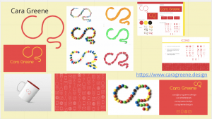
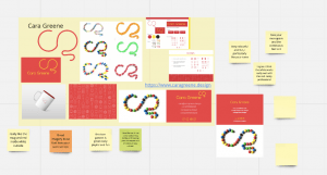
This week we had our group critiques, we had to present to our selected group our entire brand. This was a great opportunity to get other class mates feedback and I go to see all of their work too. Daniel had placed out 6 pages onto a miro board and we had to place our work out on them. Everyone had to present for around ten minutes and talk about their work and the other group members were asked to put post it notes around your work giving their opinions too.
This was my board:
I added in everything I have done so far, my monogram, Wordmark, imagery, a screenshot of my brand guidelines, website link, beyond the brand mug, icon set and business card.
These were the groups thoughts on my brand:
What elements did people like:
- The m&m business card/ imagery because it looks ‘fun’ and ‘welcoming’
- The red and white colour combination
- The mug addition and the red detailing on the inside
- How the brand looks playful/colourful and fun
- My icons
- The continuous feel to my monogram
After getting this feedback I had to ask myself why were these elements working and not others? The red and white icons and red and white mug works so well because it is simple. Daniel remarked that my recent work is the best, and my recent work is those elements – the mug and the icons. I liked the way the white worked on the red background and I liked how well my monogram worked on the white mug. If these worked so well then I have listen to this, and. repeat it for all parts of my brand. The simpler the better.
Daniel was giving me advice on what to I should change/alter and I took note of these, here are the main ones:
- Remove the colour yellow completely from the brand because the red and white works better and is enough.
- Only use some of the imagery from my selection because some do not work. Maybe work on the multicolour images, they look the best.
- Change the layout of the back of my business card.
- Do some more of the beyond the brand perch because they really work.
What is my next step:
- Going through my elements and removing the yellow.
- Editing my brand guidelines to make sure only red and white is featured.
- Edit my website and take out the yellow in the navigation.
- Find inspiration for more beyond the brand ideas e.g keyrings etc.
- Experiment more with multicolour objects for my imagery for eg, use all green m&m’s etc.
Overall, I think this was a very informative and productive lecture for me because I have things to change, I really appreciated all the feedback because it it turn will make my brand better and more successful. I am eager to change things that don’t work and make changes so that they do.

