After the group critique Daniel mentioned that he thinks I should take out the yellow from my brand. I agreed, I knew something was off with it so when he mentioned it was the yellow I knew he was right. I initially wanted yellow because I thought red and white on it’s own was too boring because I want my brand to be very bright, creative and fun but he reassured me that red means energetic and along with my multi-colour imagery is enough.
This is where my colour scheme was
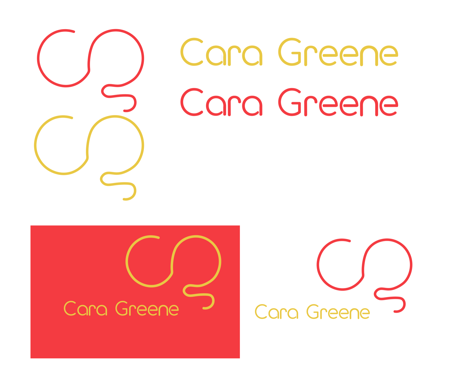
Why doesn’t this work?
- Too much is going on
- My wordmark is hard to see with the red background
- Doesn’t look very professional
- Isn’t the vibe or message I want for my brand
My colour scheme now
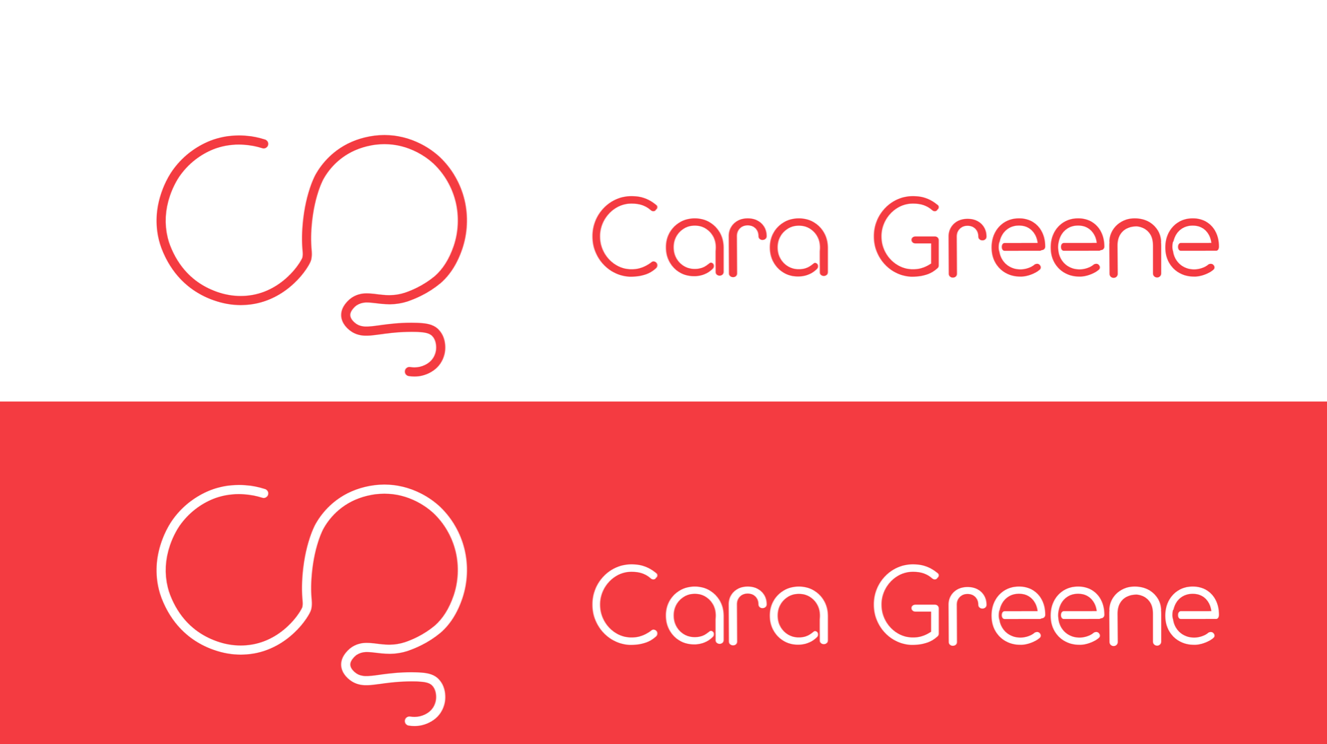
Why does this work better?
- It looks more professional and makes my brand appear more solid and strong
- It highlights the wordmark and monogram nicely and doesn’t take away from them
- Simple yet effective
Overall I am so glad I got Daniels opinion because it does look so much better, I have been on quite a journey with my colour scheme and its nice to see it finally finished. I feel now that all elements of my brand will blend much more better and just look complete.