IXD103 – Portfolio Research

In order to know the type of portfolio I want to design and then make for myself I have to see other designer’s portfolios first. This is to make sure that I know what I want and know what looks good and what doesn’t. I also want to see what the current trends are for portfolio websites, what current desires are doing and what I should be doing too. I want my portfolio to be modern, clean and overall a successful looking website that displays my work nicely but first I have to see what’s out there now. I started by looking for portfolio sites with different approaches to get a broader view of all type of features I could possible try.

One page portfolios

Rachel Cheng

I found that Rachel Cheng has been recognised for her one page portfolio and its’ minimalist design with a modern touch. Her work has been mentioned in the blog ‘Design bombs’. She introduces herself at the top half of the website and then goes on to show off her work in lovely mockups – this could be something I could consider for my travel app. I haven’t seen many portfolios that are one page but hers was very easy to navigate through, she has other pages for her about and resume but all of her work is on the home page. She also includes a lot of CTA buttons for example ‘View Case Study’. This made it easy for me to look at her work and see the process. Another part I liked was how clean it was, she makes great use of  white space – this is something I am considering. Sometimes colour can be too much or too heavy but the white really lets all of her mock ups shine – they are the focus of the portfolio in my opinion.

After seeing her one page site Rachel is encouraging me to take a closer look at doing this myself.


Animation portfolios 

Kuon Yagi


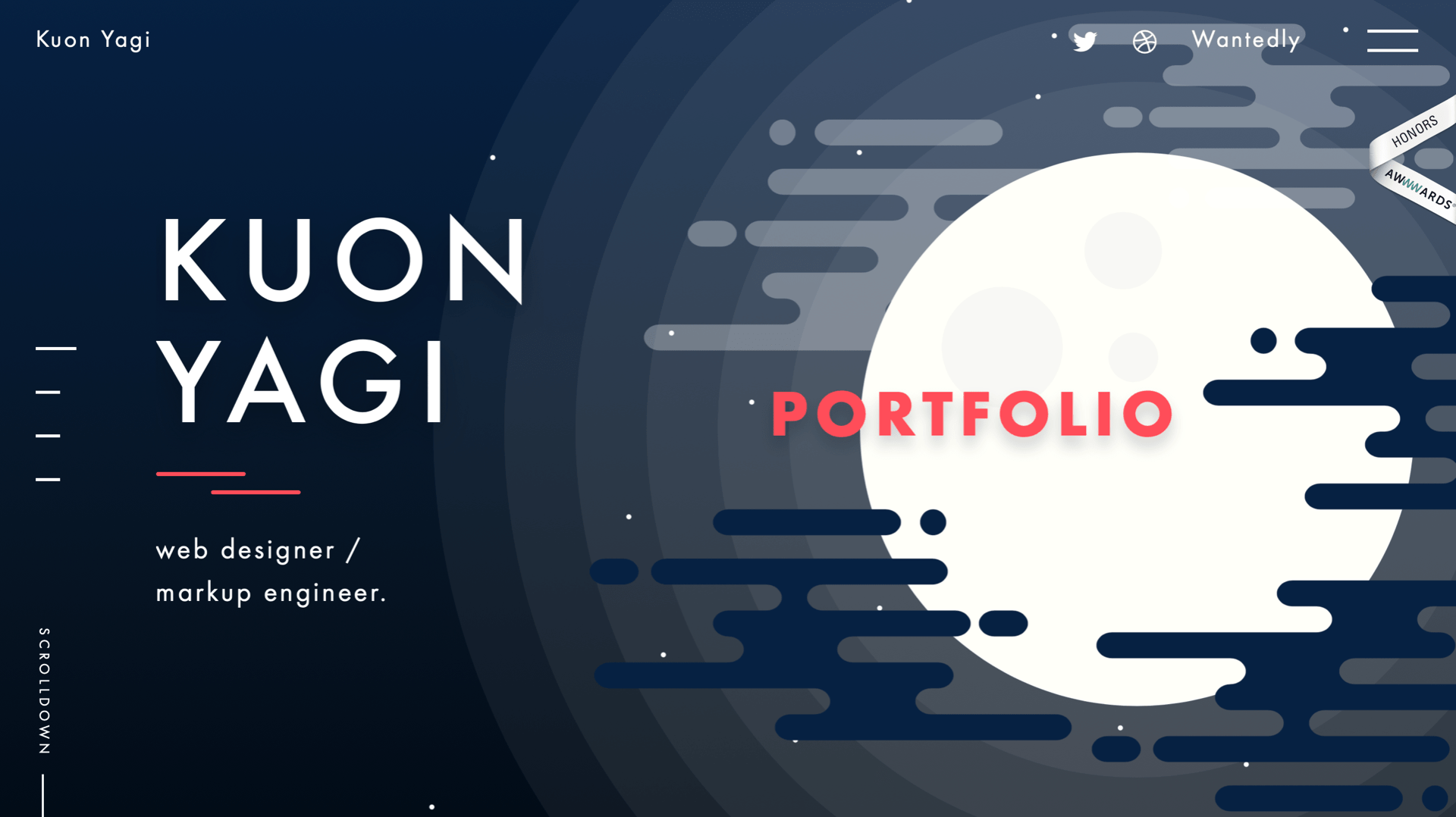
I found Kuon Yagi’s portfolio online all over blogs because he has won honour awards for his work and website. The continuous ux animation he has going on in the background as soon as his home screen comes up is so innovative and modern. I have never seen a website like this before. As I moved my mouse around his homepage the moon and sky started to move which was a really fun touch. I was thinking of adding in an animation on my portfolio but I wanted one that the user had to click and it would animate. Yagi’s is so well executed and thought out, I also like the choice of theme – night. It really sets a mood for his work and is so enjoyable to scroll through all of his work.


Simple yet effective portfolios

Jane Song

Jane’s work is so well liked because of how simple it is, I wanted to look for an example like this because I think the work is the. most important. A blog stated that her portfolio ‘does not disappoint the audience’ because one goes to a designers portfolio looking to see their work – that is the whole point. And I understand that amazing designers/ux designers can make very unique and animated portfolios and this only adds to their skill levels etc but I think sometimes it’s nice to keep it plain and simple like Jane Song. Since I am not very skilled in the production of websites I think I will have to stick to something a bit more basic and simple for my website and just include lots of images of my work on the homepage just like Song did.

Did this research help me?

  • Overall I think it did. It was great to see a few different approaches to portfolio design, some more complicated than others but I think it’s important to know some of my options that I have. I plan on sticking with a simple layout and work with my strengths but I also want to push myself and see what else I can accomplish when I try. That’s why I think that animation is something I could work on and try out.


IXD104/103 – Exploring Adobe Illustrator

Week 5 started out with an introduction to illustrator, this was from Daniel and it was so that we could get use to illustrator to make our monograms. He ran through all of tools and the most important ones to use, these are the things that I learned from his quick illustrator run through:

  • Choose A3 – landscape because it is good for drawing, it’s like paper.
  • Pathfinder is an important tool to use because I can use it to unite and subtract shapes
  • Always use shapes
  • Making type outlines is good for kerning

I then made my monogram etc. But I wanted to explore illustrator even more because I have to create lots of different illustrations this semester, fro example app illustrations, infographic illustrations etc. I wanted to complete a sort of master and apprentice exercise or task. I found an illustrator video demo online of a landscape image and I thought this was perfect to recreate because I have to illustration images like this for my app – different countries.

This was the demo I followed:

There were so many tutorials/demos for beginners on YouTube and Linkedin learning. I chose this one because I though there was lots of techniques that I could transfer into my own work. The video showed my step by step on how to create this vector scenic image. I learned lots of useful tips and tricks, for example:

  • How to make a tree
  • How to make shadows and reflect them etc
  • How to make a starry sky by reiterating a pattern of dashes
  • How to layer gradients

This was my attempt at recreating this scene by following the steps

The hardest part I found with this starry scene was the stars, it was hard to make sure they weren’t overlapping too much. I think I did a good job and overall this tutorial and Daniels introduction to adobe illustrator has helped me a lot and has taught me a lot about the software. I now know and have been able to put into practise some of the tools that Daniel showed us and also I used a lot more in this tutorial. I am now aware of where everything is and I am also more practised in the use of shapes and shadows.

I liked taking part in this short tutorial because I found it very beneficial, I plan on doing more of these on the run up to designing my visual graphic and app because I will need to be creating landscape images such as these.

IXD103 – Portfolio Website

Todays lecture was the last one before our easter break and Daniel went over the final part of our semester this year. It was to design your own portfolio website. He talked through examples and how to make a successful one.

To start of the lecture Daniel showed us that here are a few things to consider before starting to design a portfolio:

  • Voice and Tone
  • Considered content
  • Visual cohesiveness

He then set us a task to do, this task was slightly difficult because I had to ask myself questions on mom strengths and weaknesses etc, and this can be tricky sometimes. He had us complete a SWOT (strengths, weakness, opportunities and threats) table and I completed mine on MIRO,

SWOT


Daniel then asked us this week to write a mission statement before we begin designing our portfolios so we are aware of want we want to achieve with this portfolio etc. This is the next thing I have to do.

We then had a class task over on Miro and Daniel asked us to write onto a post-it what we think our portfolio is for. I wrote down that my portfolio is to ‘show my work and my skills’. Below is a snapshot of the whole classes opinions of what they think a portfolio is for and what is it to them.


Hierarchy

The next ask we had was to see put the most important meanings of a portfolio into a hierarchy. The one on the left is what the class believed to be the correct order, and the one on the right was Daniels correct order of importance. He made it clear that the most important reason for a portfolio for any designer is to show their work.


It was interesting to see what others thought making a portfolio was for and why having one was important.

Content Planning 

The next section of the lecture was on content planning and what we actually include. Daniel said that our element collages will help us in this part. He also said that we should consider the formatting and placement of elements.

Some ideas that I could include:

  • Imagery
  • Content
  • Bio
  • Diagrams
  • Text
  • Contact details etc

I also have to think about if I want my portfolio to be 1 page or be a multi-page portfolio. Daniel warned to not start our portfolios with ‘Hello I am..’ because this is very common and is seen a lot throughout the design industry.

Inspiration

Daniel then showed lots of examples from different designers and websites that will help me in this process. For example he recommend that we look at SFCD.com because they have a great case study, so I plan on looking at them.

SFCD


He also suggested eta for web standards a good website to look at is Mediaqueires.cm

Whats the next step? 

Daniel suggested that our next step should firstly be research into portfolios that we find interesting for inspiration and then to start wireframing. He suggested that we should draw 20 boxes out on an A4 sheet for different ideas for a layout. Then repeat in a larger scale for more details. This will help with the flow of idea and generate more possibilities. I plan on doing this.

He then talked about what follows this task so I made a flow chart on miro.

He finished the lecture by giving some tips

  • Be ambitious – explore animation/transitions etc
  • Step out of your comfort zone and try something new

IXD103 – ‘Identity’ by Tom Geismar Analysis

I wanted to learn more bout branding and identity for my project in module IXD103, therefore I chose a book recommend by Daniel. He suggested a lot but I wanted to pick one that appealed to me the most and it was this one – ‘identity’, I looked through a few of the books contents and this one caught my eye because of the amount of imagery shown, the book contains so many of the brands projects they worked on for other companies, therefore I thought it would be a good book to explore and get the most out of.  This book showcases some of the worlds most famous trademarks, so I may even get some inspiration for my own projects from this.

What is ‘Identity’ about?

The title of this book is ‘Identity: Basic Principles of Identity Design in the Iconic Trademarks of Chermayeff & Geismar’. Celebrated designers Tom Geismar and Ivan Chermayeff, and partner, rising star Sagi Haviv (called a “logo prodigy” by The New Yorker) open up their studio for the first time in the firm’s 55-year history and reveal the creative process that lead to the firm’s iconic visual identities, from the oldest (Chase Bank and Mobil Oil in the 1960s) to the more recent (Armani Exchange and the Library of Congress in the 2000s). The team showcase their amazing logos and designs, demonstrating how they were made and the process behind them all. This book unveils the thinking and the process behind identity design that works.

The beginning of the book ( the introduction – A consistent approach to a changing world), let me know that this is company that has evolved with the times and has had to change their processes etc along the way to become recognised in an online world. Then Geismar talks about how their first major trademark they designed in 1960 for a bank was seen and reproduced on business cards, printed on newspapers or carved into the sides of buildings and now today, their work is on screen on websites, apps or in animation. He talks about the contrast of this and how graphic design has advanced so much in a few years. In saying this, he stated that although the world is changing , the way they approach basic trademark designs has not.

Their approach to design 

‘We start every identity project as if we are a sponge, trying to absorb as much relevant information about the client’.

I liked this idea of becoming a sponge and really trying to take in all the information before moving onto the next step. Once they have the knowledge of the client they then move on to working out the strategy for designing an efficient identity. They then have to ask themselves and the clients an important question ‘will the client or the design problem require a symbol’, They stated that this is when science meets art.

‘We sketch our ideas by hand – using pencils, pens, china marker or paintbrushes…the rough designs are then scanned and translated into digital artwork’. The author then goes on to talk about the benefits of sketching by hand, for example the connection created between the ‘idea and the creation of a form’. I thought this was a lovely way to put it.

‘Identity design is not about what one likes or dislikes. Its about the ones that work’. The next stage of their design method is judging, by using these questions, ‘is it simple? is it memorable? is it appropriate?… For example, is the trademark relevant to the companies filed or industry, does the mark need to be bold or dramatic or elegant etc. By simple they mean that the trademark has to have a story and be focused on one single concept, so it can work effectively. Finally, by memorable, they mean that even though a successful trademark has to be simple, it also has to be distinctive and unusual enough to become memorable.

Theses are all aspects that I need to think about for my own brand and questions I need to ask myself, so this part of the book has been really beneficial for me. That was the start to the book , where the team assembled their specific process and thoughts on what makes a successful trademark, and one that can be endured. The rest of the book is the designers showcasing their famous or successful trademarks or logos that they have created for many companies, giving them an identity of their own. These are some of my favourites.

NBC 

Above are some images that were included in the book to show how the identity they made for nbc has lasted through the years. I liked this example because it was great to see the logo being used throughout, on tv, on paper etc. I also liked the commentary included beside the images which said ‘The simplicity of the peacock symbol allows it to be used in a wide variety of forms..’ The last image are early sketches for the peacock design, which I thought were very interesting because of their vintage and almost retro feel. It was investing to see how to has changed over the years to something similar yet more modern.

They also included so much information on the process and how they created the logo, for example they talked about how they took out the ‘n’ and replaced it with a peacock et, why the peacock is the chosen bird to represent this brand and what the colours mean etc. All of this information as new to me and I had never thought of looking at a company like NBC to analyse their logo but I am glad I read all about it in this book.


National Geographic Channel

I love this channel and was surprised when I seen that this team of designers had come up with the trademark, so I had to look more clearly. I learned that in the late 1990’s the national geographic society was exploding one very seen, newspaper, tv etc and this growth had endangered a confusing array of brands and sub- brands, therefore Chermayeff and Geismar were asked to develop an identity for the company. They came up with a yellow box with the name right beisde it in a bold new proprietary letting style.

Geismar commented that this brand is one example where the name of the company can be expanded to include another word and the yellow box is usually alone and appears in the lower right of the screen.


Other Trademarks that I liked:

NYU


JFK Library 


Merck & Co

Screen Gems


What did I learn?

Overall I really enjoyed reading this book and seeing all of the various types of famous trademarks that Chermayeff and Geismar had created over the years and how the team still create and re create logos that we see everyday. It was really interesting to read their process for each trademark, and everyone differed from the last, I got some great tips and one that seems to come up a lot was to always start on paper for sketches, and the most liked sketch may not be the one etc use. It is all about the three questions, is it simple, memorable and appropriate? I plan on asking myself these questions for my own logo. I also learned that the logo designs do not have to be overly detailed or complicated to be successful, the deign could simply be one circle and one line and it could perfectly reflect the brand. I learned a lot about identity and what that means for trademarks, I am now more prepared to go and design my own trademark logo for my brand.


IXD103 – IBM logo Pocket Profile

What is IBM?

IBM stands for International Business Machines Corporation is an American multinational technology company headquartered in Armonk, New York, with operations in over 170 countries.

Why am I looking at this brand?

I am researching this brand in particular because I am interested in finding out about their infamous logo designed by Paul Rand – who is known as the father of graphic design. IBM was recommenced by Daniel to look at for inspiration and research for our monograms. It is one of the most successful and unique logos to ever exist and is still used as inspiration or examples in the world of graphics today.

What makes this logo so successful?
One of the reason for the IBM logo being a memorable design is that it is based on a unique concept. The concept used by the graphic designer is presenting the logo in equal stripes. There is perhaps no other logo that is entirely designed in stripes only. This makes the logo stand out in its niche markets. It is uniquely crafted with 8 horizontal lines which was never seen before. It was made in 1967 snd Rand understood that a distinguishing mark was essential to a company success.

Paul Rand designs principles.

1. “A logo derives meaning from the quality of the thing it symbolizes, not the other way around.”

2. “The only mandate in logo design is that they be distinctive, memorable and clear.”

3. “Presentation is key”.

4. “Simplicity is not the goal. It is the by-product of a good idea and modest expectations.”

Tips and principles like these will help me develop my new monogram and make it as successful his brands like IBM, BM, UPS, Enron, Morningstar, Inc., Westinghouse, ABC, and NeXT. They are most likely so successful and what he us known for because he followed his principles. I will ensure to follow these and try to designs a monogram that has derived from a good idea and has meaning that is clear and legible. I want a unique and creative monogram that will carry me through my career and stand out amongst others, I feel that will this research of IBM, that I will get there.

I then went on the IBM’s actual website to see what they had to say about their own monogram/logo. Below is a snapshot from their ‘logo’ section on their website under the tab ‘brand’, this is their brand guidelines. I found all of their logo guidelines, this was interesting as it stated all of the logo’s do’s and don’ts. They also included lots of other information on their brand and co-branding events etc. I was more interesting in the logo for my monogram research.

Specifically I wanted to look at the brands ‘expressive logo’ section, as seen below, where they discussed their brand being used in these bright colours. I plan on doing something like this for my brand because I want to show my band in a creative, fun and energetic light. I plan on making other blog posts on this aspect and showing different colours I am planning on using. I also will ass this information to my brand guidelines.

Overall I enjoyed this research and feel it has benighted me on my monogram journey. I plan on following Paul Rands design principles to ensure my monogram is successful. I want a monogram that is strong and unique, that is clean and legible yet also derives from a good idea. I enjoyed learning about the designer, Rand and getting to see his other art work and logos was also very helpful.

IXD103 – Interface Inventory

This weeks lecture was on style guides but after Daniel set us tasks to do for the day, these were to create an interface inventory for a brand of our choosing. He recommended it be the same company we chose to create brand guidelines for, however the company I chose for that does not have a website as it is a very local restaurant. So I chose Motel Rocks, I looked at this brand previously in a blog post for our content audit task that Daniel set us at the beginning of this module.

We have to screenshot parts of the brands website and show all of the interfaces inventory. I found this template online so I could display all my findings in a nice way. I then filled it in with all of the information I could find on motel rocks and everything they had available to me on the website. The images below are a few snapshots of the inventory and it can be seen in full here –Interface Inventory


What did I learn from this exercise?

  • I learned all of the work that goes into a website and what is actually needed.
  • I learned that a website really reflects a brand in its’ entirety. For example if the website is of good quality then the products most likely are too.
  • I learned that even though I am not selling clothes I am selling myself through my portfolio, so my portfolio has to be just as high quality as my work.
  • I also learned that it does not take a professional to know what a website has or doesn’t have, the public can see if things are missing or not up to standards.

Thoughts

My final thoughts on this exercise was that I feel like it was really helpful and I now know all of the elements I have to include in my portfolio.  There are lots of parts and sections to include in any website and from seeing Motels inventory and how much it reflects the brands style I know that I too must be consistent with my website style and ensue it matches my work.


IXD103 – Brand Critiques and Feedback

This week we had to present our final brand to a group within the class, I was excited for this because I wanted to see what others thoughts and I also wanted to see how others were approaching this. Over the past few weeks I have been developing and changing my brand throughout with tutorials with Daniel and class discussions it has really helped me move along nicely. Below are the images I showed for the Group Critique,


I got lots of great feedback from Daniel and my group. It was nice to hear positive things about how my brand is developing and it was even better to get advice of how I can move forward and make things better.

Postive comments:

  • Nice colour scheme, the colours work well together and make my brand appear fun
  • The addition of the circle throughout makes my brand look creative
  • I have a strong monogram that is interesting to look at
  • My set of icons for my visual mark is an interesting addition to my brand

Things to work on or change:

  • Change parts of my wordmark to fit in with my monogram – ‘Unbroken line’ could be carried though in my wordmark. Therefore I have to modify the letter ‘e’ for example and cut a part out of it to resemble it was drawn in one line.
  • I have to kern parts of my wordmark so it looks finished.
  • I should think about trying something creative for my buisness card instead of having circles at the bottom left I should try and use things around my home for example a shoelace and write my monogram with an item like that, this would reflect the ‘unbroken line’ idea and show that my monogram can be made with anything. This was a great idea as I never thought I could use photography on my business card- so I will definitely be trying this out.

I was really grateful for the feedback and I really enjoyed getting to see others brands and telling them what I liked about theirs. I think it’s important to hear from your peers because someone always has another idea you could work from. Overall I am exciting to make these interesting changes and hope that when am finished that it all ties in nicely together.

IXD103 – Week 8 – Style Guides

Today Daniels lecture was on style guides. He firstly explained what a style guide and pattern library was and what they consisted of.

Style Guide – The Physical or digital document that represents the styles, patterns, practises and principles of a deign system and teaches how to use it.

Pattern Library – An organised set of related, reusable components, often containing code examples, design guidelines and use cases.

Components – A self-contained and reusable pattern that represents a specific piece of interface or functionality.

He then went on to talk about each in more depth, he said pattern libraries ensure a consistent user interface. For example lots of people work on big projects together, therefore there has to be a pattern library to ensure consistency and efficiency. Daniel then gave us good examples of this – the BBC guidelines for their pattern library.

He also showed lots of examples of style guides, because this is what we will be creating for our own brands –

  • Githubs style guide
  • Alista parts style guide
  • Twitters new and improved guidelines
  • CSS guideline book by Harry Roberts

Then he told us what we should consider as regards our own style guides.

  • Establish a table of contents
  • Break information in to managable chunks
  • Use plain English and explain things clearly

These tips will come in handy this week as I start to develop my content for my style guide.

The rest of the lecture was Daniel showing great examples of Modern tools we should be using to develop our style guides. For example Style Tiles, Element Collage and the Interface Inventory. All of these sights will help me during this week, not only for my style guide for my brand but also for this some of weeks tasks which are;

-To make an interface inventory for a brand of my choice

-To create an element collage for my brand

-To update my research blog

What did I learn from this lecture ?

I learned a lot that I didn’t known from this lecture, for example I learned what a style guide was and why they are so important for each brand- to make the brand consistent and a place where there is both visuals and content about the brand itself. I also found out that company’s can have a range of style guides, some are presented in style tiles, some on element collages etc. I didn’t know what these were before today and now I am very excitinf to make them for my own brand. I am most excited about designing my brands element collage because the website we have to use to make them seems very colourful and interesting. I am excited to see how my brand will look when all elements are put side by side, with iterations, and various colour combinations.


IXD103 – Week 7 – Brand Guidelines

This week we had a short lecture on brand guidelines and then we went straight into our presentations for our brand so far. First of all the lecture on brand guidelines was a brief introduction on what they are and why we have to make them for our brand.

What are brand guidelines?

Brand guidelines are essentially an instruction manual and rule book on how to communicate your brand. They lay out all the visual details, as well as important notes about the company’s voice, tone, and messaging.


Daniel then went on to show us what should brand guidelines contain rules for ?

  • Tone of voice
  • Colour
  • Logo
  • Icons
  • Illustration
  • Motion
  • Photography
  • Type
  • Layout

So every aspect of the brand has to be covered in the brand guidelines, for example my brands story and all the imagery for my brand too. Daniel gave us lots of examples of great brand books or guidelines and I plan on researching them to understand what the type of language I should use. He showed examples like, ‘Brand Pad’ and the ‘NASA and New York Transit manuals’ as inspiration and guidance on how to to do it.

What did I learn about brand guidelines?
I learned a lot of things, for example I learned why these are so important – it’s how the world recognises you and begins to trust you and inconsistency will confuse and alienate customers. Thats why it is important not to keep changing guidelines or your brands values. I also learned that there is so many examples out there to help me because most brands will have a brand book or guidelines manual, so I can always keep researching and learning.

What next?

I now plan on researching the most current and popular brand guidelines out there at the moment and also the most famous ones of all time for example NASA – so I can see what makes it so infamous.

I also plan on researching the format and style of brand guidelines, to see what kind of style I want to go for when presenting. I think it’s important for my brand to have a successful design for my guidelines because the ones that are so popular have the beset layout and fun graphics.


IXD103 – Week 6 – Application

This week was all about the application of our brands and where they could be apply them, we had to make business cards today, that was the given task.

We started of by Daniel emplaning what a brand is, our brand is a gateway to our true work, it is how people are introduced to you and a reflection of your work and promise. Therefore, it is important to make a good first impression.He asked the class what can we apply out brand to? and lots of people responded with examples,

  • Business cards
  • Social media
  • Apparel
  • Website
  • Adverts
  • Literature/leaflets
  • Envelopes and mailers
  • Stationary
  • Studio
  • Banners
  • Email Signature…


…and many more, this showed me that the possibilities are endless for companied to make their mark out in the real world by putting their brand on every day things like pencils or leaflets to distribute. This not only promotes the business but also gives the world a taste of what your brand is about.

Then Daniel asked us to take an hour to design our own business cards for our brand. I was excited to hear this because buisness cards is something I have been thinking out deigning since we started branding. I had a few ideas and concepts to try, I started mine on Adobe illustrator and made a few selections, this is what I started with,


I was playing around with circles and mix and matching different backgrounds (front and backs) of the business cards to see what was working and what wasnt working. I decided I liked the first pair the best because I like the colour palette and I also like how its not as busy as the other two I was looking at. I went with circles because circles is a big part of my basic design for my brand as a whole, its how I made my monogram and my wordmark has circular attributes. I wanted to include it because I think the circles reflect bubbles to me or just a fun and creative energy for my brand.

We then got to see some peoples designs in class and it was great to see what they had produced within the hour, seeing others has inspired me to keep working on mine as I feel like it definitely was not finished. I plan on making a separate post on the development of my business card and researching other popular or famous ones.