Revisiting my brand and talking with Daniel I wasn’t happy with the colour of my brand, something wasn’t right or something was missing, so I started to look at colour again. First of all this is my starting point and what my brand looks like now,

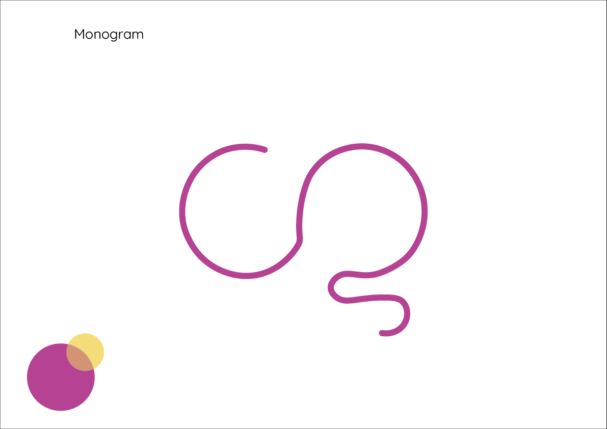
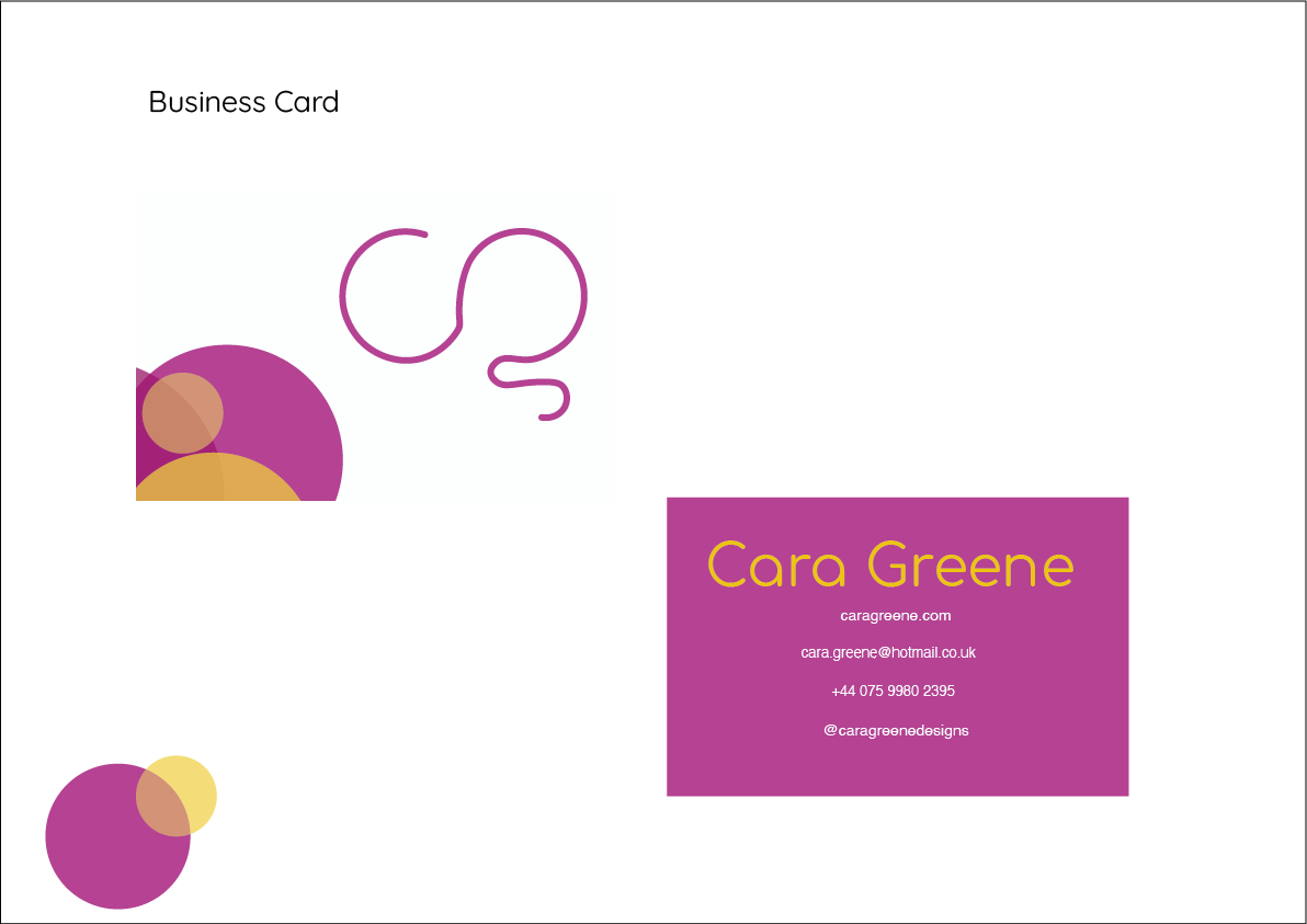
I don’t think this looks bad, I just think it doesn’t match my brand values and really screams ‘fun and creative’. Talking with Daniel, he recommend that I should stick with the yellow and perhaps a red/pink instead of the purple.
Why does this not work?
- Purple reflects royalty, knowledge and spirituality, these aren’t my main values or aims for my brand
- These colours don’t make my brand look fun, creative and spontaneous (in my opinion)
- The circles on the business card don’t work for me, I think I can make my brand imagery more exciting
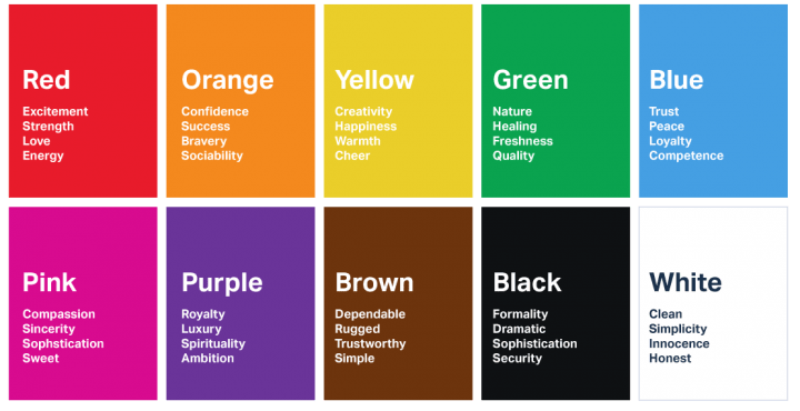
I took a look at the colour wheel and what colours I could use and what they mean, I then tried lots of colour combinations out digitally to see what they looked like in action. These are some colour combinations I tried with my monogram:
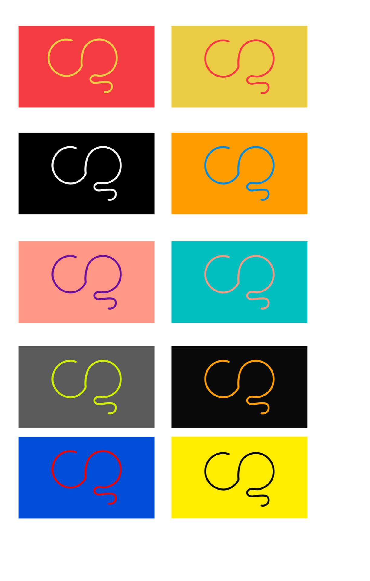
Analysing my favourite and also taking into consideration of what Daniel said, I came to the conclusion that the red and yellow was my favourite, but I wasn’t sure so I tried out some more red colour combinations.
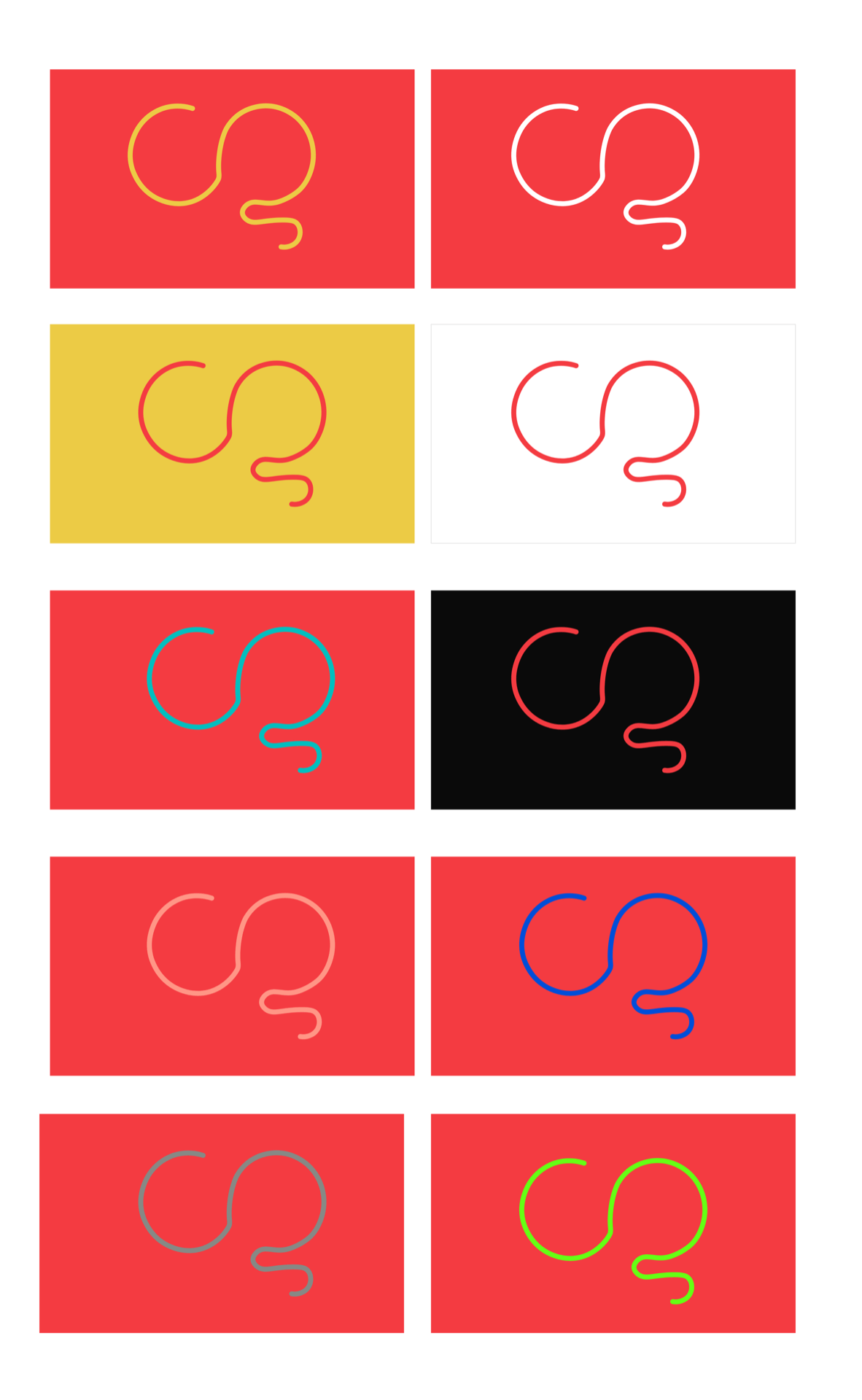
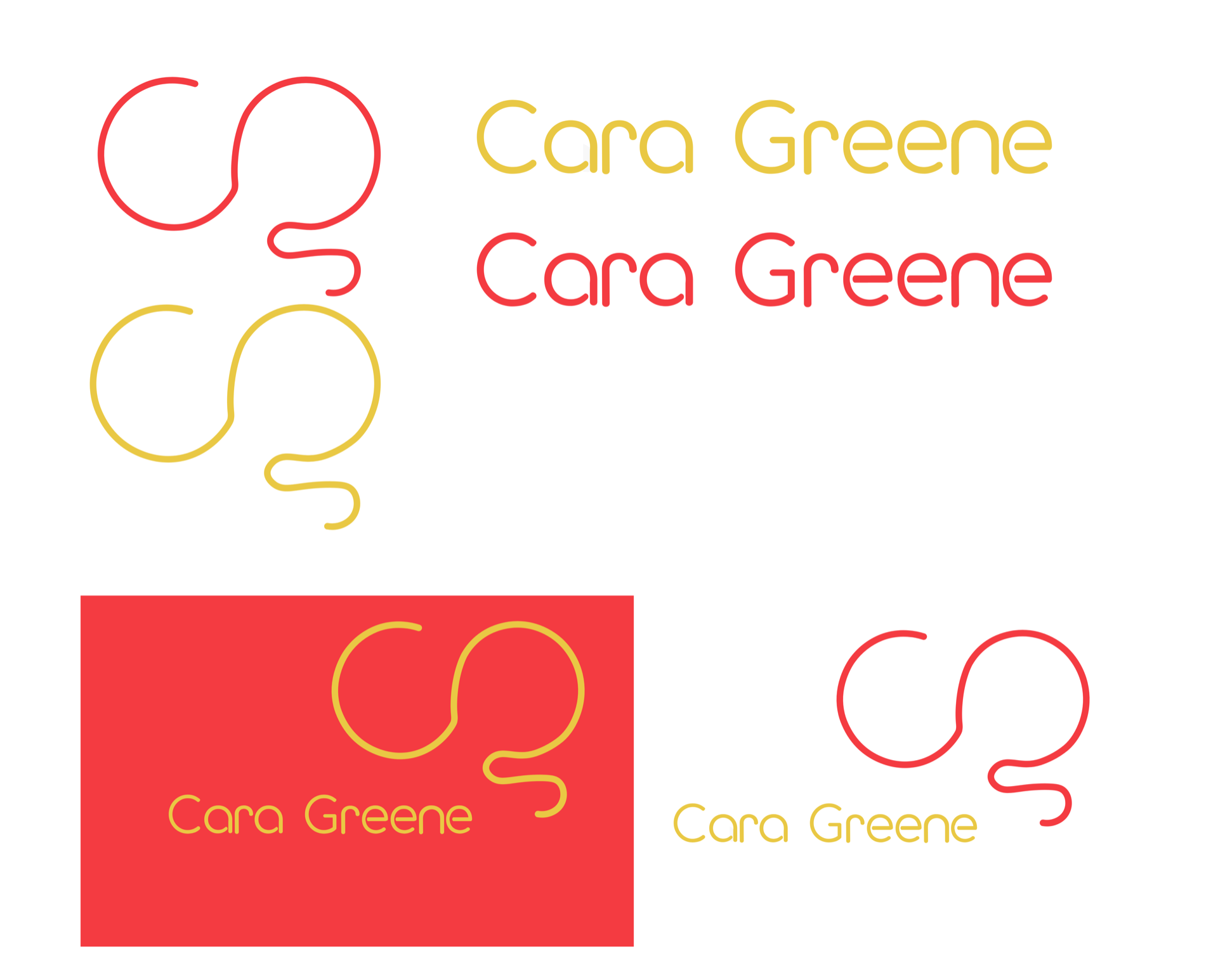
My favourite from this selection is still the first one, the yellow and red. I also think the white goes nice with the yellow and red. This will be good when it comes to making my portfolio because there will need to be white space. Now I want to look at what those colours mean and how they will reflect within my brand:
Red = Excitement and energy
Yellow = Creativity and happiness
These are all words that I wrote down for my brand at the start of this project, so this makes much more sense to use. Using colours that represent my values and aims makes my brand more reliable and trustworthy.
Putting it all together
Now I have my colours chosen I have to apply it to all aspects of my brand.
What do I like about this?
- I like how the yellow really pops on the red.
- I like how the combination looks fun and creative.
- I like that these colours reflect my brand values and aims perfectly
- I think these colours bring it to life
What needs work?
- The business card needs work
- Perhaps try a brighter yellow, although it still has to be dark enough to be read easily
Overall I think that my colour development and changes will really help my brand and really inspire my portfolio also, this colour palette makes me feel like my brand will be successful, as now I can see it come to life and really portray what I want it to. Furthermore exuding my aims and values perfectly.