During a lecture Daniel advised that we should try and find good case studies to review and look at for inspiration. He recommended a few but one that stood out to me was the SFCD case studies. He said that they have very good ones so I had to take a look. Not only is this research good for case study examples but also good inspiration fro my own portfolio site, to see how this company does it.
What is SFCD?
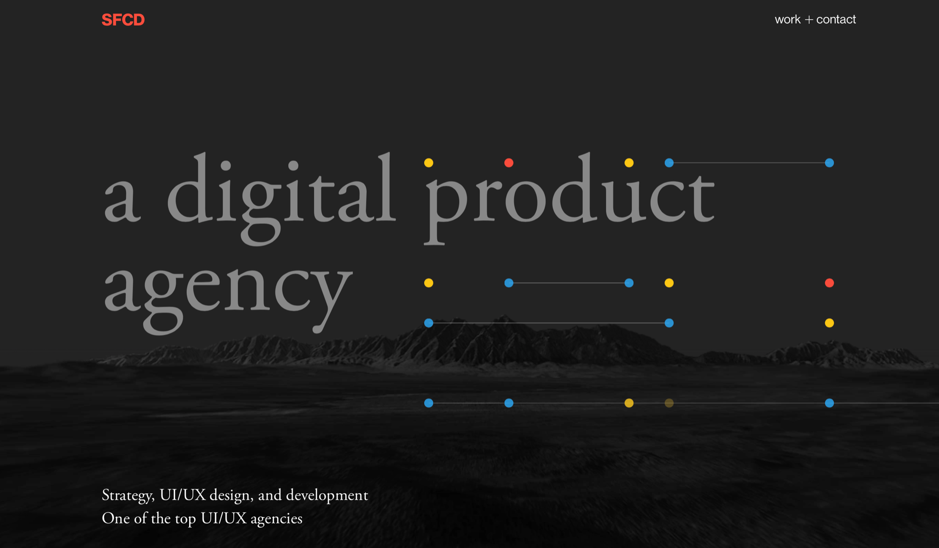
SFCD is a digital product agency based in New York. We make mobile and web apps for global brands and innovative startups, applying our expertise across platforms and screens. Reading this I had high hopes for their website and it’s content since they made digital products.
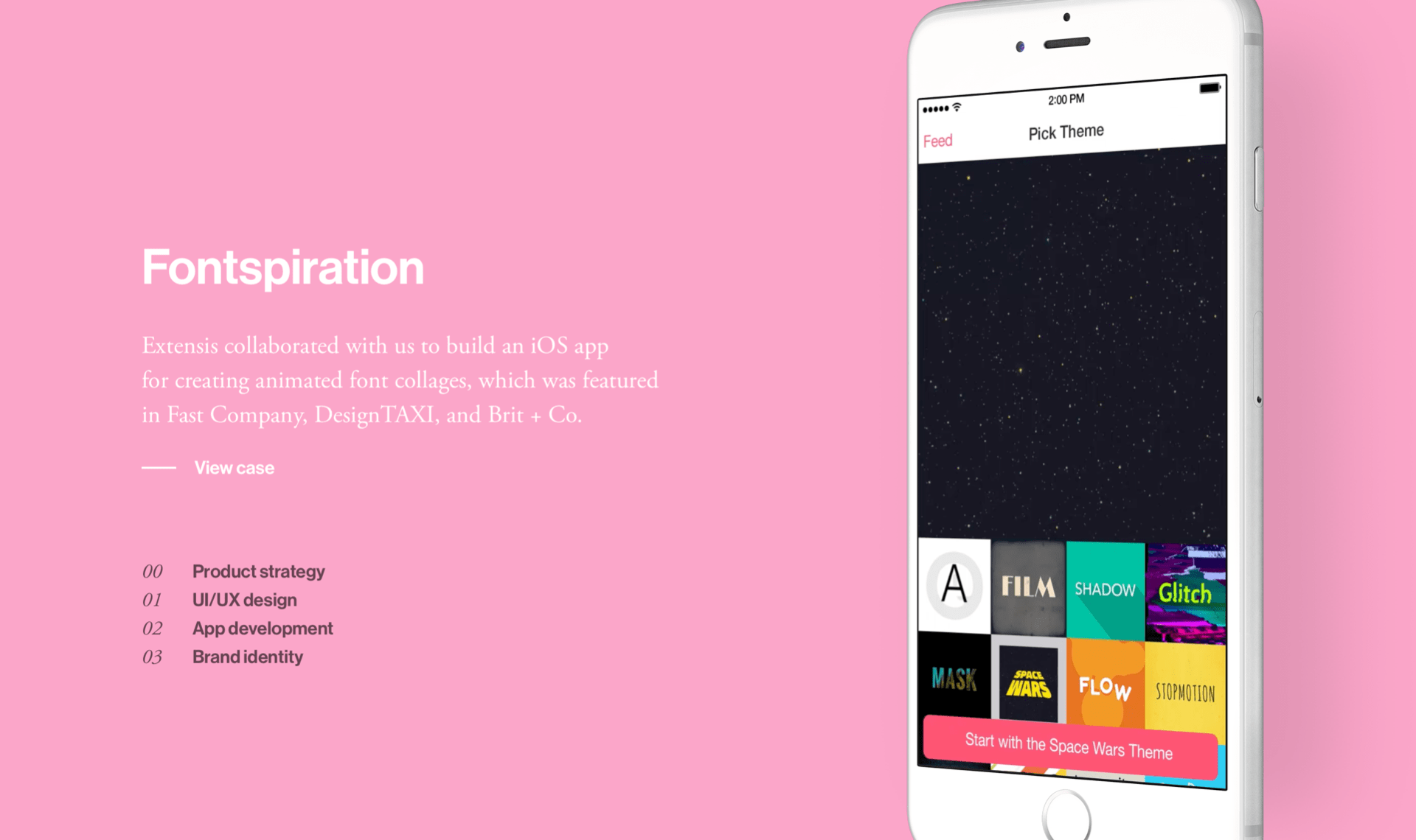
Going on their website I noticed it’s a one page essay. This was interesting to me because going on designers websites they normally have multiple pages. The homescreen contained all of the work and then link to the case studies. I clicked on the first one that intrigued me it was called ‘Fontspiration’.
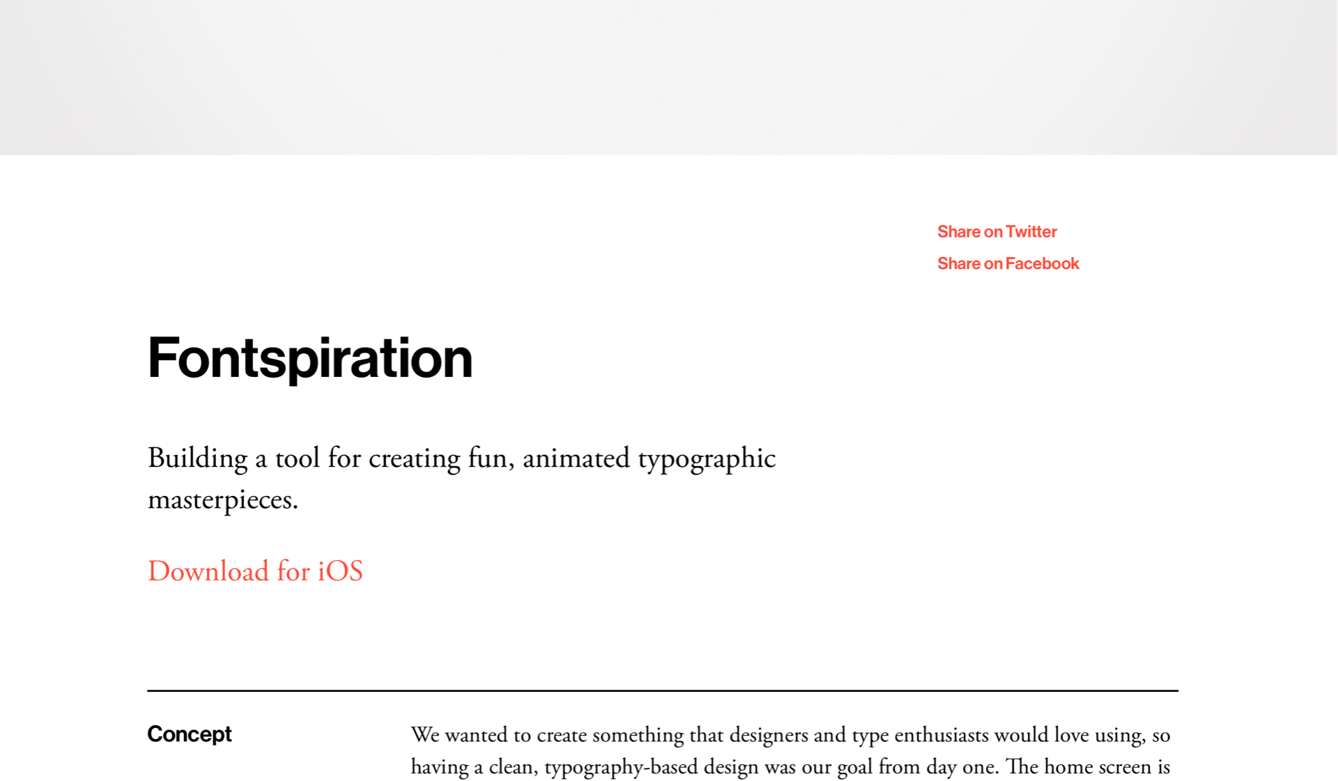
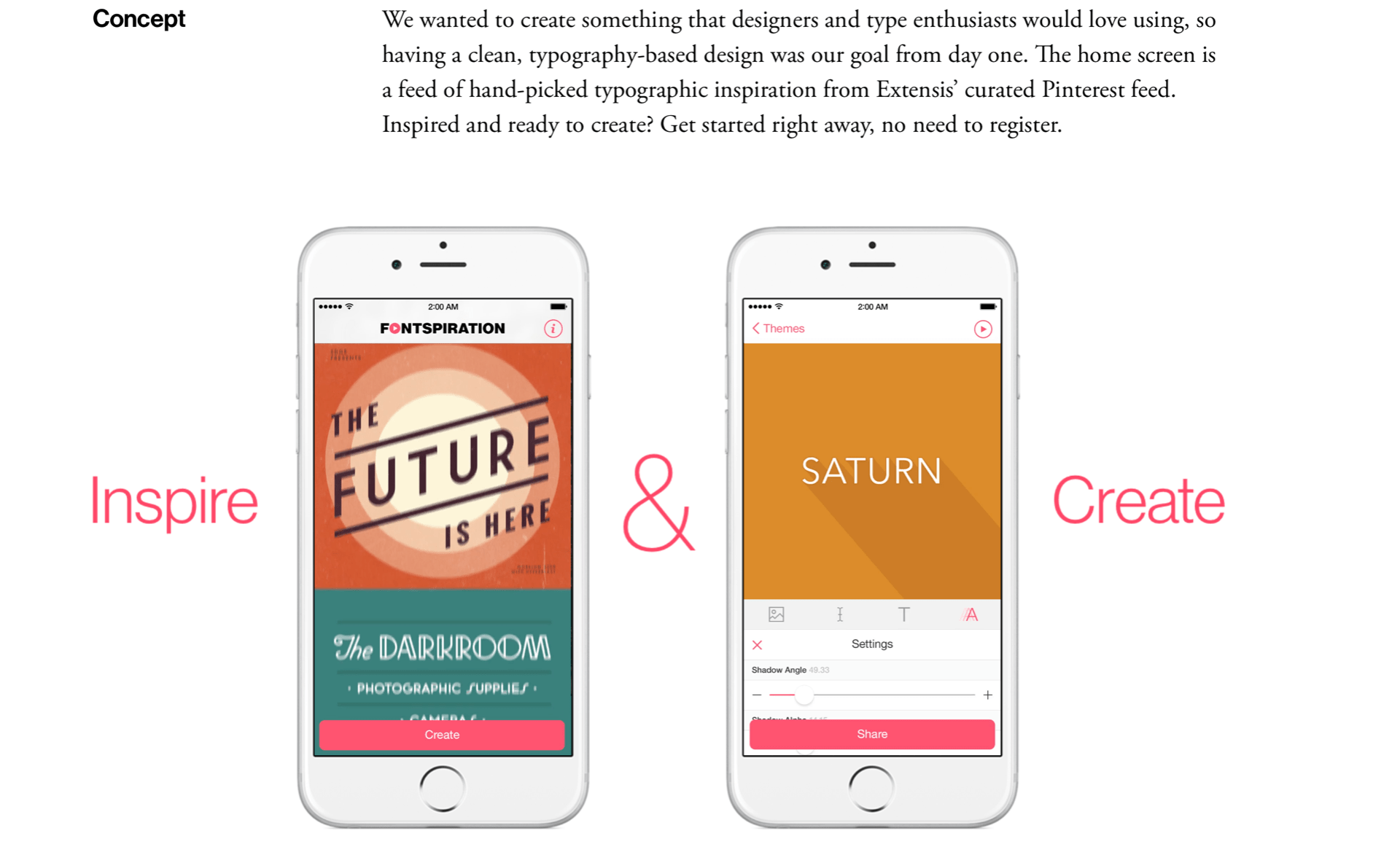
What was so pleasant to look at for me was the animation throughout. As soon as I opened this case study I was met with an animation that took up the whole page. It was like a mini slide show on what the case study involved and even included mock ups. The information is all laid out clearly down the page and it is easy to read, from the concept to the end mockups of the app I was able to understand and follow along on the journey.
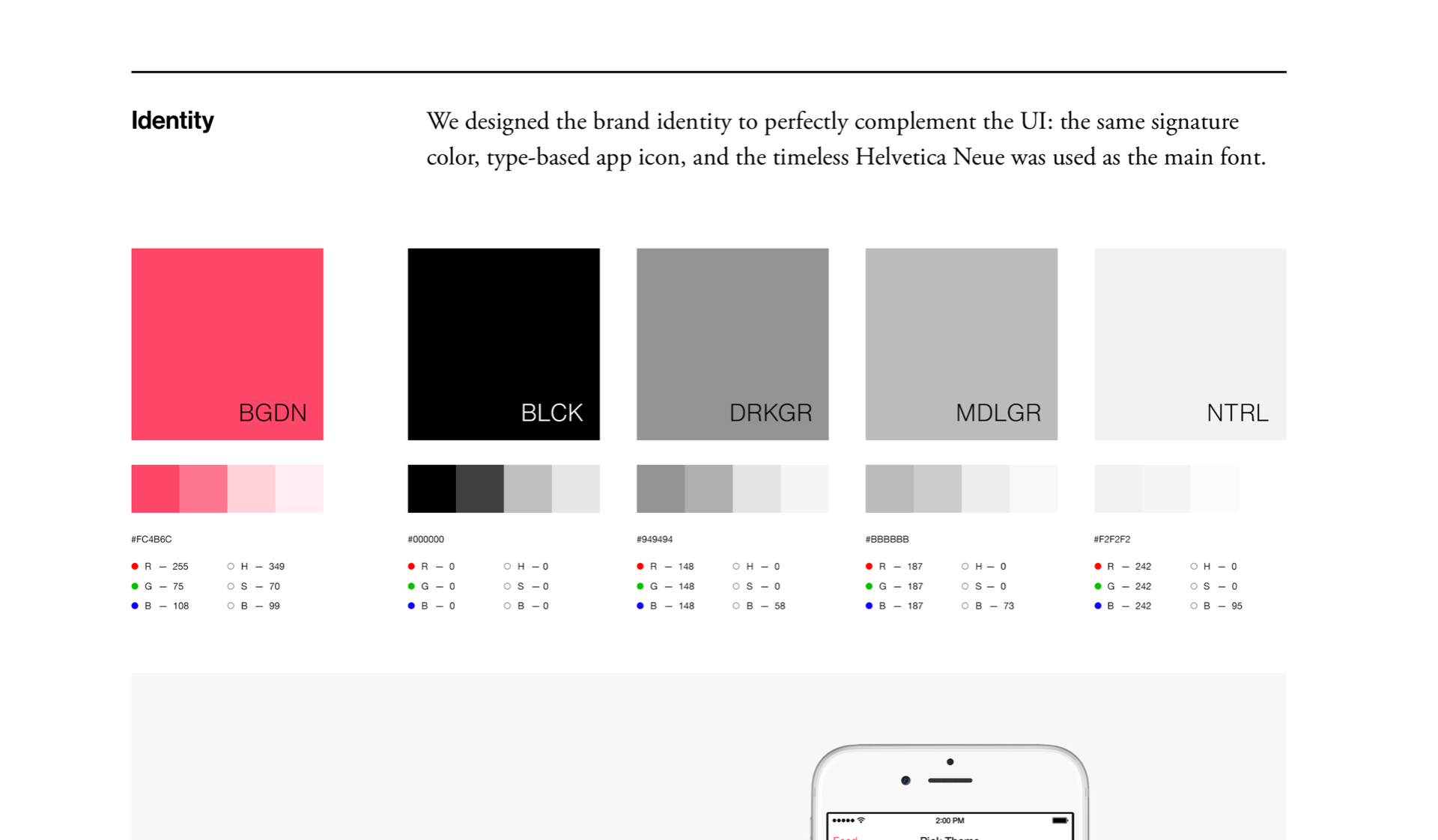
I liked how each section was cut off with a line so the readers are aware as to what they are talking about or showing, as seen in the image below. They go through each aspect of the app and briefly talk about what they did or used. I liked this, sometimes there can be too much words and paragraphs on why brands did this but sometimes visuals work much better. The sample square moves and animates as you read or look at the icons. This was a nice touch in my opinion because I didn’t want to look away – which keeps this case study very interesting.
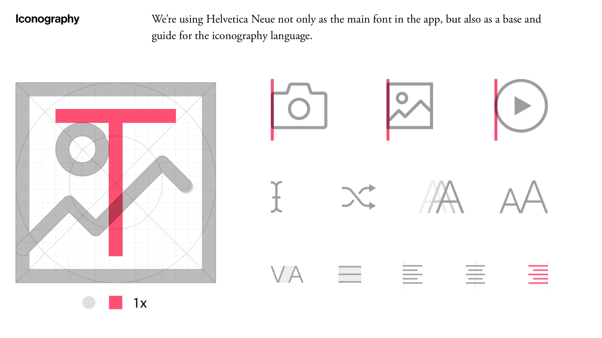
I also like how there is final colour. SFCD make great use of white space which is simple but it lets the app or project shine. No colours clash which is nice.
What makes their case studies successful?
- Use of white space – so the project shines on it’s own
- Layout – everything is neatly positioned and centred
- Order – the whole process and everything about the app/project is labelled and sectioned. Making it easy to work one’s way down the screen in a chronological order
- Sizing – everything is the correct size and easy to read and see
- Animation – the constant moving gifs/animations makes the case study interesting and never boring
- The mock ups – having their work shown in a screen brings it to life and lets the audience see it action. Making the product appear user friendly and appear very professional
How could their case studies help me?
- I think that looking over their studies has shown me a lot of the importance of clear placement and displaying work in the best way possible. The work has to be clear to read and understand and neatly positioned on the screen. This also makes the website appear professional and at a high quality when it comes to design. This really helps me when it comes to my own portfolio.
- The use of mockups, I think that seeing this in use and seeing mockups being used throughout has been a great help to me. I think its important in a case study to see the work in use and what it would look like in real life. I am making a travel app so I think that seeing this company use mock ups so much has encouraged me to use them too and to use them at the best standard as possible just like they did. I feel I have also got inspiration from this company on how they display their mockups, some are on a slightly different colour background, this makes them stand out and shows the reader that this is a new section. I think I could do something like this too because I think it raises the mock-up up form the screen a bit.
- The use of animation was great to see and has encouraged me to use it in my website possibly. I think it was a great addition and one that makes the use study more interesting. Even though I am no digital product agency I still feel something like this could look good on my portfolio. The animation inside the ockxus made them look so real and was a fun touch.
Overall I was really impressed with the company SCFD and their work, I wanted to find a company that specialised in really well done case studies and I am glad I found this one. I think it’s important to look at case studies and see how other designers tackle ideas and see their progress and then the final outcome. I will be doing this in my portfolio because I had a lot of projects over the last year, so I’m glad I have this as inspiration and somewhere to go to for guidance on successful layout, process and portfolio design.