Category: Printing

Graphic Design- Final Poster

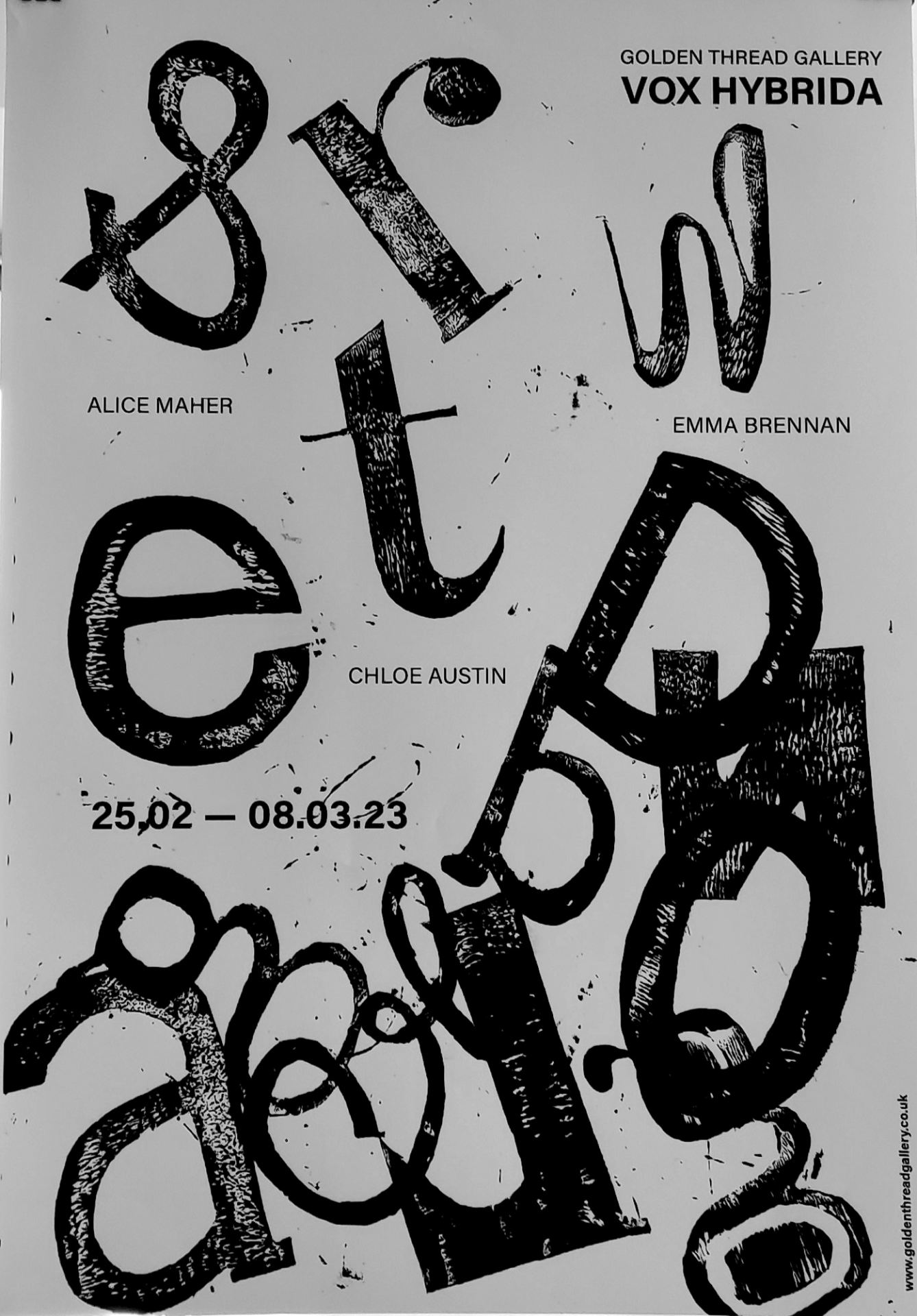
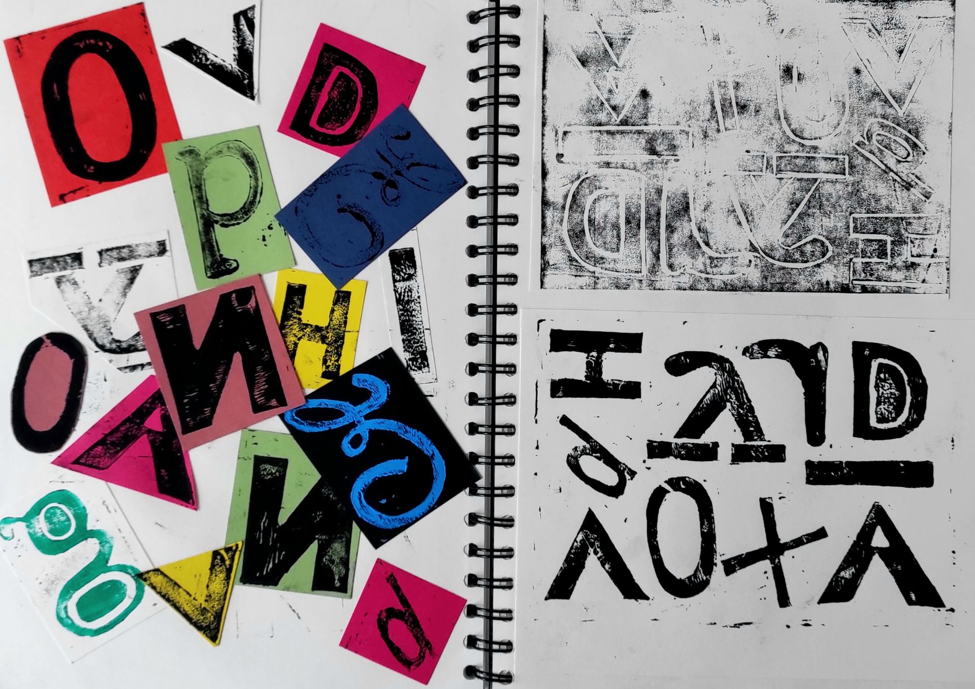
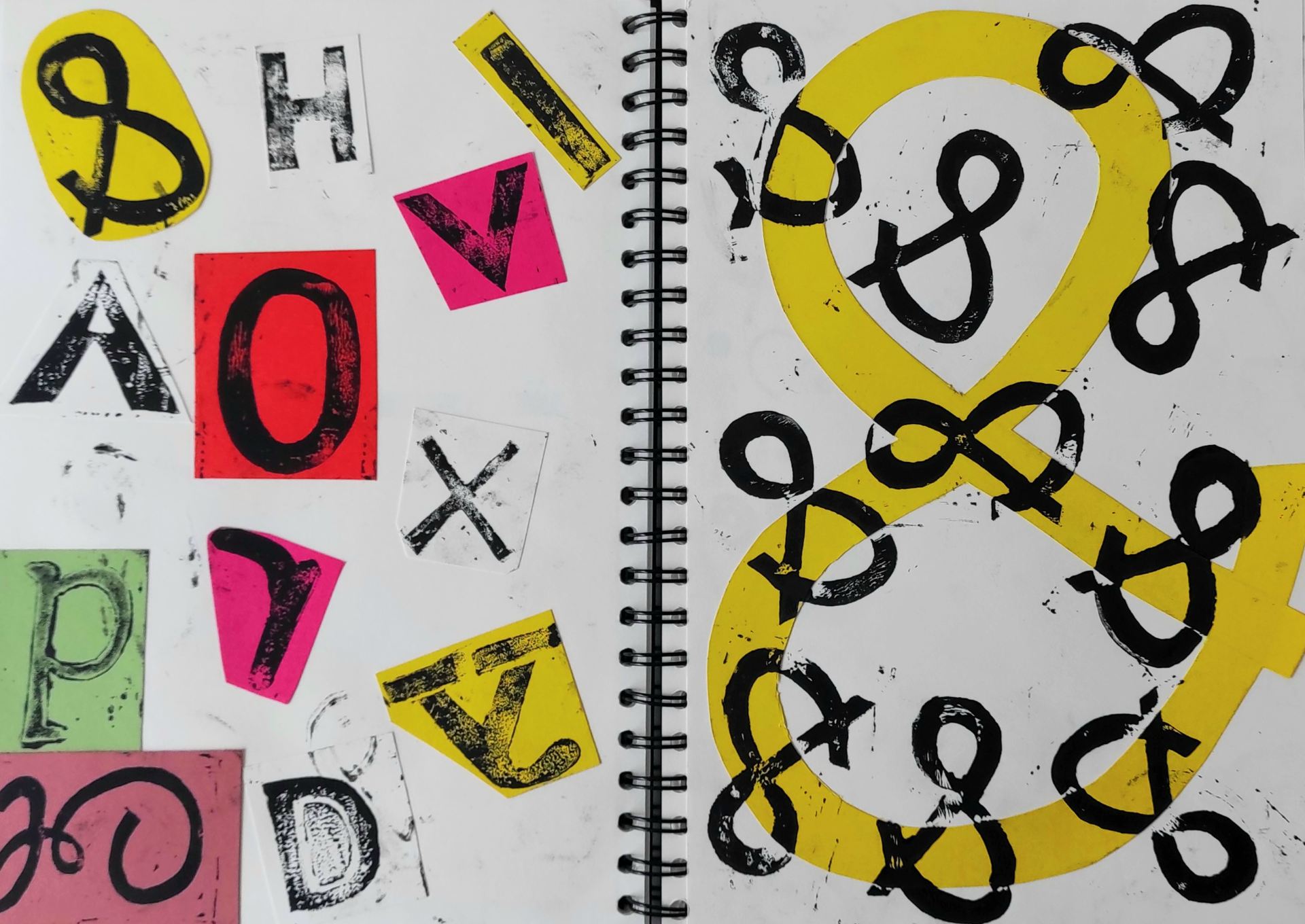
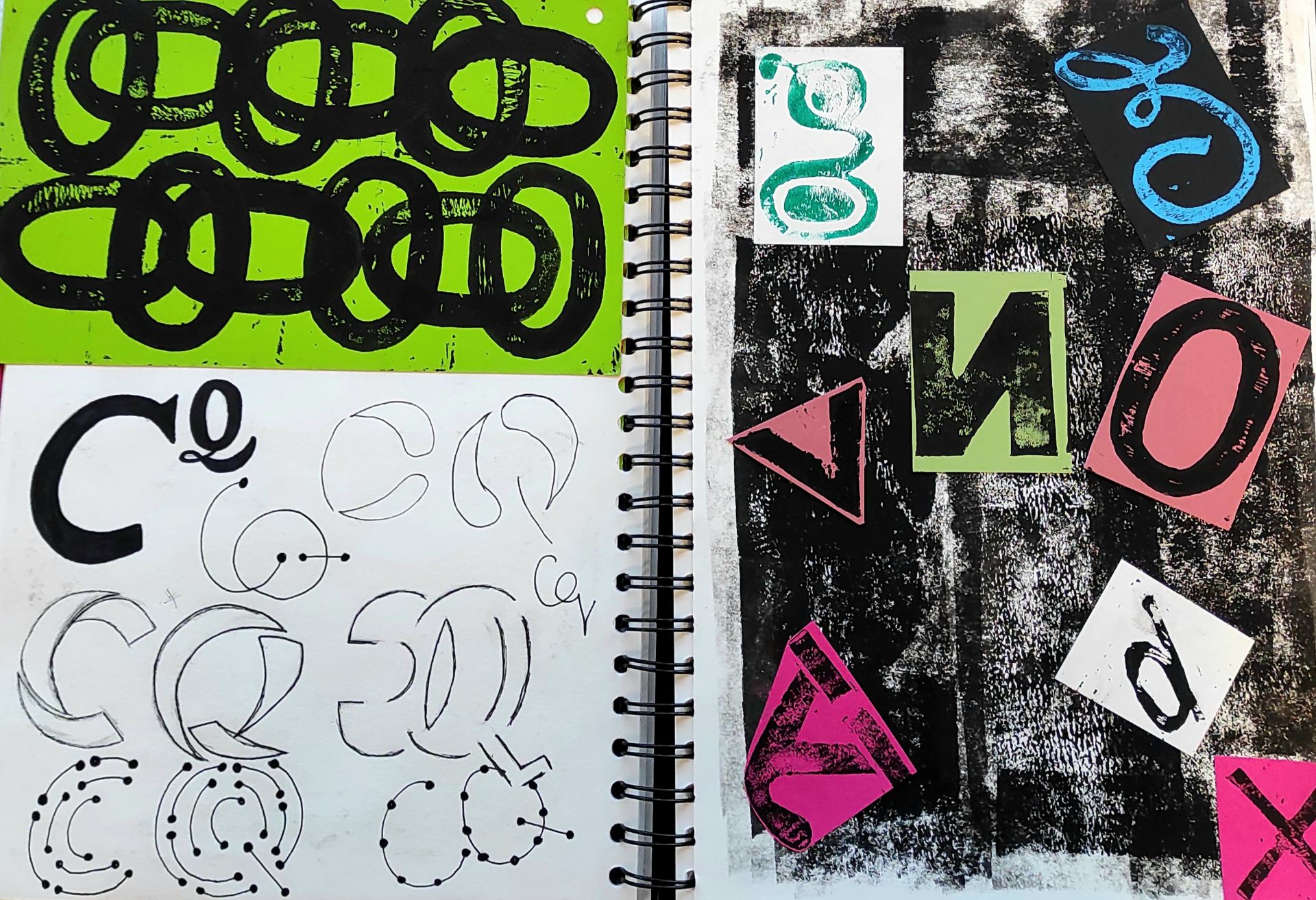
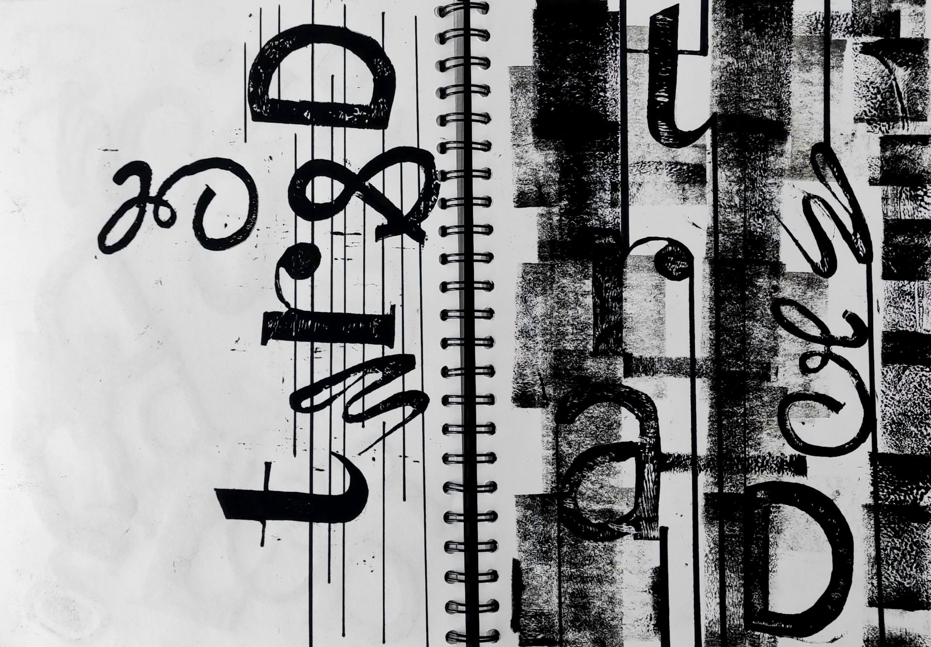
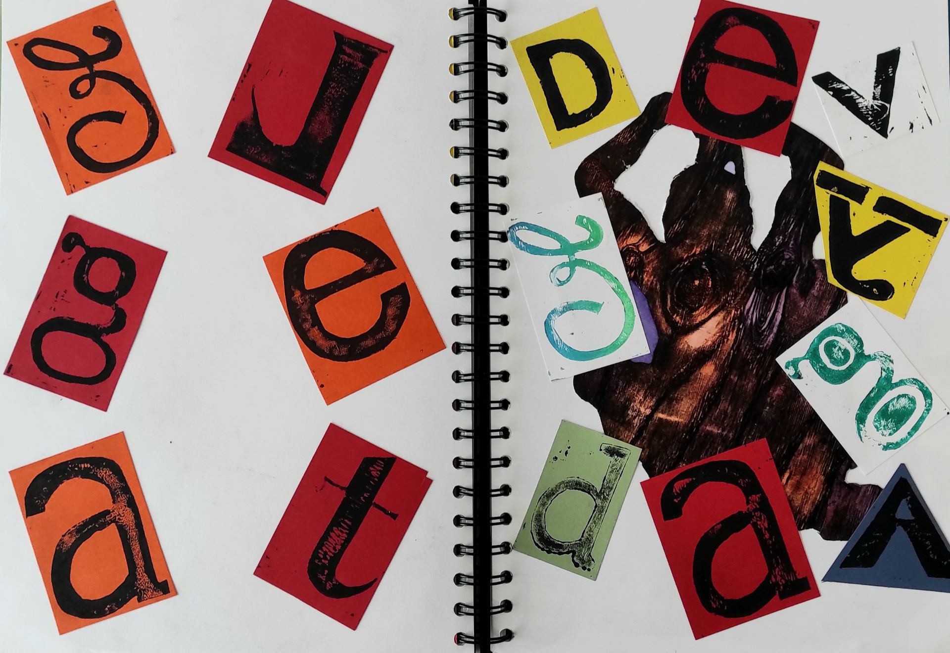
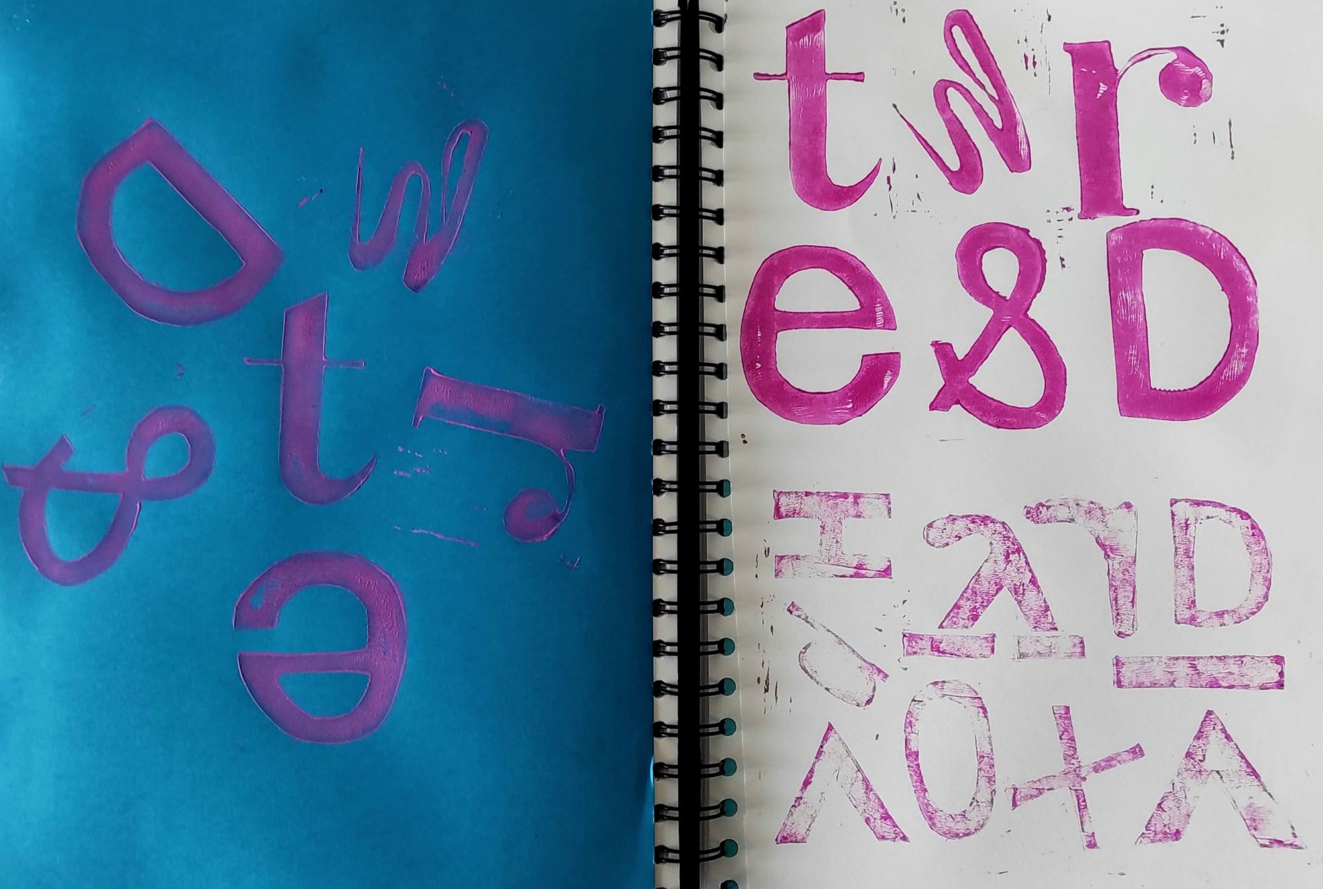
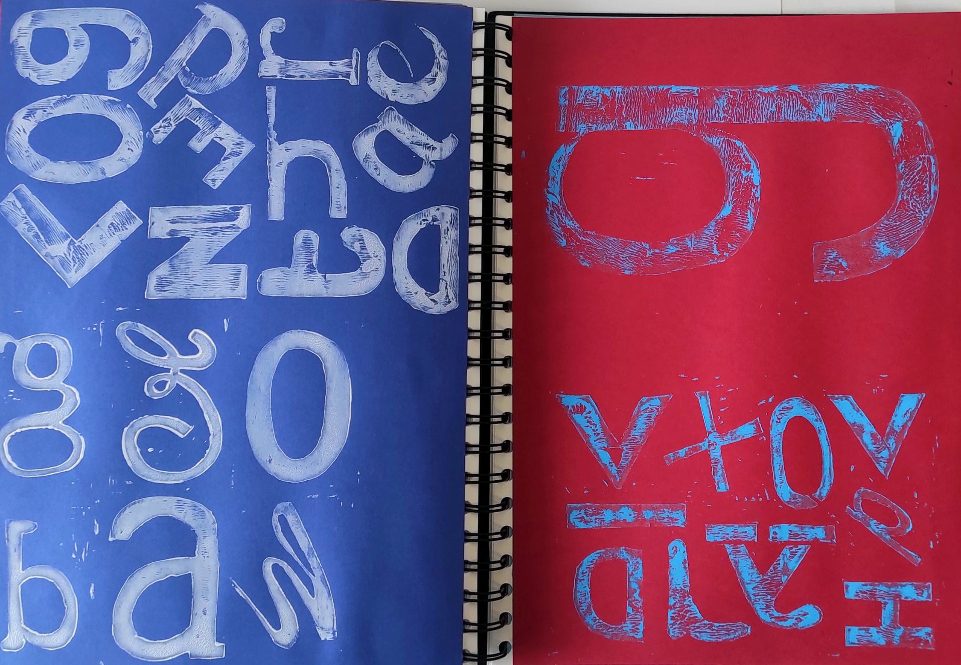
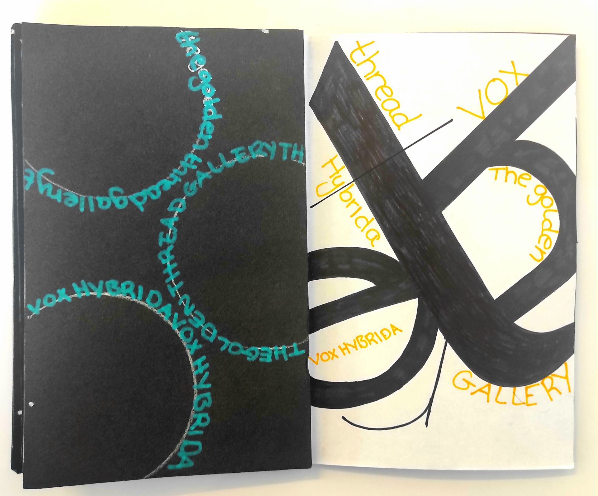
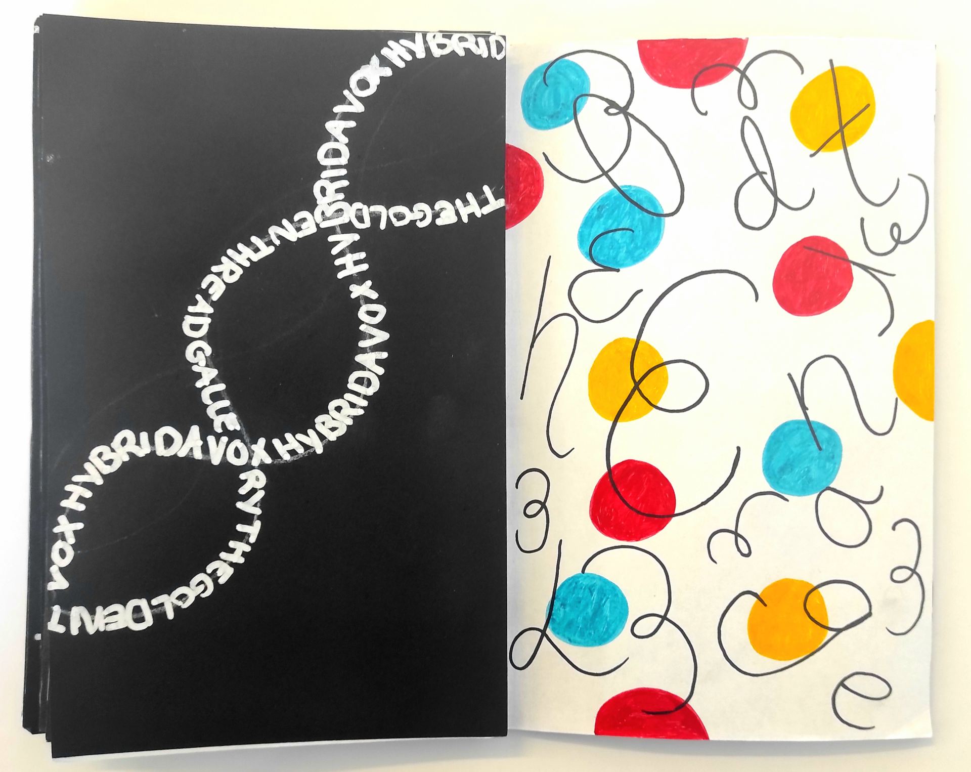
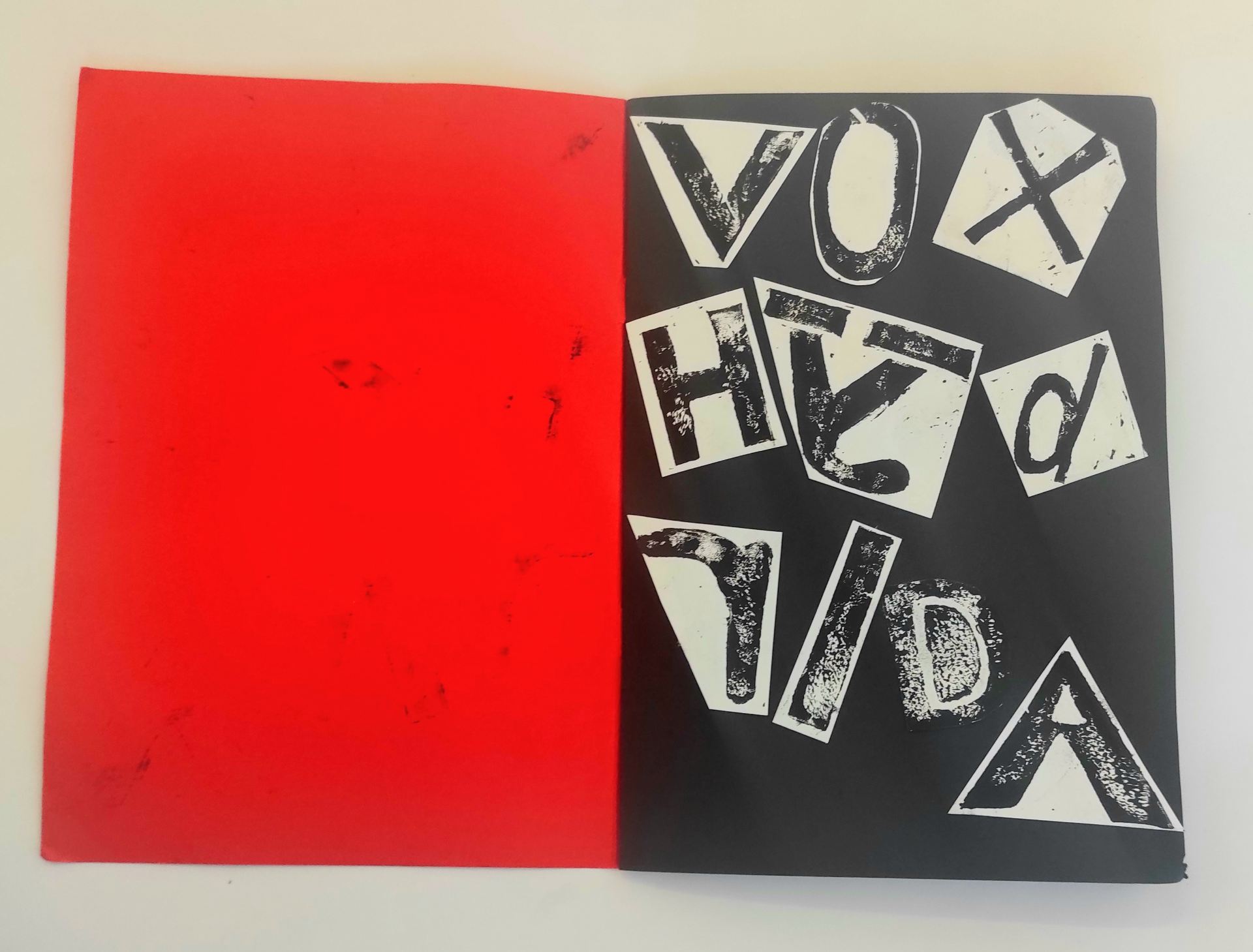
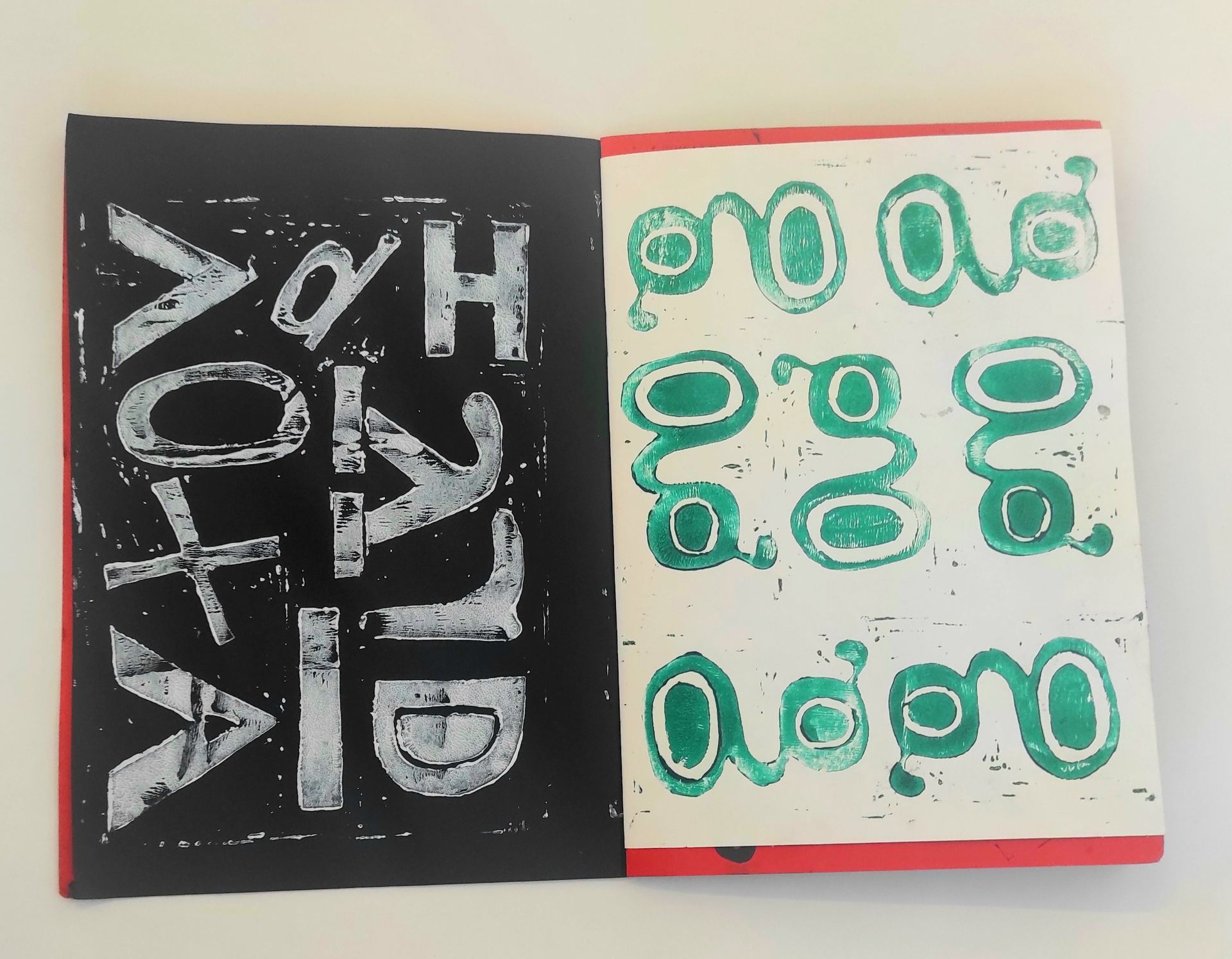
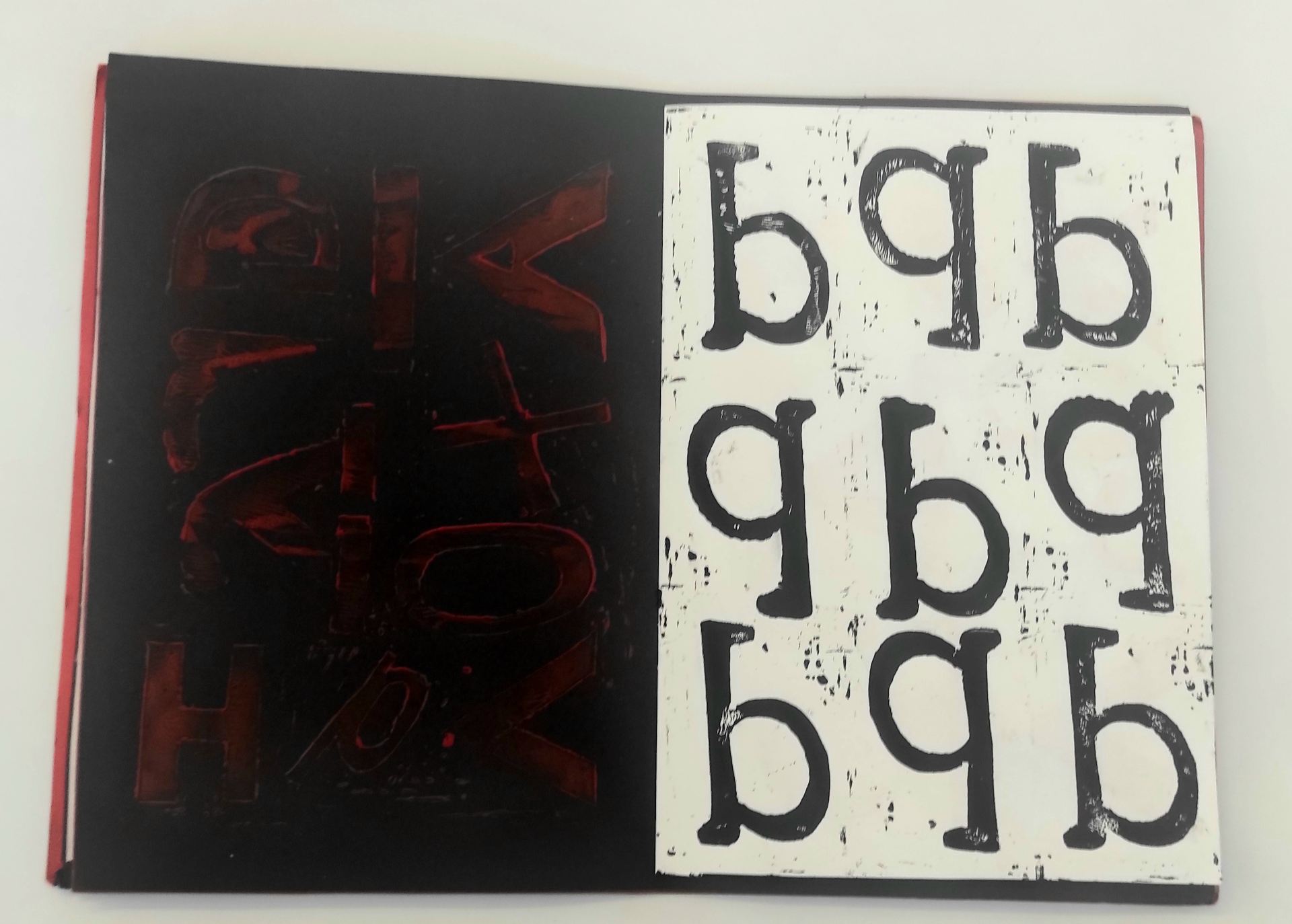
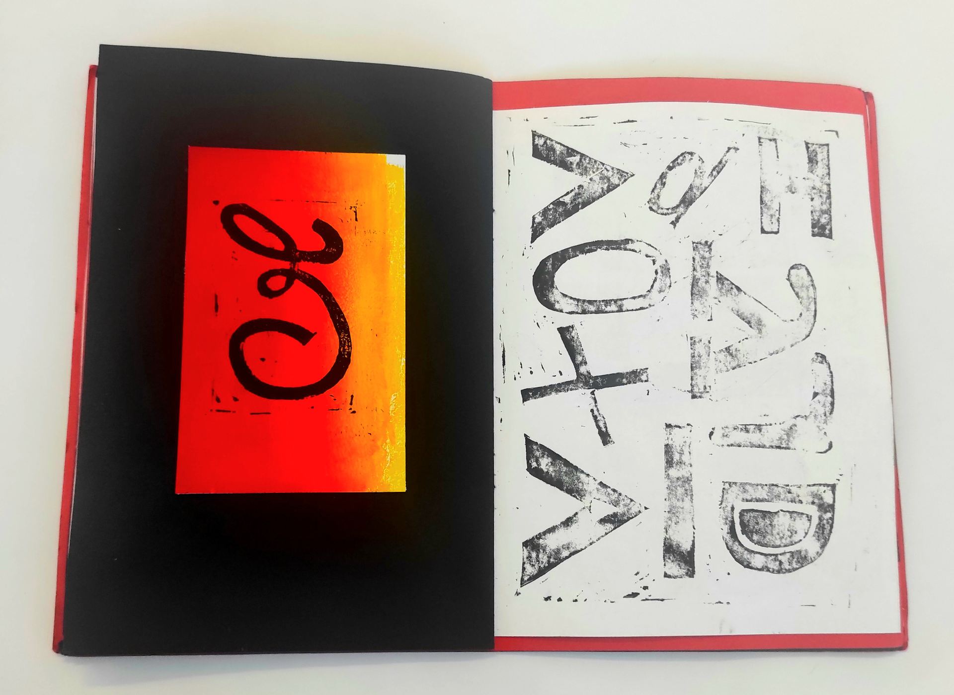
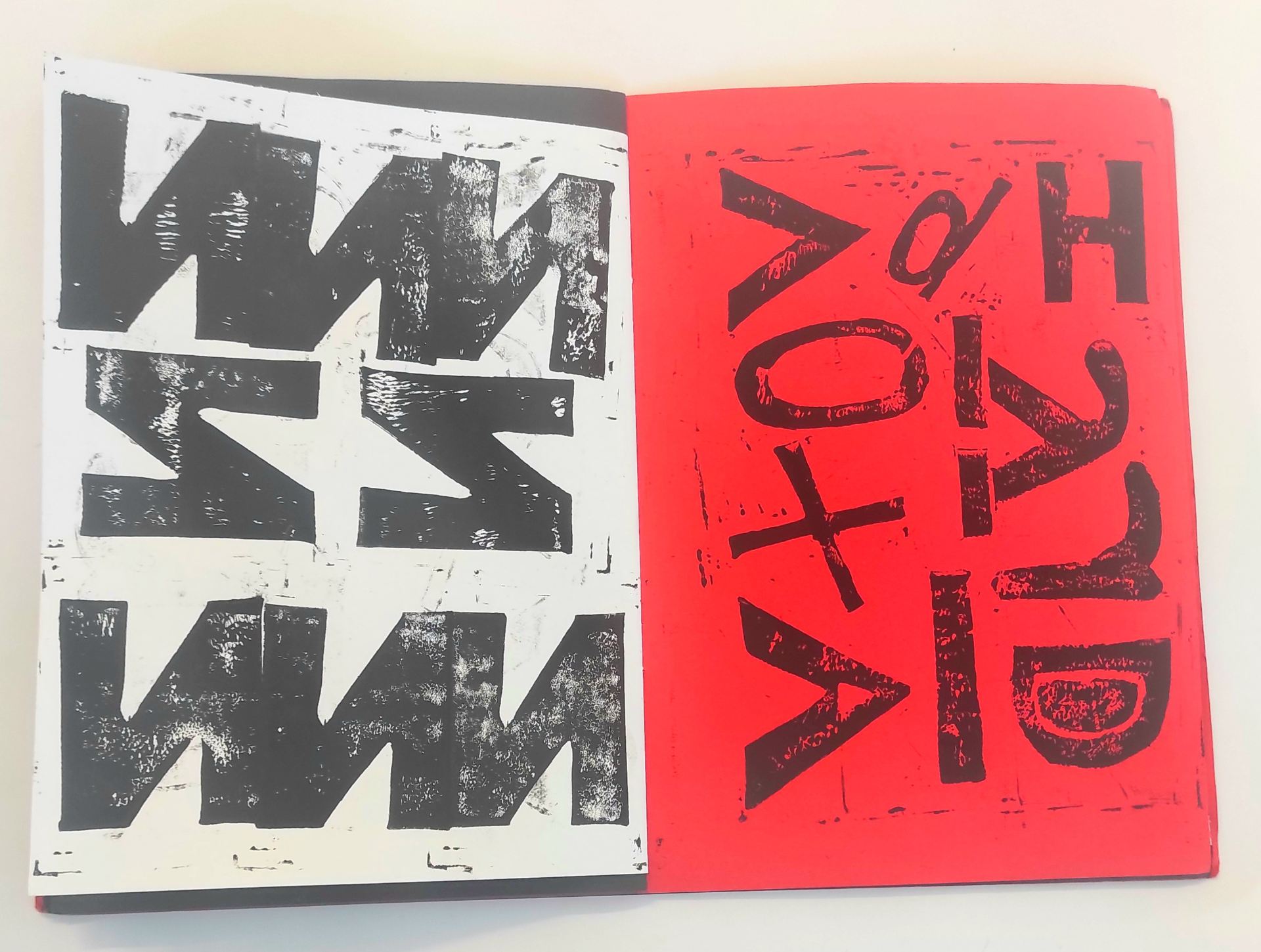
Here is my final outcome of my A1 Poster, thats based on my chosen exhibition VOX HYBRIDA in The Golden Thread Gallery. This poster was inspired by a lino print design that i originally created in my sketchbook. This poster represents the name of the gallery but the letters are printed individually to create a scattered effect or to make them look dispersed and some of the letters are purposely printed backwards, as a particular piece in the exhibition really caught my attention and became very influential on my own work as that particular artist also experimented with letters and words chipped backwards. I’ve also incorporated different type styles as some of them are: uppercase, lowercase, block letters and some of them in a calligraphy style. I’ve also included: the name of the gallery, the name of the exhibition, the name of the artists, the date of the exhibition and also the website. Overall,  I’m very pleased with the outcome.

Graphic Design- Vinyl Project

For this project i had created a moving Vinyl using Adobe After Effects software. This Vinyl is representing all work thats currently in my sketchbook and also typography books. Personally i thought that using my lino prints would work well and it also helped experiment further with my design ideas for my final poster. This Vinyl is quite quick and sharp when the images are changing and i also included audio that consists of old radio sounds, which i think works well. There are so many different elements that i was able to include as there is an effect that really stood out to me called the difference effect, which makes the type/text in the Vinyl appear more vivid in colour and contrasts really well together. I also included type in the center of the Vinyl which i’ve called it ONLY LYNO and also inculded 05 which represents May the month that we are currently in. Overall, i’m very pleased with the outcome.

https://ulster-my.sharepoint.com/:v:/g/personal/reid-s41_ulster_ac_uk/EV2M_BKsADtHmYvhvIUajgQB6PatlGyitcPeRx_vS7usrQ

Graphic Design- Moving Poster

For this project i had created a couple of moving posters using After Effects software. These moving posters are based on my experimental lino prints from my sketchbook and typography books. Personally i found that creating the moving posters were quite challenging as all my work within my sketchbook is based on lino prints, which are considered as images. Although it was quite interesting in finding many ways to make these images move and to create a pattern on movement.

https://ulster-my.sharepoint.com/:v:/g/personal/reid-s41_ulster_ac_uk/ERL1tlkexE1FhP4TrQqYqIIBt1APAxVYXsf_ZqdKRhgU7Q

https://ulster-my.sharepoint.com/:v:/g/personal/reid-s41_ulster_ac_uk/EfWMIWVH-wBJjjgrV4G9NP4BFTyUcC4krGvF7C351-6f3Q


Graphic Design- Sketchbook Experimentation

This sketchbook contains various amounts of first-hand images of the 4 exhibitions that i had visited which are the: The Golden Thread Gallery, The Mac Gallery, Catalyst Arts Gallery and Belfast Exposed Gallery. I then chose to mainly focus on The Golden Thread Gallery, as i found the VOX HYBRIDA exhibition very interesting. There is one piece in particular that really caught my eye which looked like words and letters backwards that were chipped out of a large piece of wood then painted ontop with a vivid pink colour and with the access paint there was a large sheet of paper that was used to print over the top.

This technique used in this piece inspired me to incorporate a printing process within my practise which is the Lino Printing technique. I intended to experiment as much as possible with my initial ideas and designs to then help generate ideas towards my final outcome. Colour is definately a main element that i like to include with in my experiments, so as you can see the process of creating these designs using a variety of coloured card, ink and acrylic. Again, with taking inspiration from this exhibition i had also included some letters to purposely become backwards and to create several repeat patterns. I personally think that theses lino prints worked really well and i also really like the contrast of each colour.

Graphic Design- Lino Print Experiment

Here is a series of experimental lino prints, using various colours of card and ink/acrylic. These prints were inspired by a graphic designer Vince Frost as he tends to include various amounts of colour within his practise and another element that inspired me was how he presented his typography piece and how he positioned his typefaces. These prints are inspired by my chosen exhibition The Golden Thread Gallery.

Graphic Design- Typography Book

Heres another typography book which is very similar to my previous examples. Here i attempted to experiment using marker and coloured paint pens to create various amounts of ideas that include the words of my chosen exhibition, The Golden Thread Gallery. Personally, I really enjoy experimenting scale and compostition, as i thnk that it helps balance the designs which a few of them can appear more simplistic. I also like to include a variety of elements such as: shape, pattern, colour and angles, which makes the designs look more effective.

Graphic Design- Typography Book

Here is another experimental typography Book, again using a lino printing technique. As you can see i have went for a bold colour scheme, as I’ve found that bold colours really enhance the details within a lino print. I have attempted to experiment with creating patterns, especially repeat patterns. I had also taken consideration of other techniques to create more abstract ideas that include: composition, scale, negative space, colour and collage. My aim was to create a series of prints using a variety of colours and with any excess paint or ink i rolled onto a separate page to craete a nice textured background.

Graphic Design- Logo Ideas

Here i’ve created a series of ideas for the live logo competition. I’ve attempted to use a variety of medias including: lino print, marker, chalk pens and paint markers. I gathered inspioration from a few books which were (Decoding Logos, Why we design and Logo) I found that researching through books really enhanced my ideas and trying to focus on how to make them creative and meaningful at the same time. There are not many in colour as i preferred to experiment more in black and white first before experimenting with colour. So far there are only a few that stand out, as my next stage i will begin to finalise my chosen logo.

Graphic Design- Final Zine

Here I’ve completed my final Zine with a similar approach to my mock-up, only I’ve used different coloured paper which I’ve found to have better quality comparing to the mock-up. Overall, I’m pleased with the outcome so far and I found this project very enjoyable.

Graphic Design- Zine Mock-up

Here I had just designed a rough Mock-up of my zine as I just wanted to test print a few of my designs before placing them into my final Zine book.