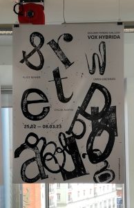
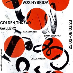
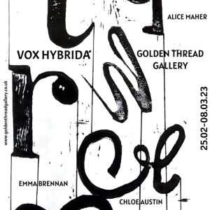
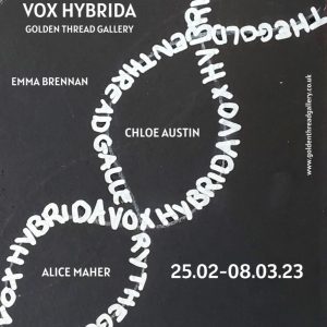
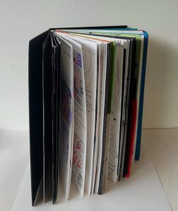
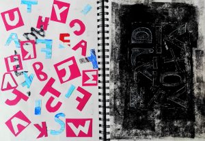
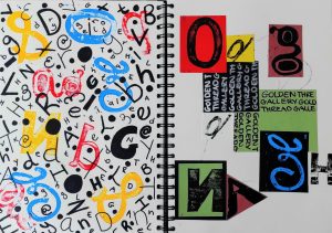
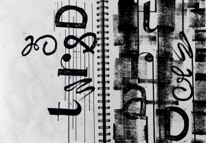
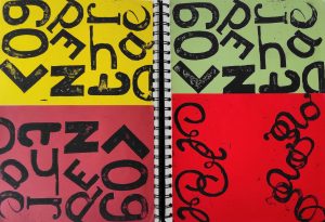
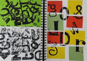
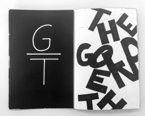
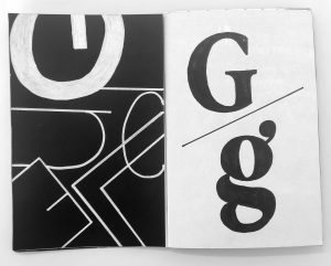
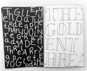
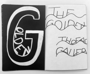
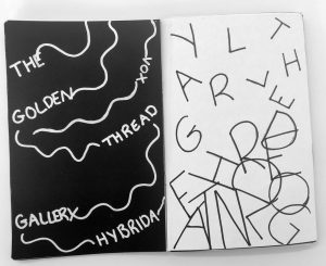
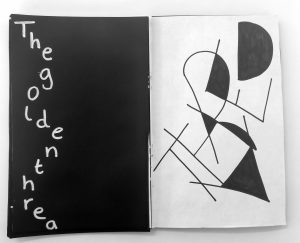
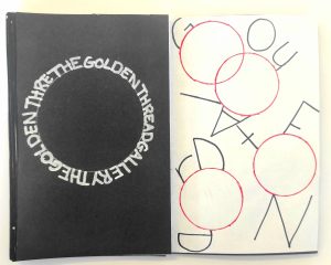
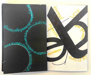
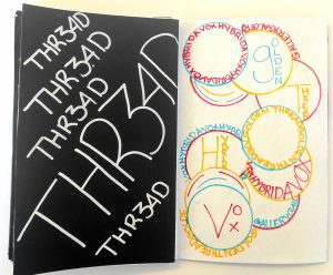
Here is my final outcome of my A1 Poster, thats based on my chosen exhibition VOX HYBRIDA in The Golden Thread Gallery. This poster was inspired by a lino print design that i originally created in my sketchbook. This poster represents the name of the gallery but the letters are printed individually to create a scattered effect or to make them look dispersed and some of the letters are purposely printed backwards, as a particular piece in the exhibition really caught my attention and became very influential on my own work as that particular artist also experimented with letters and words chipped backwards. I’ve also incorporated different type styles as some of them are: uppercase, lowercase, block letters and some of them in a calligraphy style. I’ve also included: the name of the gallery, the name of the exhibition, the name of the artists, the date of the exhibition and also the website. Overall, I’m very pleased with the outcome.
Graphic Design- Final Poster
- Author By reid-s41
- Publication date 11/05/2023
- Categories: A1 Poster, AAD012, Abstract, Adobe After Effects, Adobe Illustrator, Art Exhibition, Brainstorm, Brainstorming, Collage, Collage samples, Collage work, Colour, Communication, Digital Design, Digital Drawing, Editing, Elements, Exhibition, Experimental, Figma, Final Outcome, Final piece, Final Poster, Final Project, Golden Thread Gallery, Graphic Design, Graphic language, graphics, Images, Initial Drawings, Initial ideas, Ink, Lettering, Lino cut, Lino Print, Lino Printing, Main Workshop, Marker, Markmaking, Mixed media, Numbers, Patterns, Photo's, Poster, Printing, Processes, project, Shapes, Symbols, Textures, The Golden Thread Gallery, Typography, Uncategorized, Visual, VOX HYBRIDA
- No Comments on Graphic Design- Final Poster

