Week 4- Illustrating our Interfaces ixd104

This week we looked at illustrating our interfaces. He gave us a quick overview. For this week we would continue our Initial Sketches/wireframes for an app. Paul mentioned in Week 6 we will have a group Critique session were we can give each other feedback on our designs. In this PowerPoint we covered interfaces and how to illustrate them with some helpful sketching tips. Practicing your designs makes perfect. We looked further into different types of illustrations such as Mascots and characters, Thematic, Icons, diagrammatic, data visualization, hype realistic, simple vectors, hand drawn illustrations.

He mentioned the importance of workflow looking at Google images, Flickr, dribble, stumbleupon, books and blogs for further inspiration.

Week 3- IXD104

This week we specifically looked at the different designers and illustrators such as Marion Deuchars, Dan Fern and Olly Moos. He also showed work of previous students such as Jordan Henderson, Paddy Donnelly and Peter Strain, etc. who went on to create their own work after they finished the course. Their work can help inspire us our own designs. On blackboard he provided us with links to their work. At this stage I should have my Master- Apprentice Icon exercises completed as accurately as possible and upload them to our blogs. Continue to work on the city scape master apprentice. In addition, I should plan the layout and content of our travel apps. Then next week begin to illustrate my interface which will help me to develop our me designs. For guidance Paul wanted us to look at Google’s Material Design to show how to layout our content.

Week 2 IXD104- Getting Iconic

This week we look at Icon Design considering the need to create icon sets as part of our design process. He gives us a brief overview of the history of Icon design from the early discovering to the modern area and showed us plenty examples such as the Munich Olympics. He mentioned Icons are visually recognized worldwide and give a people a good understanding. Icons play a major role in user interfaces. He showed us some inspirational designer and illustrators.

He then went on to explain mind mapping keywords, send/receive/context, style, harmony, differentiate, required reading. He showed as a brief video of a man who made letters and symbols from everyday shapes. I thought this was interesting and shows us that words and letters can be made from anything if you use your imagination. It is a fun and exciting way to create art.

This week Paul set us a couple of tasks. Paul asked us to continue recreating our Master Apprentice travel icons, try mind maps your ideas for your travel app consider the name/brand. As well as start to create wireframes for our travel app by sketching out designs on paper. He mentioned the importance research on our campus blogs.

Week 1- Introduction to Imaging and Data Visualisation (IXD104)

Today we were given an introduction to our new module “IXD104- Imaging and Data Visualization”. We briefly outlined the content we will be covering for this module during this semester. In this module we will exploring the use of imagery in design specifically focusing on using data and illustrations to help communicate our message. Paul then showed us some of the best previous work for inspiration. He then explained the deliverables and expectations to help us achieve this module. He explained the importance of keeping our dairy’s up to date weekly. We were given a brief narrative. We also introduced to the Master-Apprentice model as a way of learning by redrawing images. He then went on to talk about different illustrators/designers such as Jon’s Freddie, Tim Micons and Vic Bell and showed examples of their work which can help us with own research. Over the course of the next few weeks, he wanted us to recreate the five travel Icons for our first master apprentice exercise by using Figma or Illustrator. These can be found on backboard. As well as this, he wanted us to begin to Mind Map and start developing ideas for our own travel app. He ensured us we can book in one-to-one personal tutorials weekly through the Calendly link he set up if we need a chat.

Pocket Profile- David McCandless IXD304

David McCandless is a writer, designer and creative director who currently lives in London. He was born in 1971 and was educated in Westfield College. He is the founder of Informationisbeautiful.net which uses the world of data to create infographics and visualizations.

He wrote several books on Infographics and Visual data called:

Information is beautiful 

Knowledge is Beautiful

His most recent book was released this year called The Visual Miscellaneum 

David McCandless is also a public speaker. He spoke about “The beauty of Data Visualization” at Ted Global Event which was based on his book “Information is Beautiful”.

Talk Notes

He started off explaining how we can deal with information overload by using our eyes more for visualizing data so we see trends in patterns which our important and design information in visual way. The data therefore can be used to tell a story and allow us to focus on the important information and can make it cool.

He then went on to show and explain some examples of data visualizations which he used to store data in an appropriate and appealing way such as:

The Billion Dollar o-gram

Mountains out of Molehills (A timeline of global media panic)

These diagrams show interesting occurring patterns in the data which highlights important information.

One Phrase he hears all the time is “Data is the new Oil” Data can be used to provide innovations and new insights and can found all around us and minded easily. He thinks the metaphor should be adapted to say that “data is the new soil”. Personally, he feels it is like a fertile creative medium. Throughout the years online we have laid down a huge amount of information and data and we irrigate it with network and connectively.

He said it feels like visualizations, infographics, data visualizations are like flowers blooming from this medium. Directly it is just a lot of numbers and disconnected facts. But by working and playing with the data, interesting things can appear as well as revealing different patterns. For example, he showed a diagram with a trend and got the audience guessing before revealing the name. Lee Byron and himself gathered thousand pieces of data in order to display them in visual way based on the data.

He was never designer but through studying and viewing data through his own work and media he felt it came more natural.

You can basically collet data from everything and can spot emerges in information. We are visualizers and using our eyes we can see patterns.  He showed us some examples visual appealing data in the world.

The examples has made us consider the data. He expalined importance of using relevant data so that we can see the fuller picture which therefore can change our perspective.

Quote from Hans Rosling once said “Let the dataset change your mindset.” This perhaps could change your behavior. He showed us another example called Snake Oil? Which showed evidence for nutritional supplements” This is a balloon race type of diagram. The higher the data appears on the image the more evidence there is for each supplement and the bubbles correspond to popularity on Google. He went on talk about this in more detail.

He showed a digital data visualization of the political spectrum and breakdown of the data which is of concepts and explores our worldviews.

To summarise he said:

  • Design is about solving problems and providing elegant solutions.
  • Information design is about solving information problems.
  • In Society we have a lot of information provides from the overload of data to the breakdown of trust and reliability or how interest information can be.
  • Therefore, visualizing information can give us a quick solution to these problems, as well as making it appealing, provides clarity and better understanding for users to find data which makes data beautiful.

From this talk it helps give a better insight into data visualization and how it is used in our everyday life’s to store data in appropriate manner. Therefore, I feel I have now a better understanding of visualising data as well as looking at examples of David’s work. This will hopefully inspire me and help me come up with ideas when I start designing my own infographics.

Travel App Research ixd104- The Mourne Mountains

Before developing my Travel App, I done a bit of research on my specific topic the Mourne Mountains. Through using the internet and looking at my own book on The Mourne Mountains I found out a lot of information. This included the history of the Mournes, different points of interest, safety advice, routes, the best walks and peaks in the Mournes, places to stay, eat and drink etc. This information I gathered helped me form ideas and help me think of what content to include in my own App.

I looked at the following sites:

https://www.nationaltrust.org.uk/the-mournes/features/walking-in-the-mournes

https://walkni.com/mourne-mountains-destination/

https://outsider.ie/ireland/best-hikes-mourne-mountains/

As well as this book below.

Research

The Mourne Mountains are the highest Mountain range in Northern Ireland. It is well known for its breathtaking view. The Mournes consist of popular rugged paths and tracks recognized by walkers all over Ireland. These walks allow walkers to explore the great outdoors. The Mournes have a vary of routes from Easy, Medium, and Hard which may situatable for beginners and experienced hikers of all abilities to enjoy.

The Mournes was voted the ‘Best Walking Destination’ in Northern Ireland in WalkNI’s inaugural awards.

There are many peaks in the Mournes. Below is a list of some:

  • The highest peak is Slieve Donard which is 849M located in the town Newcastle.
  • Slieve Commedgah is the second highest peak at 767m
  • Slieve Binnian
  • Slieve Meelmore
  • Slieve Meelbeg
  • Slieve Commedgah
  • Slieve Muck
  • Slieve Bearnagh
  • Slieve Martin
  • Hen, Cock, and Pigeon Rock

I looked at points of interest here is a few:

  • The Mourne Walls- It is a famous landmark which strengths for 22 miles in length and connects the submits of 15 Mountains. This wall was built by stone granite by was locals. It was completed in 1922 and took over 18 years to complete. Today you occasionally see people maintaining the wall.
  • Tollymore Forrest Park- Was established in 1995. It is stunning 630-hectare Forrest Park located in BryansFord at the foot of the Mourne Mountains near Newcastle. The Shimna river flows through the park.
  • The Mourne Way- This is a 40km country route which travels between Newcastle and Rostrevor.
  • Game of Thrones- The Sandy Brae near Attical, Tollymore Forrest Park and Leitrim Lodge all featured in Game of Thornes.
  • Annalong Woods is an evergreen wood.
  • Annalong Cornmill
  • Annalong Valley
  • Slient Valley and Ben Crom Reservoira
  • Castlewellan Forrest Park- A 450 hectares Forrest park lying North of the Mourne mountains. It allows people to do Partake in Outdoor activites such as Camping and touring, walking, cycling, horse hiding, fishing on the lake, canoeing and orienteering. Recently it was announced at Castlewellan Forest Park was getting a £5.5 million revamp.

The Mournes are made up of Newry, Mourne and down area. They are situated North of the border between North and the Republic. They can accessed throughout Co Down in Hilltown, Rostrevor, Newcastle, Annalong and Castlewellan.

Safety Advice

  • When hiking in the Mournes it’s important to stick to the routes so you don’t get lost
  • Check the weather
  • Bring a Map and Compass
  • Plan a Route
  • Bring a Snack and Water for hydration
  • Bring along a friend for company
  • Enjoy the experience
  • Watch out for bikes

Basic Kit and equipment

  • Boots and socks
  • Trousers
  • Hat and Gloves
  • BackPack
  • Map and Compass
  • First Aid Kit
  • Walking Poles
  • Phone
  • Food and Water
  • Coats
  • Map
  • Compass

You may spot some Wildlife on your walk such as:

  • Sheep
  • Frogs & toads
  • Rabbits
  • Birds
  • Bees
  • Wasps
  • Mice
  • Squirrels
  • Insects

The Mournes have alot of Plants and Flowers such as:

  • Heather is spotted everywhere.
  • Gorse
  • Moss
  • Ash, beech, birch, and Oak Trees

The Climate can vary from Windy, Wet, Damp, Cold and Dry depending on the different seasons. You can have sometimes get 4 seasons in one.

Accommodation & Places to Stay near the Mournes:

  • Hotels- Slieve Donard Resort, The Donard, Kilmorey, The Whisteldown, Canal Court, The Rostrevor Inn, The Downshire Arms, Harbour House Inn
  • Hostels-
  • Holiday Homes- Hillyard Mews, Glassdrumman Lodge
  • Bed and Breakfast- Slient Valley Bed and Breakfast
  • Campsites- Annalong, Kilbrony Park, Tollymore forrest park, Castlewellan and Newcastle,
  • Glamping Pods in Newry, Hilltown, Castlewellan Forrest Park, Newcastle, Annalong, etc.

Famous People who are from or mentioned the Mournes

  • CS Lewis the creator of Narina was influenced by the landscape of the Mournes.
  • Percy French who wrote “Where the Mountains of Mourne Sweep down of the Sea”
  • Designer Thomas Wright of Durham
  • Seamus Heaney
  • Actor Nicole Kidman was – The film the Northman.
  • Catherine McGrath Singer from Rostrevor Co Down

I felt this information was really useful and may prehaps helped me when planning and designing my Travel App.

Week 7- Lecture Notes IXD104

This week we started off with a wee refresher on where we are in terms of our designs. He stated the importance of keeping our research blogs up to date. This week the lecture was on visualizing data. Everywhere we go data is all around us and we were shown examples where we can find data on a daily. “The commonality between science and art is in trying to see profoundly- to develop strategies of seeing and showing”. – Edward Tufte. We then looked at different diagrams used to store data such as line chart, bar chart and pie charts. We looked at ways we can reveal or hide data. Paul showed us a couple of sites to help us for referencing. We were given names of designers to research for some inspiration.

This week we will begin our 2nd project which requires us to create an infographic/ data visualtion looking specifically at global population. I will research data visualtion and infographics thoroughly before starting my own infographic once I have a good understanding of what needs done.

Area of possible approach include:

  • Births and deaths in world- past or present
  • Population figures specific to country.
  • Population in the last 50, 100 years (future?)
  • By religion
  • By Environment
  • Climate Change
  • Disease/ Illness.

On the PowerPoint there is examples of research and supporting material to help me with inspiration. Worldometer is a good website for gathering data for my infographic. Paul says we must Research the subject further as it is important to find out specific information in our chosen area. As well as this for next week we should complete our Master-apprentice exercises by redrawing the Images on blackboard using either illustrator or Figma to help us when designing our own images.

IXD104 – Project 02 – Infographic

This is the requirements of the next project.

Week 8- Lecture Notes- IXD104

This week our lecture was on “Designing infographics”.  He first talked about the use of Pinterest for collecting Images and add them to your Blog. He created a board on infographics which he showed us as Inspiration. These images are good for referencing. These will help us when considering our own designs. Paul explained that the designs should be kept simple and does not have to be overly complicated. It can be hand drawn or digital. He said if we wanted, we could look at his Pinterest for more examples. Below is a screenshot of Paul’s Pinterest: eleventhirty. He stated the importance for us to build up our own Pinterest boards as they are good for inspiration.

He stated the importance for us to build up our own Pinterest boards as they are good for inspiration.

He then went through the slides. He mentioned a couple of books which may be useful for referencing as they are all on Infographics. Below are the names of the books and authors along with an image following:

McCandless, David. Knowledge is Beautiful

McCandless. David Information is Beautiful

Ritchie, Josh, Crooks, Ross, Lankow, Jason. “The Power of Visual Storytelling Infographics.

He noted a list of deliverables which he expects us to be working on. Our travel App tasks which include master apprentice exercises, app a minimal 6 screens and designing our Icons. The Infographic tasks include the master apprentices along with the pie chart and bar chart and researching our blogs.

This week we learned the importance of words which make up a picture. Nowadays people rather images than words. He spoke about the use of Instagram and twitter. Communication can be used through images. A picture is worth 1000 words. Edward Tufte once quoted that “Infographics help fill the gap between words and pictures”. Infographics are a combination of picture and words.

We looked at The rise of information graphics. Infographics are defined as a “representations of information, data or knowledge designed to present information quickly clearly”. Use of Infographics have become more popular in recent times in everyday life as it presents info clearly. We were shown different examples of Infographics. Infographics are a potent form of communication. It gives users a better understanding. We looked at Infographics used to represent information for Air Bnb, Get invited, US elections, Poverty, and data stories.

This is an image of a Timeline on how Air bnb started.

Paul said there could be some possible job opportunities in Infographics.

“Infographics are generally created for the purpose of telling or explaining a specific story and will usually be intended for a specific audience thus infographics are subjective” Jack Hagley

He then went on to talk about what makes a good infographic. Mainly the infographic must make sense and be information. We mentioned the Utility of infographics. We were looked at different steps which we should consider when designing our own infographics. It’s important to research and sketch out before designing the infographic.

He went through these steps and shows many examples. He listed a couple of resources on blackboard.

This week we were asked to research content on infographics and reproduce 2 bar charts as accurate as possible for are master apprentice exercises.

Research Data Visualisation and Infographics- IXD104

Data Visualisation

Data Visualisation is the way of representing data as a visual form using charts graphs and maps, etc in order to view the data in clear and efficient ways making it easy to for users to understand and read. It allows users to easily spot the trends, patterns bars and points which visualize data for user insight.  Once any data is collected It must be visualized in a visual format.

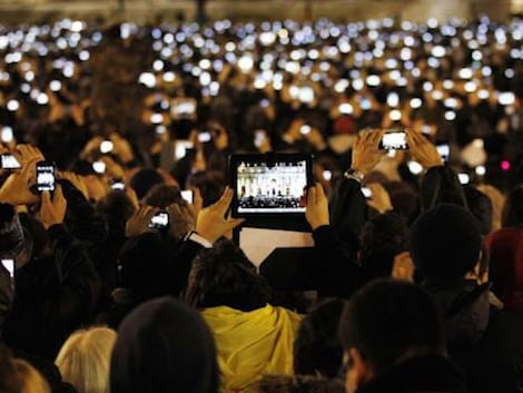
Example data visualisation can be used by teachers/ lecturers to display a student text results or football analysis may use data visual to display a player goal scoring form. There are many examples in our daily life’s where data visualisations are used.  Many Businesses collect data to show their trends. Data visualisation are quick and easy ways to see the overview of specific data in a visual way.

Data visualisation is commonly used in sales and marketing, Politics, Healthcare, Scientists, Finance, Logistics, Data scientists and researchers, etc.

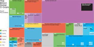
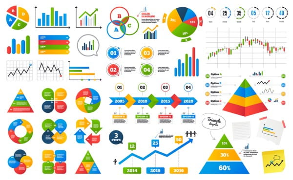
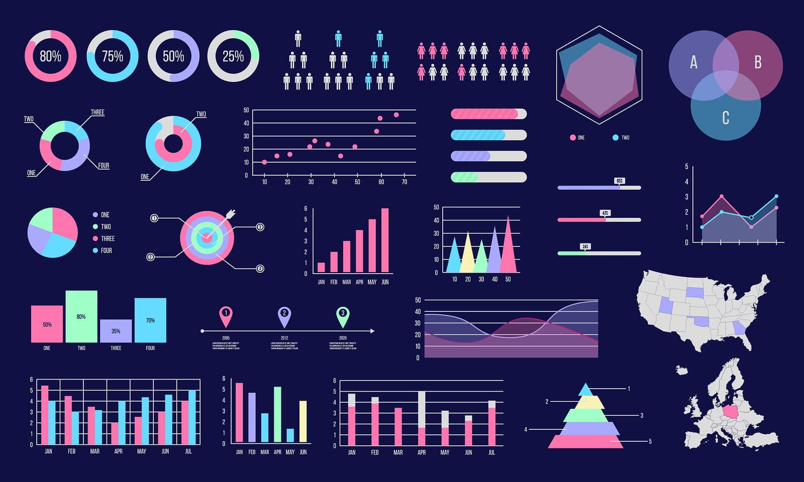
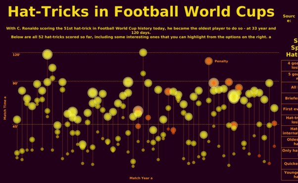
This data can be represented in following ways:  line charts, pie charts, bar charts, area charts, scatter plots, Treemaps and population pyramids, etc.

Microsoft Excel is a popular tool used for data visualtion as well as other ways

Figure 1- A timeline highlighting the history of data visualtion.
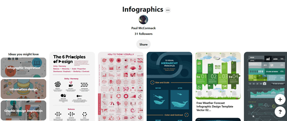
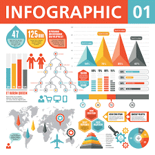
Infographics

According to the Oxford English Dictionary, an infographic (or information graphic) is “a visual representation of information or data”.

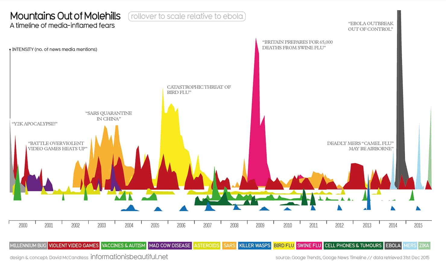
Whereas Data visualtion is a collection of data in visual format, Infographics are similar to data visualtion, they are a collection of images, charts with minimal use of text which allows users to see a clear understanding of a specific subject. It is a good way to communicate information in a quick and easy way.

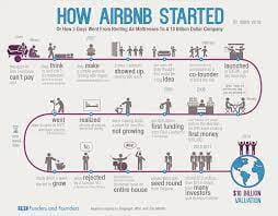
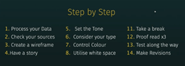
There are different types of infographics such as Statistical Infographics, Informational Infographics, Timeline infographics, process infographics, Geographic infographics, Comparison infographics, Hierarchical Infographics and List Infographics.

Infographics can be used to help promote events or rise awareness for poverty and other causes, they can be used in schools to make content more outstanding for students, local governments may use infographics to share stats and data on the census. Many small businesses may use infographics to create a brand style guide, promote their business, showcase their products, etc.

This research here will therefore help me when creating my own infographics.

For my own Infographics I will choose one of the following areas:

  • Births and deaths in world – past and/or present
  • Population figures specific to country
  • Population in the last 50, 100 years (future?)
  • By religion
  • By environment
  • Climate change
  • Disease / Illness

Week 9- (Lecture Notes) IXD104

Today was our last lecuture before the Easter Break. Over Easter Paul asked us to make sure to have our Blogs up to date by adding in lecutre content and research. He stated the importance of researching our own infromation.

He went on to give his lecture. The lecture today was called “Manufacturer in the Age of Instagram.” He started off showing us a video of “Deepfake Tom Cruise” Impersonater which makes him looks like Tom Crusie. He explained that technonolgy is improving. They can now use people’s faces on bodies. He talked briefly about the use of VFX and VR today which helps create special effects and makes things more realistic. For example Game designs is increasing become more and more realistic.

He shared with us a few quatoes. I really liked this one “We shape our tools and there after our tools shape us”- MarshallMcLuhan.

He showed a photo from 1932 show by famous photo journalist which was sold in 2008 from $265. From that period it was on the best photo journalist around. It had a range of comments such as “Why is the staircase so “soft”? Camera Shake? Like the angle through” and another stating “When everything is blurred you cannot convey the motion of the bicylist. On the other hand, if the bicylist is not the subject- What was?”

He then went to explain the power of social media and advertising and promotion products. It can be used to show the good times.

We were shown a short video which Jack Daniels used to promote themselves on their Social media. It gives people a real Nostaligia and transforms them back to hay days and good times from 1866 and show it’s still going strong today.

We then looked at Lego. They simply used their blocks to recreate movies/childern story. It allows people to think back at their childhood memories and storys they read growing up. It is a very clever technique and good advertising campigan.

After we were shown a video on the different generation of playstations from 1-4 through the ages. It allows people to remember back to their childhoods and teen years right through to their adult hood. It is an excellent campigan stragey. It is very creative and inotivated in its’s approach. It gives out good vibes and allows people to see the music artists and style back then and how things have changed and developed over time to now a days.

We then we looked at the war on Hipstamatic. He showed us a website called Hipstamatic which was used before instagram and is still active. This website allowed users to take photos throigh different filters, it allowed you to change the camera and films, you can add flash and lighting effects and you can create a range of different effects.

He then showed us some fanastic Images of war and everyday lifes which a photographer capture on his Iphone. As well as this we looked at citizen Journalism. This is images of everyday people using their camera phones to capture everyday events to help get the new out their.

We looked at some nostalgia imagery which looked back on summer days and where would like to be. This help’s bring us back to the good times. Music is another way on helping get us through these times and gives us good vibes to remind us of the good times.

Paul then showed us a site on pictorymag.com which allows peoples to explain a story and gives us the true meaning behind these photos. He then talked about instagram and virtualhuman.org which is promoting these fake accounts and encourging wannabe influencers.

Today’s lecture made me think and give me a deeper meaning behind photos and the power of them. It also give me a deeper meaning behind social media and how modern society are easily influenced. It was a really interesting and insighful lecture.

So over the easter break I will contiune to add content and research to my blogs as well as working on my projects.

Skip to toolbar