Here’s my Final outcome of my Website.
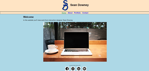
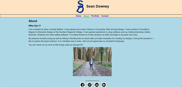


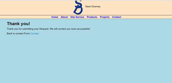

Here’s my Final outcome of my Website.
I choose to research the Book called “Infographics: The Power of Visual Storytelling” by Jason Lankow, Josh Ritchie and Ross Crooks. This booked started off with an introduction which covered a brief history of Infographics, the purpose of this book, How to use this book. It then explored 10 different chapters all to do with Infographics.

The World around us is changing. The way information is shared today has changed the we communicate today. Infographics and data visualisations are visually effective way of sharing information and getting the message across in exciting and interesting way to a specific audience.
This book shows you how to use visual communication to attract and get your point across to your choosen audience
Infographics have been around from the early cave paintings to the modern-day data visualisation. People have always had different ways of displaying information in a visual form. Infographics have been spotted back during the victorian area. It shows some examples of infographics.
The purpose of this book is focusing on improving business communication. They hope the readers will be informed and inspired by the use of infographic thinking.
Throughout this book it uses specific terms such as:
Chapter 1: Importance and Efficacy: Why our Brains Love Infographics.
This chapter will present explains the importance of visual communication and how best to use it.
Chapter 2: Infographic Formats: Choosing The Right Vechicle For Your Message
Chapter 3, 4, 6 and 7: Applications
Chapter 5: Content Distribution: Sharing you Story
Chapter 8: What makes A Good Infographic?
Chapter 9: Information Design Best Practices
Chapter 10: The Future of Infographics
This chapter will help use to stay on top of the latest trends and technologies. Infographics are constatnly updating and it’s important information is revelant.
Throughtout this book there was alot of interesting examples of Infographics which were used to represent specific information in visual way.
Information graphics are basically aimed at communication infromation. Each purpose is different.
This book is a good read. It has give me a good insight into understanding Infographics as well as the best practices. It has helped me gain more knowledge and give me inspriation when designing and thinking of ideas for my own Infographic. I would 100% recommend this book for anyone looking a clearer understanding of Infographics.
By researching this book I am aware of the various forms of infographics and data visualisation designs and the best pratics for each one. I also now the importance of promoting content through the use of social media to share my designs. I know the do and don’ts of information design and how to create more interesting, accurate and effective infographic designs to help me to attract users. I looked breifly into the emegring trend and technologies of infographics in future which i found interesting. Overall I learned alot which will help me in my further designs going forward.
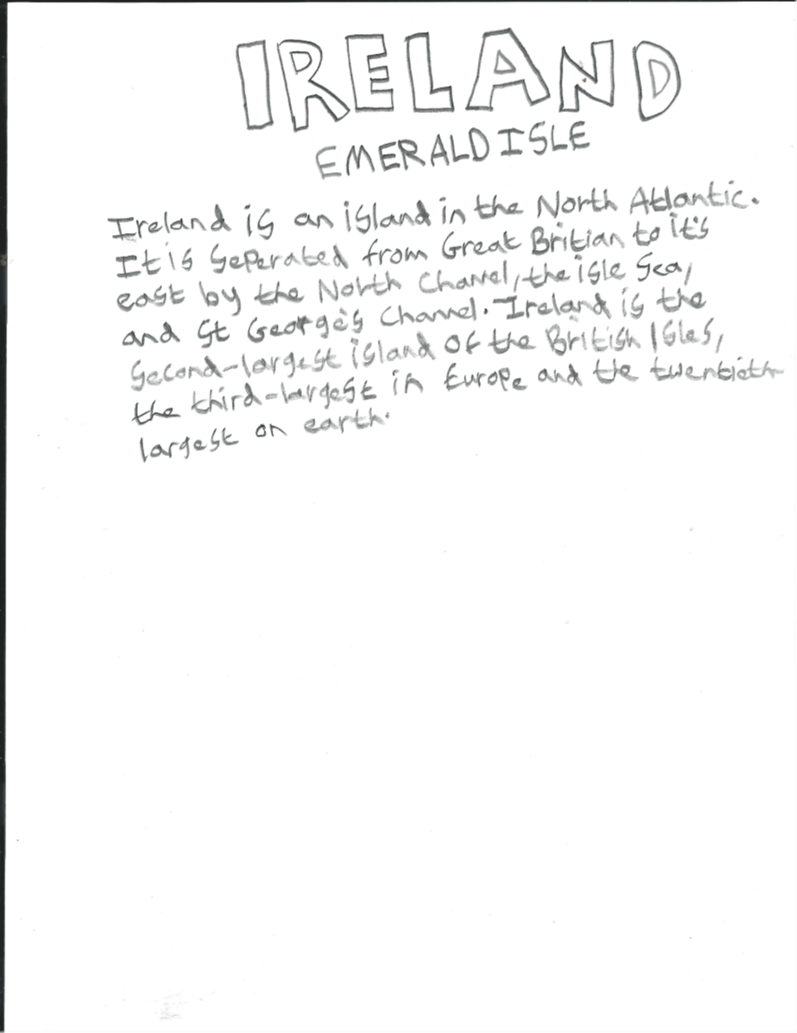
Before I start designing my digital infographic. I made a number of rough sketches. As you can see below these are rough sketches. I decided what I wanted to possibly add in my Infographic and what content i found important. My infographic I choose was on Ireland. I looked up stats and information which were relevant. I was figuring out what I was going for in terms of design and layout.
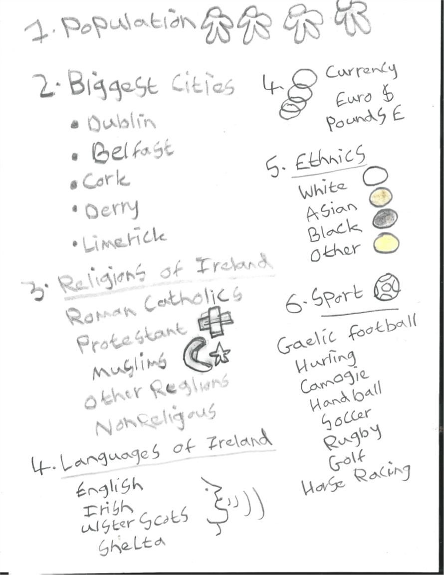

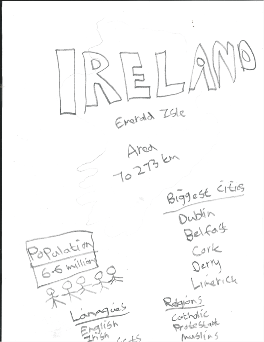
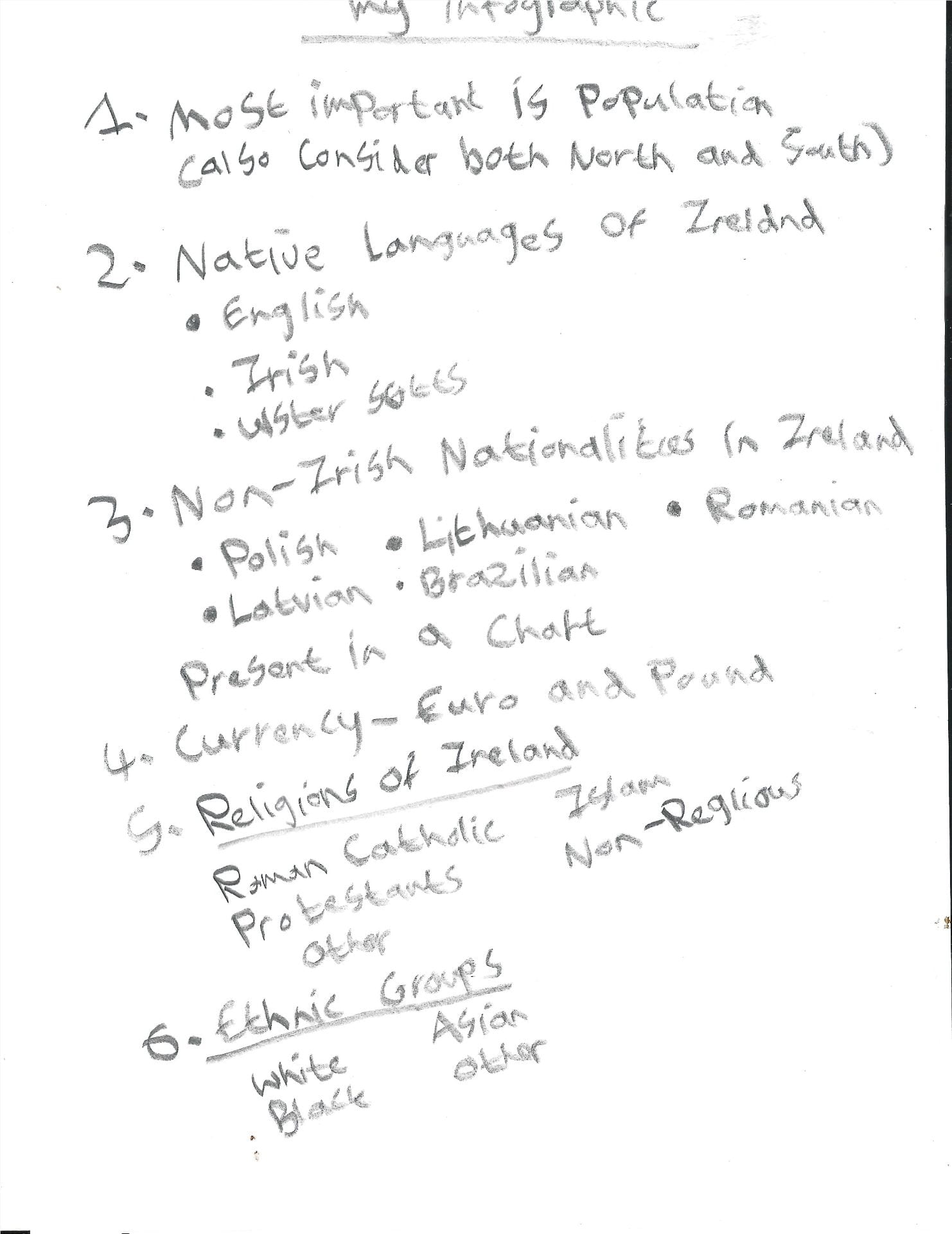
This is my Final verision of my Infographic. I took on advice from last weeks Group Critique and made changes. I decided to scale up the size of map. I searched on Google a Map of each of the 5 biggest cities in Irealand and traced around the outline of them and used a blue colour to fill them in. Then I placed them onto the map approitately. I felt doing this was a better way of presenting the info rather than in the circles which I orginally had. I made the content espeically the stats alot bigger to highlight the important info. I also gathered more content which I felt was relevant such as Native Language, Top 5 Non-Irish Nationalities, Currency, Religions and Ethnic Groups. I decided to add more visual graphics in order to make it more appealing to the user.

Overall I am happy with the final outcome of my Infographic design. I really enjoyed making and working on this task. Once I completed it give me a good statification seeing what I have achieved. I feel I added in relative information on my chosen targert and included an apporitate colour scheme. I am pleased with my attempt and felt I put good effort into my work. I made sure I hightlighted and represented the data as best I could. I believe I shown good content on screen and hopefully people will find out a lot of interesting facts and figures on my infographic about Ireland.
During Week 7 and 8 we were asked to reproduce the images of visual data and bar charts as accurately as possible. This will go together alongside the infographic research.
Below is the orginal Images of the 2 bar charts and another infographic.

These next 3 Images are my attempt at reproducing the orginal infographic images as best I could.


Hopefully by completely these designs, it will help we visually display data when designing my own infographic posters. These Master-Apprentice Excercises were fun and interesting as it allowed me be creative in attempting these range of charts.
Friday was our final class of the year for our course. During class we had a group critique on our Infographics. This was a good oppournity for me to recieve some feedback from Paul and the rest of the class on our Infographic designs to date. The feedback I got was very postive. As well as getting feedback I also had the chance to look at our people’s work and make some comments under their posts.
By having this session today I was able to see where I am compared to the other members of the class. This week I will continue to work on my infographics and make the changes as well as adding in more content and visual graphics to make it appealing to the user.
Below is the Image of my Infographic

Summary
I felt today’s this class was very useful and helpful in order to improve my infographic design. I will use the feedback to this week make changes to my design. I also need to add in more data and visual graphics. Overall I enjoyed learning about Imaging and visual data over the 12 weeks. It’s hard to believe my first year of the course is over. This next week I will work hard to get my coursework complete for the deadline.
Before designing my app I came up with a set of Icons that I wanted use in my app. I wanted to keep my Icons simple and easily recoginsable so it is user friendly and allows users can navigate around my app with ease. I sketched out on paper a number of different Icons. Then I went to Figma and digitalised my Icons. I felt the Icons I choose to design were apporitate as my App was on the Mourne Mountains.
Icons on paper
![]()
Digital Icons


![]()


![]()
Once I created my Icon set I created a Map of the Mournes. I drew out a Map and included some of my Icons on the Map along with a colour coded key which makes it easy for users to follow the Map. This was also digitalised using Figma. I started off sketching around the out line of a Map of the Mournes I found. I then added names of the different locations on the map and started to pinpoint them on the map. The Location, Forest, Moutains and Lough were added. I made sure I made them colourful so they attract the users attention. Once I finalised the map I copied this onto my App on Illustrator.
Map sketched on Paper

Digitalised Map of the Mournes

I felt happy how my Icons and Map turned out in the end and I feel they work really well on my App. Hopefully these Icons will help make my App a success and they will stand out on screen. I enjoyed being creative and making my own Icons and app. By adding some colour they can create an impact on the user.
Today’s lecture was on the art of infromation. We also covered big data and small talks. We looked at content needed for the 2nd project different. A quote from Kenneth Cukier who is a data editor says “We are at the onset of a new movement in Art that is built around data.” Paul showed us a number of books which relate to data that may help us with further research.
Big Data refers to data that is so large or fast it’s difficult to process using traditional methods. Big Data has gained more momentum during the early 2000’s. Data is used everywhere we go. We need data for everthing we do. Their is alot of data content out there. We need to resolve the amount of data we have and decide what we do with it by through analysing and storing data. It’s important data is managed apporitately. Netflix is an example of big data. 80% of what we watch on Netflix is influenced by Big Data . The recommedations we recieve are based on data they collect on shows we may like based on what we researched or watched. Uber is another site which manages data. They have open source which allows us to look into different data.
We were also shown different infographic designers and illustrators along with some examples of their work which will help give us inspritation.
Couple of artists and designers we looked at were:
At the end of class Paul went over the hand in date and the deliverables we need to cover for then which include the illustrative, the diagrammatic He ephasised the importance of adding content to our Blogs.
Next week we will have one-to-ones sessions with Paul so we can catch up with him and ask questions or concerns we may have. Then following week we will have a group critque session.
The content we covered today and further list of resources will be on Blackboard for us to look at. I will have look at these for more info.
Reflection
I feel today’s class will help me further with my infographic designs. I enjoyed looking at each designers work. We looked at their artwork and few short videos which I found very interesting. This may possibly help with my own project and how I can lay it out apporitately. This week I’m going to try to research and work on the infographics
Graphic Designer Charles Joseph Minard is best known for his acclaimed graphic from 1896 which depicts the horrific loss of life that Napoleon’s Army suffered in 1812 and 1813, during its invasion of Russia.

This famous graphic is famously known as the Napoleon’s March or the Minard Graphic. Since it’s design it has received a lot of recognition and applauds in data visulisations thanks to high praise from Edward Tufte who is on of the leading designers in data visualtions. In 1983 stated that Napoleon’s March “may we be the best statistical graphic ever produced”.

Joseph Minard is still being mentioned today as the legacy of his work still lives on. He is mentioned alongside greats such as John Snow, Florence Nightingale, and William Playfair. His best work and most famous work being the Napoleon’s March which is identified worldwide.
Minard originally paired the Napoleon’s March with a visualization of Hannibal famous military campaign in 218 BC, as seen in the image below.

Minard will be best remembered in years to come for Napoleon graphic which was his greatest achievement, and he will go down in history for this alone. But this was not his only graphic/chart. He designed nearly 50 maps. He initially designed several important thematic mapping techniques as well as perfecting others, including using flow lines on a map. An example of this being the 3 maps in the graphic at the top of the post, which depicts cotton imports to Europe.
Minard begun making a couple of charts and maps during this engineering career. But it was after he retired at 70, he focused his attention on designing “graphic tables and figurative maps” as he referred to them. His last designs he made were the Napoleon and Hannibal graphics, at 88 years old.
Reference- https://www.nationalgeographic.com/culture/article/charles-minard-cartography-infographics-history
This week we take the illustrations we made and looked to tying together all our ideas to produce our Mobile travel app design. We will consider the principles of design, colour and size of thumbs on the screen. There are further resources for us to look on blackboard.
Paul wants us to produce a minimal of 3 screens for our travel app as next week we will be doing a group critique session. This will give us an opportunity to receive feedback and look at other people’s work so we can make improvements.