
David McCandless is a writer, designer and creative director who currently lives in London. He was born in 1971 and was educated in Westfield College. He is the founder of Informationisbeautiful.net which uses the world of data to create infographics and visualizations.

He wrote several books on Infographics and Visual data called:
Information is beautiful
Knowledge is Beautiful
His most recent book was released this year called The Visual Miscellaneum
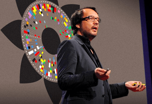
David McCandless is also a public speaker. He spoke about “The beauty of Data Visualization” at Ted Global Event which was based on his book “Information is Beautiful”.
Talk Notes
He started off explaining how we can deal with information overload by using our eyes more for visualizing data so we see trends in patterns which our important and design information in visual way. The data therefore can be used to tell a story and allow us to focus on the important information and can make it cool.
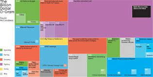
He then went on to show and explain some examples of data visualizations which he used to store data in an appropriate and appealing way such as:
The Billion Dollar o-gram
Mountains out of Molehills (A timeline of global media panic)
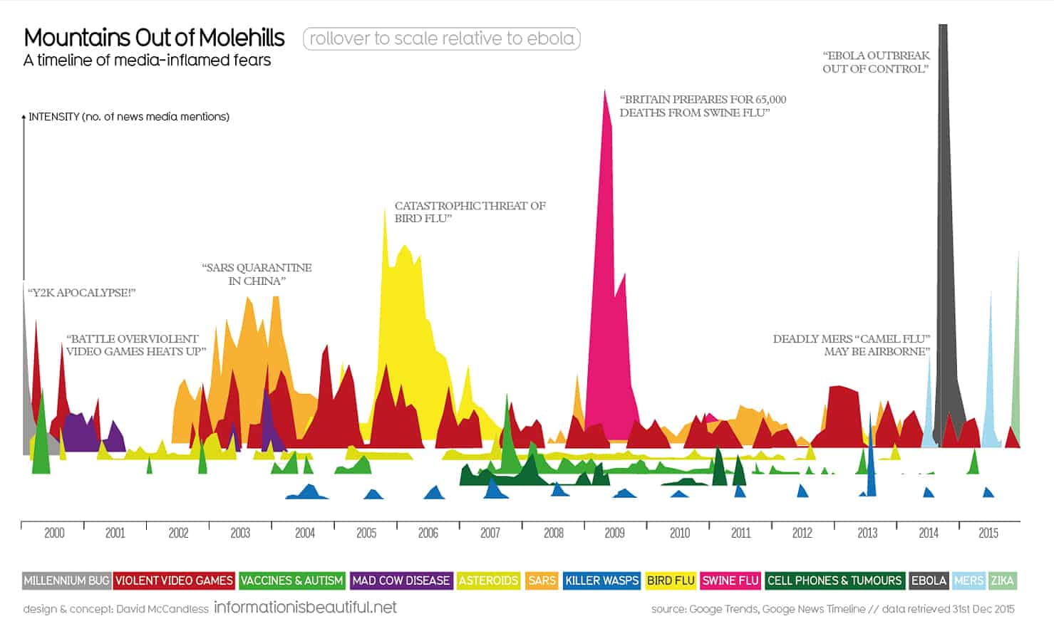
These diagrams show interesting occurring patterns in the data which highlights important information.
One Phrase he hears all the time is “Data is the new Oil” Data can be used to provide innovations and new insights and can found all around us and minded easily. He thinks the metaphor should be adapted to say that “data is the new soil”. Personally, he feels it is like a fertile creative medium. Throughout the years online we have laid down a huge amount of information and data and we irrigate it with network and connectively.
He said it feels like visualizations, infographics, data visualizations are like flowers blooming from this medium. Directly it is just a lot of numbers and disconnected facts. But by working and playing with the data, interesting things can appear as well as revealing different patterns. For example, he showed a diagram with a trend and got the audience guessing before revealing the name. Lee Byron and himself gathered thousand pieces of data in order to display them in visual way based on the data.
He was never designer but through studying and viewing data through his own work and media he felt it came more natural.
You can basically collet data from everything and can spot emerges in information. We are visualizers and using our eyes we can see patterns. He showed us some examples visual appealing data in the world.
The examples has made us consider the data. He expalined importance of using relevant data so that we can see the fuller picture which therefore can change our perspective.
Quote from Hans Rosling once said “Let the dataset change your mindset.” This perhaps could change your behavior. He showed us another example called Snake Oil? Which showed evidence for nutritional supplements” This is a balloon race type of diagram. The higher the data appears on the image the more evidence there is for each supplement and the bubbles correspond to popularity on Google. He went on talk about this in more detail.
He showed a digital data visualization of the political spectrum and breakdown of the data which is of concepts and explores our worldviews.
To summarise he said:
- Design is about solving problems and providing elegant solutions.
- Information design is about solving information problems.
- In Society we have a lot of information provides from the overload of data to the breakdown of trust and reliability or how interest information can be.
- Therefore, visualizing information can give us a quick solution to these problems, as well as making it appealing, provides clarity and better understanding for users to find data which makes data beautiful.
From this talk it helps give a better insight into data visualization and how it is used in our everyday life’s to store data in appropriate manner. Therefore, I feel I have now a better understanding of visualising data as well as looking at examples of David’s work. This will hopefully inspire me and help me come up with ideas when I start designing my own infographics.