
IXD301
Web Portfolio Reflection
Web portfolio Reflection
I thought this was a very successful project. The aim was to make it professional which would hopefully attract potential employers and follow UX designers to my site. Following the feedback from the class I made the necessary changes. After making my improvements I got further feedback from my class. The home screen I used a plain black background to make my text stand out and visually appealing to the user. I made sure the typeface, colour scheme and structure of content were all kept consistent throughout the website following advice received from my lecturer. I agree it enhanced my portfolio site. During the first week our lecturer gave a quick recap of using HTML and CSS which we had learnt in first year and using our knowledge taught us how to use web flow which I thought was extremely useful for this project.
I gathered inspiration and learnt a lot from looking at past student’s portfolios, especially Calum Dixon portfolio as I particularly liked his simplistic layout which I thought was effective. This helped me to create my own site and I certainly took inspiration from his portfolio.
How I could improve my site?
In the future I would like to learn how to add accessibility features and images to my portfolio site, so it is all inclusive for people with various disabilities. For example, people who are visually impaired, I would like to have option to make my text and images larger, clearer, and brighter so they too can access my portfolio site. I would also like to improve the look and feel of my overall site as well as making it responsive with mobile and other devices. This is an area that I would definitely need to work on the adaptability of my site as I worked on the website but need to make sure it is accessible and works on mobile, tablets and other hand held devices.
Elements Project Reflection
Elements Reflection
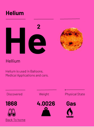
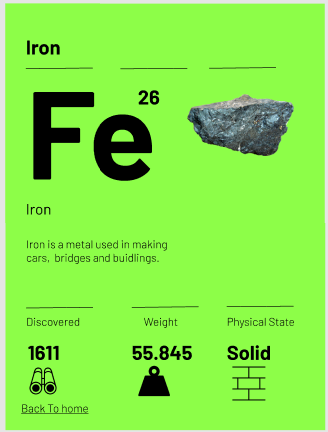
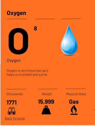
I was pleased with my outcome of the elements project. I felt each page was simplicist and colorful, which would appeal to primary school pupils. The information is displayed in a visual and interesting way. I used clear images to represent each element and cut out the background to make the images stand out on screen as I feel they will appeal to the curiosity of primary school pupils. I used language which I felt primary school pupils would understand. The Icons and facts represented at bottom of each page is clear and very eye catching which appealed to primary school pupils.
The research I gathered from my survey of primary school pupils really helped me to see what their understanding was of the elements in the periodic table. It gave me a great basis to start this project and allowed me to cater to their needs. I choose to design it for an IPad as from research I realized most pupils use them in primary school.
How I could improve?
Possibly I would like to draw out my own images of the elements and to create my own Icon set instead of getting images from the internet.
I would like to have shared the elements project with the same primary pupils I done the questionnaire with and receive some feedback on:
- What have they learned?
- Did they find it easy to use?
- Did they find it interesting?
- Was it engaging?
Using the feedback from the pupils I would make further improvements to elements project taking on board their thoughts and opinions.
Updated Elements Project Porotype
Improvements
Following the feedback I received in Week 11 I made some improvements/changes to my original porotype design. Firstly I tried spacing out information to make it clearer. Then I tried to align my content and removing background images on my photos according to make it more professional looking as suggested by another class member. I also redrew the lines as they looked a little faded. I also decided to add an Icon set which Kyle suggested. Finally I wanted to make sure the content was linked properly meaning the user could click on a specific element and it would take them to that one. Same with when click back to the home it will take them straight back.
Final Elements Project screens
Below you’ll see the final version of my Elements Project


Elements Project Branding Sketch
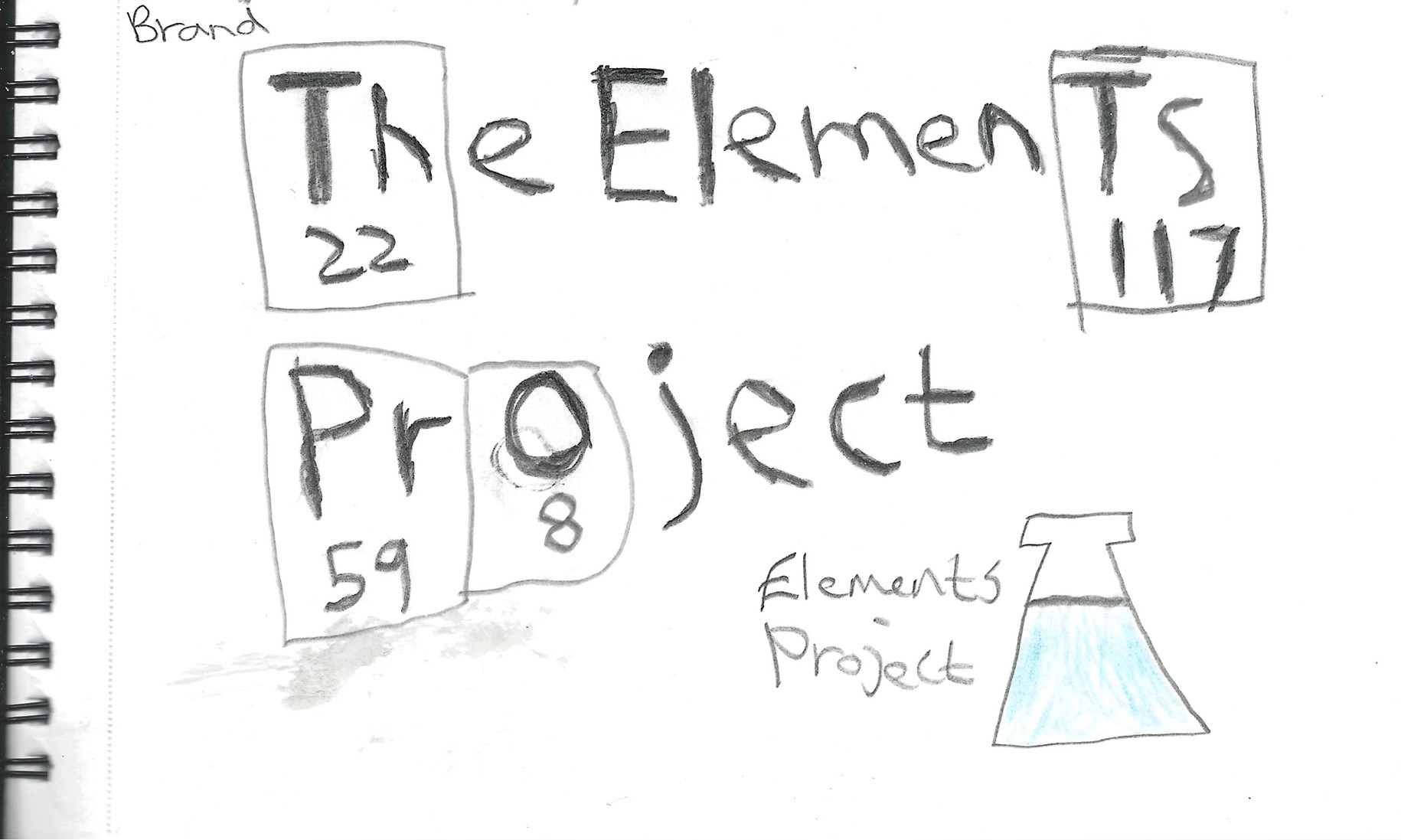
For my elements project brand I wanted to keep it simple by effective. It was important my brand which would fit well with my prototype design. I looked up elements of the periodic table in alphabetic order and used the elements which represented different letters and their number to come up with my sketch. On Figma I will choose the typeface and colours to make it nice. on my notebook I drew a little visual marque beside it but wasn’t sure if I was gone to use it.
IXD301-Elements Project Sketches
Original Sketches
For my elements project I wanted to create a game that would appeal to young children to help them learn about different elements from the periodic table. I started off coming up with a number of sketches as part of the intital development phase.

This first sketch is my original idea. I was initially thinking of creating a connect 4 game but for the elements of the periodic table. So basically you had to match 4 elements from the same group in order to win. You could play against friends or against the computer. That was one of my ideas but I felt it may be complicated if you didn’t know the elements and plus it may look quite squashed. I also wasn’t sure how I could develop this into a prototype.

The second sketches I produced was a further development of the original one. I thought it will be simpler and would make more sense. So basically the user had to click any 2 elements from the grid to see what compound they could create. The next screen on this page showed what the user could expect to see once they click on the 2 elements. Basically it would say You have just made carbon Dioxide. Then it would have a small description about this element as well as a back button take them back to the first screen. I was also thinking of adding a test table as a visual effect.
Final Sketches


After receiving feedback from Kyle on my original sketches I changed my design. We agreed that it will best to focus on the structure and choosing an appropriate typeface along with colour. For example the home page would the title, followed by a sentence and then 6 elements all neatly laid out. Once the user clicked on a particular element they will be taken to a particular page which will show the element name, image, as well as 3 facts and tell them what the element is used in or for. I felt this was more clearer approach and allowed for better understanding to help the children learn about 6 different elements. I thought to myself some of the best designs are simple but effective. When I design this prototype I will make sure it is interesting and eye catching. This will not be complicated but quite fun and useful for children.
Research-What is Content Strategy?
I found an interesting article online which went into depth of what a content strategy is, why it is important, and the steps needed to create a perfect a content strategy. It also shows some examples to give inspiration. This was an article which was originally published in September 2018 and has since been edited.
Content Strategy is plan in which you use content (audio, visual, and/or written) to achieve a goal. By creating a successful content strategy this will attract your specific target audience and keep them engaged.
It’s important to implement your content strategy and focus on specific goals to increase more people accessing my websites, socials, and products. By producing a high-quality content strategy at the start of any project this help you succeed in the long run.
Content strategy is very important and key to user journeys and will help you compete with others.
What to consider when Developing a Content Strategy
- Decide who the main target audience will be as the content should be catered towards them. By using different social media platforms this will help deliver the content which meets everyone’s need.
- Figure out what problem you are looking to solve. The product or service should identify the user’s problem and help users them come to solution by overcoming challenges.
- What’s make your product unique in comparison with your competitors. It’s important to stand out from the crowd to prove they should listen to you.
- Figure out what formats to focus on by meeting with your audience
- Choose the channels you want to share your content on to reach your audience. For example, if decide to go for Instagram you’ll be targeting a younger age group.
- Carefully manage how you will create and publish your content. Its important to establish: Where it’s being published.
7 steps needed to create a content strategy Framework
- Start off with Defining your goal.
- Conduct user persona research
- Run a content audit
- Choose a content management
- Determine what type of content you want to create
- Brainstorm content ideas
- Lastly Publish and manage your content
Types of media where you can publish your content:
- Blogs posts
- Social media platforms such as Facebook, Instagram, Twitter
- YouTube
- Websites
- Podcasts
Reflection
I thought this was an interesting article to read. I liked the fact it had steps which were easy to follow. This article starts off from building the foundation of your content strategy to techniques and to tools which can be used to better manage a content strategy. No matter if you’re starting from scratch or revising your content strategy plan this is the article for you. This will help you become more innovated and engaging to your target audience.
Book Research- Learning Responsive Web Design
Learning Responsive Web design was written by Clarissa Peterson in 2014
This book is a beginner’s guide to help UX designers and students learn the basics how to code a responsive website. It provides readers with helpful techniques for using HTML language and CSS coding to design a website which will provide a good user’s web experience. This book shows how you create a responsive web design across multiple screens on different devices. Throughout this book you’ll also learn how to handle elements such as image, typography, navigation and how to structure content on the site.
It’s a perfect book for web developers who have little or no experience of responsive web sites. The book has a clear layout with a very simple understanding. It’s a fantastic book to read I highly recommend it. It’s a great starting foundation for building a good responsive web site as it covers all the basics you need to. I really enjoyed this read and thought it was the most useful book. As one of my projects involved creating a portfolio site this book was very helpful and taught me a lot about web design which helped me gain a better understanding of Webflow.
I look forward to reading more books which are similar to this.

Purple Cow- Book Research
Book Review

This book was written by Seth Godin. Purple cow explains why coming up with an original product idea and advertising doesn’t quite meet the needs of users nowadays. In this book the author Seth explains how you can build a fantastic product that makes people want to share and enjoy it, in order to help you become successful in today’s world.
My favourite quote from his book I liked was:

3 lessons I learned from this book is:
- The best form of advertising you could do is word of mouth
- The importance of taking risks
- Start to focus on communicating to people about your product and expected outcome if u want your product to succeed.
Reflection
I feel there is a lot of good points to take away from this book by Seth Godin. It has inspired me to give it my all-in projects and course and hopefully be able to produce something great.
Although this book was written in 2003, it is still very popular today. Many University students read this book by Seth Godin for inspiration and advice. I would highly recommend any young person or adult to read this book as it’s a great read. It will give them a lot of helpful tips which they could use to become more successful. I’m sure there is a lot more great books out there by Seth which I will need to explore
User Scenarios and User Personas
Based on answers from my questionnaire, I created 2 user personas and user scenarios for 2 pupils in my mums primary school. I googled templates to help layout out the design and so I know what to include.

I started off with basic info, their interests followed by frustrations and goals.

I followed the same lay out and structure for Frank.
