
The Story so Far
This week Kyle gave us some feedback on our element projects so far.
I showed him my project so far, as well as my brand guidelines and design system.
From this, I got some really great feedback that will help me progress and improve my project.
I had a couple of different ideas for different things, as well as a few different typefaces for the game title, and I showed all of these to Kyle to get his opinion on them.
I have also included the different versions of these ideas in this post.
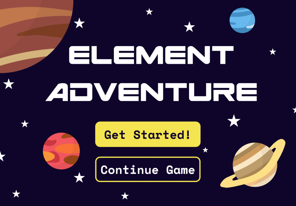
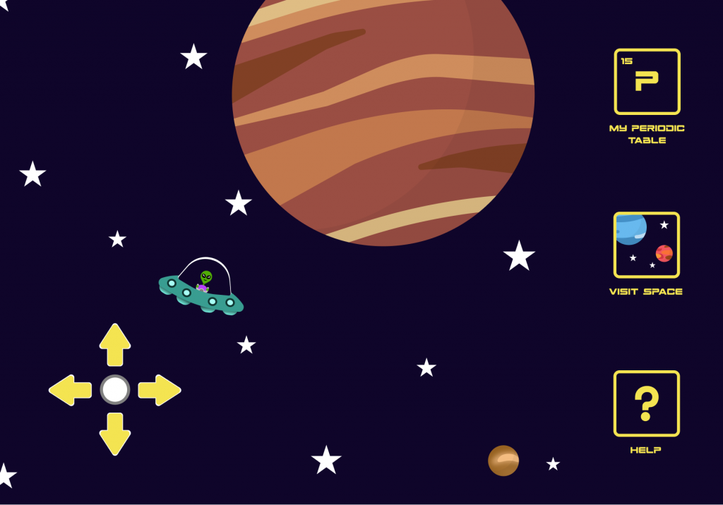
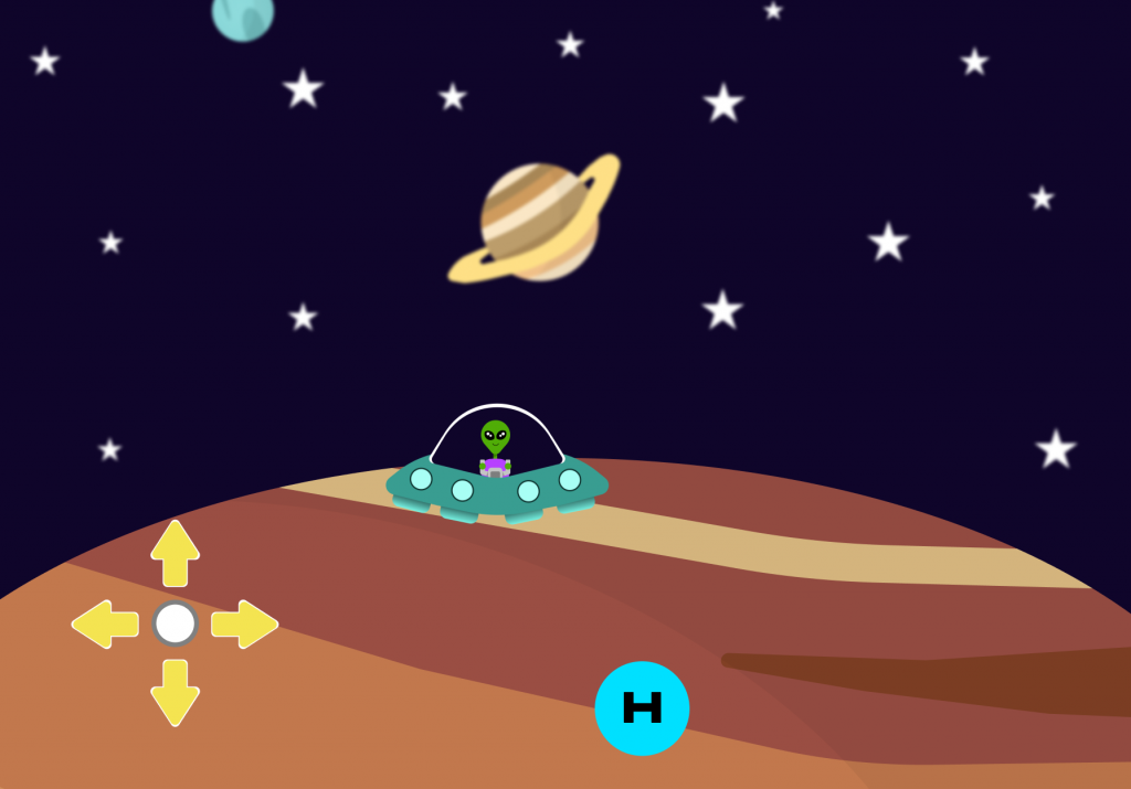
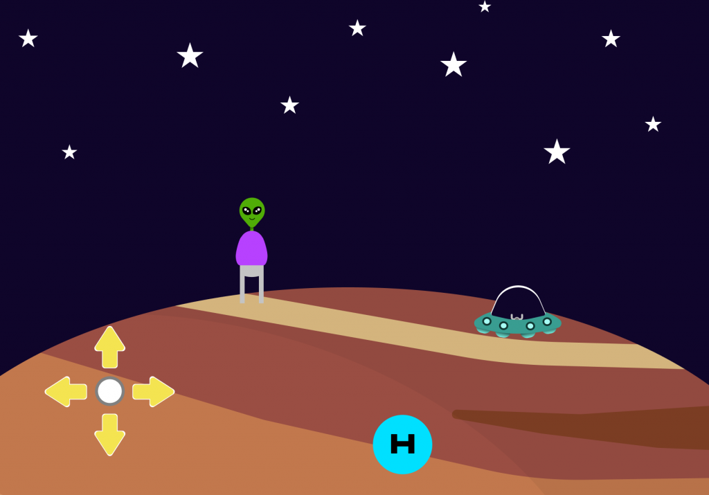
Here are my Initial Screens:
Start / Log-in
Exploring Space in a Rocket (Option 1)

Exploring Space in a UFO (Option 2)
Landing on Planet in UFO (Option 1)
Landing on Planet out of UFO (OPTION 2)
Completed Table (Option 1)
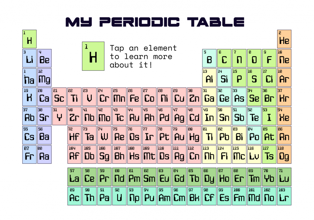
Incomplete Table (Option 1)

Completed Table (Option 2)
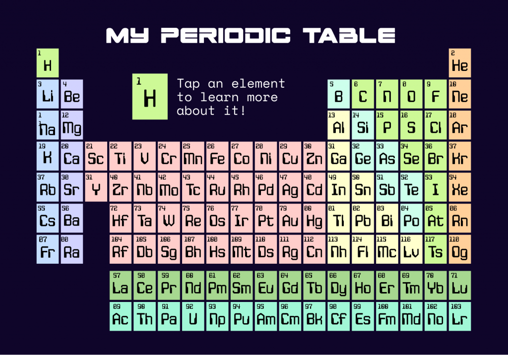
Incomplete Table (Option 2)
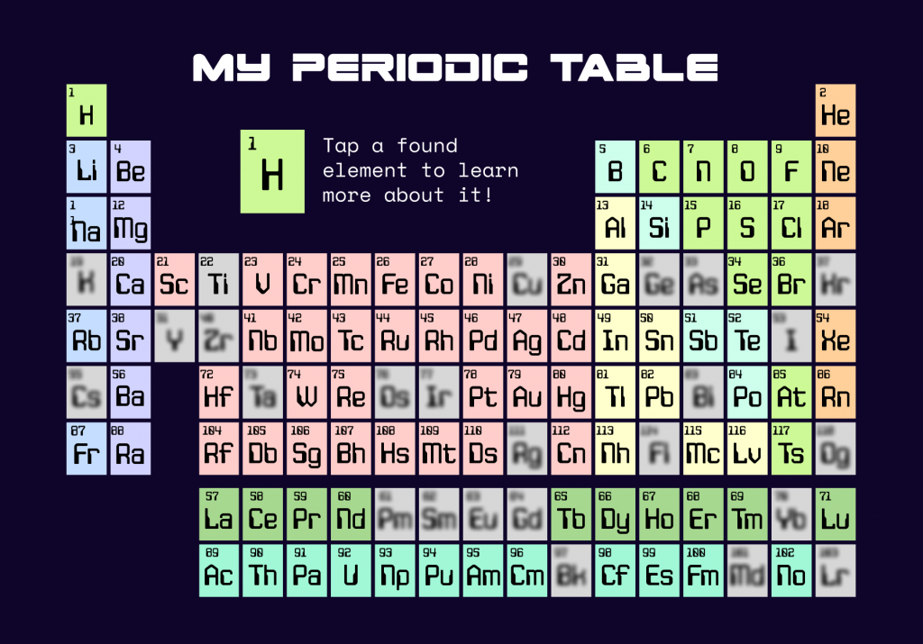
Kyle gave me lots of valuable feedback. This included that I should blow up the periodic table and make it scrollable across the screen. This would not only make the text larger and more readable, but also make this screen more interactive. He also suggested that I include more of the fun space theme into the background of this screen so that it’s consistent. Then also to strip back the colour coding for the chemical groups since a young child may not understand how this works anyway – so it could be easier for them to digest if it were all one colour.
As well as this screen, Kyle suggested that I make the element, that you find on the planet, appear in a more fun way. He said I could turn it into a balloon perhaps, instead of just a plain circle. This would be more eye-catching to a child, and make them more likely to want to actually navigate over to it and tap on it. Then perhaps make it pulse or glow when the alien is hovering over the element, so that it is clear that the found item is also an interactive element.
I will also think about all of this advice while making the rest of my screens.