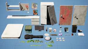
Props:


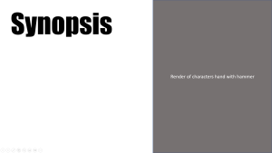
Final Render: Whats Left:
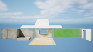
Props:
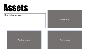
Final Render: Whats Left:
To research for my poster design I looked at movie which shared a similar theme to my major project. The concept of my project is a man trying find peace within grief and violence. While the themes of the project are post apocalyptic, revenge and vengeance. So I looked at movies such as The nightingale, Prisoners, Django Unchained and The last of us part 2, which my major project is heavily inspired by. After looking at some of these movie posters I started to put together some rough designs using the curved based systems. The first poster features a hammer in the centre covered in some blood using a negative space style. The hammer is used in my project as one of the murder weapons. The second design features the main characters eyes covering the bottom half of the poster, in an attempt to convey an emotion state. This is to give the viewer a better idea of the tone of the project. The third design is a bit more graphic as it features the character Vivian’s death. Within the story she is killed by blunt force with a hammer to the head. The poster would then be a half and half style with Vivian’s face covering the right side. I think this gives a much more powerful impact on the viewer.
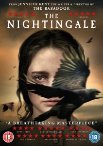


I met with Alec to receive some feedback on my poster and business cards. He felt the font needed to be bolder and stronger to help fit with the theme. The word ‘Left’ should be aligned with ‘whats’ to help give a stronger impact. Having ‘left’ not aligned gives the font a more softer feel. It would also help if I added a subtle shadow or vignette around the edge of the poster, just so it wasn’t just a block colour. My name should also be a bigger font to fit with the title and I needed to experiment a bit with the placement of all of the text. Another improvement was the hammer itself. At first it took Alec a second to realise it was a hammer, when it should be an instant connection. To help with this I needed to try a few different angles with the hammer or add certain highlights to emphasise the shape more. With the business card all of the text on the front needed to be aligned to line up with each other. The art station link also needed to be moved up slightly as it was to close to the bottom. On the back of the card Alec thought it was a better idea to move the QR code either to the left or the right side as it was blocking too much of the environment behind it, which I agree with.


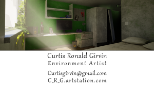

I also met with Henry to get his feedback on my designs. Firstly with the poster he shared the same concern with Alec about the readability of the hammer. He suggested that I create a second poster with a close up render of the main characters hand holding the hammer with a blurred background. He told me to use the ‘Logan’ movie poster as inspiration. He also thought it would be better to use a more ‘blocky’ font and maybe even include a texture to create more of an impact and fit with the theme of the animation. When I tried this I realised it was too close to the title font of The Last of us, so I decided to not use a texture. For the business card he didn’t like the use of the white spaces so he suggest using only one of the rendered environments to fill the entirety of the back of the card. The front of the card should then match with the green wall within the environment to keep a more consistent look. Also to help with this the font on the card should match with the poster and across all my materials. To help create a better presentation of the text on the front Henry suggested I use the ruler tool within photoshop to keep everything aligned correctly. The front of the card would now also include the QR and my phone number.


I started by taking my previous C.V I created for second year of uni and comparing them to other environment artist C.V’s I could find online. I removed the symbols as I think it looks more professional having them listed. I also moved my name, role and contact information to the top of the C.V as I think it creates a better layout. I decided I didn’t like the use of purple and I wanted to keep it more simplistic. I also showed my previous C.V to Henry and he suggested to add more information and again to keep the font consistent with my poster and business card. I think the updated C.V stills needs a bit of a rework but is in a better state than my previous C.V.