Category: Initial Drawings

Graphic Design- Typography Book

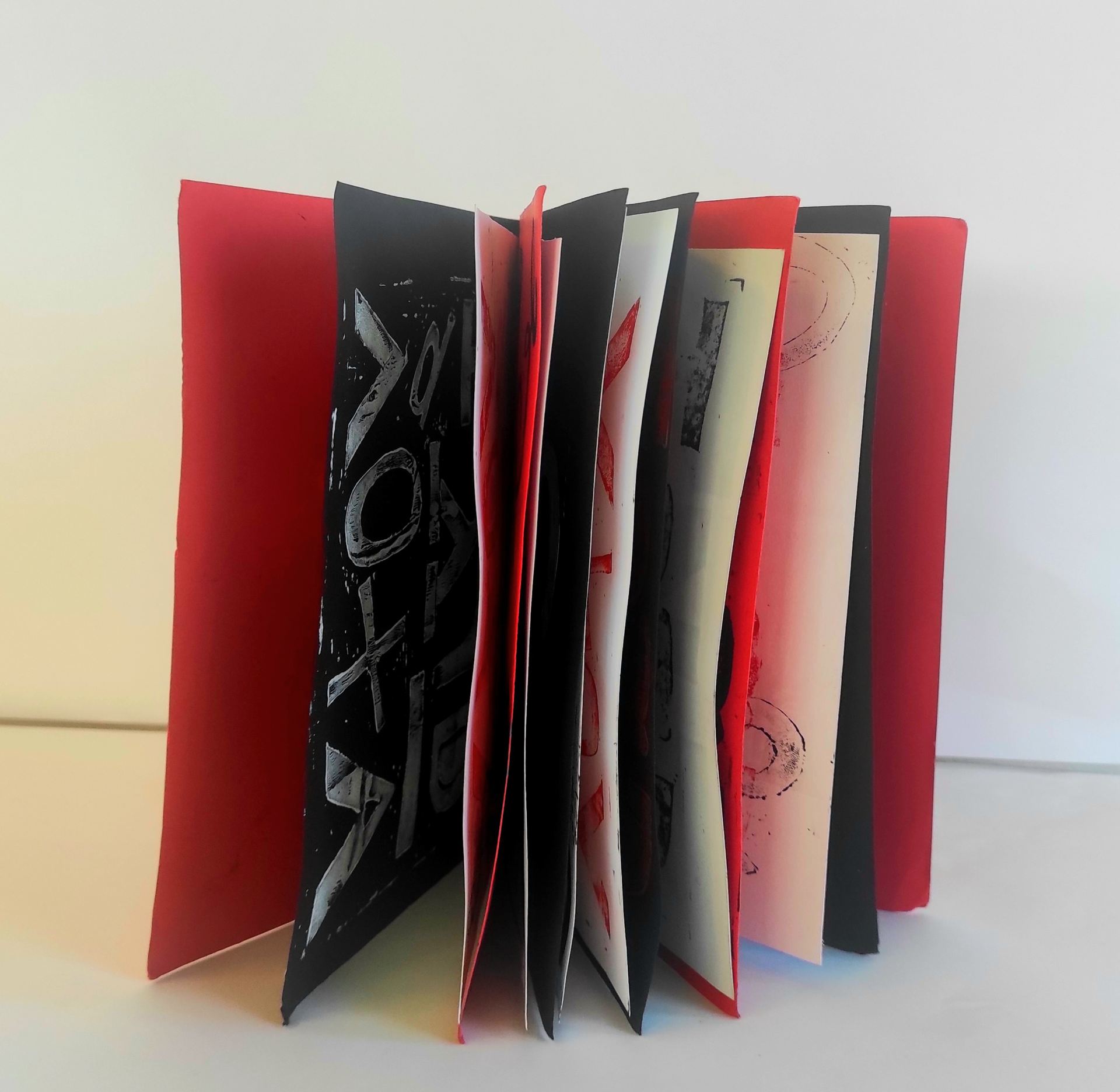
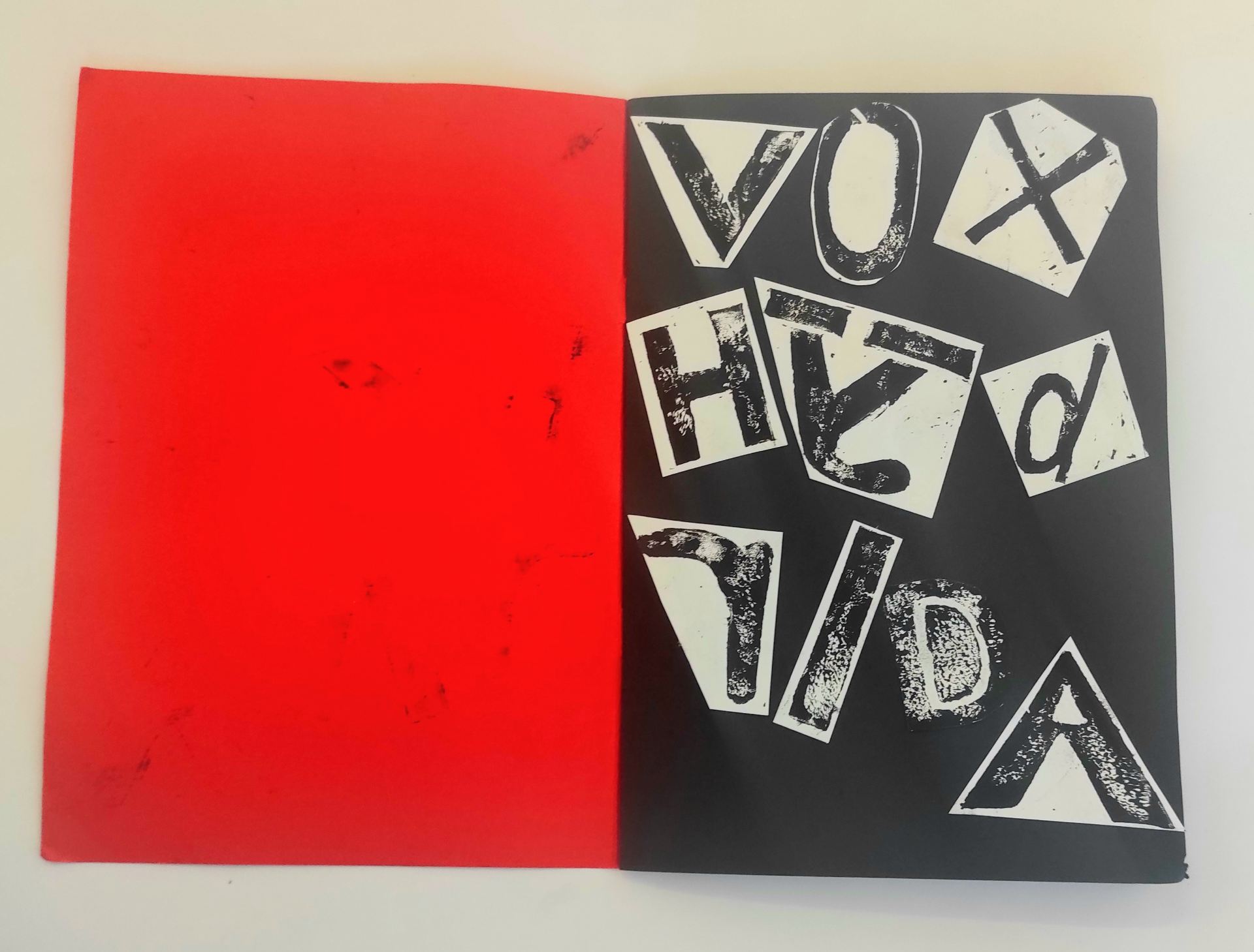
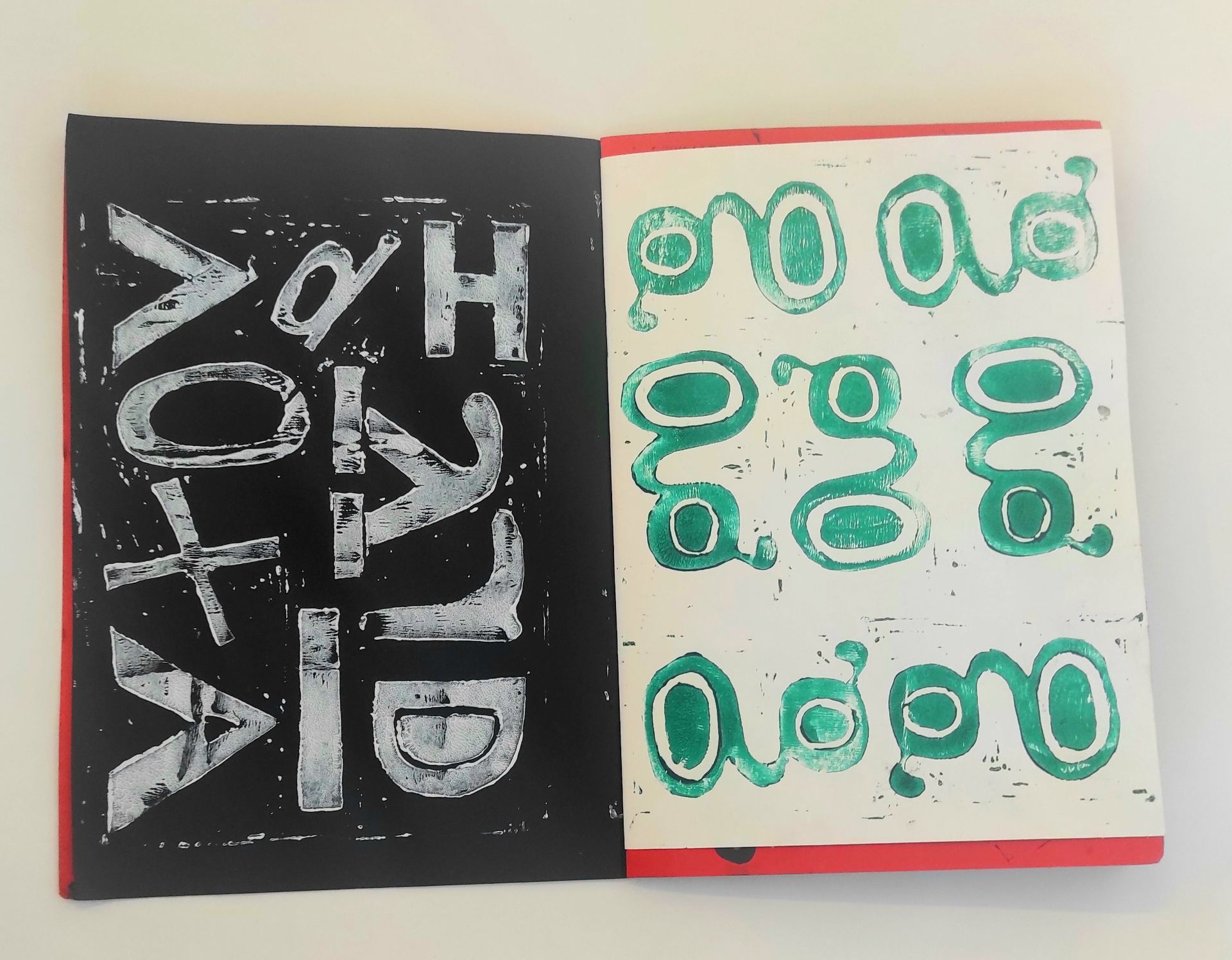
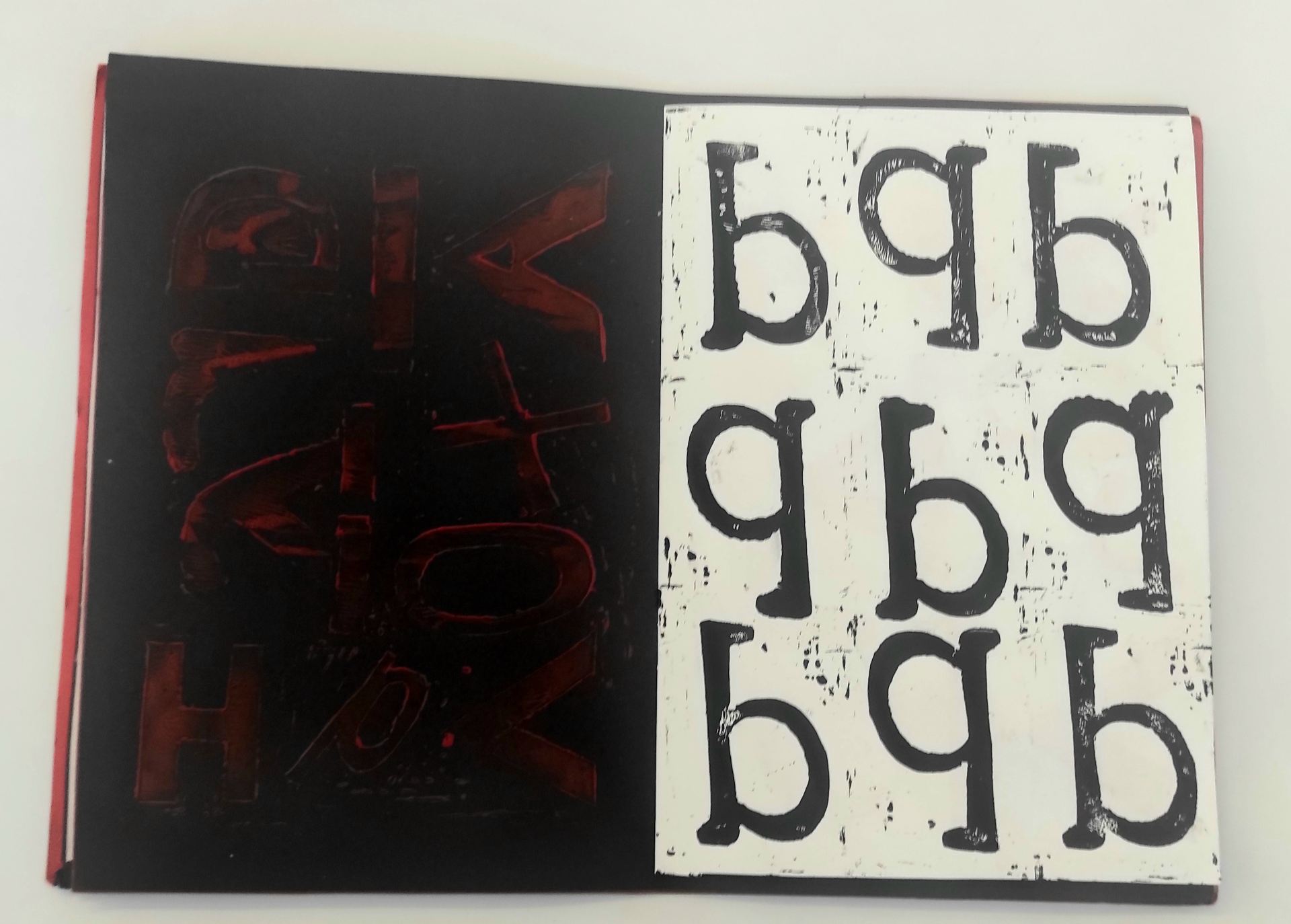
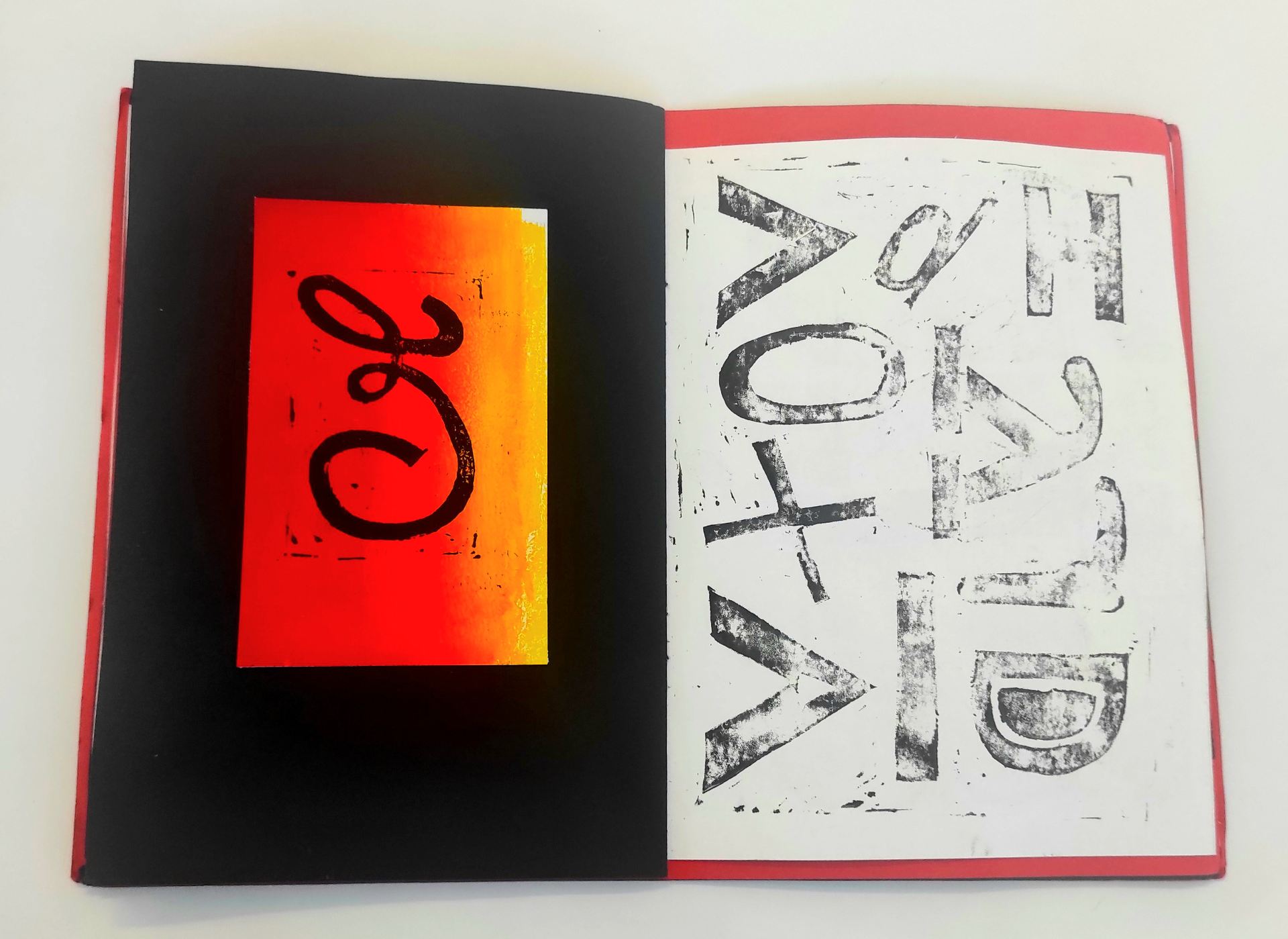
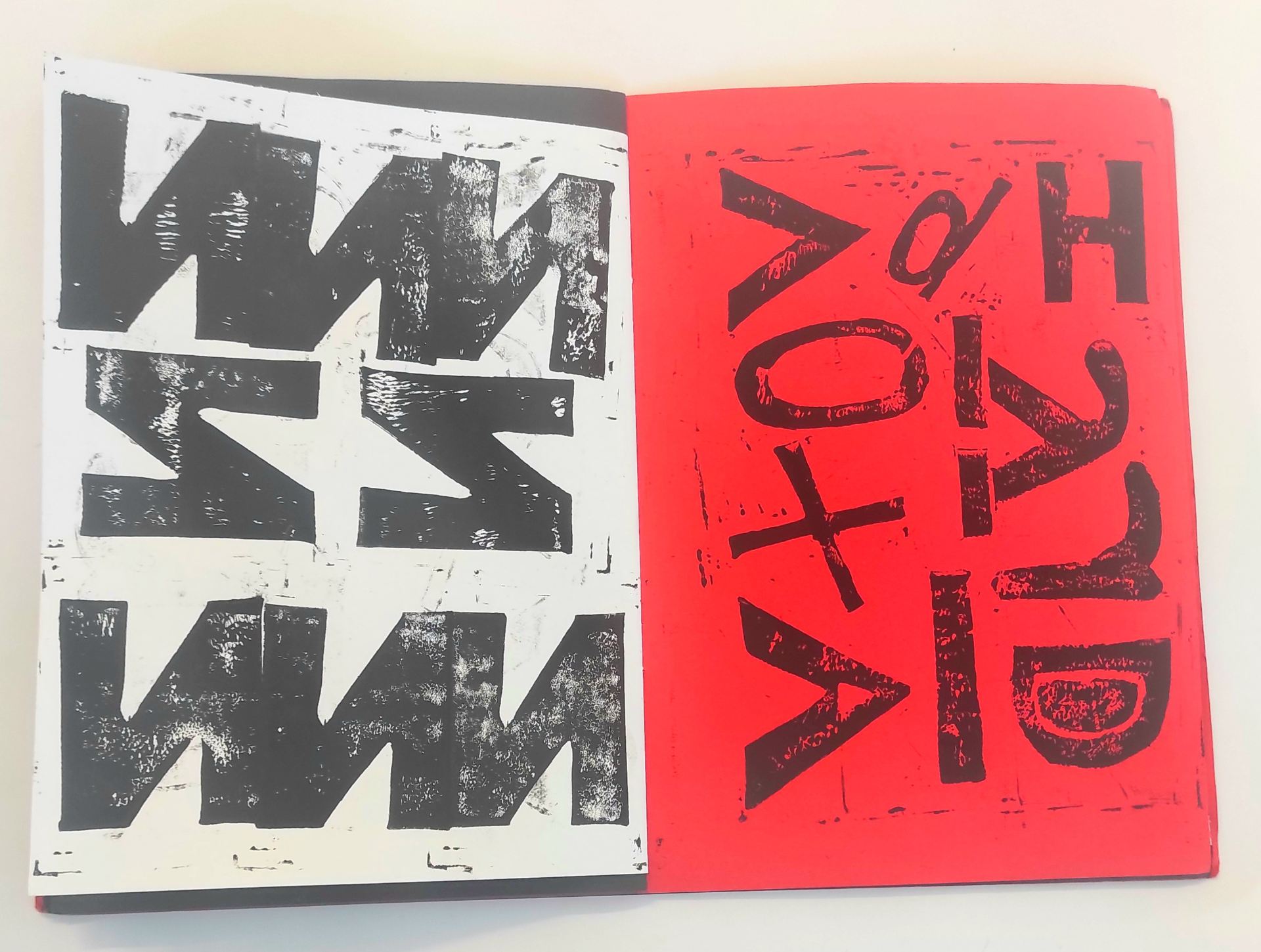
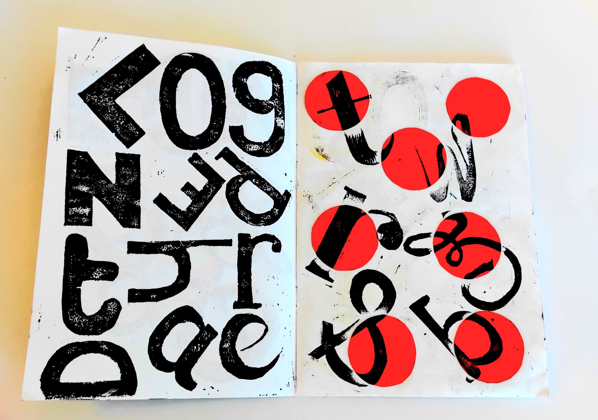
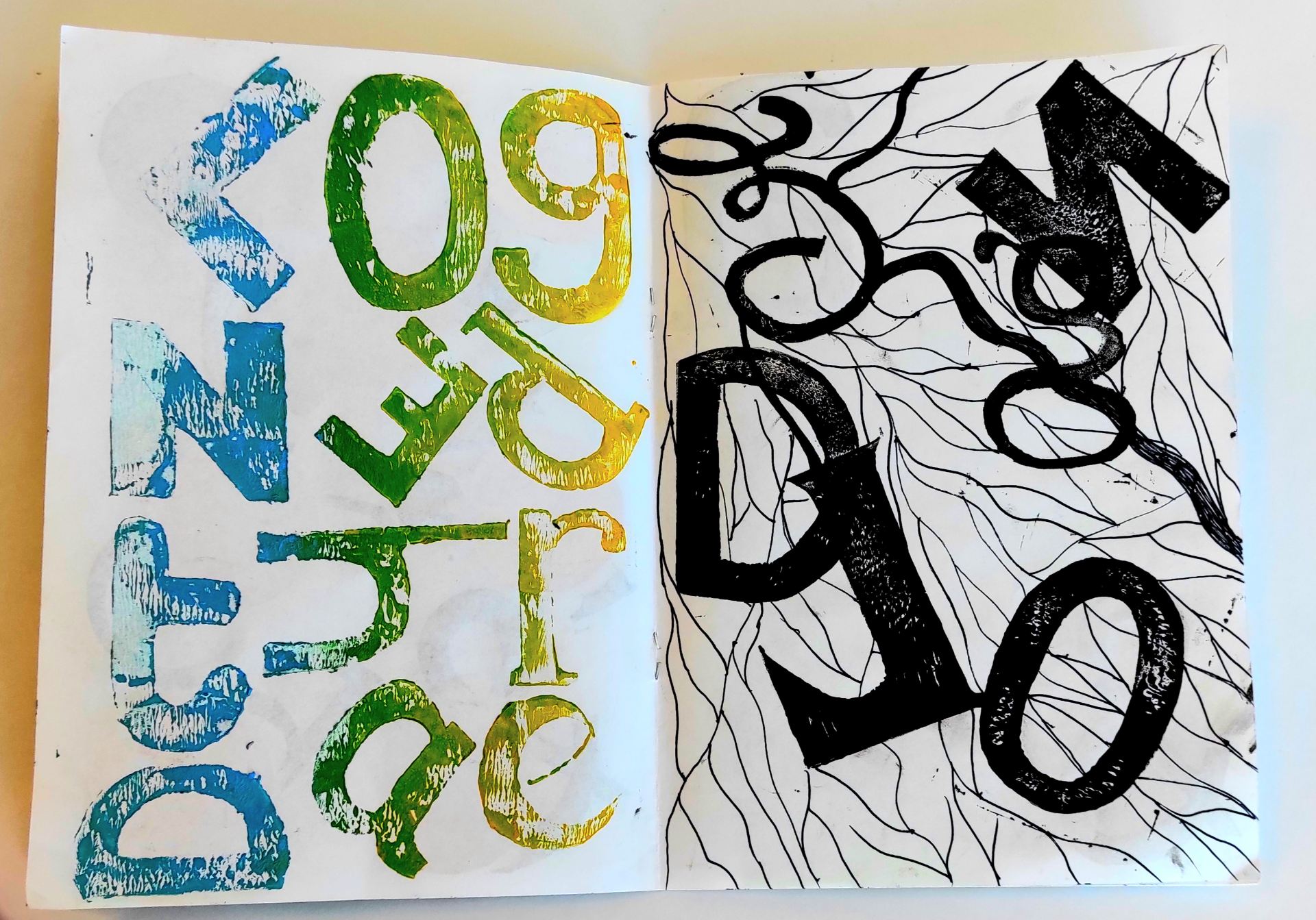
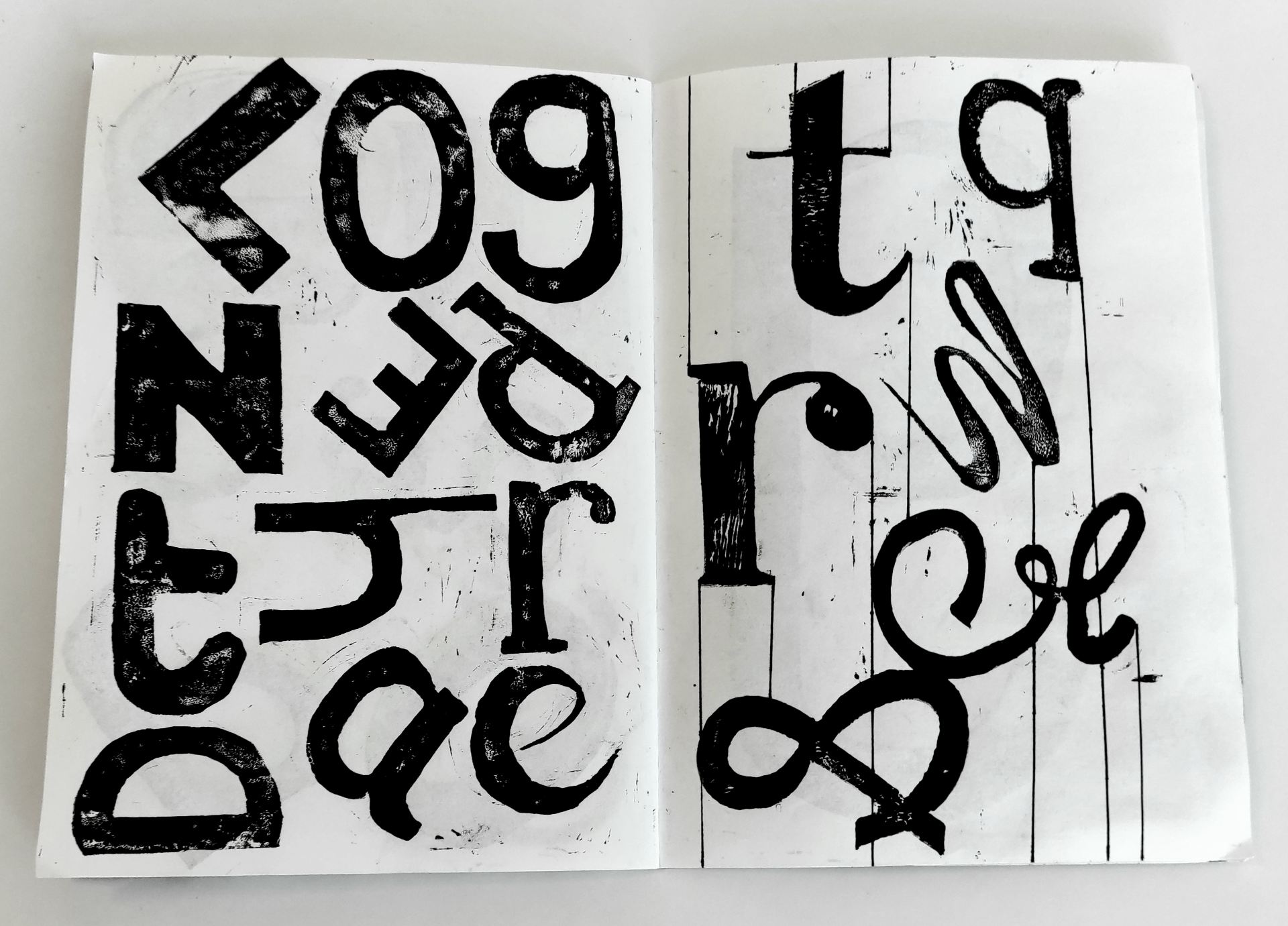
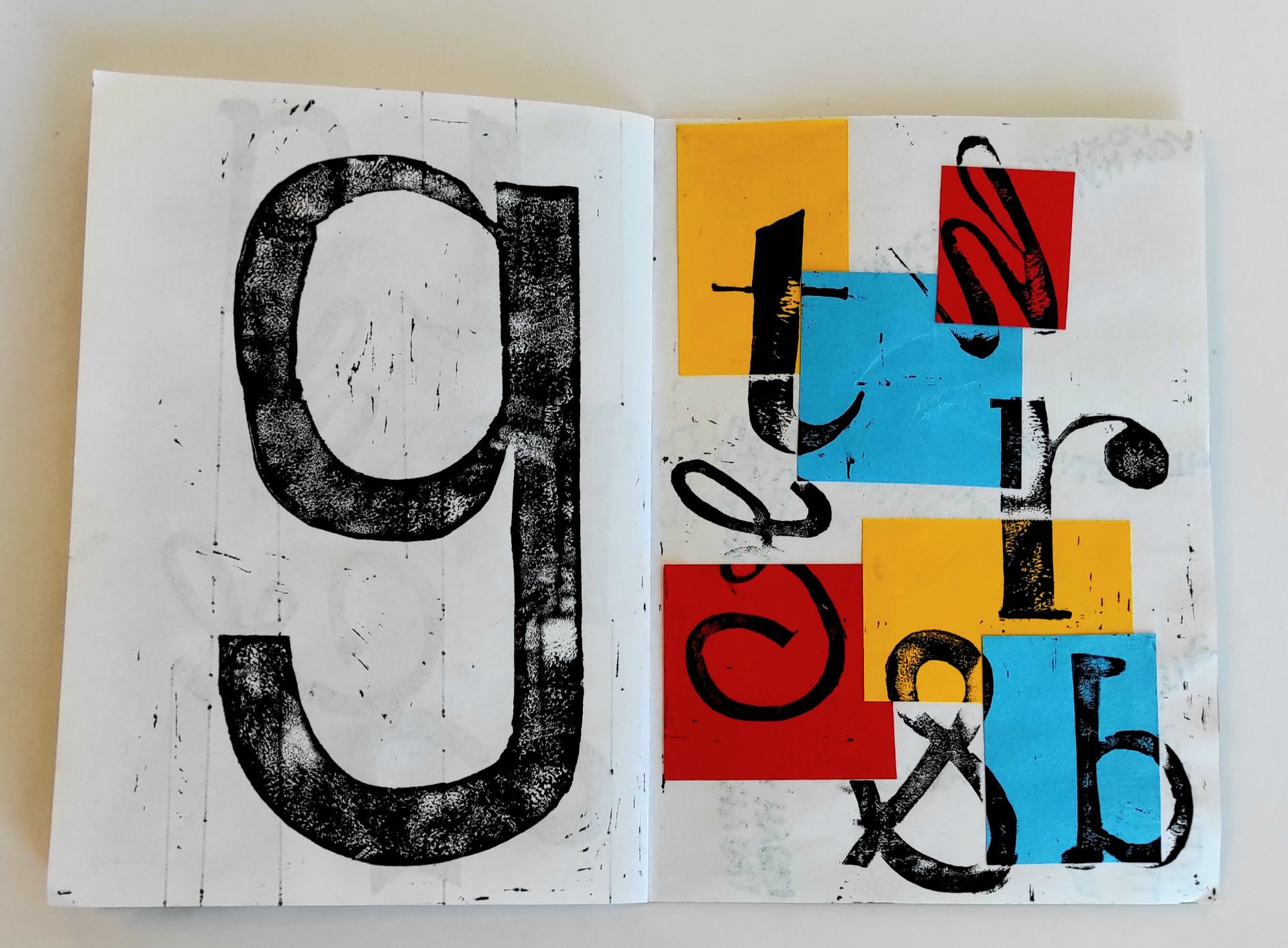
Here is another experimental typography Book, again using a lino printing technique. As you can see i have went for a bold colour scheme, as I’ve found that bold colours really enhance the details within a lino print. I have attempted to experiment with creating patterns, especially repeat patterns. I had also taken consideration of other techniques to create more abstract ideas that include: composition, scale, negative space, colour and collage. My aim was to create a series of prints using a variety of colours and with any excess paint or ink i rolled onto a separate page to craete a nice textured background.

Graphic Design- Typography Book

Here is a hand-made typography book that was based on my chosen exhibition which is the Golden Thread Gallery. This book contains experimental lettering designs using lino print. On each page it either represents the main key words of the exhibition which are: The Golden Thread Gallery and Vox Hybrida. I’ve also attempted to experiment with various colours of paper to create abstract shapes and then print ontop. Personally I’ve found that creating smaller books works a lot better as i was able to gradually add more designs and ideas. I also like how these book are a great size to work with as it’s much easier, comparing to working on a larger scale.

Graphic Design- Artist/Designer Research

Max Bill- artist research

Graphic Design- Logo Ideas

Here i’ve created a series of ideas for the live logo competition. I’ve attempted to use a variety of medias including: lino print, marker, chalk pens and paint markers. I gathered inspioration from a few books which were (Decoding Logos, Why we design and Logo) I found that researching through books really enhanced my ideas and trying to focus on how to make them creative and meaningful at the same time. There are not many in colour as i preferred to experiment more in black and white first before experimenting with colour. So far there are only a few that stand out, as my next stage i will begin to finalise my chosen logo.

Graphic Design- Sketchbook Images

These are first-hand images that are presented in my sktchbook which are based on the four Exhibitions i had visted such as the: Cataylst Arts Exhibition, The Mac Gallery, The Golden Thread Gallery and Belfast Exposed. I’ve found that having images presented in my sketchbook is beneficial especially when trying to work on ideas for this project.

Catalyst Arts Exhibition- Observation Sketches

This was another very minimal exhibition based on Catalystr Arts. This was a very spacious area which is an element that i took into consideration when it came to the observation sketches. The main elements that I found interesting was that there was no colour used at all and also the shapes, which is something that would work well within this project.

Belfast Exposed Gallery- Observation Sketches

Another Art Exhibition thats based on Belfast Exposed Gallery. Again, including a sketch of the space around the art work and i’ve sketched out the main areas that i found interesting. I’ve found that this Exhibiton was very minimal with there colour, but i really like the abstract pieces and those with great textures.

Golden Thread Gallery- Observation Sketches

Here are a few other observation sketches based on The Golden Thread Gallery. i’ve also included a sketch showing the space surrounding the area, which is a main focus on this inspiring Typograpghy piece. I’ve incorporated a range of other sketches that include different textures, shapes, colour and typographic lettering. I plan on choosing this exhibiton to work on throughout this project.


Mac Gallery- Observation sketches

Here are a few observation sketches based on the space surrounding the art work and the art work itself. I collected a variety of ideas including: colour, scale, shape, form and pattern, which i could then incorporate into my work.

Exhibition- Catalyst Arts Gallery

Here is another exhibition visit to the Catalyst Arts Gallery. This exhibition was based on “Ornaments Of Prospect” The contrast between the shapes and colour is very strong, I think that these would work really well as pattern ideas to incorporate in my experimental typography pieces.