Now that I have settled on a topic for my infographic, and have a good idea of what I want and don’t want; it is time to do some data research.
Since the Earth is over 4 billion years old, a lot of significant events have happened between then and now. Since I did not want to overcomplicate, I tried to restrict the number of events to around 15 for my infographic. It was not easy for me to choose one event and rank it over another, the history of Earth is so fascinating that there are over 100s of interesting facts I wish I can share in my infographic.
The first thing was to figure out how many Eons there were in ecological time and how long each Eon was. The reason I used Eons as a time measurement is that they are the longest portions of geologic time compared to eras and periods;
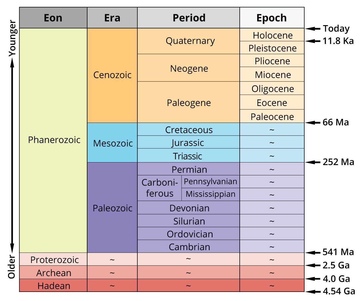
With Eons as the time measurement, since they are the longest measurement of time, there are only 4 Eons so far. Thus, when translated into a timeline it will make my infographic a lot more simplified and easier to read rather than having to squeeze a bunch of different periods and period names into my timeline.
I did consider using a mixture of Eons and Era at first, my idea was to have my timeline go from – Hadean, Archean, Proterozoic, palaeozoic, Mesozoic and Cenozoic. This is reflected in my research notes;
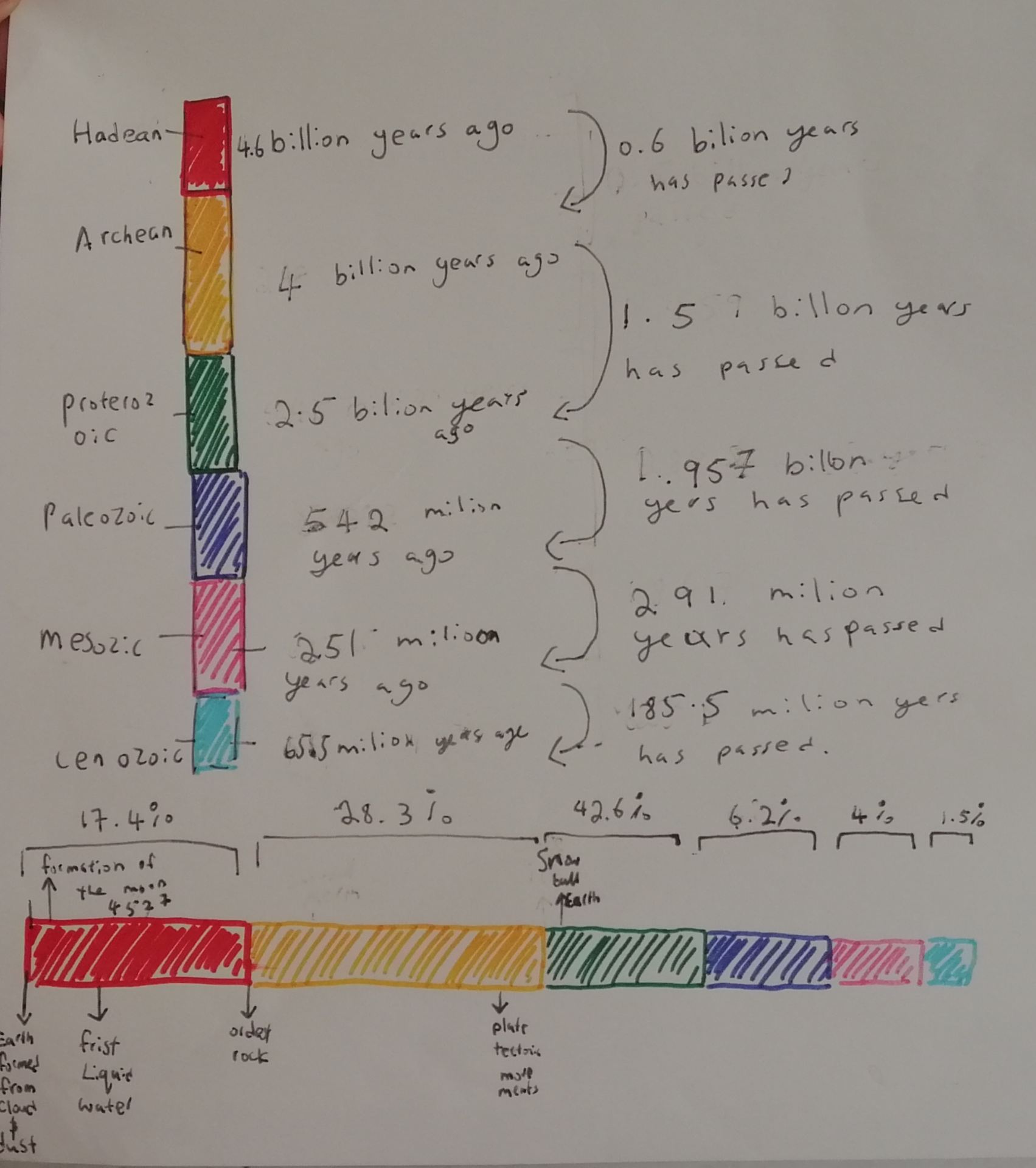
( each eon/era length of time is not accurate to scale)
When I did the research on how long each Eon/Eras are, I realised that palaeozoic(6.2%), Mesozoic(4%) and Cenozoic(1.5%) timelines are too short in comparison to the whole ecological timeline. Since I want to have my timeline to have an accurate scale according to the length of time passed ( such as 1cm on paper is 1000 years). I’m planning to colour code each time period in my infographic, if I included palaeozoic, Mesozoic and Cenozoic separately, they would be too small to see in comparison. Thus I just decided to go with the 4 Eons instead of a mixture.
When I gathered all my information for my timeline, I summarized them;

Putting together the timeline took a very long time, as I soon realised that a lot of sources don’t agree with each other on when a particular event happened. This is only natural, as history goes back so far, on some events, there are only theories of when it happened, and there is a lot of contradicting evidence. This made my work very difficult, as some sources state events to have happened 1 billion years earlier than another source, and it was very hard to know who to trust. Thus, the only solution I have is to read as many sources as possible, usually, there is a middle ground.
(If you did like to check out my sources, I’ll put the link at the end of this blog)
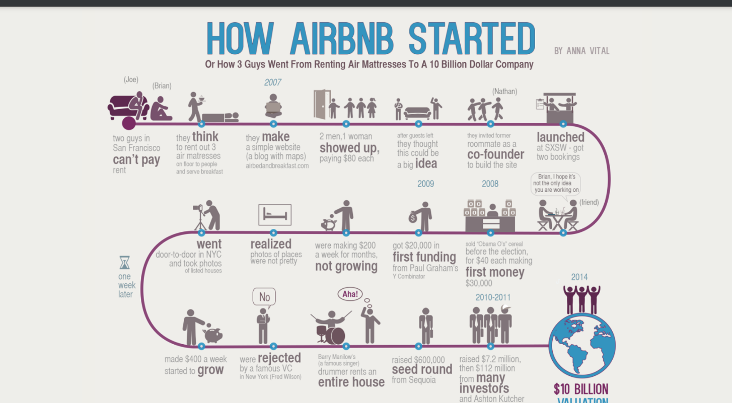
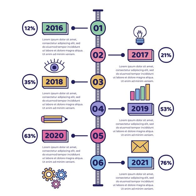
Now that I have gathered all my sources, I can get started on designing my own timeline infographic. I had a look back through all the timeline infographics that I liked such as;


and I drew a few mock designs on paper;

I liked the 2 idea (middle on the top) and the 5th idea ( right on the bottom ) the best. I like the layout of the 5th idea, but as a personal preference, I prefer timelines when they are vertical like the 2nd idea because for me it’s easier to read.
I think I will do a vertical timeline like the 2nd idea, but I defiantly need to add more elements to it such as a pie chart or graph. I don’t think just having a timeline is very appealing, it would make the graph seem a bit empty. The plan, for now, is to get started, once I finish my vertical timeline, I can decide what is appropriate to add in.