One of the last things I need to do before putting together my user interface in Figma is to have a set of icons.
Before starting the design of my icons, I needed to do a little research in order to decide what styles of icons I should go for
The frist place I looked was the Figma community, I like all the icons samples that I see, but most of them was a little too simplest for me (won’t fit my illustration style);

I did find one set of icons that I liked on Figam, it was called “doodle icons” and it fitted in with what I was looking for in terms of that hand-drawn quality, I even customised one of the icons to see what it would look like in colour;


Overall even though I really liked this set of icons, it just didn’t seem very exciting. Thus I turned my attention to an online source. Through research, I actually found a really good tool called flaticon.com, and it was very usual in explaining to me all the different coomon types of icons;
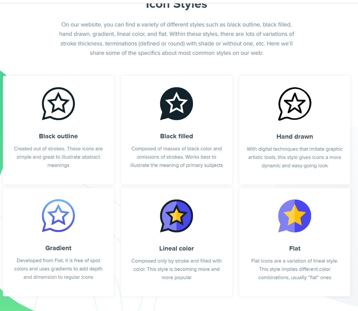
From the first look, I know that my icons will have a black outline/blue outline to match my illustrations. I think a slight gradient may suit my icons nicely as my illustration background is a gradient. The only one that I didn’t really understand the is “hand-drawn” explanation, I don’t see how it differs from the rest, but I understand what it is saying.
At the moment I have yet to decide whether I want my icons to be flat or more 3D, I remember seeing a set of icons in my teacher paul’s lecture and really loving the style;

Although at first look I thought it was a flat icon, now I would actually say it’s mixed. Even though it is leaning towards more flat, I can see the strokes of white highlight on certain icons.
I like this icon set a lot because it’s exactly how I want my icons to feel like, with simple and clean lines yet very playful and fun at the same time.
Back to flaticon.com, even though to own the download the icons you need to have a membership, it is actually a very good sight to just search for the latest icon trends and look for inspiration. Here are some of the icons That I really liked;
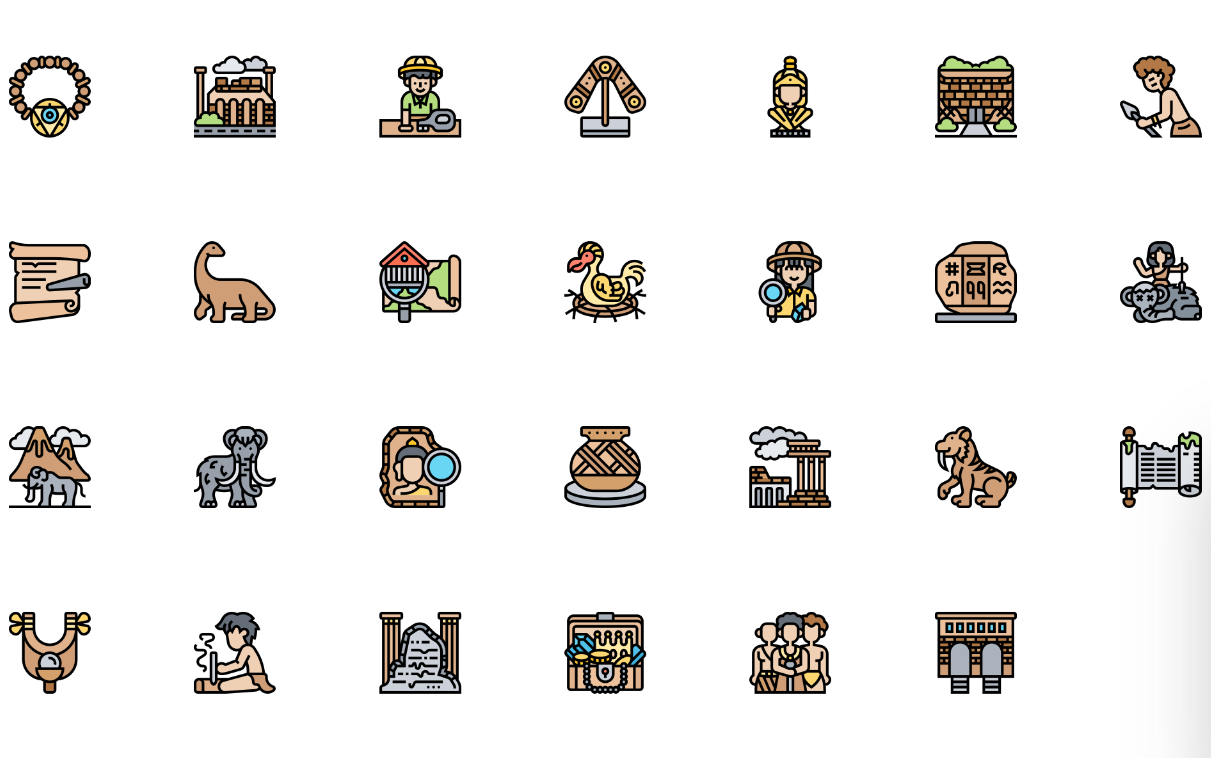
This is the first icon set that I really liked, there is a treasure hunting feel to it. I thought the style will suit the idea of my travel app well.
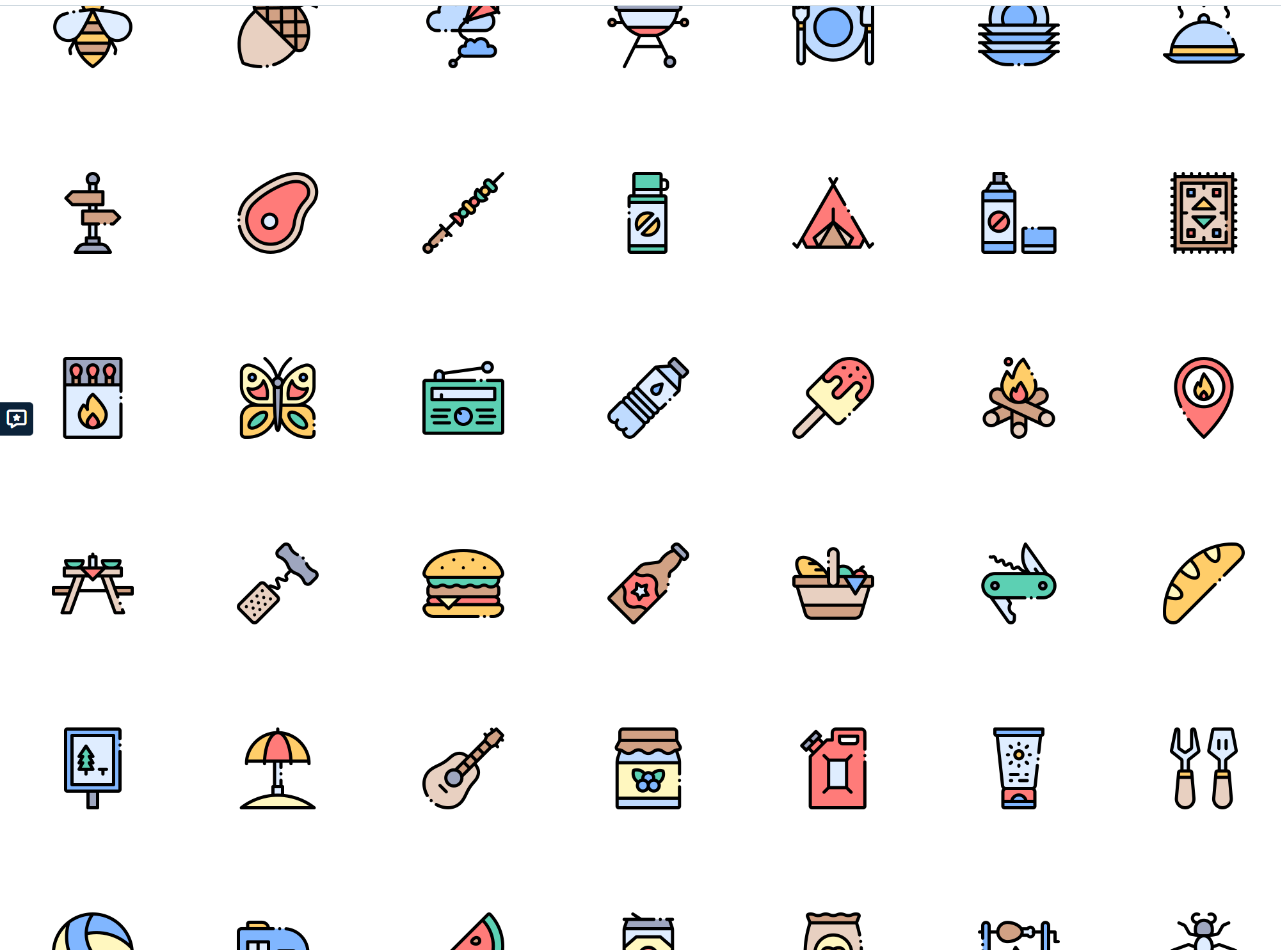
I really liked this one as well, from the first look its’ build is simple but the illustrative element is very fun. I especially liked the match icon and the ice cream icon. There is a holiday campsite feel to this icon set, which I also thought would fit my travel app very well.
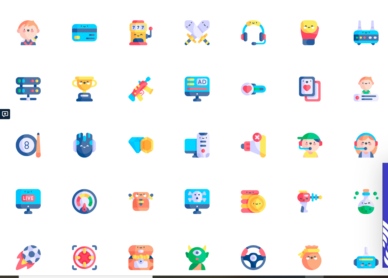
Now we come to the 3D icon sets instead of the flat ones. And this is the icon set that convinced me to do my icons more 3D. I think the 3D icons stand from the white background much better ( my app background will be white), add that extra special detail and a bit more unique to the more popular flat icons.
After a bit more digging and I found my perfect icon set. It is like the previous set but with a thick outline. It is exactly what I’m looking for with its childhood-nostalgic feel to it;

I took note of what I like about this icon so that I can apply it to my own
- a little shadow/gradient
- bubbly illustration
- thick outlines
- hand-drawn feel
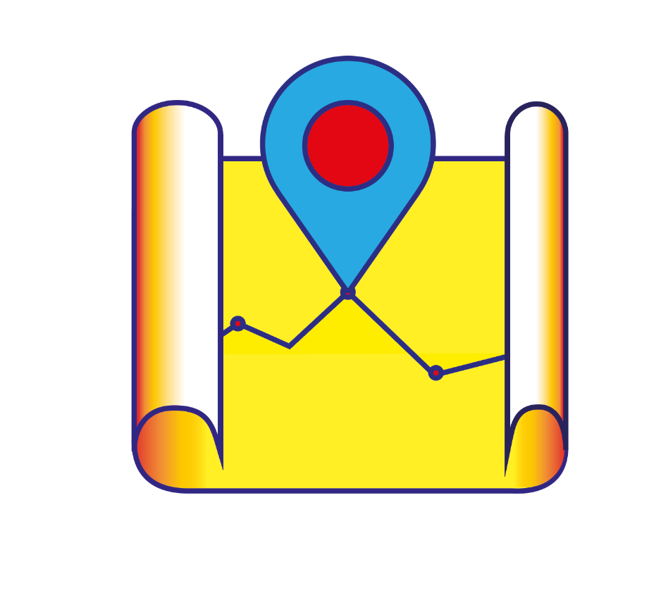
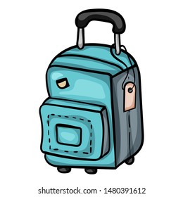
From having done my mock designs on paper, I know that I’ll need a least 5 icons – a “map” icon, a ” sights to see” icon, a “recommendation” icon, a “places to stay” icon and a “travel bag” icon for my travel timeline.
I did all my icons in illustrator, and it took a very long time to get exactly what I wanted. Since I have already done a blog on what I did for mater apprentice icons in illustrator, I feel like repeating that in this blog will be too repetitive. Thus I’ll just show my working progress for one icon;


The reason why I love to take screenshots of my icon working progress is not just for my research blogs, I keep all the screenshots in a saved file. In the future, if I ever forget how I did something, this will be invaluable to me.
By now, I have become very good at seeing a complicated icon as its simplest shapes first and then adding the more complicated details later.
The colour choices I chose for my icon match my logo, red/yellow and blue hues. I didn’t want them in exactly the same colour of yellows and blues etc as I’m planning to have my fonts and buttons in the exact shade as my icons. I don’t want the 2 to clash.
The shapes of my first 3 icons were sampled from my master-apprentice icons;


As you can see, since my mater-apprentice icon excise I have also learnt how to do gradients and add inner/outer shadows in illustrator.
The next three were a bit more tricky since they weren’t any similar icons in the master-apprentice excises that I did. So I took inspiration from the internet;

Next was the “places to stay”, I decided that instead of a generic hotel icon I thought I would do a toothbrush and cup icon. This is my most complicated icon yet, and it took the longest to make as well;


For my “recommended” icon I wanted to do a binocular since the camera icon has already been taken for the “places to see” icon. Binoculars are also a good fit as when a tour guide recommends a specific sighting, the people use binoculars to look at the place where he/she is pointing.
There is a binocular icon in the mater-apprentice icon set, but I didn’t like it as it was pointing downwards. My whole icon set is facing forward, so I wanted my binoculars to face forwards too.
However, after an attempt I really didn’t like how it looked;

so I made a compromise, I had the icon looking sideways;

Overall, I’m really happy with how everything turned out;

It is very similar to the playground icon set in aesthetic, but I’m really happy that I managed to make it my own with some changes such as the colour scheme and some background shadows etc
ecfe