The first thing I did for my personal branding is to make a monogram. Since my first name is 2 words – Jing yi and then my surname is – Sun; my first idea was to go with the initial J and S, since most people’s monogram is the first letter of their first name and the first letter of their surname.
I did some sketches in my notebook of potential ideas for combining J and S into a monogram;


Then I tried out playing with different letter combinations in illustrator, since I can just copy and paste letters, it makes the brainstorming process a little bit faster. This time I decide to go for the combination of JYS. I changed my mind as I think JYS highlight the fact that my first name does have 2 words, it makes me who I am. Since it’s my branding, the JYS helps people to more quickly recognise me and avoid confusion;

Looking at the different monograms, I started to get good first ideas of where my wordmark was going, but nothing was really standing out to me.
I decided then that I would give myself a break from trying to design a monogram right away. Instead, I’ll look at the different typefaces which might fit my brand to get some inspiration. Since my wordmark might be modified from letters in a certain typeface, I thought that the process of looking at and picking out typefaces will help me in the design process of my monogram;

As I was picking out the typefaces, I began to realise that what I really like about some of these typefaces is the circle at the tips of the letters. I think the circle stencils add a simple yet playful element to the typeface, which I think represents can represent my brand very well.
Having discovered what style of typeface I might like, instead of going straight back into doing my monogram, I decided that I will do some more research and find monograms online with a similar typeface. I hope by studying them it’ll lead to more inspiration. Here are some screenshots which I saved on my phone;


Through looking at these monograms, I really confirmed my love of these circle details at the tip of the typeface. The skinner typeface almost has a tiny hint of the art deco feel, and the more bubbly typeface ( the first one) has a young, playful and friendly feel.
When I saw the following monogram, I found the perfect balance. To me, it looks modern and vintage at the same time. The font is bubbly and fun, but not too bubbly so it feels too childish and unprofessional;

Since my teacher has always encouraged us to try and replicate designs using simple geometric shapes, I did an experiment to see if I can simplify the above typeface, even more, by just using rectangle and the circle element which I love;
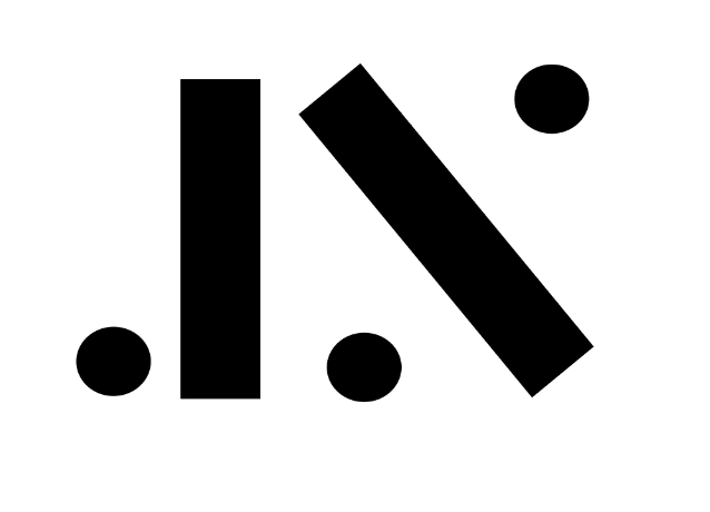
I found the product of this experiment to be a little bit too stiff, so I added some curves to the rectangle;

It came out really well, so I tried to add in the Y as well;

I absolutely love how the monograms came out, I think it hits all the criteria for me. It’s simple and modern, and the font is not too bubbly or too skinny for its looks professional and friendly at the same time. Again, I love the added bonus of the monogram having a little vintage feel to it, I think it gives a little hint of my personal taste and makes the branding more personal and special.
I also decided that I’ll keep the monogram black as I do think I want my overall colour scheme to be the classic black and white, maybe with some pop of colour, but I’ll decide that when I get to the application design stage.
The last thing I did for my monogram is to do a little kerning and make sure the proportions are all correct;
