With my monogram done, the last thing I need to do for this project is the application.
In my research blog, I discussed how I want to keep a class black and white colour palette, but add a touch of my own personality through perhaps a little bit of retro/vintage pattern, colour or shapes. The main goal is to keep the branding classy but also add in some personality and fun.
I think my monogram has archive what I want pretty well in terms of being classic/modern and simple with a touch of vintage/fun;

The first application that I’m designing is the business card.
When I was flipping through the book “You’re Invited! Invitation Design for Every Occasion”, I saw something that really caught my eye;

The little black vintage illustrations of gentlemen and ladies were really eye-catching and unique. Because I’m a very keen illustrator, this really inspired me to do something like this for myself. I think it is a good way to make my card more unique, reveal a little about what I look like, and add some personality to my brand;

I kept the illustration experiments mostly black and white ( like in the book) so that they will go well with my black and white monogram. Also, like in the book, I added no expression to keep the look natural (for versatility and not giving away too much).
However, the difference is that I made my illustration entirely out of circles to add simplicity, and also it adds to the theme of my monogram.
I really like the outcome, the illustrations are not as vintage as in the book, they are purposefully made more modern looking. I actually think they look a little like the retro pop style.
My idea for the card was to have a simple, minimalist front with my name and contact detail but then the back of the card would be a nice pattern design/illustration.
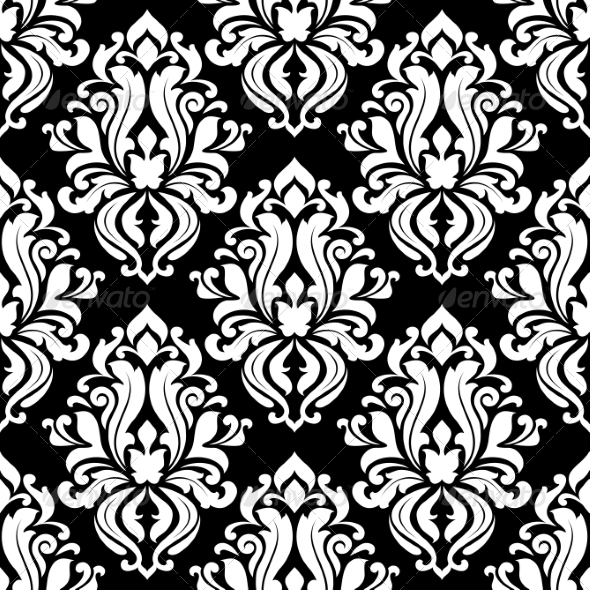
Thus the next thing I need to work on was the pattern. Originally I thought I might do something floral, like the ones seen in the retro patterns in my research blog. However, after thinking about it I thought it was perhaps too overused and obvious, I would like something with a bit more personal creativity.
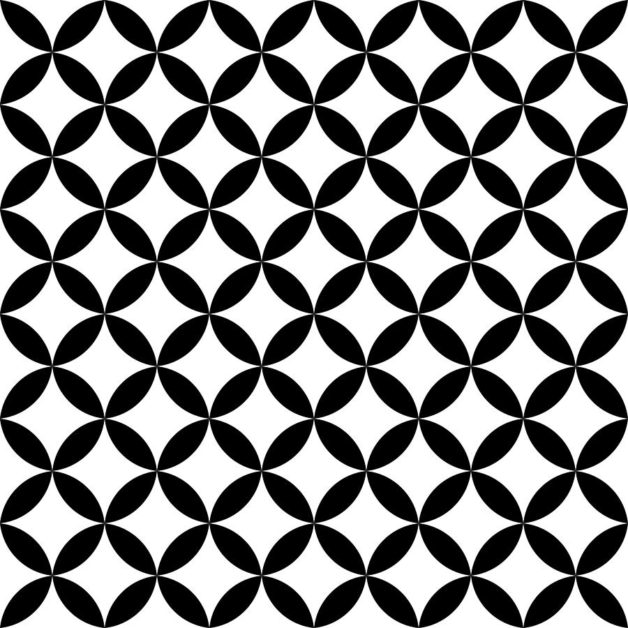
I went onto the internet and researched for retro or vintage geometric patterns. I found one that really caught my eye. It reminds me a little of the Bauhaus style;

I did my own interpretation of this style using the rectangle and circles from my monogram;


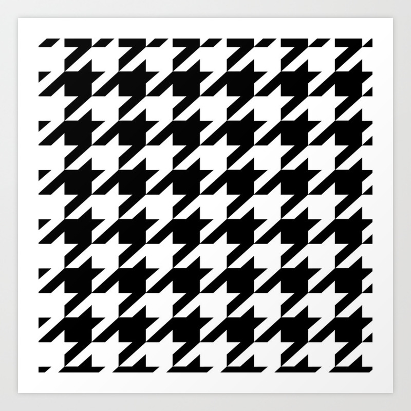
I also tried out different retro patterns which I remember seeing on a dress whilst shopping in Belfast, unfortunately, i didn’t take a photo of the dress, but I remember the pattern vividly because it was so striking;


I’m happy with the patterns for now, so I start to prototype the main body of my card on Figma.
While in class, I really fell in love with a card design shown to us by the teacher;

I like the uniqueness, I also love how the design/writing is shown through the transparent body. I wanted to attempt something similar. However, I would just like the top and the bottom strip to be clear, as I think the patterns would be too overwhelming if the whole body of the card is transparent;

( left- front of the card, right – back of the card)
now I apply my patterns to my card;

I really like the top one, I think so far that is the best design. But, I’m still not 100% happy with what I have got right now, thus I decided to do more research.
While I was researching the art deco and vintage patterns styles, I noticed one thing in their black and white colour patterns. A lot of them were repeating patterns of a simple unit;

Inspired by this, I made a repeating pattern using the “S” from my surname;

To my surprise, It tuned out really well! The pattern fits all my criteria, it is simple and versatile, and it has a vintage/retro touch to it, but it’s also modern enough that it doesn’t look like something that is dated. Lastly, and most importantly, it’s unique and personal to me because it’s made from my signature.
I applied this pattern in my card design;

and when I was finally happy with the pattern and monogram, I was able to apply that to a wider range of products;

( 2 different designs of a book cover, with the added stamp detail for a bit of fun and a touch of vintage)

( left – front of the cup, right – back of cup)