After consulting with my teacher Daniel about my wordmark, I have received some important feedback.
I now realise that I have put too much empathises on the colours of my wordmark a stage too soon. A good wordmark should be simple, eye-catching and can be applied to different scenarios. Because of the heavily gradient nature of the colours that I have chosen, the colour won’t necessarily turn out well in different background colours, also if it was made smaller to fit on physical objects such as bank cards or leaflets, the colours would be hard to see.

(Me trying the logo on a dark background and realising that the colour wasn’t showing up very well.)

( I also see that my logo isn’t very adaptable. My teacher advises me that sometimes, in certain applications, the wordmark needs to be in one colour or in greyscale. I tried it out and it wasn’t very good at all. In fact, this excise made me realise just how complicated and crowded my wordmark is.)
By focusing on the colour too much at this stage, I have taken too much attention away from actually choosing and making a good typeface, instead focusing on the colour too much made the wordmark too crowded and complicated.
I feel like I also incorporated too much colour, looking back at my research on the Belfast high street, almost all good brand wordmarks had 1 colour/ 2 colours max.


Now looking at my wordmark with the new knowledge, I felt like the wordmark need a major revamp.
My teacher suggested that I should at this stage focus on how I can manipulate the shapes of the wordmark. Since my logo has associations with light and triangles, I should just keep my wordmark black for the moment being and see how I can use different shapes to make it more interesting instead of just relying on colours.
To help me get started on my revamp, there were a few class excises that helped me generate ideas. The first task was to make an animal with purely triangles and circles. I designed a little cow;

I really enjoyed this exercise, as it showed me that you can build more complicated things using just 2 simple shapes. It gave me the confidence that I will be able to design my wordmark focusing on the idea of shapes instead of colours.
The next exercise I did in class was looking at the IBM wordmark. The IBM wordmark, with the iconic strips going through typeface, is very similar to one of my ideas of strips of light ( light going into the prism and 7 colour beams reflecting out from the prism);


Using the IBM wordmark as a starting point, I was able to explore how I can incorporate the effect of strips of “light” ( of the prism) into my own wordmark;
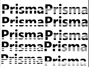

I love how the wordmarks turned out, I particularly love these 2 below because I feel like the wordmark reflected how the prism works. One beam of light goes in and 7 beams of light come out;
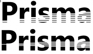
As much as I loved how the wordmark turned out in this excise, I do see that it might pose the problem of being over-complicated and hard to see in smaller print.
Having done my 2 excises, now it is time for me to get started in reshaping my own wordmarks again. My teacher directed me to a few very useful sources for exploring more unique fonts. One of my favourites is Lineto.com, this website contains so many beautiful typefaces to explore that I spend over an hour just playing with the different fonts;


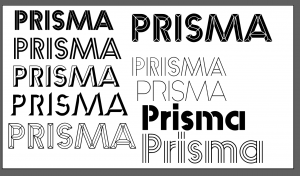
By chance, I actually found a typeface that was called the Prisma! There were 3 sets; Prisma set A, Prisma set B and Prisma text. I was really excited to find a typeface that matches my brand name, and I wanted to explore it further. Upon further inspection, there were a few fonts in the set which really matched what I was looking for;


( I like how the first one is sort of like the IBM logo in the way in which it plays with lines and negative space, but this one is simpler. I think the negative space between the lines could really imply light passing through. However, I do worry that it looks a bit too old style. The next 2 I love because they played on shapes, I like how the shapes look like crystals – which is what prisms are associated with, clear crystals)
I played around with the different fonts in the Prisma sets and eventually gathered my favourite ones into a single file on Figma;
I show this file to my teacher Paul and we both thought the bottom left 3s are the best. However, we also agree that they are still too complicated in their own right, there needs to be a little modification. The modification should still keep the font crystal-like, but cleaner and have fewer lines through the typeface. I went home, did my medication and came with this;

I’m really happy with how this turned out. I think I achieved the objectives of my modification, with the typeface being still crystal like but now much cleaner.
Once again, I will show my work to my teacher for a further critique session.