Now that I have spent so much time designing the wordmark, I realised that I’m beginning to be really behind in progress in other aspects of my brand. Originally I really wanted to make sure my wordmark is perfect before moving on. However, I also realised that it’s best to leave it for a while and come back to it, otherwise I will be stuck in the same spot without making much progress.
Thus, in the end, I decided to give my wordmark design a break, and start the next stage, my logo;
In class, we looked at the different types of logos;

My teacher first highlighted the 3 types of logo that we would most likely be using in this project – and they are Monogram/letterform, pictorial and abstract.
For our logo project, my teacher stressed the importance of form. we leant that we can create something unique from fundamental shapes such as triangles, circles and squares. We did an excuse where we had to make an animal just from fundamental shapes;

( my cow design)
I first did some research on monograms and later realised that it wouldn’t work for my own brand. A monogram is a single form created by combining multiple letters, like the famous example of “IBM”. Since my bank name “Prisma” consists of 1 word only, a monogram would properly not work well for me ( unless I do something like “PA”, which I think just makes my branding more confusing), and realistically my bank brand would better off as a “P” letterform if I decided to go down that route, such as the one for Figma or Pinterest;

While researching monograms, I came across this article by 99 designs article called ” The 7 types of logos (and how to use them)”
The article was very helpful in demonstrating the different pros and cons of each logo type, and together with knowledge from this article and my teacher’s lecture material, I decided against doing a letterform because of 2 reasons;
- I think a letterform would bring more purpose to my branding if my brand had a lengthier name or a name with more than 1 word. It would simplify my design and allow customers to have an easier time recalling the business and logo. But my brand name is short and wouldn’t necessarily take too much benefit from a letterform.
- For examples like Figma and Tesla, I do understand that there are short names that could benefit from a letterform. However, I think my brand would benefit more from an abstract/pictorial mark. In class, I learned that sometimes having symbols being the visual shorthand for the name would make the brand more memorable. I think this applies true to my case there is a very specific image attached to my branding, which is the prism. The prism symbolises opportunity (by the colour it gives off), and I think that visualisation would be very hard to replicate in a letterform.
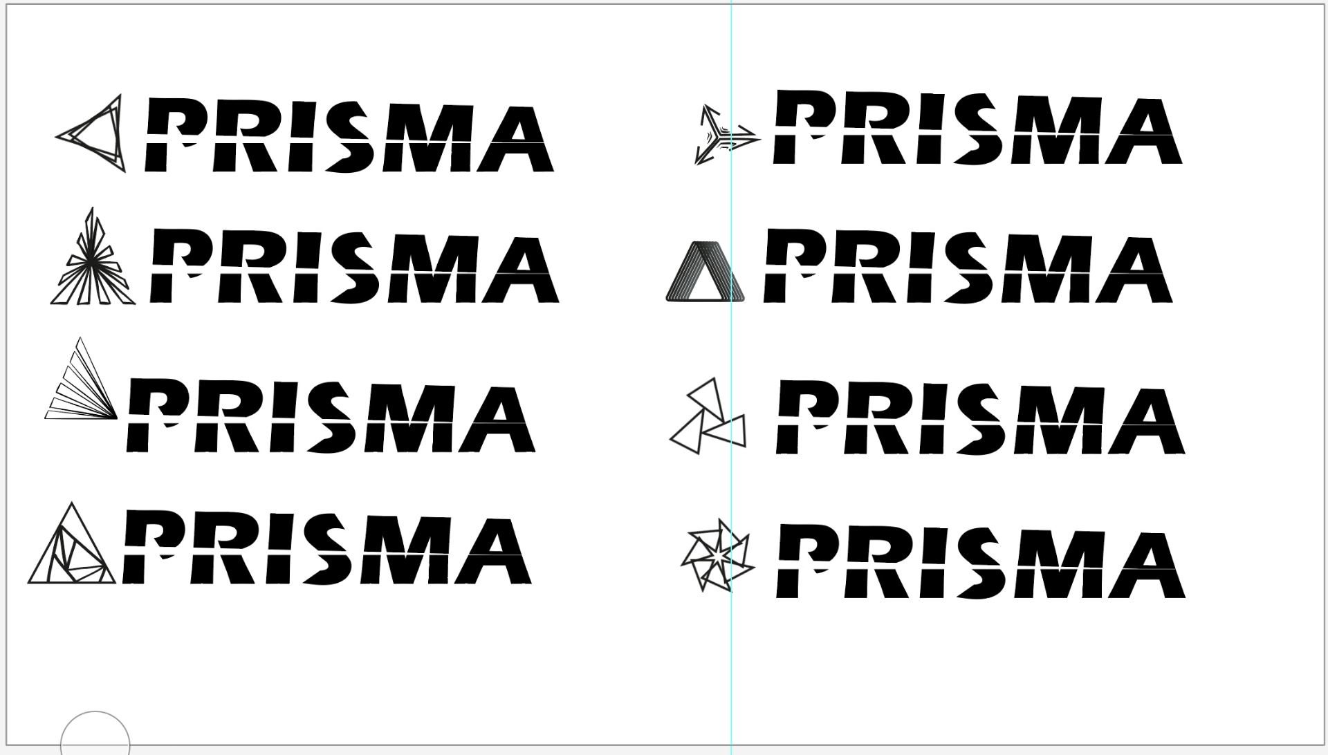
As someone who has never designed a logo before, I went onto Google and found existing companies that have triangles in their logo ( and also triangle shape logos that other designers made). I sketched some of the logos I found in my sketch book, I was hoping that looking into other’s work, it would give me some inspiration;

This excise really helped me to see the endless designs that I could do with just triangles, I even modified and saved a few of my favourites in adobe illustrator for future exploration if needed;

( looking back, most of the ones I saved were logo forms which not only hinted at the idea of prism, but also hinted at light)
At this point in my design, I felt really lost. I had ideas in my mind, but seem nothing stand out in particular. I felt like I was just designing a logo with triangles for the sake of it.
To further my knowledge, I decided to check out some of the resources that my teacher provided, the first one was an article called – “How Geometry Influences Logo Design”
This article really opened my eyes to the symbolic meaning of using triangles in design, I realised that all these times I was using triangles as a metaphor for a prism, but never really considered that triangles as shapes hold a lot of weight by themselves in design.
In the article, I found the explanation of triangles as endless cycles really fascinating :
“Recycling is the three-part act of coming into existence, existing, and then being folded back into the mix for another future purpose. More simply stated, the triangle is a metaphor for birth, life and death, or beginning, middle and end. The recycling symbol expresses this sequence in the simplest way possible: as triangular arrows that enclose the three parts of a triangle.”

While reading the paragraph and looking at the recycling symbol, I thought about my own brand and how it focuses on the theme of opportunities. I like this idea of an endless cycle, perhaps instead of birth life and death, I can use triangles to replicate a cycle and allude to endless opportunities. I quickly experiment with this idea on illustrator;
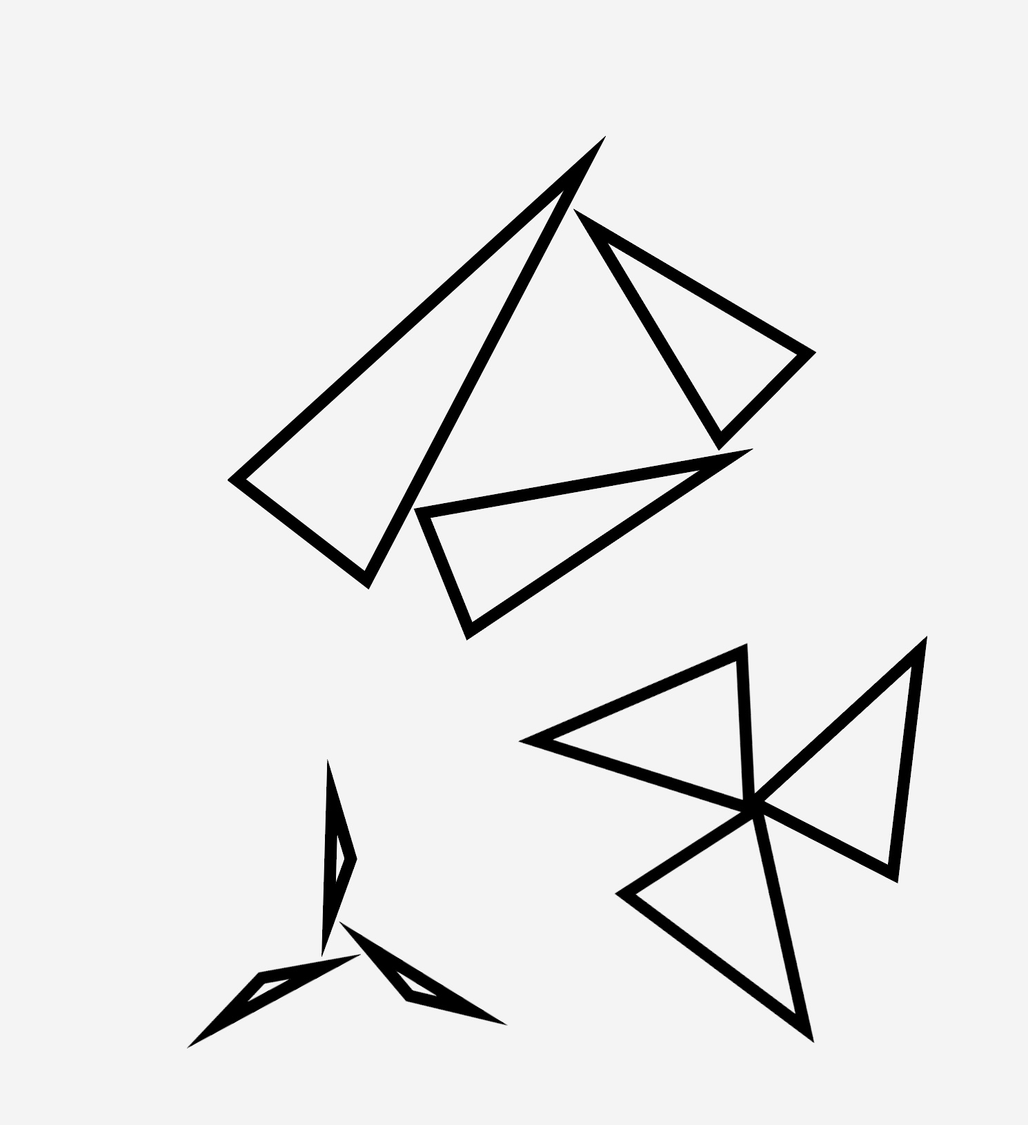
I liked the one at the very top, it almost looks like shards of glass which could be an interesting concept.
The end of the article also talked about stars and how it is associated with excellence and rewards, thus often being used in government agencies and the police. I suddenly came up with the idea that triangles can also make star shapes, and I should experiment a little with the idea on illustrator. I think this association with excellence and reward can also fit with the theme of opportunities;

overall I really like how this turned out, the shapes made are so interesting. Perhaps most of them are too complicated for a logo, but I thought that the first row looked like a good fit.
I also had a quick flip through the book I got for Christmas by Aaron James Draplin;

I think I understand now what my teacher meant by creating logos from simple forms. Looking through Aaron’s logos, unless it’s a character or emblem logo, most of his abstract and pictorial logos are simple, made of elementary shapes.
Another source that I looked at, recommended by my teacher was Armin Hofmann, who is a famous designer known for his Swiss style posters.
Through Armin Hofmann, I got the inspiration for what I think is my best logo design yet. While looking at his work, I came across this poster

I liked the idea of 4 rectangles making a circle in the middle, in fact, I can almost see the shape being a versatile logo as well. It’s simple but eye-catching, and easy to remember. I replicated this idea but using triangles;

As soon as I made the triangle, I suddenly realised that one of them also fitted the idea of endless cycle/endless opportunities idea! I feel like by chance it all came together, I like how each of the 3 triangles points to another, like the recycling symbol;

I’ll admit that the cycle idea isn’t that obvious, but I still like how as each triangle points to another, there is no end to this logo. Also, it gives a hint of the spiralling, almost as if it’s focusing the light in the centre. Most importantly, this logo is simple but unique.
Even though I clearly have a favourite logo in mind, I still want to show all my potential logos in class, to get a second opinion;