In this blog, I’m going to do a few case brand studies using a new resource called “Brand New”.
“Brand New” is a subscription-based website in which my teacher Daniel has kindly set up accounts for the students of our class. On this website, there are many reviews and critiques of logos and brand identities from companies of all walks of life, and it is an extremely valuable resource. While reading the “about” section of the website, I found a section of text that describes the website pretty well in a humorous manner;
“Brand New has been published since October of 2006 when it was spun-off from the now unpublished Speak Up. In the glory days of Speak Up some of our most ardent discussions happened around redesigns of logos but that same passion that ignited those threads was a turn off for some readers who claimed they were simply bitch-fests. As a patch, we decided to move those logo bitch-fests to their own site so that we could all bitch merrily about logos. This focused energy turned out to be quite an attraction and Brand New has become a very active reflection of the world of corporate and brand identity. And, while we do all bitch quite a bit, the opinions presented throughout amount to something of real value for those in the field.” – Brand New
In this case studies task, I’m going to be looking at brands that have a similarity to my own bank brand and try to state what makes that particular brand effective. In particular, I will be doing 3 small case studies with brands that;
- use the colour that I’m considering
- aimed at my target audience
- a direct competitor in the financial sector
1. Matching colour personality
This case study is a little tricky as I don’t yet know what colour I want for my brand. I’m considering purple as PRISMA is a prism and in theory, multicoloured, and purple is a good natural base colour that has a blend of red and blue.
However, nothing is set in stone yet as I know with new information and research my ideas might change, but for the purpose of this case study I will look at another brand with as their primary colour purple.
A really interesting brand I found was “MINDSHARE“.
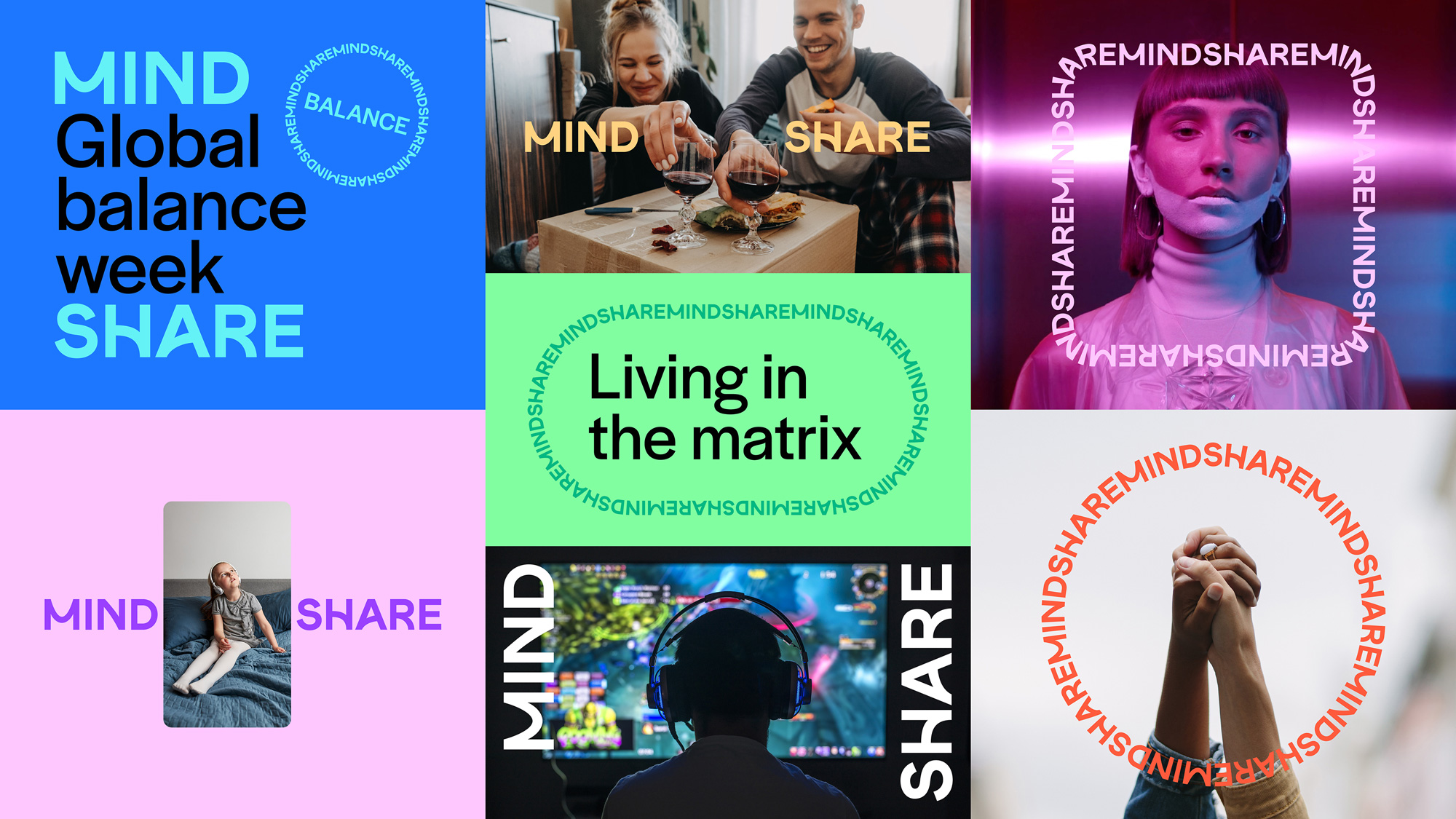
Mindshare is a global media agency network that is responsible for providing global marketing billings and campaigns using the power of the media, allowing their clients’ businesses to become digital. Back in December 2021, the company had a rebranding, but much of the focus on the colour purple remained the same. This highlights the importance of the colour purple to the brand, but could also be that it’s so ingrained into the brand that changing it could hurt the brand identity itself.

Starting by looking at the older branding on the left. From the first outlook, the darker purple in the background provides good contrast against the white text, which also ensures reliability. From this deeper shade of purple, I’m thinking about professionalism and wisdom, but the purple has brought an air of creativity that hints at Mindshare’s creative media aspect. The professionalism aspect for the brand is very important as mindshare is no small company, it is a huge firm with over 10,000 employees across 116 offices in 86 countries. With any large company, professionalism and reputation become very important as they deal with large amounts of client interactions and is sometimes at the centre stage of their work. Potential clients need to know that the firm is professional and trustworthy before investing their time and money into the firm. Especially if they are to trust a media company to make their brand digital.
I really like the deeper shade, I think it conveys the message of professionalism and trustworthiness very well, while the colour of purple itself shows that the firm is rather versatile and creative rather than ridged.
looking at the newer branding style, I can defiantly see that company is trying to appeal to its creative aspect more. What I think is interesting is that while the colour of the older branding is duller and neutral, their newer branding is brighter and leans slightly towards a more feminine colour palette. I wonder if the more feminine colour choices are a deliberate decision to make the brand look more “friendly” and “creative”. Also, I have noticed that in a lot of brands, the brighter colours attract a younger audience, thus making the brand look younger. For me, the brighter colours of the newer brand certainly look better on screen, but the feel of the brand has changed quite a bit. With the brother colours and the more playful typeface, Mindshare’s new brand design doesn’t seem to focus on a sense of legacy and professionalism, rather to me it looks like the branding of the new creative startup. Not that it is a bad thing, of course, it can be argued that the new brand design is a breath of fresh air for the company, but I think the modern look doesn’t distinguish itself as a large, reputable company among a sea of other modern creative companies.
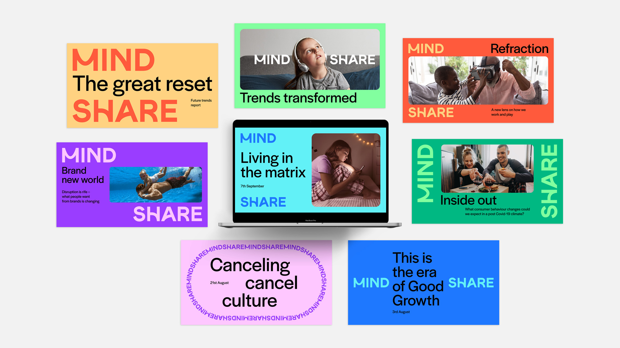
what I think really distinguishes the new brand design is not the colour, but the application and versatility of the wordmark to form different shapes;
This I think is the most amazing part of the new branding. It’s young and fresh, it certainly fits the
Back to the colour purple, I still think it is a great colour for this brand because of the imaginative, mystery, and almost magical elements that it adds to the media firm. Below is the application of the old branding, which I like a little more than the newer branding as I think it’s more cohesive.
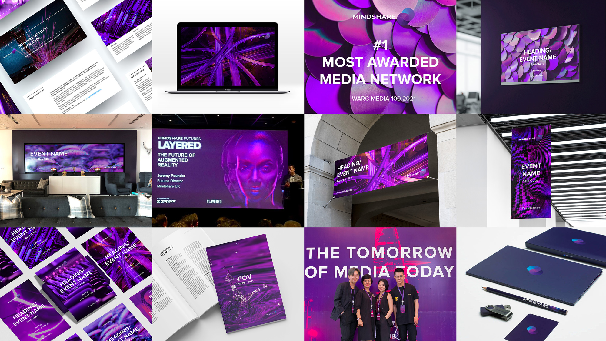
newer branding application;
However, I can appreciate that older branding was a tiny bit overwhelming with all the purple colours.
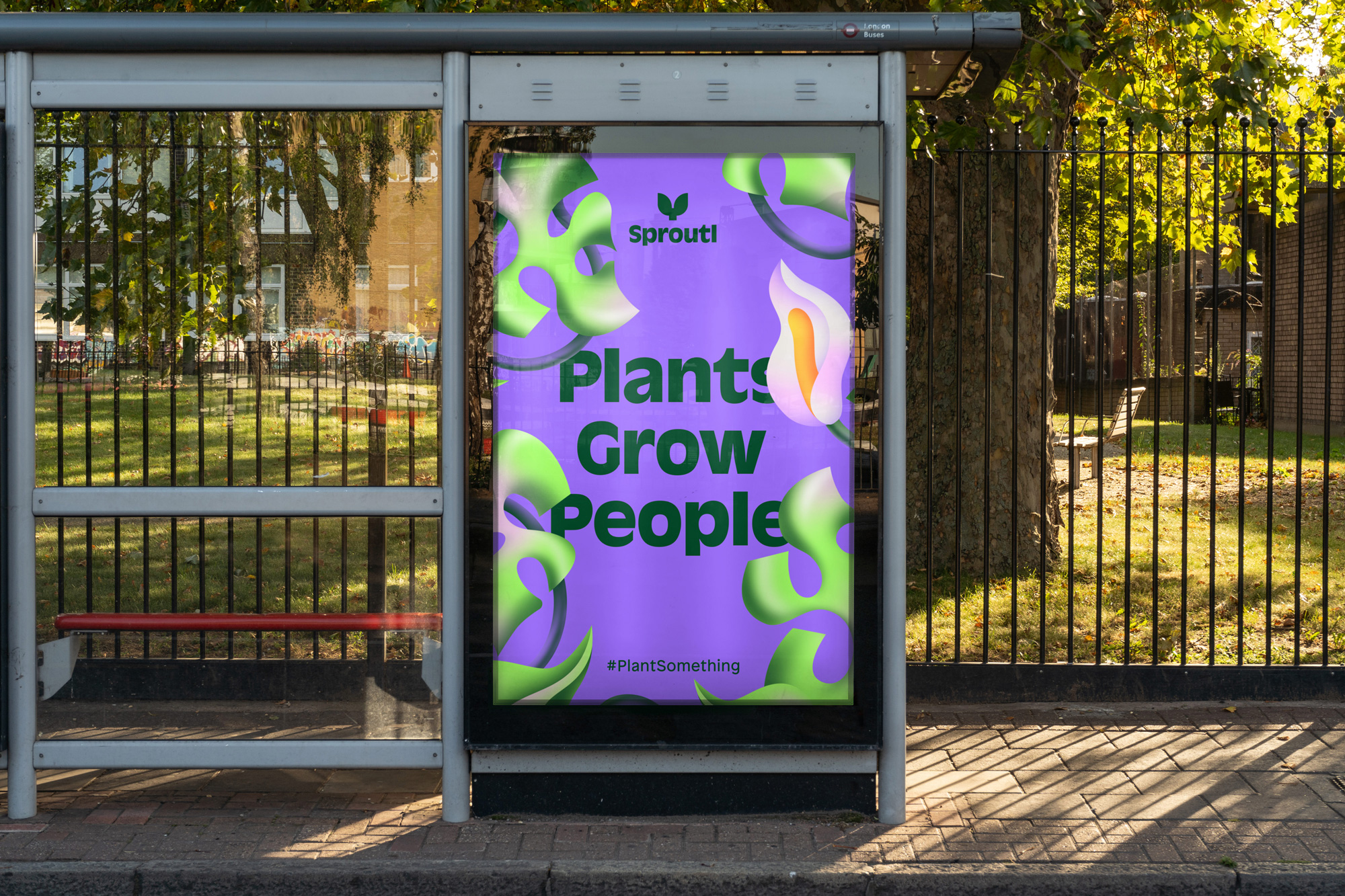
Another brand that I looked at with a heavy incorporation of the colour purple is the brand “Sprouti”. Sprouti is a plant-based company that offers an online marketplace in the UK for gardeners.
At first, I didn’t really like the colour pairing of the bright green and the purple;
Since plant-based companies usually go for more of a natural look, the bright, more artificial/neon colours really caught my eye. I can see where this company is defiantly more online presence than offline as this colouring works well in UI to catch attention. However, at first, the bright green against the lighter purple almost makes me think of something radioactive rather than something plant-based.
When I looked into the brand more, I started to slowly fall in love with the colour pairing, challenging the norm and definitely allow this brand to stand out from the others. While the green colour of the logo still hints at the plant-based nature of the company. Although I’m coming around to the bright green and purple colour combination, I’m still not sure if I like the bright green wordmark against a purple background.
One interesting thing I noticed is that, with a lot of their physical products such as packaging or physical advertising, the bright green wordmark with a purple background combination is not often used. In its place is often a darker green or purple wordmark, or a bright green/blue wordmark against a more muted background;
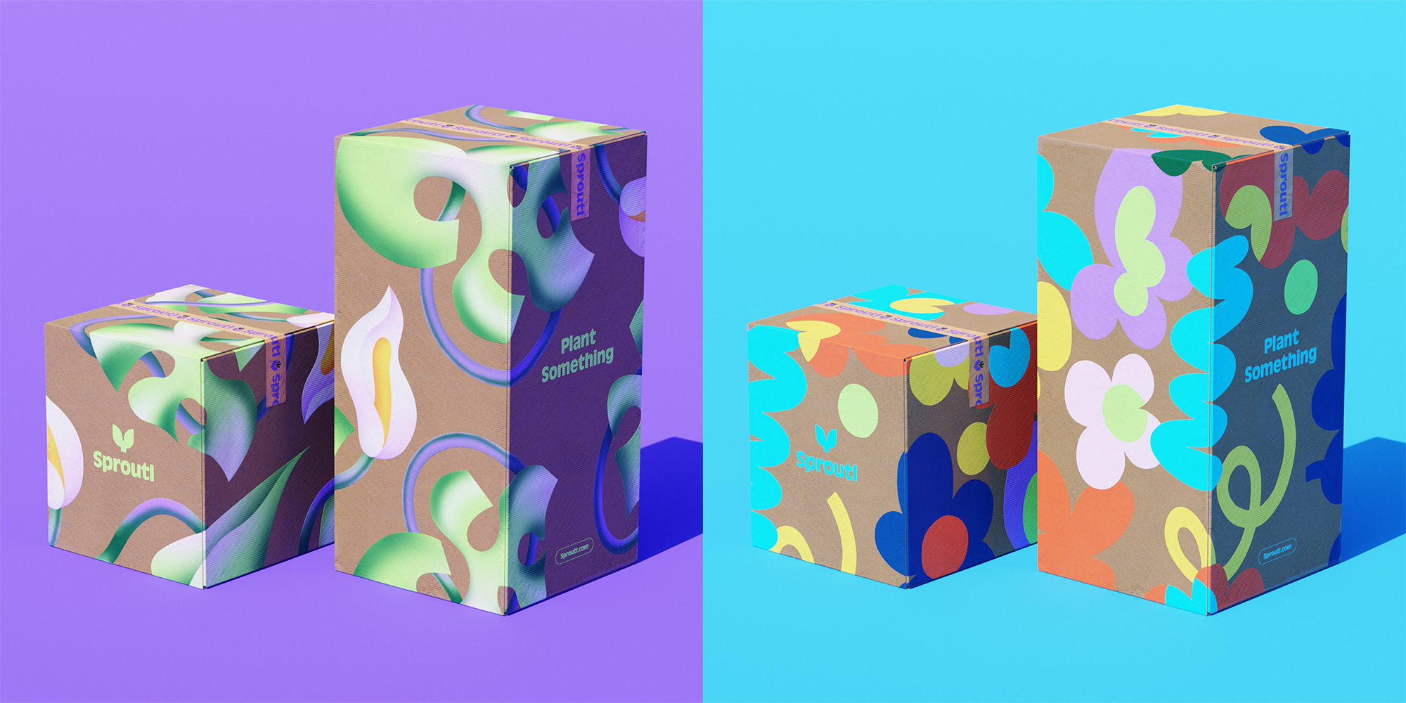
maybe the specific neon colour of green is hard to produce in physical form or maybe it’s hard on the eye.
Overall I enjoyed studying the colour behind the 2 brands, it taught me even different shades of the same colour can convey a different message. It also taught me that there is a fine balance between sticking to the basics and trying something new.
2. Matching target user
My target user for the bank is these between 15 to 25 years old, thus for a target user brand study case, I wanted something that is specifically targeting the younger audience of society. Something that is genetically “fresh” and “young” looking. In this way, I can have a look at what my target audience might want in a brand. What will be interesting is that I’m within the target audience myself, so in this section, I should self-reflect on why I found the brand appealing.
While looking through the Brand New website, one brand really caught my eye. The brand is called “Yoi”, and it is a probiotic nut and seed milk drink made that is “packed with probiotics, prebiotics, plant protein, and a pop of real fruit”.
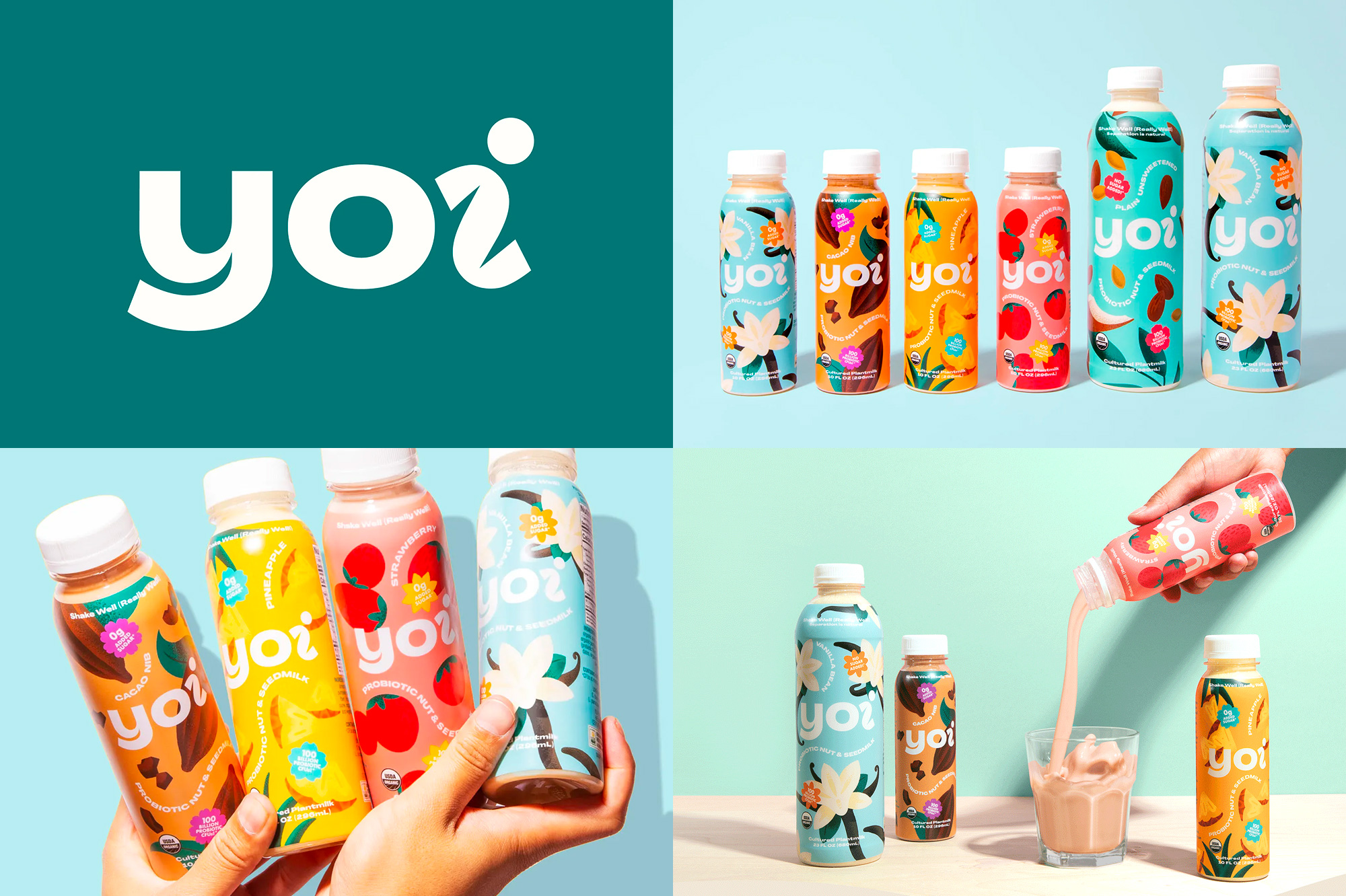
What initially attracted me to the brand is definitely the beautiful colours. They are sort of like a bright pastel colour, very reminiscent of spring.
After reading through the brand design project, I decided to make a list of all the important points that make the brand attractive to the younger audience. I usually don’t like to write list when it comes to writing brand research, but there are a few distinct points I would like to make.
- The name – “Yoi” comes from the Japanese meaning “good”. Of course, since this brand is based in California, not many people are going to know what the word means. However, I think that this is one of the attractions of the brand, the “exotic” name appeals to the curious, adventure-seeking younger audience. Also, the name “Yoi” is easy to read and not too complicated, as a complicated foreign name might deter consumers.
- The typeface – The typeface is clean and bubbly, something I often see with the branding targeting the younger audience. And since the name is foreign, it’s important to make the typeface hard to read. The friendliness of the brand comes with the wordmark being in the friendly lowercase, the playfulness of the brand is expressive through the playful custom “i”.
- The graphics– the graphics are a big element of design, as the bottles are very graphic-heavy. This is something you would expect to see in drink brands targeting younger audiences. Like the typeface, the graphic was fun but very minimal, for most images, there is just the outline of the fruit/flower. This minimal approach to graphics is very on-trend with some of the young modern drawings I see on Instagram.
- The colour – perhaps the most important point is the colour. The colour aspect of the design is what appeals to me the most. It’s fun and refreshing, it’s not bright, neon and in your face, but a nice bright pastel. The difference in colours for each bottle hints at the different flavours and as I said it’s very spring-like. Spring makes me think of growth and gentleness, it defiantly fits the paints the healthy image that the brand is going for.
- The tone of voice – “Probiotics”, “good stuff”, “live” and “enyoifully”. The wording is very positive and especially the word “Probiotics” is a current buzzword for online health influencers.


even the advertising images on their websites seems to hint at a younger audience with the extra healthy breakfast and the model seemly young in top and jeans.
3. Matching in the finance sector
The next brand I’m looking at is a bank that is a direct competitor of the bank brand that I’m making.
Having had a brief search through all the banks on the Brand New website, there was one particular bank that stood out to me as it has a similar design element to mine – the use of shapes.
Since my bank is called Primsa, I would like to think that there is a huge possibility for my word mark and logo to contain triangles. I’m also planning to use the triangular shape and apply it to more aspect of my branding. Thus I thought by looking at this particular bank which has a use of shapes will help me in the design of my own brand.
This bank is called “Zonda”, formerly known as “BitBay”. Zonda is one of the largest digital currency exchanges in Europe.

The name Zonda comes from “Zonda Wind”, which is the “regional term for the foehn wind that often occurs on the eastern slope of the Andes, in Argentina”. The logo is made up of what looks like 3 triangles, which in my eye represents an arrow pointing upwards. Combining the name and logo, my interpretation of this brand is that the wind is blowing upwards/pulling the amount of money upwards/riding the wind the sum of money going upwards, hence the upward arrow. It sort of makes sense
The wordmark is very unique, and I can definitely see the incorporation of the triangles
What interests me most about the brand is the use of its different shapes to represent the different functions thier offer ;
the upward motion is really emphasises even in the animation.
there is also a 3D version too, but I like the flat 2D better. I think this is really just a personal preference, I think the 2D design fits in better with the flat designed logo. If the triangles that made the logo were side ways/more 3 deminsonal i think i would be more drawn to the 3D element. Also, to me, it seems that the 3D elements look little “plastic” and “shiny”, maybe it was meant to be this way, but certainly i feel the plastic feels takes a little bit away from the seriousness of the brand.