I am working with Jon – one of the game design students on my team – on the GUI. He is learning UX as part of his course, so he’ll be doing the Figma/UE implementation, and I’ll be on the graphical/art side.


I looked at a lot of inspiration for the GUI from other games, specifically Gris and Ori and the Blind Forest. I made sure to apply key theoretical graphic design principles such as grids and hierarchy, whilst sticking to our style guide in terms of colour, texture and font.
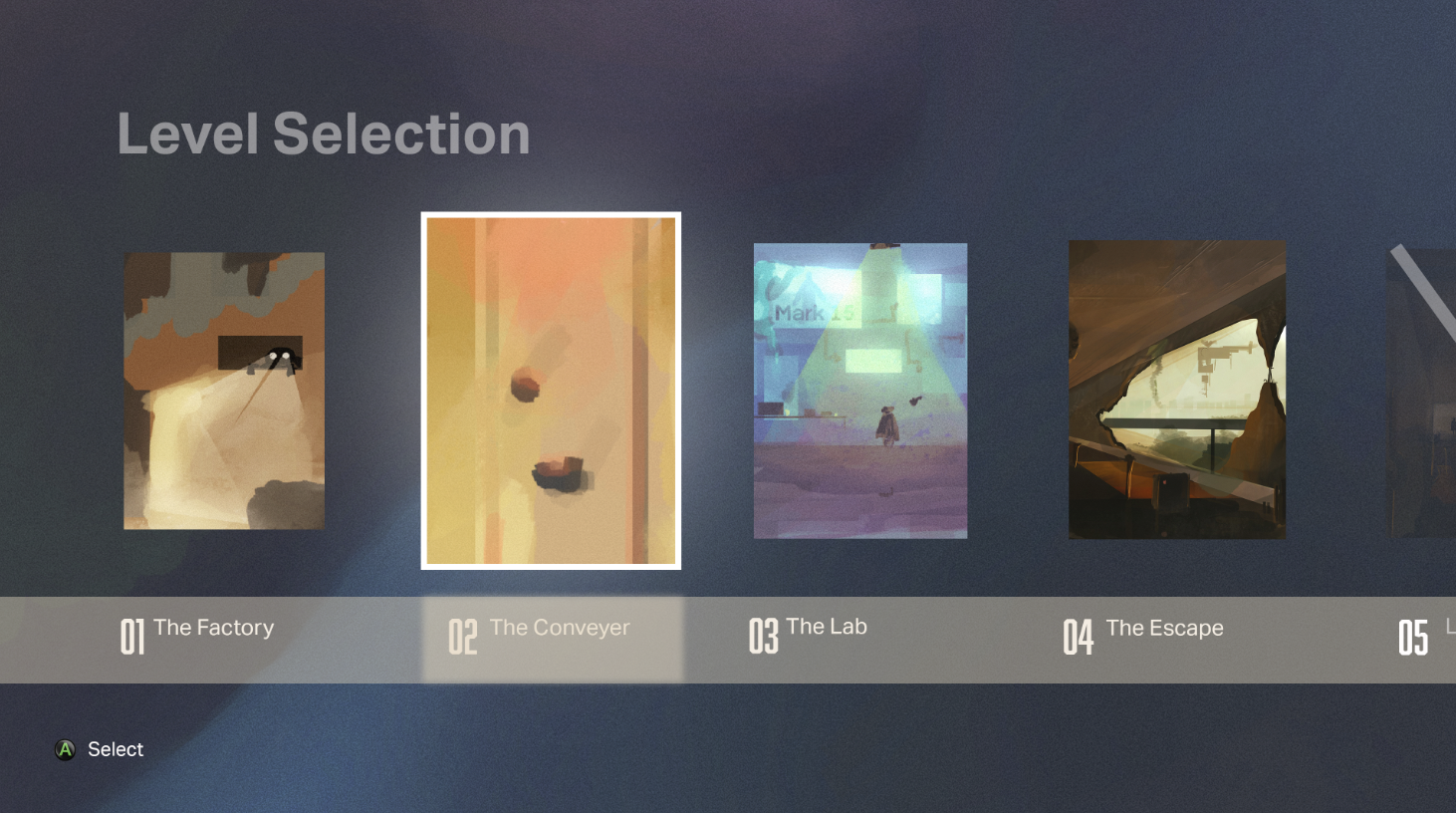
This video was really useful in explaining the difference between UI design and other types of design. It reinforces the importance of consistency of the style guide – including typography, iconography and shape language. UI should act as an ecosystem, and cover level selection, loading screens and startup screens. “Layout is critical because it affects the way a user understands what’s on screen, [and how] quickly the viewer is able to navigate. And in games, we often need to give critical information really quickly.”
Here are some iterations:


Another key part of the UI was fonts, logos and general brand design. I worked hard on this and came up with some solid fonts (see AI file here).


I ended up going with an altered version of the Tech Demo font. I made the Os look like Mark 15’s eyes.
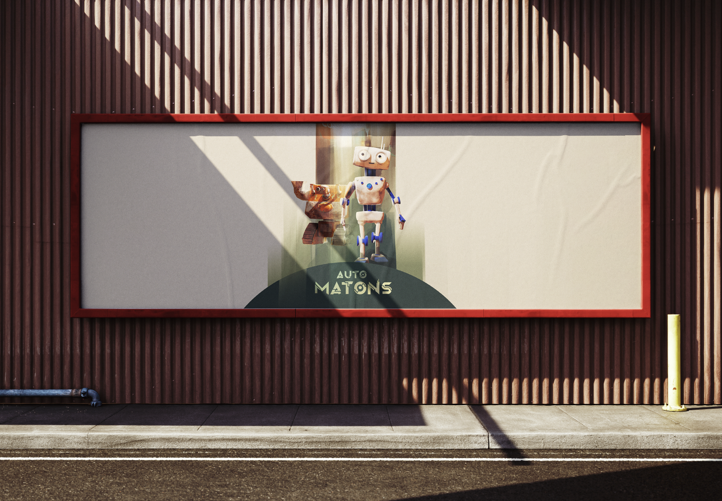
In the process, I also came up with some in-universe logos for the facility, which I named AutoCorp. For this, I used the Midnew font. I continued the Mark 15 eye motif. I was able to use this on assets later and in the game as decals.


Additional Backgrounds/Logos:


Leave a Reply