This was the first sketch I did at the thought of a robot protagonist. I think Morgan had mentioned the term ‘samurai’ and it just sprung this cool hybrid idea in my mind… a samurai robot. I liked the plate hat and poncho and thought it made a really solid silhouette. I actually used this for a lot of concepts and ideation.
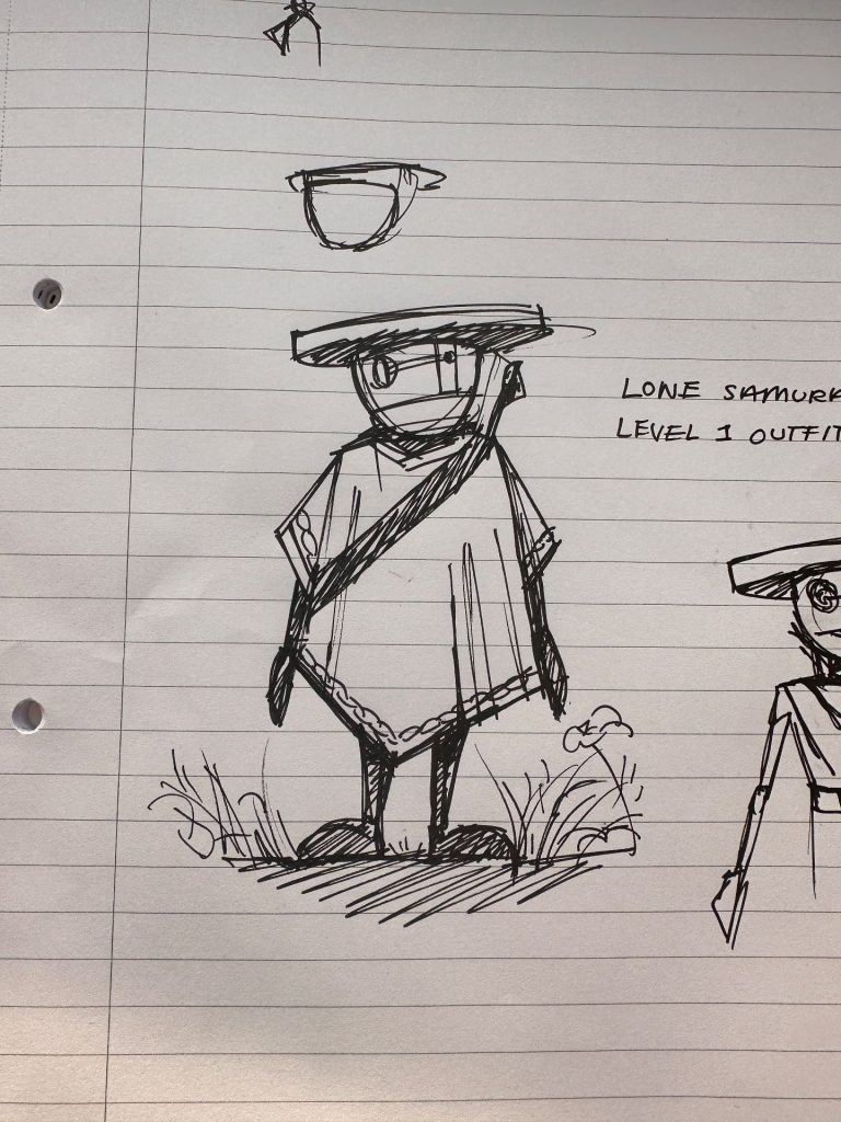
BUT… we ended up deciding not to go in the sci-fi direction at all. This meant I had to innovate. I still really liked the silhouette, and I didn’t want to lose this entirely. But I had open mind, and started conceptualising further…
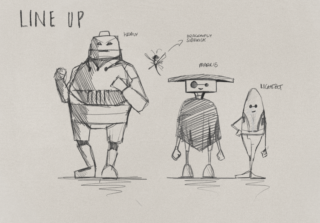
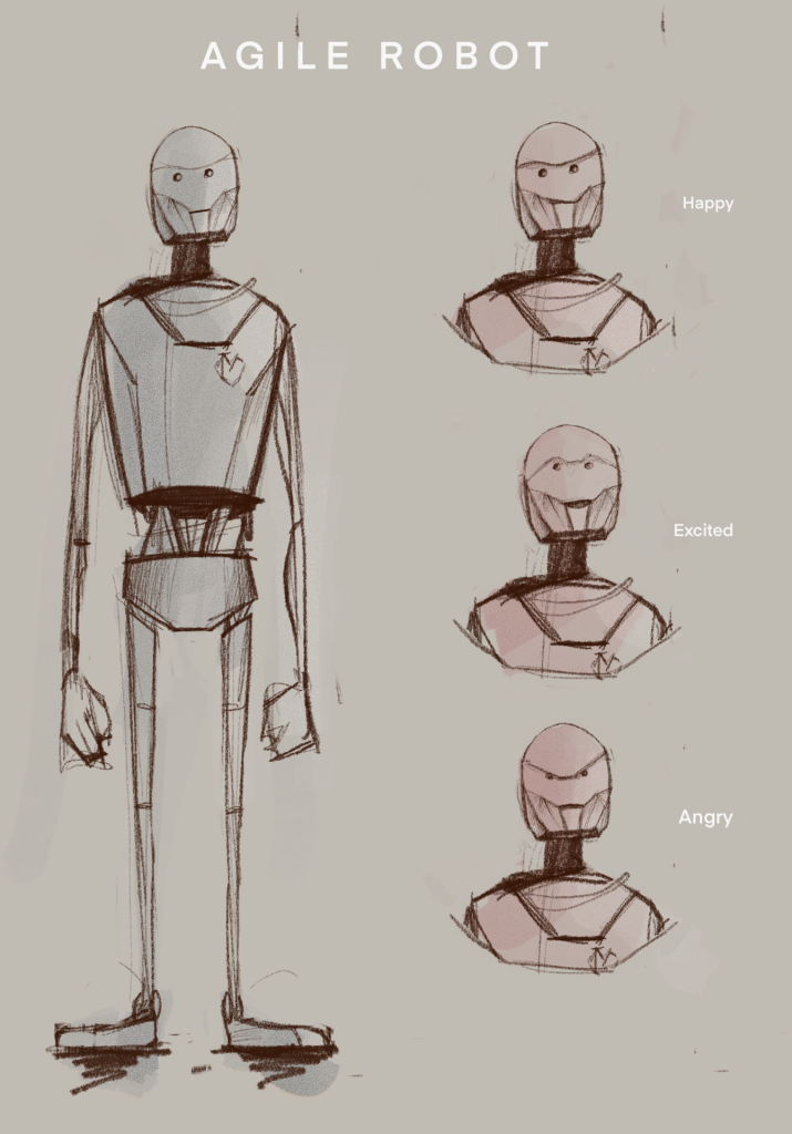
This design was much leaner. It was actually when we had three characters in mind, and I’d envisioned this maybe being the ‘middle’ character (with a smaller and a heavy also in the lineup). In our week 2 presentation, this guy was shot down and we were told to go with two characters only for mechanics and pipeline reasons. This was good feedback, ultimately. Three would have been convoluted for a vertical slice project. Therefore, we were back to square two… the big guy and the small guy.
As a response to this, the team got together and tried to knock out Mark 15’s design together. This usually isn’t the best idea, and the end result – whilst good – still wasn’t really realised. Everyone had put in their ideas, creating a hybrid of everything that felt kind of like..nothing (yet).
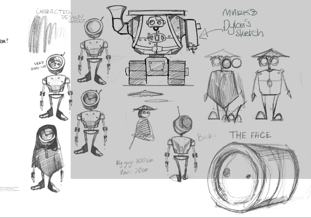
I really struggled to start blocking this out as it just wasn’t looking like a humanised, emotional, relatable character which is what we want him to be. I showed Henry, and he agreed. He pushed me to look into more robot designs from other games to get inspiration. So I did:
This is when things started falling into place… I really like Nine from 9. His eyes, specifically. He feels like a robot that’s trying to be as close as possible to a human, but can’t due to technical limitations… and that’s what Mark 15 is. At this point, Josh explained to me that Mark 15 was the Scientist’s attempt to recreate his dead son. So, it has to be somewhat humanised for that concept to work.
![]()
So, I rotated the head. All of a sudden, that silhouette from the start is back (in a way…). The contrast between the vertical and horizontal lines is very strong, and I think for a robot character that type of thing is key in humanising it.
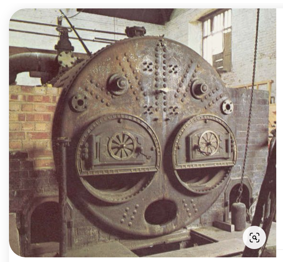
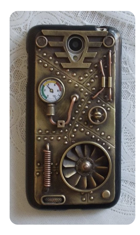
For the little textures and details, I took inspiration from steampunk machinery – specifically from our other art director Dylan’s Pinterest board. Whilst this wasn’t a huge part of our final style guide like we’d initially planned, the stimuli still proved useful in coming up with unique shapes.
MARK 15, FIRST PASS
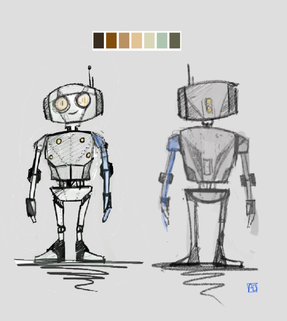
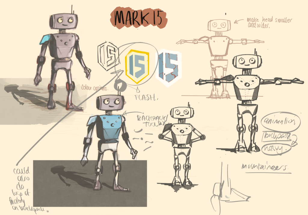
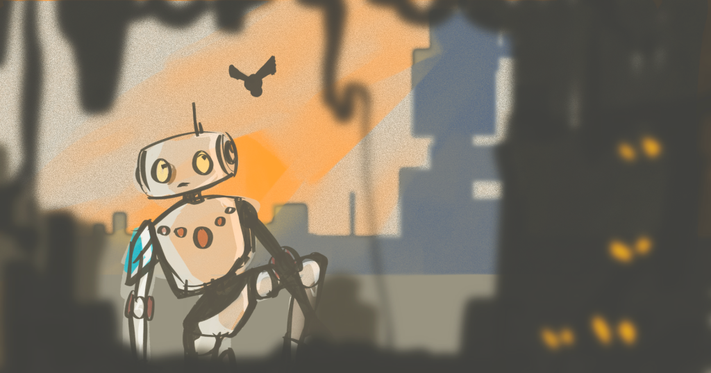
This was not the end of the concept development for 15. It took more feedback and a decent way into the modelling process to realise he still wasn’t quite there yet….
