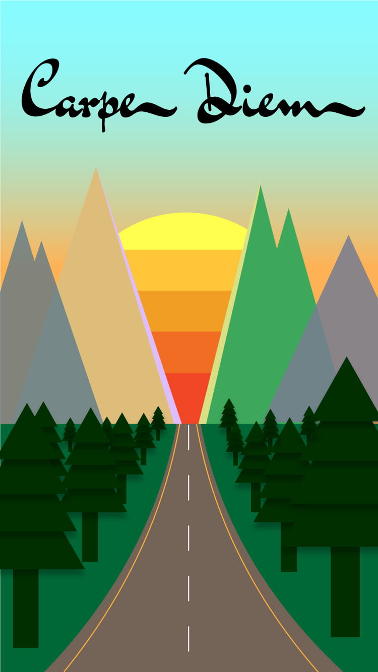
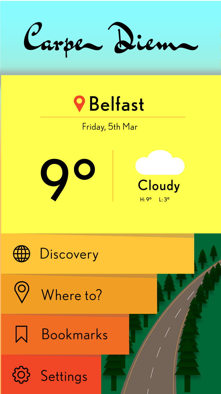
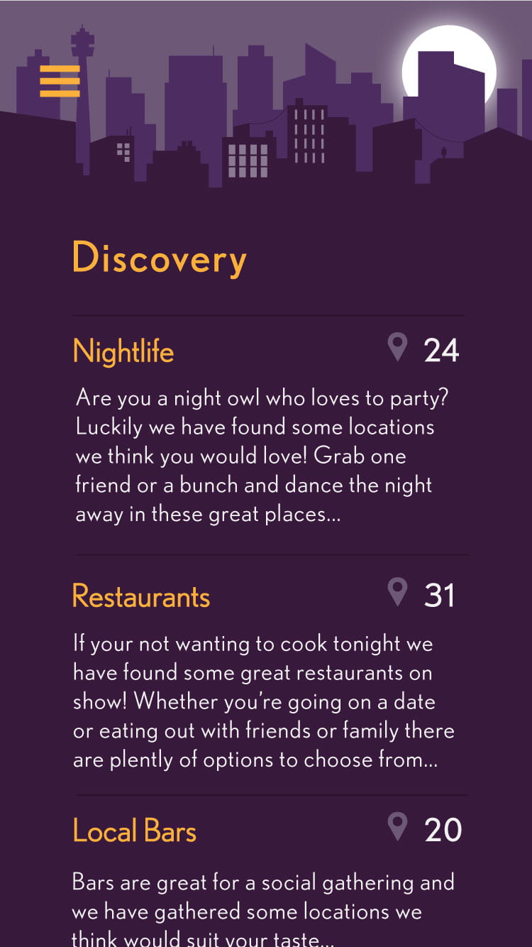
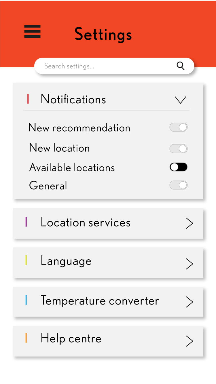
These are my final eight travel app screens for Carpe Diem. After more feedback on my previous screens, there was not much to change besides some minor details. For example, the title, ‘Carpe Diem’ being on one line, adding colour to the images on the ‘Where to?’ screen and fixing the banner on the settings screen to match the style of the banner on the bookmarks screen with the search bar. These changes can be compared to the image from my previous post. I only included the images (without the iPhone mockup) to make it clearer to view.
These are the final eight screens below.


Overall, I really enjoyed working on this project and am happy with the outcome of how my travel app looks. This has taught me, firstly, the basic components for creating a user interface and along with the master apprentice exercises, I was surprised at what I was able to accomplish when it came to vector illustration.