Previously
I had created a manifesto based on an idea I had about a lighthouse for review and feedback. The overall feedback was positive, however, there was a few things which I could improve on. This is the previous manifesto shown below.
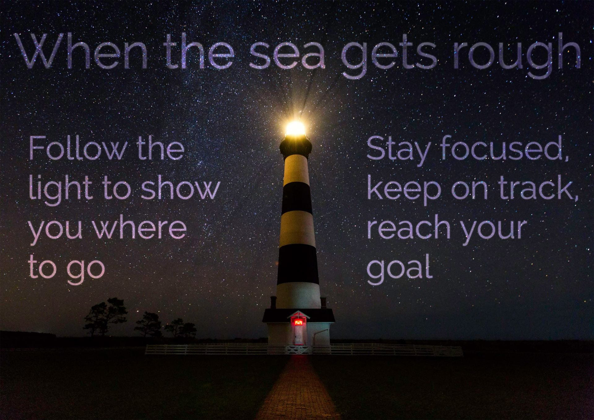
The three main things which I was recommended to alter was choosing a more interesting font, changing the image to a lighthouse with rough waves to relate to what’s being said on the manifesto and the final point was to condense the amount of text.
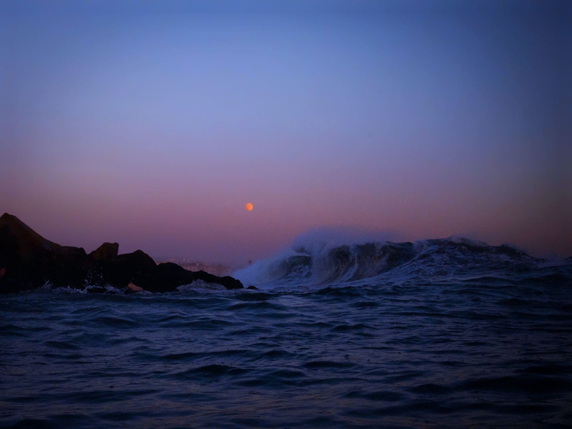
With this in mind I took the feedback on board and redid my manifesto. The first thing I did was find a new image. The image below is the one I had decided to choose because it had a pretty sky with rough waves. However, the problem was that there was no lighthouse. This meant that I would have to Photoshop one in. I then also realised that I would also have to create the light coming from the lighthouse because I could not find a silhouette of a lighthouse with a light beam.
This is the original image which I used for the new manifesto.
Once I had added in the lighthouse silhouette and the light beam, I included some clouds for the light beam to look more realistic. I then changed the font which I used. The new font I used was called Fairwater Deco Serif. I got this from Adobe Fonts. I used the technique of placing emphasis on words through scale and colour.
This is my new manifesto after review and feedback.
