IxD103 – Developing my Wordmark
When designing my wordmark, I think it is very important for me to look at all the factors which will make sure my typeface of choice is an accurate on and also matches my monogram and the overall tone of voice of my brand. Wordmarks are great as they offer infinite ways to express creativity. I tried to think of every letter in my wordmark as an individual canvas, whilst still not embellishing each letter as you could also overdo it! The endless combinations make it possible to come up with a fresh design.
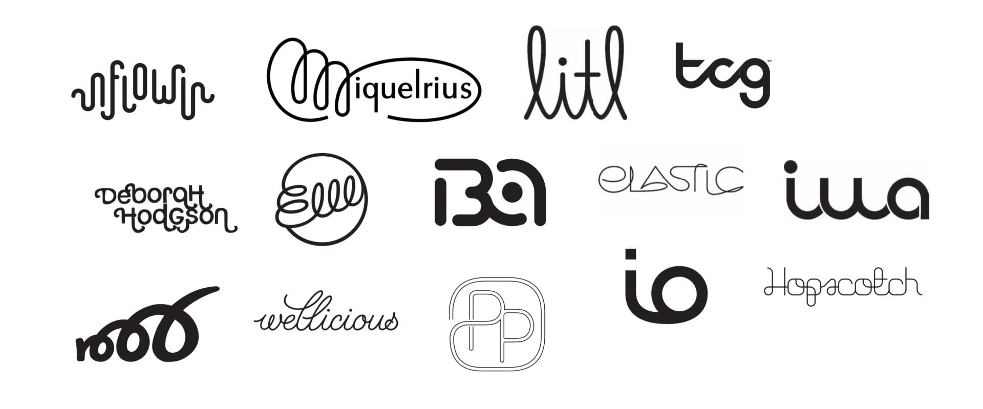
The first step I took was looking for inspiration. All of the workmarks I have been looking at have looked very modern and youthful.
Next I ensured that I have a list of my brand guidelines tone of voice in front of me before I choose which font I was going to work with.
The tone I want my brand to give off…
- Affirmative
- Reliable
- Youthful
- Creative
- Fun
- Respectable
- Sincere
- Independent
- Clean
- Strong
- Dependable
- Unique
- Positive
I am now aware that I can represent these types of qualities by playing around with the size, shape, line weight and boldness in the letterforms. Daniel provided us with many resources which could help us find a suitable typeface for our brand, however the one which I have always found the most reliable is google fonts and adobe fonts. With my mind focused on the tone I wanted to reflect, I set out looking for a Sans serif font, with slender line weights to make my wordmark feel light, youthful, and friendly.
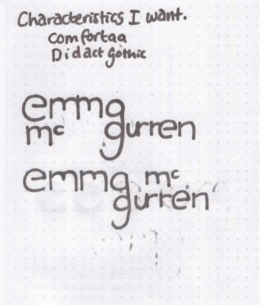
I wanted to pick something unique and not just an overused font such as Helvetica. I wanted something that was eye-catching but still readable. After a lot of searching I was able to narrow my search down to two fonts which I thought would work lovely for my wordmark…
- Comfortaa
- Didact Gothic Regular
Both of these fonts were found on google fonts. I really liked Comforta because of the curves and Didact stood out to me as I knew I could edit the letters and they would look really nice on a webpage. I have written in all lowercase as it would be inappropriate to add capitals when my monogram is all lowercase. I also feel that it gives it a more youthful feel by defying the rules of grammar.
In the end I decided to work with Comfortaa as it has more rounded edges and suits my brand’s tone of voice perfectly. It’s not too bold but also does not shy away when beside other typefaces.
This was the point when I went back to the sketchbook…
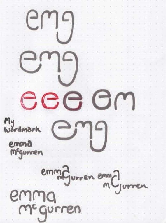
When personalising the letterforms I think it is important that I remember to create focal points, but also ensure not to overload the design with too many competing elements.
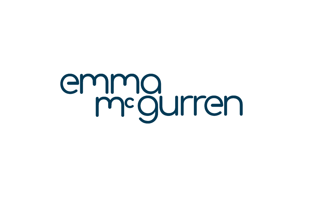
Below I have shared the first attempt at my wordmark. I slightly kerned some of the letters, however I thought it still needed quite a bit of work to look compatible with my monogram. I knew I needed to work on the letters e and m and also fix the spacing in the middle as it looks too forced.
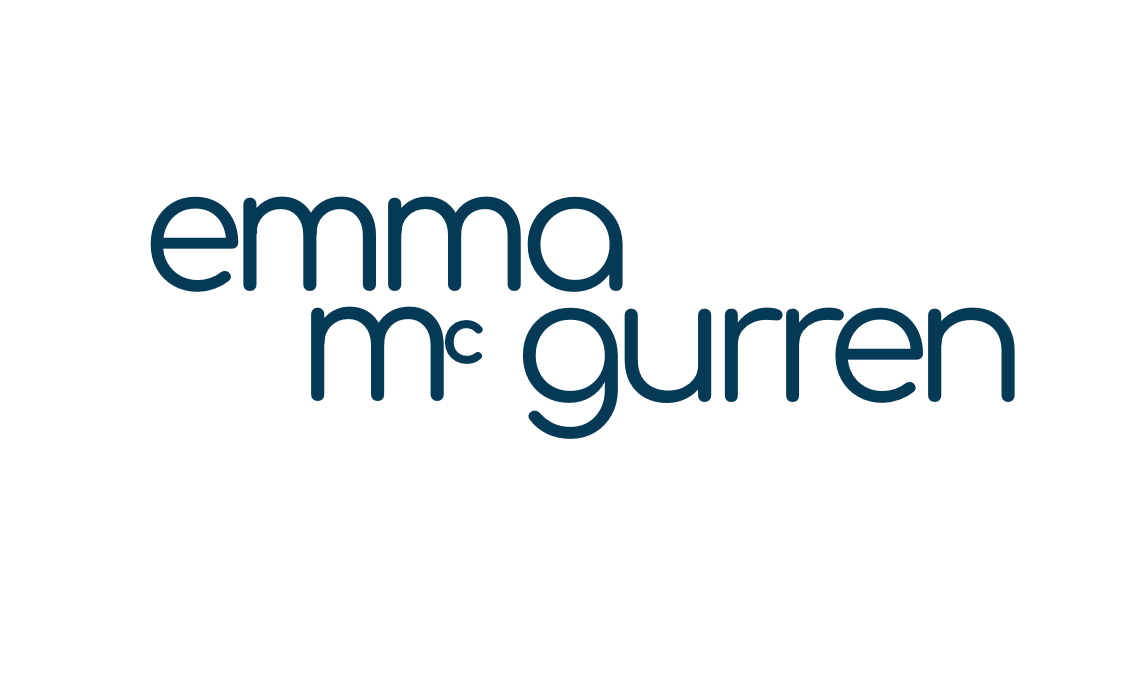
I adjusted the letter size and spacing quite a bit and realised that I liked them better when they were close together. I also kept the all lowercase and adjusted the ‘e’ and ‘m’ to make it compatible with my monogram. I am really happy with how my wordmark has turned out.