IxD103 – Improving my Monogram
I have been struggling with getting my monogram designed the way I wanted it. Although I still really like the curves, myself and Daniel discussed that it looks too hand-drawn. As you can see below, I had tried multiple times to get the curves looking equal and straight however it’s a very tricky thing to do. That’s when I knew it was time to go back to the start and see how I could improve.
Firstly, I started by reading some books and articles for inspiration. I also made another Pinterest board. Looking at pictures really helped me to remember the importance of neat lines and symmetry whenever you’re designing, as it makes everything look so much more professional.
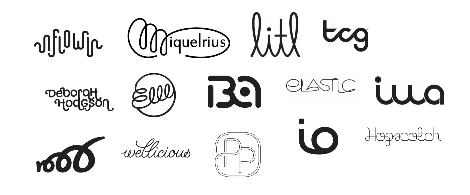
Above I created a collage of some of the styles of monograms which I found appealing. I especially love the first one. This is definitely the style I want to reflect in my own monogram as it is still quite fun and young, all of the traits I want to shine through in my brand.
Link for Pinterest board…
https://pin.it/E6ZNIdo
Developing my skills…
Like I said, drawing curves is a very difficult skill and something that I quickly realised was going to take a lot of practise. I find that youtube is a great resource for learning new tips and skills when trying to understand Adobe Illustrator. It is a software which I am still trying to familiarise myself with and I find that Adobe XD is a lot easier to understand. However I know that Illustrator has so many more tools and it will definitely benefit me more, especially if I am going to be working in a design environment.
The youtube video explained hacks on how to keep my curves straight. I copied the examples they were doing and found that it has helped my confidence with drawing curves already.
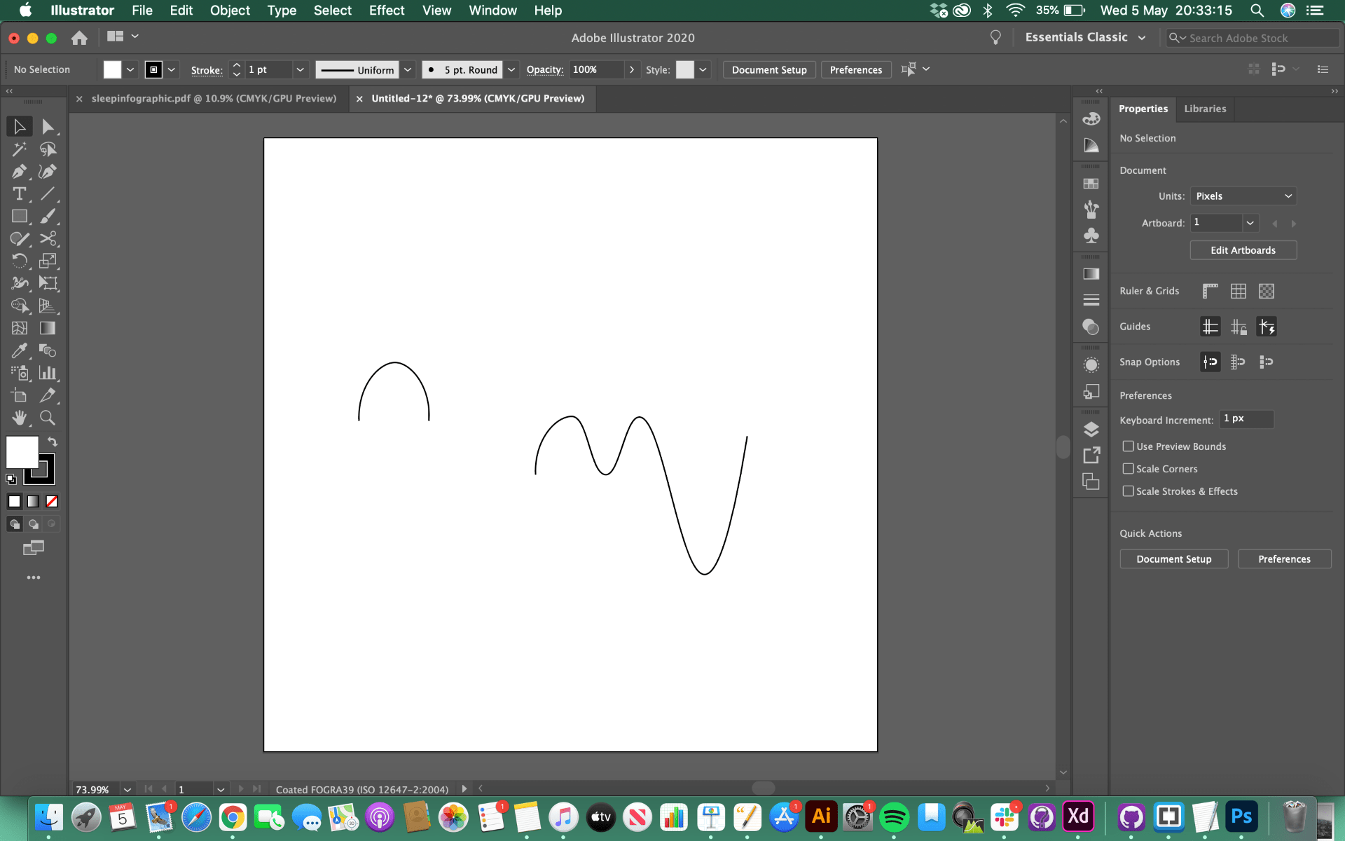
Below you can see my curves that I copied from the video. This was a really beneficial exercise to complete, especially for beginners like myself. Another tip I learned is that the box grid is so useful for working out how to get your monogram looking even.
Before beginning to design my monogram again on the computer, I decided to go back to the sketchbook to work out the positioning and length of lines etc. I found it so much easier to think, after learning how to use the curved lines tool properly. I knew what process I was going to have to use and I think this made me more confident in my design.
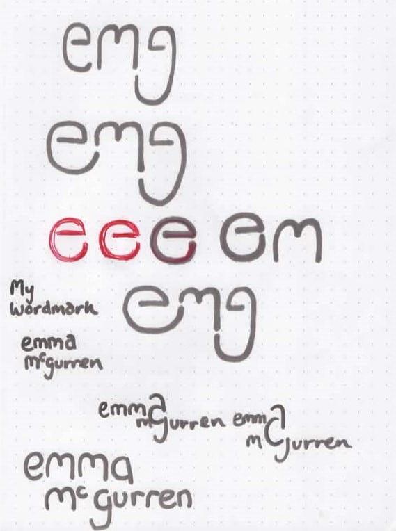

Below I have shared some screen grabs of the process of making my monogram. I still realise that it is going to take a lot of practice for me to get the curves right, however I felt that messing around like this was very enjoyable and taught me a lot!

I highlighted some of the errors I had made. Some of the lines were still not straight! I think recognising your mistakes makes it easier to realise how to improve.

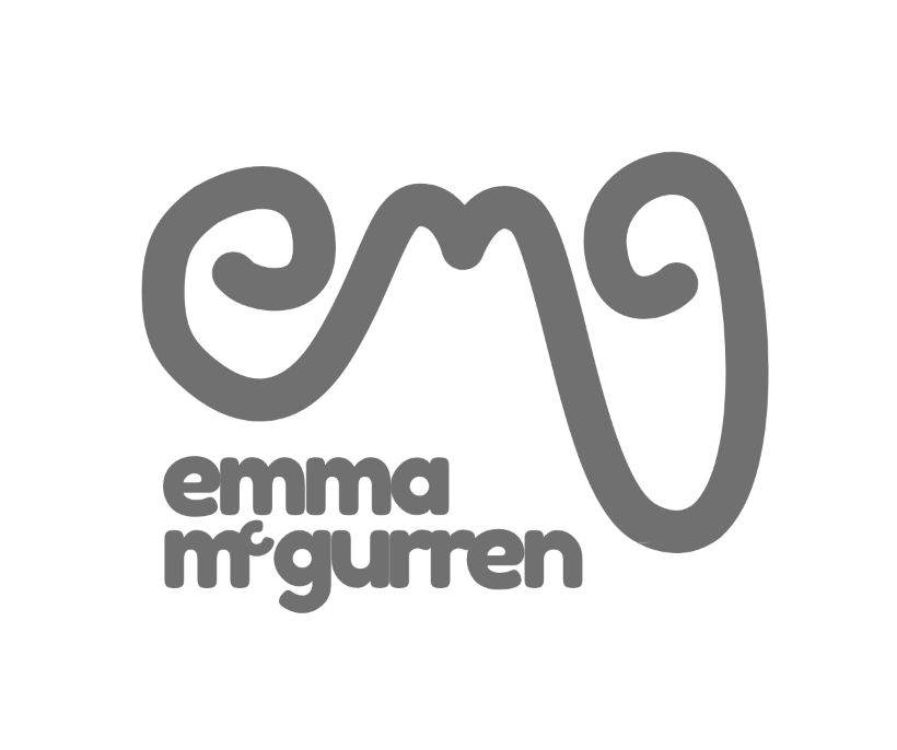
Final Design
Here is my final monogram design. I am finally really happy with how it has turned out. I think it is really unique and reflects the tone I want my brand to represent. Although it has still got a playfulness too it, it no longer looks hand-drawn and looks professional.