IxD102 – Semester One, Communication History
In this blogpost, I have been keeping a weekly update on the communication history content we learn about each Friday. Below is a short weekly summary of what I have learnt, something I have found interesting or inspiring and what tasks we have been given weekly. I think this will be really beneficial for myself and of course my tutors to keep tabs on my progression…
Week 1
Module Introduction and Reverse History
“Study the past if you would like to define the furture”
During todays lecture we learned about…
- Gesture based control
- UX design
- Older forms of web design
- Art movements, my favourite of all being Bauhaus
It was basically a summary of everything we will be learning over the next 12 weeks of semester one.
I am really excited to learn more about communication history. I agree that it is very important to know and understand how and why technology has been developed in order to improve and add to it. We are after all the future of web and app design.
Kyle and Pauline both asked us to keep a journal to document our thoughts, queries and anything we feel relevant from each week. I think this is a great idea and will help show my progression. Here is my journal… I will show some of my notes throughout future blogposts.
We were given the task of watching and reviewing a Wilson Miner speech. (Blog post attached below)
We also had to begin creating paper mockups of our first project, Type Specimen posters based on the font of our choice. (Blog post attached below)
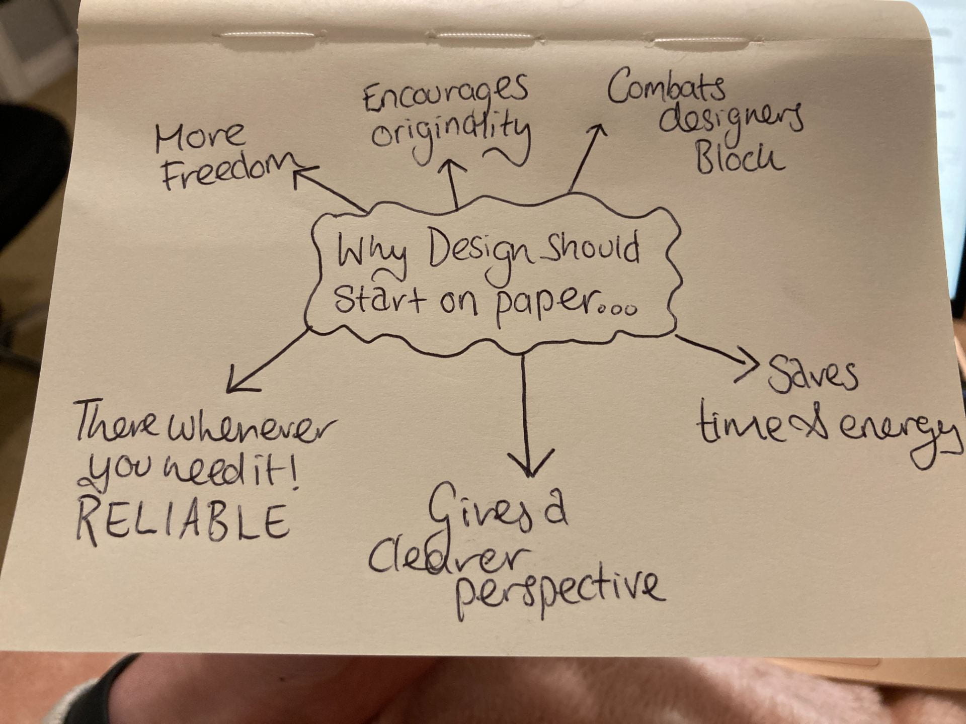
I really enjoyed creating the paper mockups and felt that they definitely benefitted my designs and ideas rather than just rushing into Figma.
I decided to further research the benefits of starting design on paper. I found a really interesting read and decided to write the advice in my journal, for a future reminder…
https://www.hongkiat.com/blog/advantages-pen-paper-computer-design/
Personally, I thought this week was a great start to a promising semester and I can’t wait to learn more.
Week 2
Gutenberg and Moveable type
“Type is the clothing for words”
During todays lecture we began looking at the history of typography. I learned about Johanne Gutenberg the German goldsmith, inventor, printer, and publisher who introduced printing to Europe with his mechanical movable-type printing press. In Gutenberg’s printing press, invented in 1440, movable type was arranged over a flat wooden plate called the lower platen. Ink was applied to the type, and a sheet of paper was laid on top. An upper platen was brought down to meet the lower platen. The two plates pressed the paper and type together, creating sharp images on the paper.
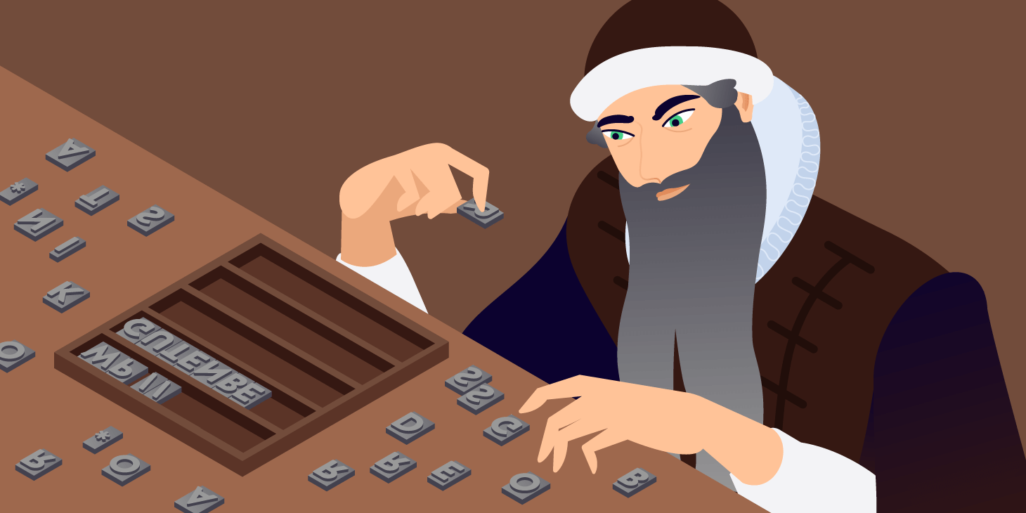
We watched a video and it showed me how careful and precise they had to be back in the days before digital printing. Not only this, but the vast amount of hours that must have been spent creating even one page for the front of a newspaper, is simply admirable. Johannes Gutenberg’s first printing press. Gutenberg didn’t live to see the immense impact of his invention. His greatest accomplishment was the first print run of the Bible in Latin, which took three years to print around 200 copies, a miraculously speedy achievement in the day of hand-copied manuscripts. The printing press had dramatic effects on European civilization. Its immediate effect was that it spread information quickly and accurately. This helped create a wider literate reading public.
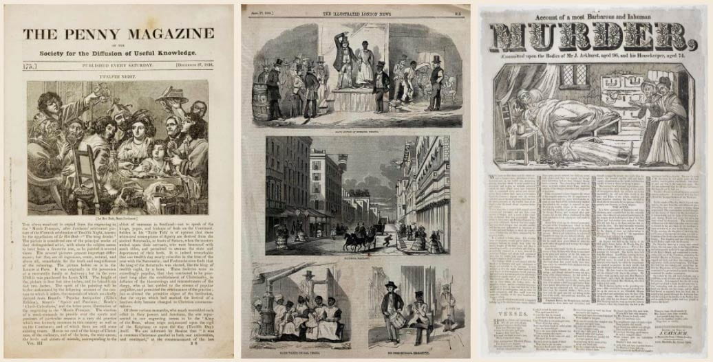
I found the evolution of typography very interesting and went on to read a couple of other articles about type history. The website “IloveTypography”, done a really cool article which explained the history behind the newspaper. Obviously news has always been spread… by mouth, by letters, but then came along the newspaper. I especially loved looking at the first newspapers that were allowed to include illustrations. As a rule, the earliest newspapers did not feature illustrations, although they frequently bore a printer’s mark or a decorated border on their front- or title-pages. In fact, not until the nineteenth century would pictures in newspapers become more commonplace. The Times newspaper, founded in 1788, didn’t print its first picture until 1806 — a murder-scene floor-plan. But the first decades of the 1800s mark the emergence of the illustrated press and hugely popular titles like The Illustrated London News, the first illustrated weekly news magazine; and The Penny Magazine, which in its heyday sold more than 200,000 copies.
The detail that went into the papers even in the previous century makes today’s papers seem rather rushed and irrelevant. They were vital for communicating news and are a major part of history. For four centuries now, newspapers have informed, reported, commentated, celebrated, persuaded, and even infuriated. But when it comes to immortalizing our failures and successes, of charting the vicissitudes of our species, perhaps no other medium has done a better job than the newspaper.
We also learned the basics of the anatomy of typeface. I find this particularly interesting and found that looking at labelled diagrams such as the one below, will be the easiest way for me to remember all of the terms.

I also intend on going to the library whenever I get a chance, to find some interesting books about typography. Kyle recommended quite a few, including “Stop Stealing sheep and find out how type works”, by Erik Spiekermann and “Just my type”, by Simon Garfield
Our task this week…
We had to begin using our hand drawn sketches to begin creating our Type specimen posters digitally. I was a little nervous to start this, because I am so much more comfortable using pens and paper rather than computers, however this is something that I am going to have to get used to. Practise will make perfect!
Link to View my Type Specimen development…
Week 3
A century of change
“The true secret of happiness lies in taking a genuine interest in all details of daily life.” – William Morris
I found todays lecture particularly interesting. We learned about how the industrial revolution ironically initiated the beginning of art movements. As the world began to industrialise, the invention of electricity, the movement of rural families into cities to work in factories and the general mass production of everything occurred so fast, that art was almost a thing of the past.
The Arts and Crafts Movement was essentially an anti Industrial Revolution movement. Above you can see a beautiful quote which I found, stated by one of the leading figures of Arts and Crafts, William Morris. Below I have included some of his beautiful designs.
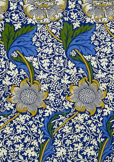

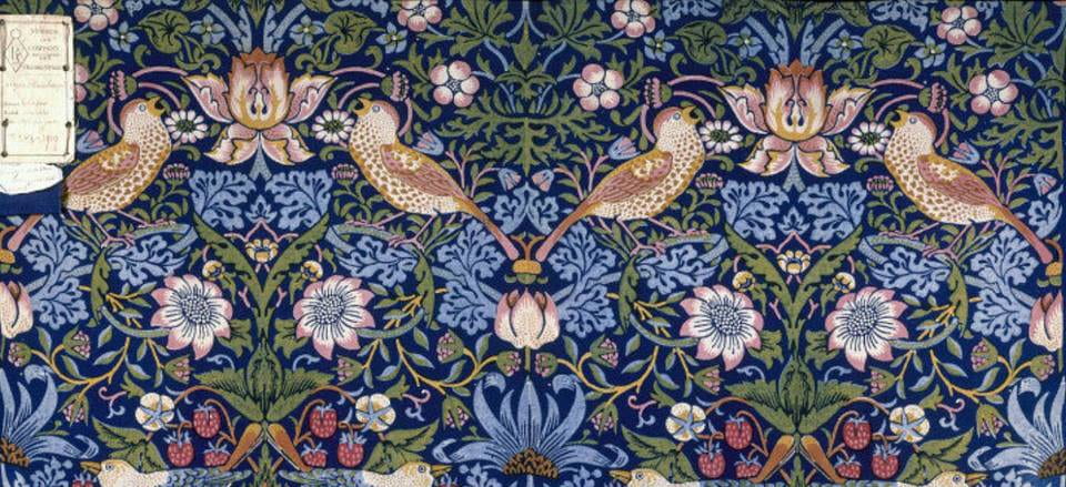
William Morris was a British textile designer, poet, novelist, translator, and socialist activist associated with the British Arts and Crafts Movement. He was a major contributor to the revival of traditional British textile arts and methods of production. Morris had his wallpapers printed by hand, using carved, pear woodblocks loaded with natural, mineral-based dyes, and pressed down with the aid of a foot-operated weight. Each design was made by carefully lining up and printing the woodblock motifs again and again to create a seamless repeat. The patience and care taken to create these wallpapers is beautiful in itself. His designs feel very regal and expensive, contrasting with the industrialisation of the world around him during this period.
We also learned about Art Nouveau and The Glasgow school, as well as Kyle sharing a demonstration of him creating his own type specimen. I took notes as I feel that I need to pay more attention to my layout and distribution of text on my own type specimens.
Week 4
Group Critique: Type specimen
“Taking constructive criticism from others is required to get to the next level.” – Wendy Starland
Today we got together as a group and listened to Kyle and Pauline’s feedback on all of the work we have done on our type specimen posters to date. We got their honest opinions and it was a great learning experience. I have confidence that with their expertise, they have advised me on what I need to improve and I will be able to carry this further on in my IxD journey. Below I have shared some of my personal notes from their advice…
The part that I find hardest is alignment and the placement of objects. My strong points normally lie within my colour choices. I am excited to see how I can improve by using their advice.
Today we also started to talk about our group presentation. The list of subject areas were introduced to us and our presentations will be presented on Friday 13th October. We were advised to create our slideshow on Google slides and myself and my group have already got a Zoom call planned for this Tuesday.
Week 5
Revolution and the Bauhaus
“The mind is like an umbrella. It’s most useful when open.”
During todays lecture Pauline explained both the Russian Revolution and the Bauhaus movement, which still to this day influence art and design. I myself felt very inspired by the Bauhaus movement for my type specimen posters.
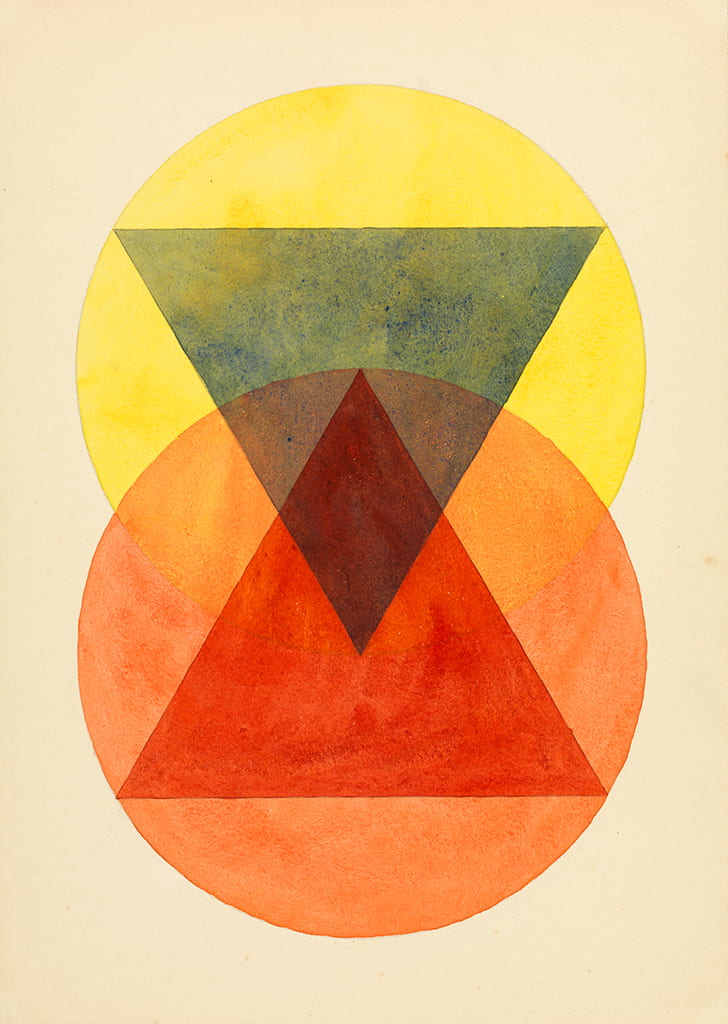
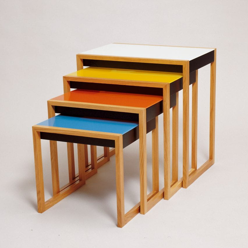
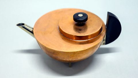
We looked at De Stijl, Piet Mondrian, Theo Van Doesburg and even the Constructivist movement. However the most striking movement for me, has to be Bauhaus. Bauhaus was an influential art and design movement that began in 1919 in Weimar, Germany. The Bauhaus movement championed a geometric, abstract style featuring little sentiment or emotion and no historical nods, and its aesthetic continues to influence architects, designers and artists.
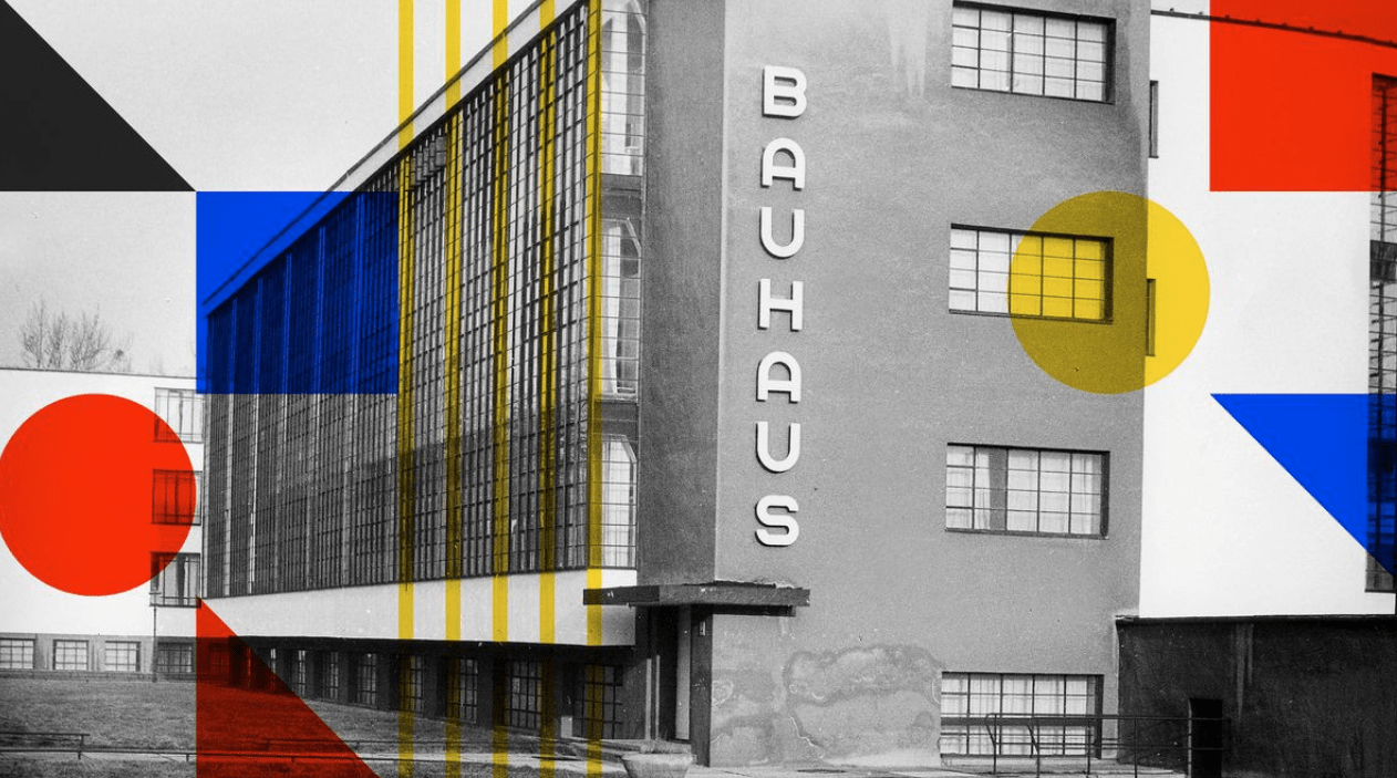
Its core objective was a radical concept: to reimagine the material world to reflect the unity of all the arts. Gropius explained this vision for a union of art and design in the Proclamation of the Bauhaus (1919), which described a utopian craft guild combining architecture, sculpture, and painting into a single creative expression. Gropius developed a craft-based curriculum that would turn out artisans and designers capable of creating useful and beautiful objects appropriate to this new system of living. In 2019, Germany celebrated the centenary of the founding of the Bauhaus. Founded in Weimar in 1919, relocated to Dessau in 1925 and closed in Berlin under pressure from the Nazis in 1933, the school of design only existed for a total of 14 years. Nevertheless, its effects can be felt today.

This week Pauline also informed us about a documentary on Netflix called, Abstract. She advised us to watch some episodes. I decided to watch the one about typography. It really helped me change my perspective on how I observe everything around me. Typography is literally everywhere.
I have linked my review of the episode below.
( https://blogs.ulster.ac.uk/emmg/2020/10/29/abstract-the-art-of-design/ )
Our group have also decided to research, “The Design Systems for the Olympic games.” I am so excited to complete this and learn more about how they create themes and logos etc. for the Olympics because I have always loved watching them.
Week 6
WWII and Modernism
Today Pauline taught us about Modernism, which arose from broad transformations in Western society during the late 19th and early 20th centuries. Some of its most well-known artists include Anita Malfatti, Pablo Picasso and my personal favourite Morgan Russell.
Modernism was not conceived as a style but a loose collection of ideas. It was a term that covered a range of movements in art, architecture, design and literature, which largely rejected the styles that came before it. At the core of Modernism lay the idea that the world had to be fundamentally rethought. Among the factors that shaped modernism were the development of modern industrial societies and the rapid growth of cities, followed by the horror of World War I. Modernist ideals pervaded art, architecture, literature, religious faith, philosophy, social organization, activities of daily life, and even the sciences.
Five of the main characteristics of modernism include…
- Individualism
- Experimentation
- Absurdity
- Symbolism
- Formalism
Morgan Russell, a Modern American artist, was the co-founder of Synchromism, a provocative style of abstract painting that dated from 1912 to the 1920s. Russell’s “synchromies,” which analogized color to music, were an early American contribution to the rise of Modernism.
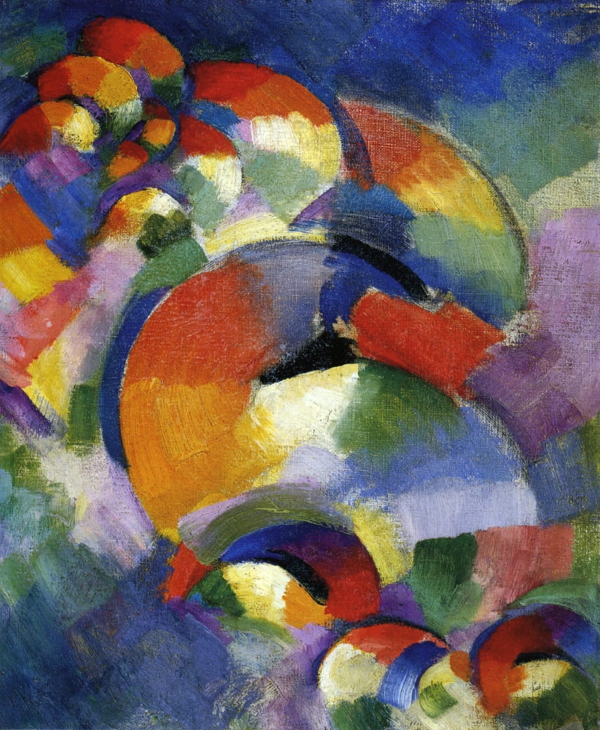
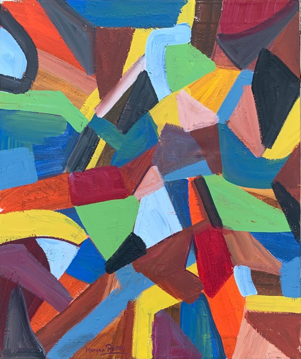
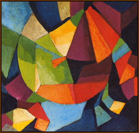
I love the idea that music influenced the placement and colours of his work.
Pauline also advised us to complete a pocket profile…
I have linked it down below…
( https://blogs.ulster.ac.uk/emmg/2020/12/01/pentagram-design…s-pocket-profile/ )
Week 7
International Style
Today Pauline taught us about International typographic style. The International Typographic Style, also known as the Swiss Style, is a graphic design style that emerged in Russia, the Netherlands, and Germany in the 1920s and was further developed by designers in Switzerland during the 1950s.
The main principle include;
- Cleanliness
- Readability
- Objectivity
The main Typefaces used include Helvetica and Univers. Those who taught Swiss Style argued that design should focus on the content and not decorative extras. By stripping away the embellishments, Swiss Style eliminates distractions for the viewer and allows the information-heavy design to be read and studied rather than merely seen and admired. Because of this, the typefaces chosen to represent Swiss Style are those that really hone in one the movement’s key principles.
It is an iconic design movement, one which I have great respect for.
This week, Pauline also began to tell us about our next project, a web essay. We were told to choose as subject area within graphic design. I have chosen to find out more about in influence of Graphic design in the movies.
Week 8
Design history presentations
Today we went into university to present our group presentation on The Olympic design systems. My review and the link to our presentation can be seen in the attached link below.
( https://blogs.ulster.ac.uk/emmg/2020/11/15/group-presentation/ )
Week 9
Postmodernism
Today Pauline discussed Postmodernism with us. Postmodernism is a broad movement that developed in the mid- to late 20th century across philosophy, the arts, architecture, and criticism, marking a departure from modernism. The term has been more generally applied to describe a historical era said to follow after modernity and the tendencies of this era. Appropriation, Juxtaposition, Recontextualization, Layering, Interaction of Text & Image, Hybridity, Gazing, Representation are her Postmodern Principles.
There are many artists and designers who have been inspired by Postmodernism. However, album covers seemed to be heavily influenced by the Juxtaposition of the movement.
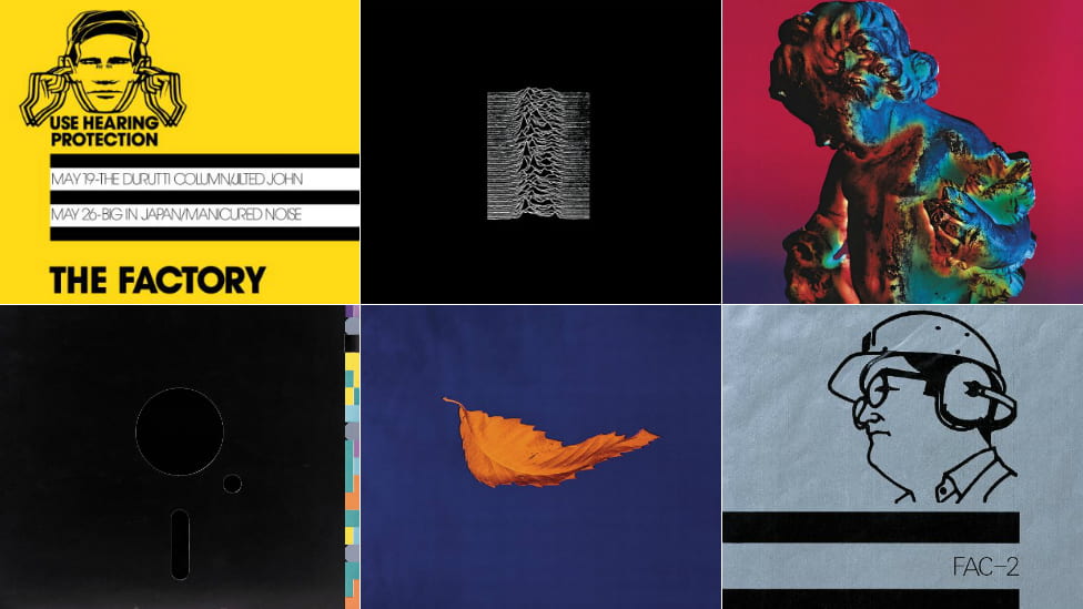
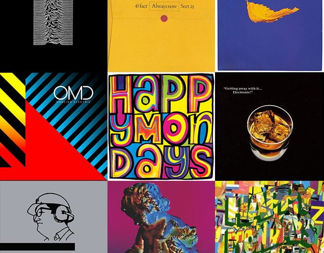
Peter Saville, is an English art director and graphic designer. He came to prominence for the many record sleeves he designed for Factory Records, which he co-founded in 1978 alongside Tony Wilson and Alan Erasmus. I have decided that I am going to use Saville as inspiration for my “Follow the Rhythm” project, which I have been having quite a mind blank for. His extravagant designs scream ideas at me and I’m going to begin by collaging some of his work together, to help me begin the project.


I have also completed my 500 words and submitted them to Pauline. I aim to have my first full draft completed for next week, so I can begin the fun part, designing my website.
Week 10
Internet History
Today Kyle took us through a presentation about the history of the internet. It was really interesting to see where the idea came from and how fast the world has evolved with the internet present.
Today really made me think about what life would be like without the internet. The world would be so different, if it wasn’t for the vision of Vannevar Bush, the development of ARPANET and packet switching.
I think it is also really beneficial that we are learning about things like this. I would be really interested in reading the book “A brief history of the future”, and intend on really helping my knowledge on the history of design and the internet over the Christmas break, when I have more free time.
Week 11
The Here and Now + Interaction futures
Today we had a very interesting final lecture on Communication History with Kyle. This lecture was the one I was most interested in, as it has gotten me excited about the future for Interaction Design. Kyle spoke about many things, including Surveying the Landscape, we compared websites from the beginning to what they are now. We discussed the main principles which have remained since the beginning of web design and what the future might bring for the tech world.
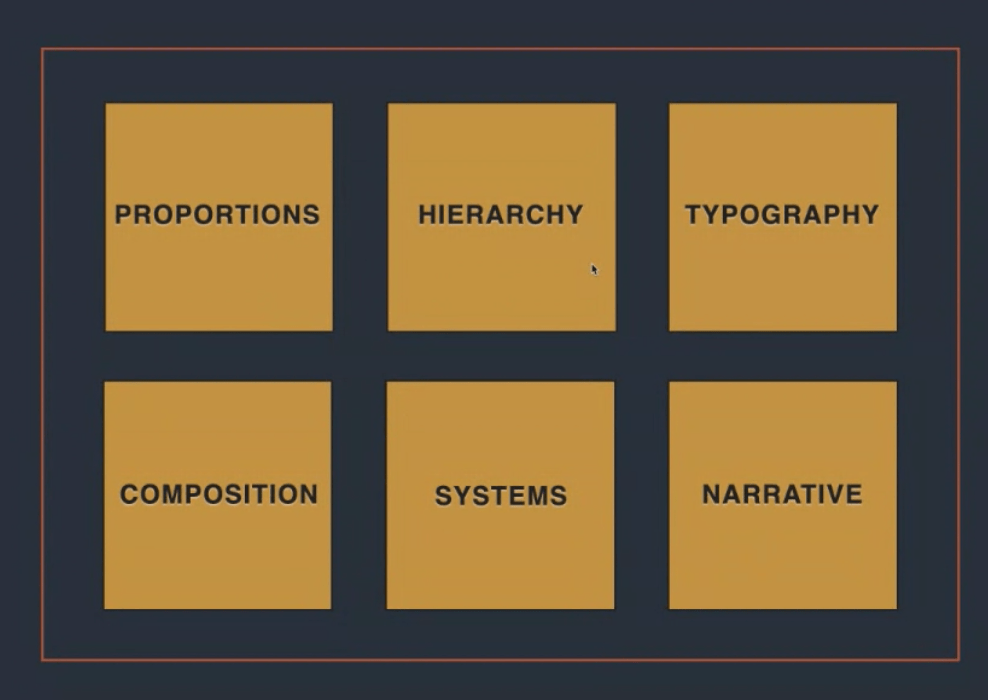
Here is a screenshot which I took of Kyle’s presentation, which displays all of the first principles. I thought these might come in handy to look back on in the future.
I completed a blog post about Wearable tech, an area I am particularly interested in. The link for this blog is below.
{ https://blogs.ulster.ac.uk/emmg/wp-admin/index.php?page=msreader.php }