
Typeface- Futura
Introduction
We were asked to research type screen specimen by choosing our favorite typeface and talk about and create a design for an iPad or iPhone on this.
Research
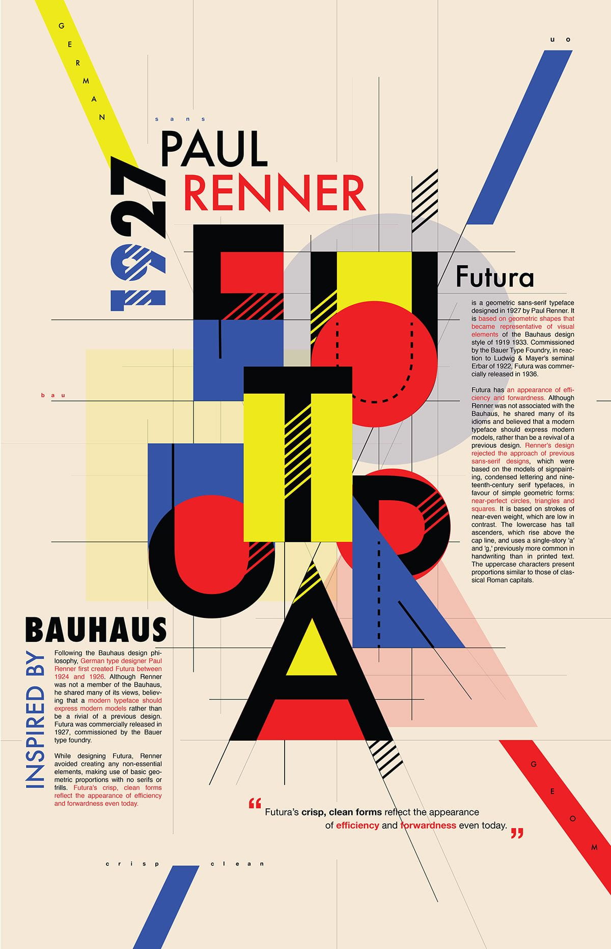
Futura has been developed from the 12th century Geometric Sanserif.
This typeface was created by Paul Renner from Germany who came up with the idea back and released in 1927 and since then it has been displayed everywhere worldwide. Futura’s style was based on the Bauhaus movement which was simple and modern. Futura font style consists of clean, simple shapes that give the style a modern and future feel to the design.
Paul Renner
Paul Renner was a German graphic designer and typographer born in the 9th August 187 in Weringerode. He was artist which created with the Futura typeface, which had grown to become one of the most popular and used types of the 20th century. His legacy and work have continued to live on since his death in April 1956. He probably did not realize how big his work would have become.

Futura is under the Sans-Serif category. In 2017 Futura turned 90 and has been widely used in the modern area and throughout history. It was believed that Futura was importantly used on a plaque left by astronauts from Apollo 11 who landed on moon. It is thought that the Nazi’s used the Futura typeface as a way of shaming modern art. The American military may have also used Futura typeface during the World war 2. They probably chosen the text as it stood out. Recently Futura is being used in Advertising and on film posters.

This image above shows the plague used in the Apollo 11 mission.
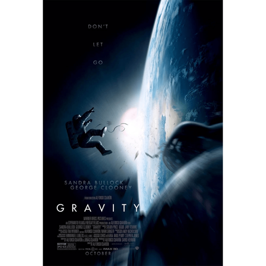
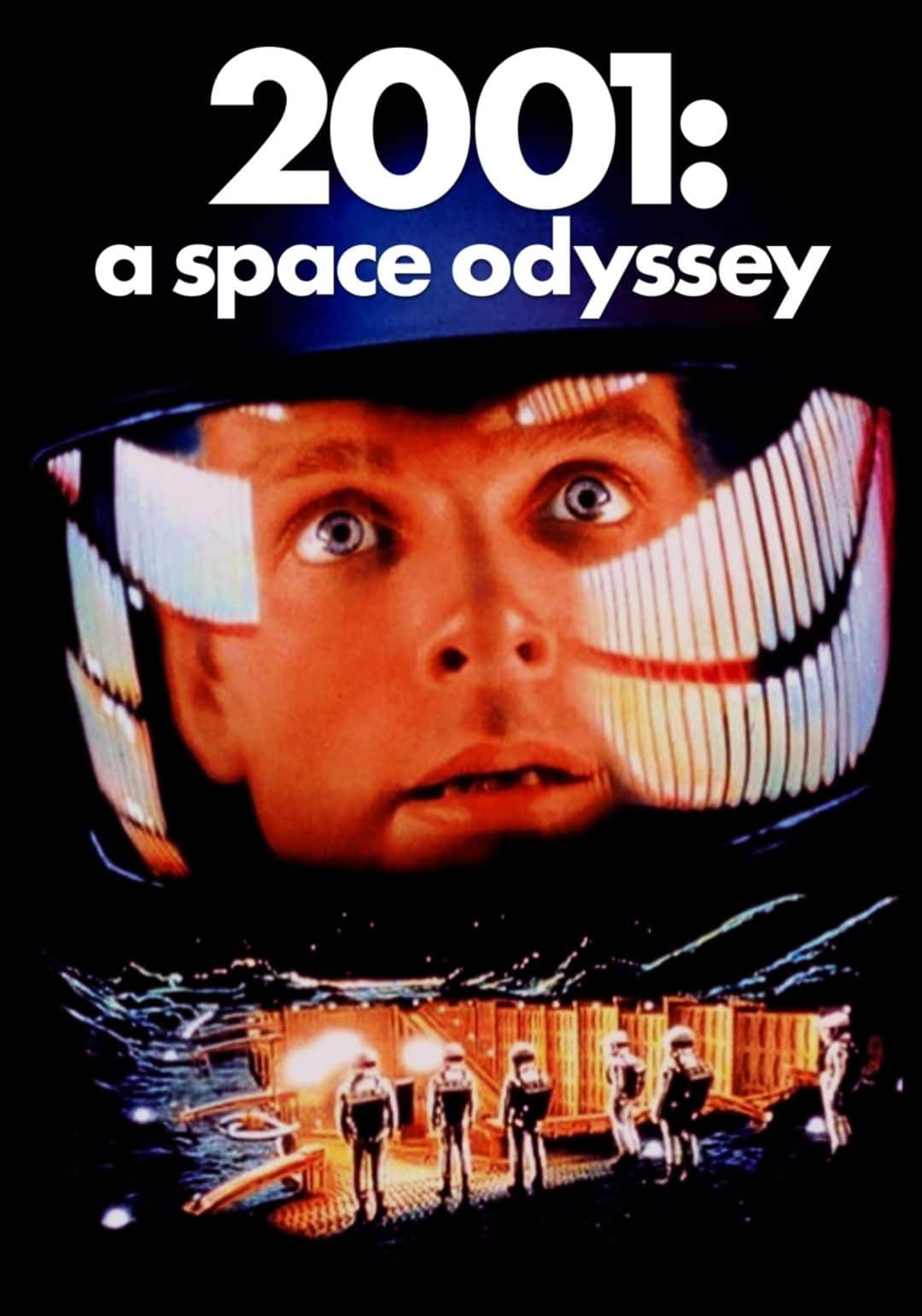
Most recently it has be used on film poster’s most recently on poster’s for blockbuster film Gravity and previously in 2001: a space odyssey. You can see it has created an impact.
There are different types of Futura weights such as bold, regular, and light, etc.
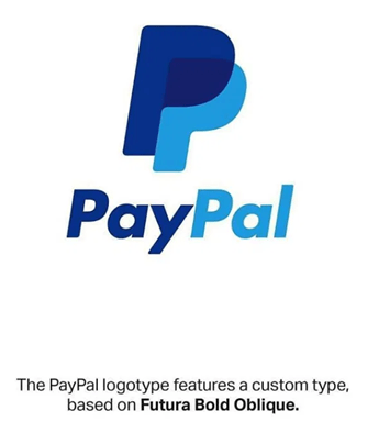
The use of Futura has increased in recent year. Many famous brands worldwide such as Nike, Dominos, PayPal, Gillette, etc, use different styles of Futura typeface in their logos. Futura typeface helps make brands and items stand out as it grabs the viewers’ attention.
I Choose Futura because I really like its simplicity and it is clear to read. The style of text is interesting and looks modern. Also, I found out some of my favourite brands use this text which makes me like it even more. I probably have seen a lot of Futura text before without even known from my movies and brands I like.
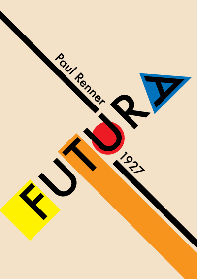
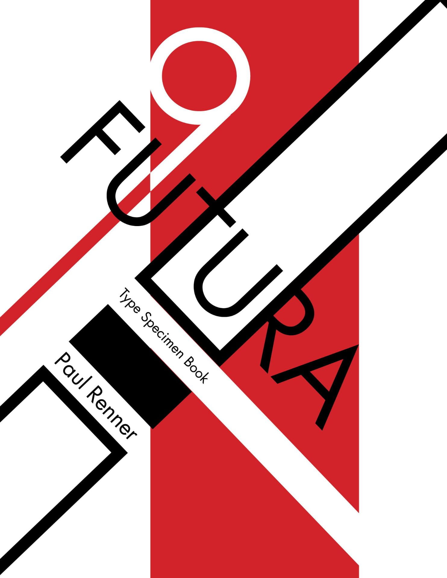
Examples of inspiration futura typeface
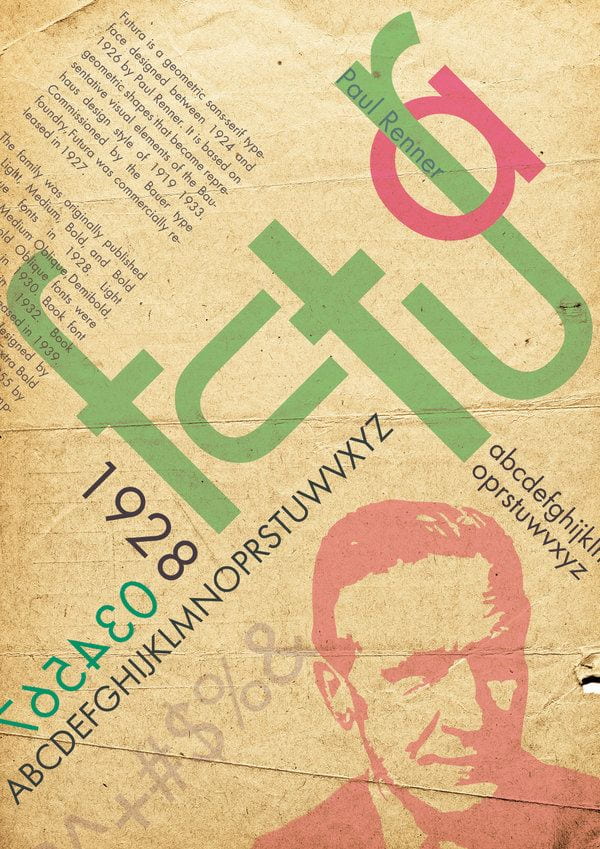
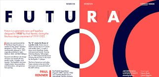
Here are a couple of examples of futura typeface which I found inspiring on the internet.


Below you can see a couple of my favourite brands which use Futura typeface in their logos.
![]()

![]()
![]()
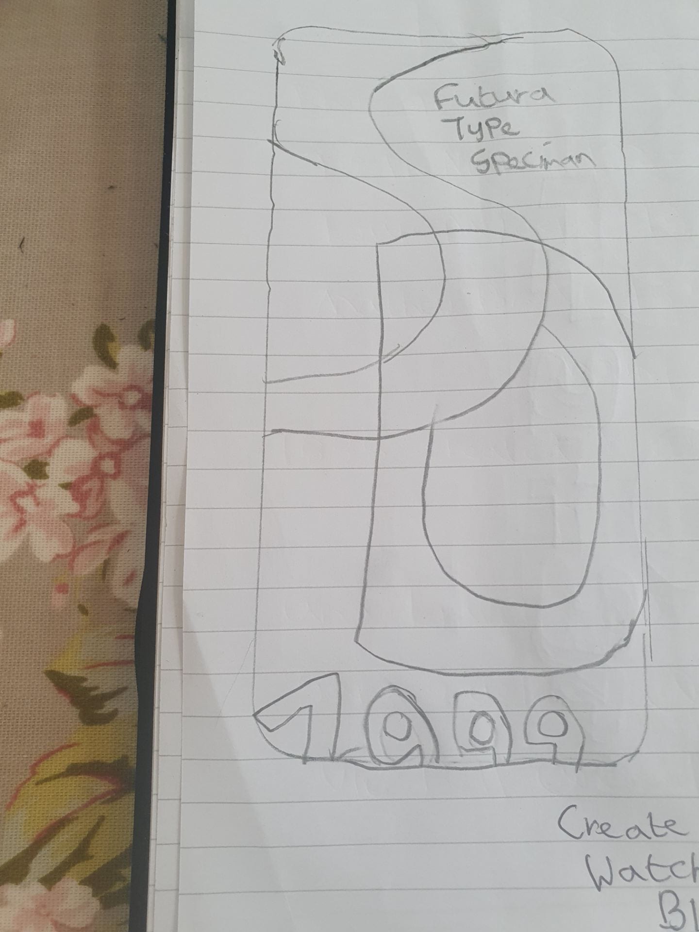
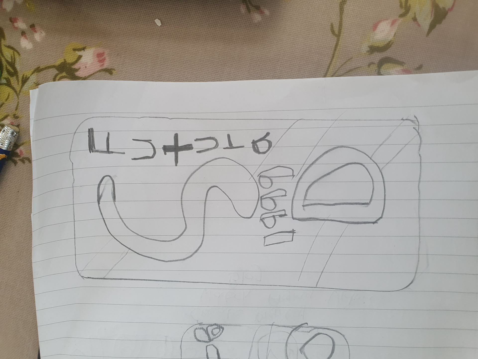
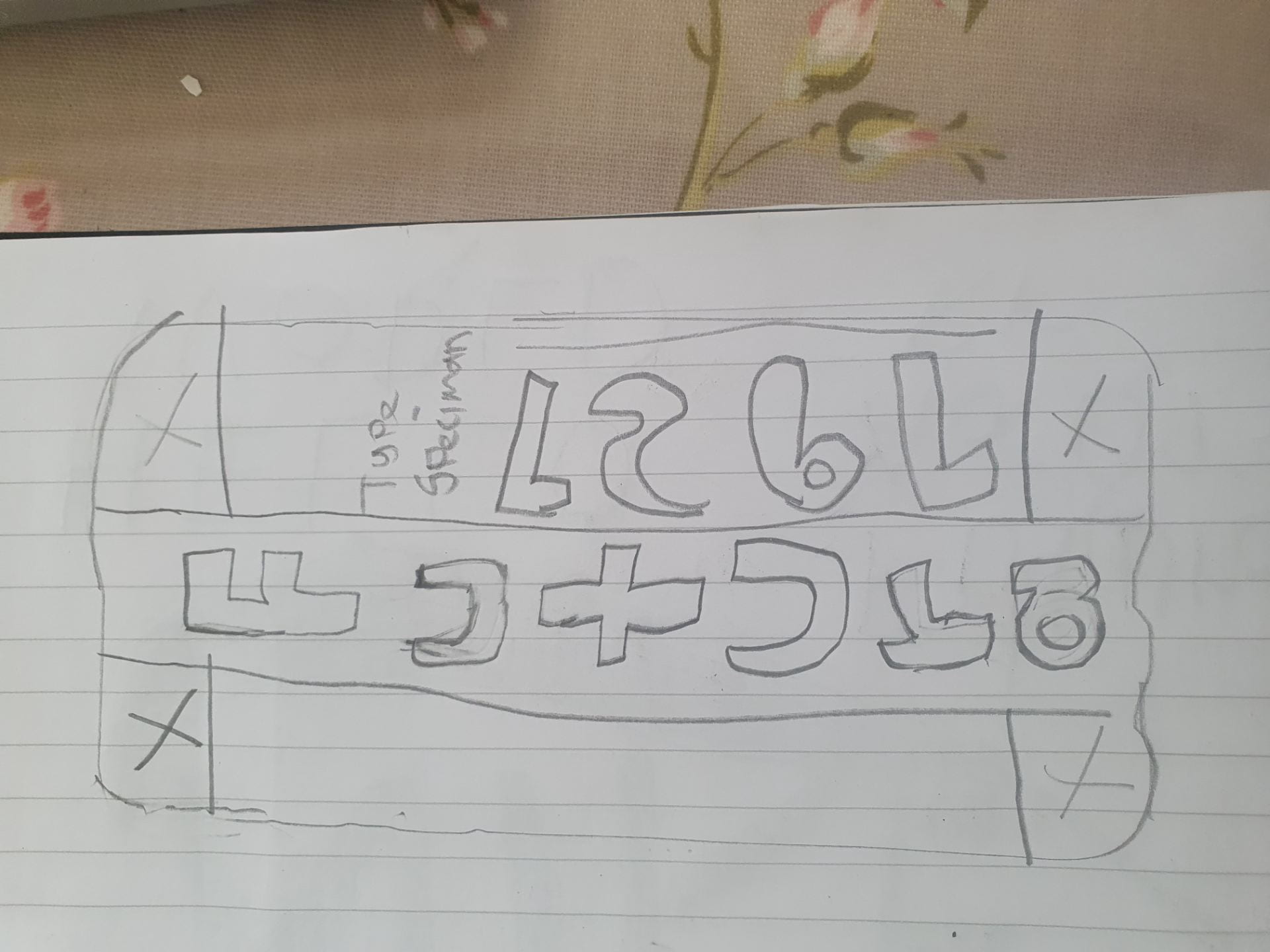
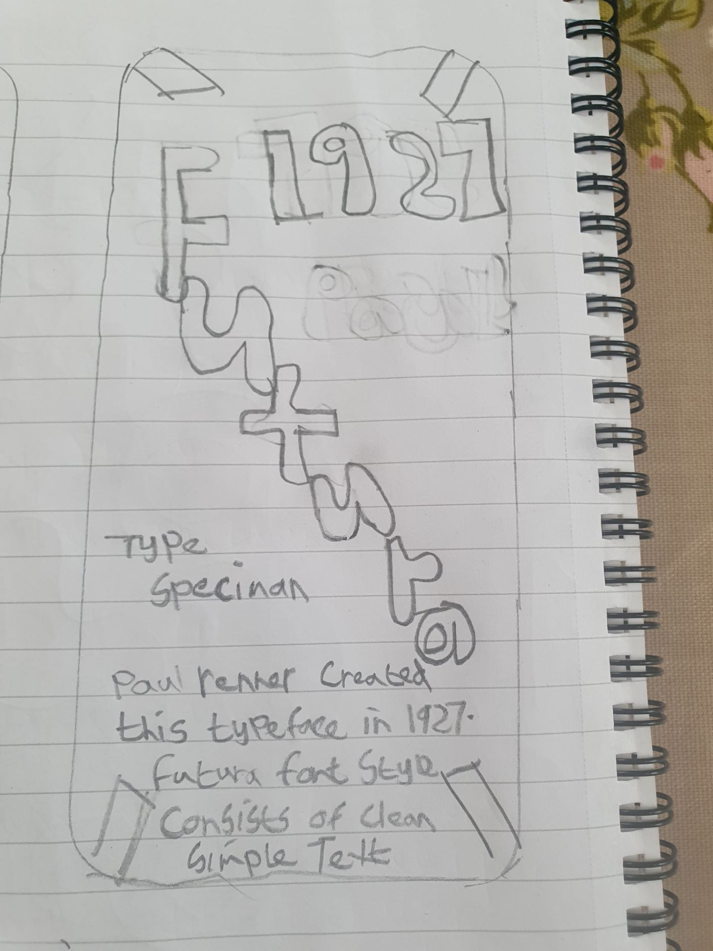
Sketches
Here I created a few sketches of Futura specimen typeface man for a mobile phone device.


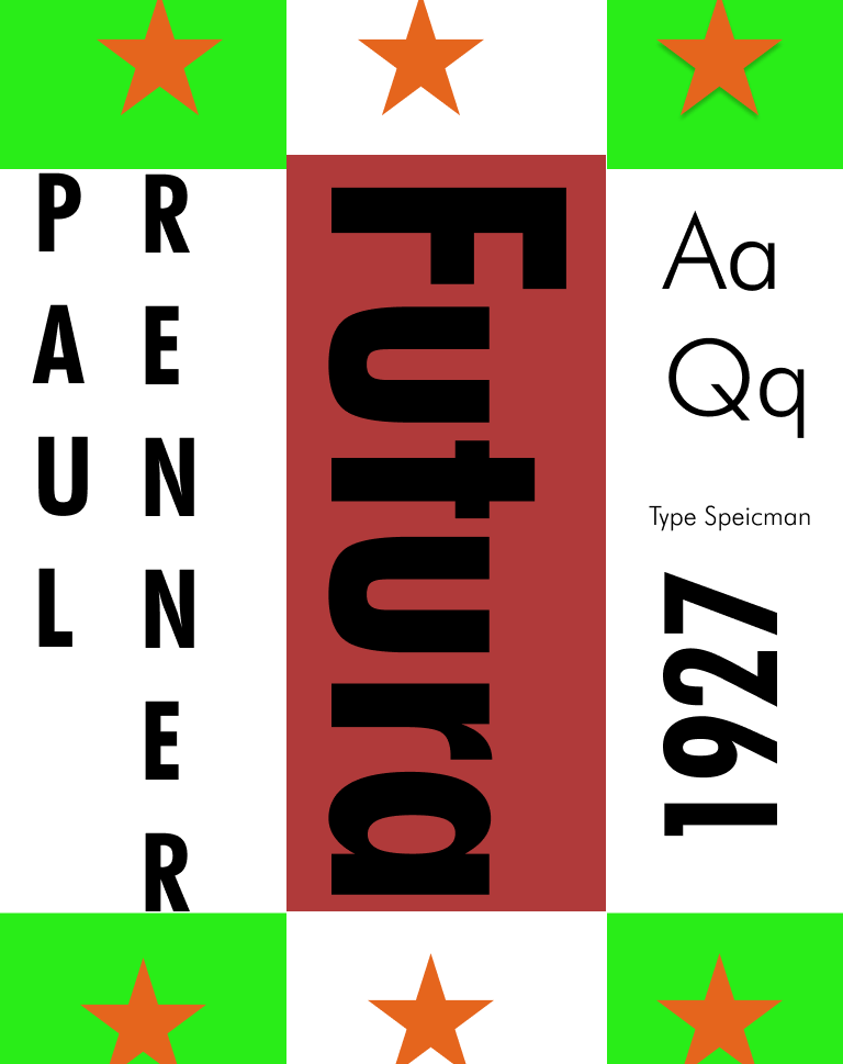
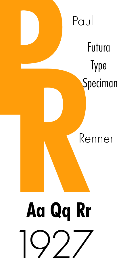
Digital
I then made a few digital versions based on my sketches of my chosen type specimen futura using Figma on either ipad, iphone and MacBook templates.


Bibliography
https://design.tutsplus.com/articles/all-about-futura-font-and-its-history–cms-35382
https://theschedio.com/famous-logos-futura/