
Following feedback from my lecture Kyle during the final week, it was advise I added in an Icon set to my website to make my content stand out. These Icons would be added to “The Missions” page on my Apollo site.
I think be adding in Icons it will make my content and webpage more visually appealing and help to divide the content.
Below is my Icon Set:


Icons on Webflow:
Here is how the Icons look on Webflow beside my text and sentences.
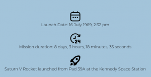
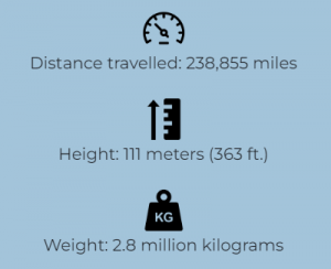
I made sure the size and style of the Icons were kept all the same size to make it consistent.
Updated
For the weight and Height Icons I slightly changed them and decided to not fill in the shape to keep it accurate with the rest of them.


Reflection
I think the advice Kyle give was really helpful and I am happy how these Icons look on the website. I feel they create a visual effect In the future for any piece of work I do I think I’ll add in an Icon set to my work.