This week we had a guest Lecture with Rachel Orr and Pearse O’Neill from Big Motive
In this lecture we would learn why storytelling is such a powerful device in design.
They started off by explaining storytelling in a design definition: “It is how we communicate with our audience to gain insight ”
Technology has advanced and so has our methods of storytelling. We use stories in everyday life it is how we communicate with each other. Making a great story-begins with your problem and it should be considered at the very start of your project. The story will then develop with your project.
We were told the 7 elements of storytelling- Character, plot, dialogue, decor, melody, theme, spectacle.
Character- Personas, mind maps and empathy maps ( what are their needs and pains, what do they look like, what is their story) You can have more illustrative techniques for user personas. Empathy maps allowed to delve into different types of users and their needs. Building their stories help us understand where we can help them.
Plot-Storyboarding and User Journeys. How would your personas you’ve created navigate your designs. Be open to having your story change. Look at all your info in one place and examine where it could go wrong. Airbnb’s user journey- shows the whole journey and process of booking a holiday- helps develop ideas and understanding. Storyboarding allows to see how everything connects and how it can be improved.
Dialogue- Language and Tone of Voice- allows you to connect with user and medium to communicate with your user audience. Important for your designs to feel relevant to them. Big Motive- changing children’s code- Changed the layout and language from legal jargon to terminologies designers would understand- were now able to use the children’s code as guidance. Also app Patterns to help track pain, tone of voice needed to be sympathetic and understanding, as well as motivating to help their user audience- this involved user research.
Decor- Visual Identity- appearance is very important as people have emotional connections with branding and their visual identities. It is important that the user feels the product looks good. An app could be incredibly designed in terms of UX but if the appearance is not to the user’s standards or taste it may not be chosen. Visual identity is how the user is introduced to your product- it’s important to consider how this fits in with your story. Big motive app-Risalco- Serif typefaces are used for credible companies through user research. The logo took intp account the story of the app
Melody- Creating a positive emotion in the things you create. In the story the app is either apart of or is the story. At the negative parts of the story- your product will intervene. Everything coming together is the melody of the product
Storytelling in practice
Aflo- allows users to record inflammation in users with respiratory illnesses and cystic fibrosis. Story began with user research- interviews and gaining context- who they are designing for. Asking the user how they feel taking inhaler medication, some are embarrassing to take it out in public. Also learning that they needed to create audio cues to help users as taking medication needs both hands. Aflo comes from word- airflow. Logo is like an air bubble and feels fresh and peaceful. Logo animation the bubble grows and deflates. Tone of voice was made to be motivating without being patronising. Being clear and simple and giving feedback. Created animation to help users understand how to take medication- gives engagement and enjoyment to user.
Our place in space-Collab with Oliver Jeffers. Trail across Belfast Derry Down and Cambridge. Big Motive created AR product to coincide Oliver’s story. The app would be educational and the story of how with distance comes perspective. With Oliver Jeffers style they needed to think of typefaces that our accessible and easy to see. Using hand illustrations for children along with the text explanations for adults. Getting users involved by placing their own star to the trail. Story of Us and Them in app. Throughout trail, us will get bigger and them smaller.
For final year- think about your story from the very beginning- what you think is the problem might not be the problem so talk to your audience and use their feedback to guide you. Allow the story to change.
Narrative Website update
Coming off of last week I wanted to use the title section I used before the astronaut animation in other areas of my website. It’s a similar design to how I introduced one of the films in the prototype.

This is how the title looks in prototype.
This is how the title looks in the website.
To keep things consistent throughout all my prototype and website I’m going to use these section break titles before moe content.
I wanted to rearrange the layout of my prototype first so I started sketching how I would like the story to flow.

I drew what I had so far, at the beginning of the home page. I added the title sections in the same style that I had used in the silver screen section and above. I think this is a great way to add more content and create a better story flow.


To get inspiration for these sketches, I looked for some layout inspiration in fashion books from the university library. I took the images above from the book Style City by Robert O’Byrne. I loved the look of the big full images and the size difference between the photo and the text.
I took the inspiration and sketches I had and began to adapt them to the prototype.


This is how I designed the first title section. There’s quite a bit of padding between the beginning of the section and the above text. I’m deciding whether this should be decreased or if it is good for a visual pause. The content of this section I placed under this title and I decided to go for a very similar layout as the start of the homepage. The text next to the image is a individual vertical scroll but I selected it so that all the text is visible.

Then I made the second stage section below this. Instead of the text being individually scrollable, The images now can be scrolled horizontally, I think this adds some variety. I also placed this content in such a way that the images slide into perfect alignment with the text under it.

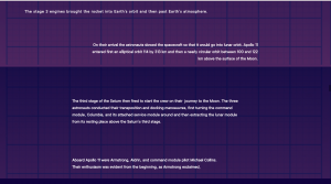
I then designed the last stage. For this section I moved away from the sketches and previous magazine pages I liked. This is because there is a lot more content in this section. I used the layout I liked of the big full image and small text in the corner underneath for the top part of the section. For the bottom part I used the following image from the Prada fashion book in the library.

I really like how they layered the image of the baga and I used that for the bottom images of the third stage part of the rocket and the colombia module.
I really like how this developed and I think it adds more of a storyline to my design, which after this week’s lecture, I think is very important.
Now that all the content is there and I’m happy with it, it’s time to add it to my website on webflow.

 This is how the first stage title and content look in my website so far. At this moment I was just getting the content in and wasn’t worrying about having all the interactions and alignment correct yet. One thing I don’t like straight away is the title being on one line, I think it looked better in the prototype when the words ‘First’ and ‘Stage’ are under each other.


This is the second stage title and I much prefer the look of the text this way. I have the horizontal scroll interaction working in this section. To make it work on the website, instead of the images slotting on top of the text, the text moves with the image. I’m very happy with how this section turned out.
So far I just have the title and text content uploaded and aligned for this section. I need to fix the title again so it looks the way I prefer and the images still need to be edited to have the purple hue I like, I use photoshop to do this. I will have this finished next week.
At this point I thought it was important I get my ‘Silver screen’ section implemented into my website. Firstly I wanted to make sure I’m happy with my prototype version.

This is how my Silver Screen section looks so far.
There’s a couple of things I want to change, the text size I have used in this section is bigger than in the rest of my prototype. The text content for this section is explaining the plot of these films but I think I could add more to this. I could get more images of the behind the scenes of the sets or maybe get info about how they used the story of the Apollo missions for their films. Similar to how I re-organised my home page section, I will be trying to find new layout inspiration and make sure I am happy with the final design.


These are some pages I found for layout inspiration from Style City.
From this and the content I acquired from an interview with Ron Howard and the cast, I designed this.
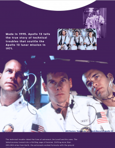

 I’m very happy with how this came out, I think you can see how I interpreted the layout inspiration. I think it explains more of the story and is more consistent with the rest of the prototype.
I then had to do the same with the other film in the Silver Screen section, The First Man.
I like the layout and interactions I have at the moment in this section. How I plan on improving it is by adding more content and keeping the text and design consistent with the rest of the prototype.


 I used similar ideas for layout and interaction as the ‘Apollo 13’ page as I wanted to keep consistency. I used just vertical scroll interactions in this page as I thought it would be interesting to see images move as the user scrolls normally. I also used some nice full screen images I found, which I think add a dramatic effect to the prototype.
Re-arranging and adding content to my prototype and website this week has taken a lot of time. Therefore I will be working on adding the ‘Silver Screen’ section and all of its new content, into my website next week. I have added all the images I used into my assets folder on webflow in preparation for this.