This week we looked through all of our short pdf presentations that we submitted for this class.
We were given a short presentation about tasks we should do before starting placement, such as remembering to register for placement year!
Tuition fees in placement years are 50% less than normal. We have a placement presentation and an employer report at the end of the year. Both are worth 20%. And finally a placement report which is worth 60%.
After this we then began the critiques.
While waiting for my own critiques and feedback I wrote down what I liked from my peers work.
learning from peers
- make sure the scale of all items are correct
- check for too much visual noise
- change branding slide, maybe too much colour
My feedback
- make navbar active
- icons consistency and legibility
- spacing issues throughout
- didn’t like red- better use of colour in new scheme
Changes I made from feedback
The first and most important change I decided to make was to make the navbar look active on the corresponding screens. At the moment my navbar looks the same on every screen but it is good interface design to have the icon look active to the matching screen the user is on.
I decided to look into what active nav bars could look like.
In Google’s material design-kit their active icon is filled with solid white.
 This contrast between the bright blue-purple background of the navbar. The white heart make it really clear to the user what screen they are on. The problem is that my navbar’s background is white already because of the solid colour background I have on the screens.
 I found this image on Dribble showing some example of different ways to show an active navbar on a white background. As much as the top two are lovely ideas, I find them a little too subtle. Highlighting a light colour around the icon or filling the whole tab containing that icon could be a good way of making the active icon obvious and clear to the user.

I decided to try out filling the whole tab with colour and just filling the icon with colour. I then tried these different option in my wireframes to see how they looked.

 This is how they look side by side.
The solid colour tab is very clear even when its small but I think when looking at it normally through the prototype view, it looks like too much colour. I needed my navbar to be a bit stripped back in terms of colour and complexity because I have a lot going on in the screen’s content. Therefore I am going to choose the solid icon. As I have gotten more comfortable using my component library, I made the navbar a component and the different active versions, variants. This made changing the navbar throughout my project much quicker.
I had some feedback about how my icons should either be a bit more simplified and more consistent. I agree with the feedback about consistency I had meant to re-draw my icons for a while now. However on simplicity, I’m not sure I can simplify a lot of these down further but I will try.
These are the icons I need to fix
I’m going to pick one style from these and recreate the others in it. I like the design of the dog food bag as it is clear and simple. I think the other filled colour icons are too bright together and that makes them harder to understand.
These are the changed icons
I added them to my prototype but when they had a purple stroke it didn’t stand out so I changed them to the pink colour.
The last piece of feedback I got was about some spacing issues throughout my app. I will fix all of this when I am doing the final touches to the app.
Final App Development
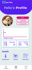
To get things ready to submit the first thing I did was mock-up the wireframes I made last week for the exercise and weight trends screens.

These are what they look like mocked up.
I think they look good, I forgot to fix the spacing between the weight graph and the heading but other than that it looks good. I used this website to get information on what a normal weight looks like for a corgi of its age. I think the graph looks nice I just want to add a few more prototype interactions such as the weight appearing when you hover over one of the purple circles in the weight graph.
The last screen I want to mock up for my prototype is the chats screen. Therefore most of the user flows I’ve created are completed.
This screen will be a simple messaging interface so it will look pretty similar to a normal messaging app. I started sketching this out.

I just wanted a simple layout as this isn’t one of the most complex type of screens to design. I just wanted to have a working page there so the user journey throughout the app would make sense.
I had already had a similar version of this wireframed from the first critique, but I had to redesign it to suit the new style of my app.


The images above show the wireframes and the mock ups.
I think this design fits the purpose. I added. a small prototype interaction of a flashing line at the ‘type message..’ to add to the interactiveness of the design.

This is what that interaction looks like.
I also wanted to add in another interaction I had used before in ‘felix’s’ weight screen. The interaction that makes the correct weight come up beside the correct point in the graph. I thought this would be a great way to improve the interactiveness of the ‘weight trends; screen.

This is the grid I made to hold the components to achieve this effect.
I’m very happy with how my prototype looks now it is time to just make sure everything it interacting how it should. I’ve found this mini final year module very fun and I’ve gained much more experience in how to prototype quicker and how to create nice transitions and interactions. I’ve enjoyed it as much as I’ve felt I had a lot to do.