Visual Marques
We began researching visual marques, visual marques can be pictorial or abstract.
Pictorial marque are more stylised and iconographic versions of something usually to describe the company or company name eg. apple.
More abstract marque consists of mostly geometric shapes eg. pepsi/nbc.
There are also combination marque which are made up of a wordmark and either a lettermark or a symbol.
Humans process images 60 000 times faster than words therefore a good visual marque can catch the eye of a user and tell them about your brand or company quicker and more effectively than just a wordmark and monogram
Anatomy of a Visual Marque
- Name mark– The company/persons name written in a special way
- Symbol– the mark (pictorial or abstract)
- Colours– Selected company colours
- Type– selected typefaces
- Fifth Element– An additional decorative element
examples
![]()

This week we were asked to begin designing and creating our own visual marks. To begin this research I made a mindmap of topics to do with my personality and interests to fit into my tone of voice.

From this mind-map and brainstorming words and things associated with my tone and voice and what I want to convey. I want to create a visual marque that portrays a sense of an easy-going and optimistic nature, I also want my visual marque to show aspects of my personality like my interest in sociology and human nature and how we all need each-other.
I then sketched a couple of pages of idea for how my visual marque would look:


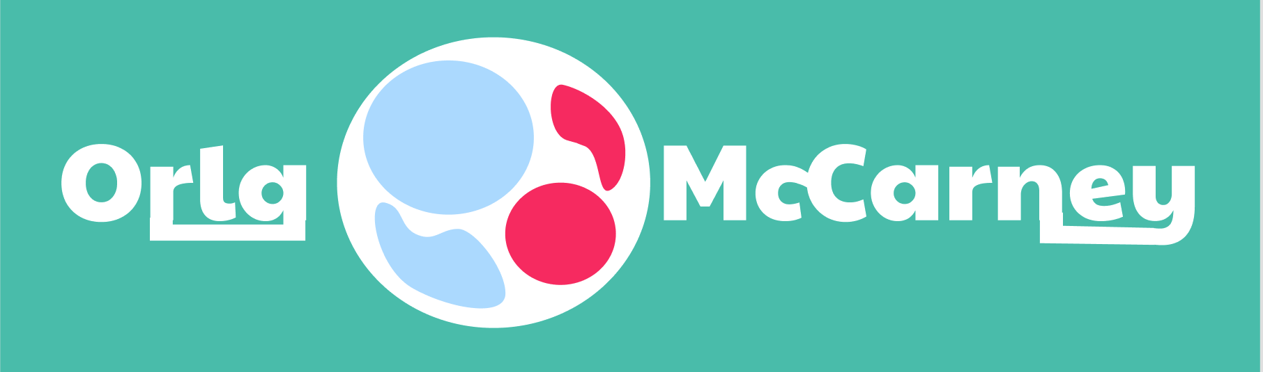
It took me a while to really find a direction I liked but on the second page of sketches you can see the development as I found a design I was comfortable with. I liked the idea of a visual marque that shows a sense of community and connection, therefore, I created a more abstract design of a birds eye view of 2 people holding hands or embracing. Now that I could better visualise what I wanted I began to digitise these using Figma and from this I finalised my visual marque to look like this:

I thought this visual marque would look bed=st as a combination marque with my wordmark:
Sunni Brown- Ted Talk
Sunni Brown is an american author and founder Sunni Brown Ink, a visual thinking consultancy. She conducted a Ted Talk called ‘Doodlers, Unite!’ in which she talks about how doodling is frowned upon in our society- seen as lazy and unproductive, especially in professional and corporate environments. Brown disagrees with these labels and states that doodling is actually integral to human nature as studies have shown that children’s artistic ability across space and time show the same evolution of complexity in visual language as they grow.
Doodling is an important step towards developing ideas and brainstorming and processing heavy amounts of information. It can be very helpful in those very environments that stigmatise it. Being a person that used to doodle heavily throughout my entire education I was really pleased to hear her speak highly of it as teachers look down upon it. They saw it as messy and as evidence that I wasn’t listening when in reality keeping my hands and part of my brai busy by doodling helped me concentrate on what they were saying.
Monogram Development
I wasn’t very happy with my original pages of monogram sketches so i did another page of sketches this week:
From these I started digitising them by recreating them in Adobe Illustrator


 I like the first monogram on the left because it has more personality to it because of the hand drawn ‘m’ joining the letters.
The middle monogram is probably my favourite because it has the visual clue to a chain link which could be used to create a brand identity for myself. There’s a few details I need to work on, changing the font on the m and making it flow more seamlessly into the design
The monogram on the right I also enjoy as the solid black filled ‘o’ is quite bold and I think it could be easily branded, the ‘m’ looks slightly out of place so I could get rid of it all-together but I just so heavily identify with the initials OMC that it wouldn’t look right to me without it.
After these I decided to see what some of the other designs looked like digitally so I used the paintbrush tool to do some quick drawings:

I really enjoy the calligraphic element of these monograms, I think the design of the first one is quite interesting as I’ve had to take a more abstract approach to incorporating the ‘m’ into the initials but I think with some touching up it could be quite successful.
I like the sort of classic look with these previous examples of monograms but I’m still not happy with one idea yet. Therefore I’ve sketched even more ideas:

From these drawings I came up with the idea of a cube, showing 3 sides which I can write each letter of my initials on. I tried it from different angles and I just really like the versatility of it.
I tried to digitise and add colour to these quite quickly to see what it would look like.
 I like the multicoloured sides cube the best but I like the monochromatic idea also. The colour and digitisation is something I’ll continue to work on.