Typeface specimens
Typeface specimens were used originally by printers to demonstrate to their buyers how a certain typeface would look at various sizes on the paper. With a type specimen, a type’s characters could appear on paper, which would allow any problems with the typeface; illegibility and bad spacing, to be identified and fixed.
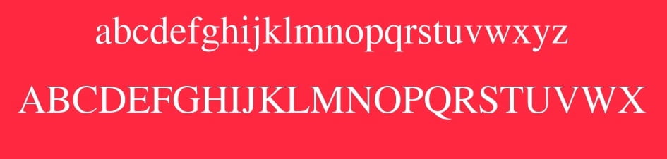
To easily and clearly present these fonts, the character set model, “AaBbCcDd1234&%#…” was created. There are other ways to present fonts, especially within sentences such as;
- The Lorem Ipsum phrase, used commonly to what the font looks like in heading and paragraph form
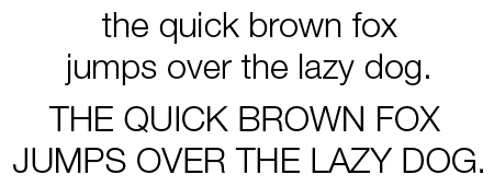
- The phrase ‘the quick brown fox jumps over the lazy dog’ is used frequently due to the fact it includes every letter in the alphabet. It is also in correct syntax which is useful for demonstrating fonts.
However, the above options for presenting a typeface is not always appropriate. Other languages use different letters in a different frequency to the English language. Also when all fonts are presented in the same way it can become boring and repetitive, which is why many designers are creating more interesting ways to display the abilities and design of a specific font.
Options;
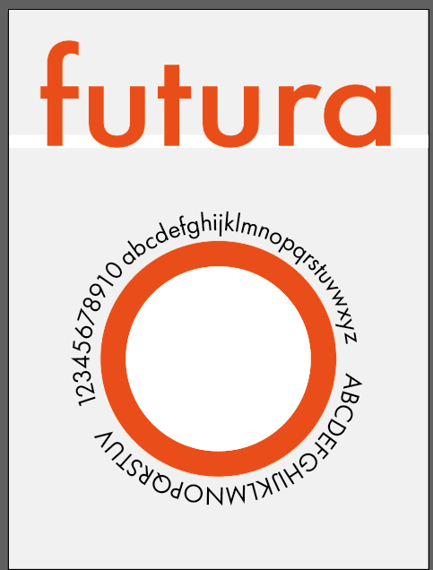
futura:
Palatino:

Times:
Gill Sans:

Helevetica:
Baskerville:

Analysing Fonts: 01- Futura
History
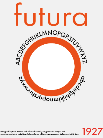
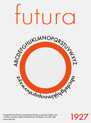
Designed in 1927 by Paul Renner and is based completely on simple, geometric shapes. Renner created this font in during the popularity of Bauhaus school in Germany, which taught typography and popularised the modern, sans serif typeface which is still used widely today.
Paul Renner rejected previous font styles known for their narrowness and lack of consistent weight and shape forms
Shapes important to this font;
- triangles
- squares
- circles
Attributes to keep in mind during design process;
- consistent stroke weight (exceptions in lowercase form)
- Long Ascenders
- Stylish Elegance
Analysing Fonts: 02- Palatino
History
Designed in 1949 by Hermann Zapf and was originally designed to be punch-cut in metal but was quickly adapted for Linotype production. Palatino was based on the harmonistic serif design of the Renaissance, meaning smaller letters and longer vertical lines
Palatino is known for being very readable which made it ideal for newspapers at the time.
Attributes to keep in mind during design process;
- Strokes are lighter
- Larger proportions
Analysing Fonts: 03- Gill Sans
History
Designed in 1928 by Eric Gill and was part of the British branch of ‘Monotype’ at this time. Gill Sans became a very popular font and influenced famous brands’ logos such as BBC and Tommy Hilfiger. Gill sans has been used in logos but it more commonly found in bodies of text due to its high legibility.
Attributes to keep in mind during design process;
- Clean lines
- Classical proportions
- Classic form in letters ‘a’ and ‘g’
- Rounded ‘c’ ‘e’ and ‘f’ (lowercase)
- Vertical Stroke ends appear to thin towards end
- Consistent thickness
- O is perfect circle
I chose to create my Type Specimen Screens around the font Futura.
I did a few quick sketches of some initial designs for these screens;
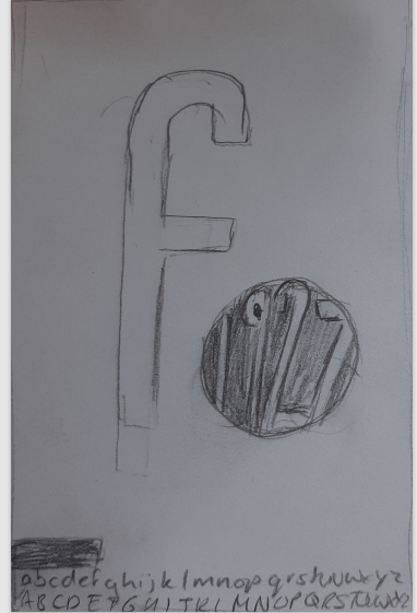
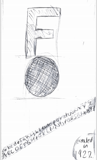
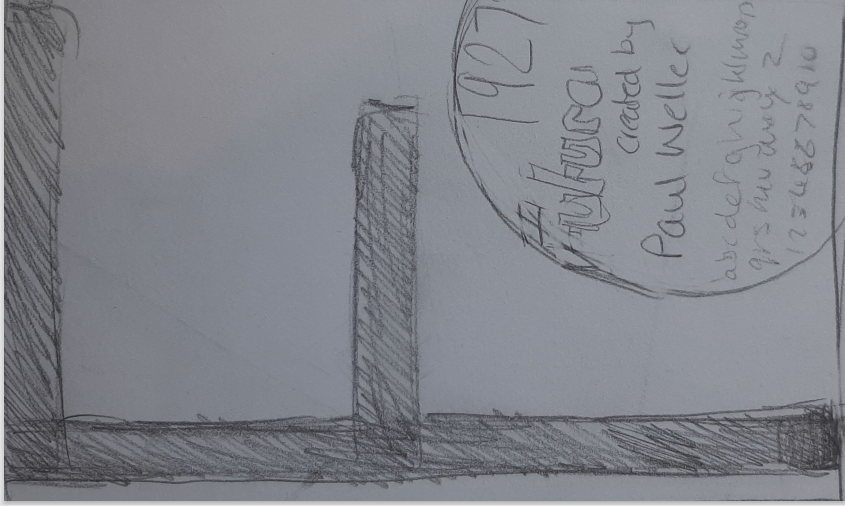


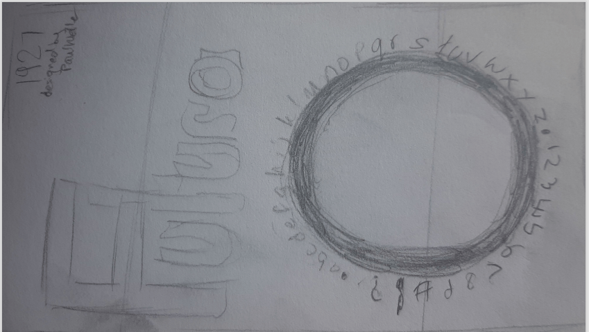
Digital Designs
I then had to choose 3 of these sketches to design in adobe illustrator. I ended up changing quite a few of the elements but this is what I ended up with
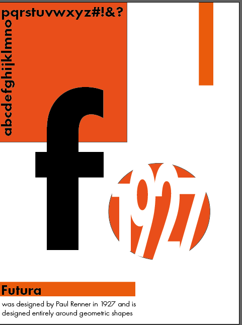
The screen I will develop further, making corrections is the screen on the far right, I think it has more potential than the others and I like how simple yet effective it is.
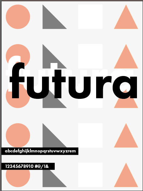
Final Drafts

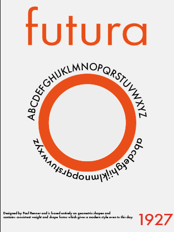
These designs look quite similar however I changed a variety of things between them.
Firstly I deleted the white stripe under the title completely, from there I experimented with having a white background behind the circle or transparent. I also added a couple of sentences about the font and when it was made to further balance out the screen.
I then changed some details such as having the title varying weights and aligning the text at the bottom differently.
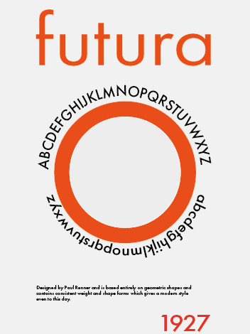
After looking at these changes side by side I decided that the following screen is my favourite;
I think the heavier weighting for the main title looks the best and more prominent. I decided to keep the white background behind the circle as I think it adds more depth to the screen.
I like how the small text at the bottom left balances out the specimen screen and I think a lighter weighting for the year it was made helps establish a visual hierarchy.