Point, Line and Plane
This project was given to us to build and improve our visual vocabulary as designers. A visual vocabulary is a fundamental of design and allows us to develop more complex patterns and ideas.
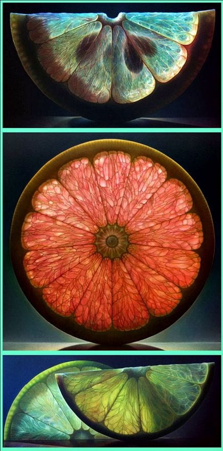
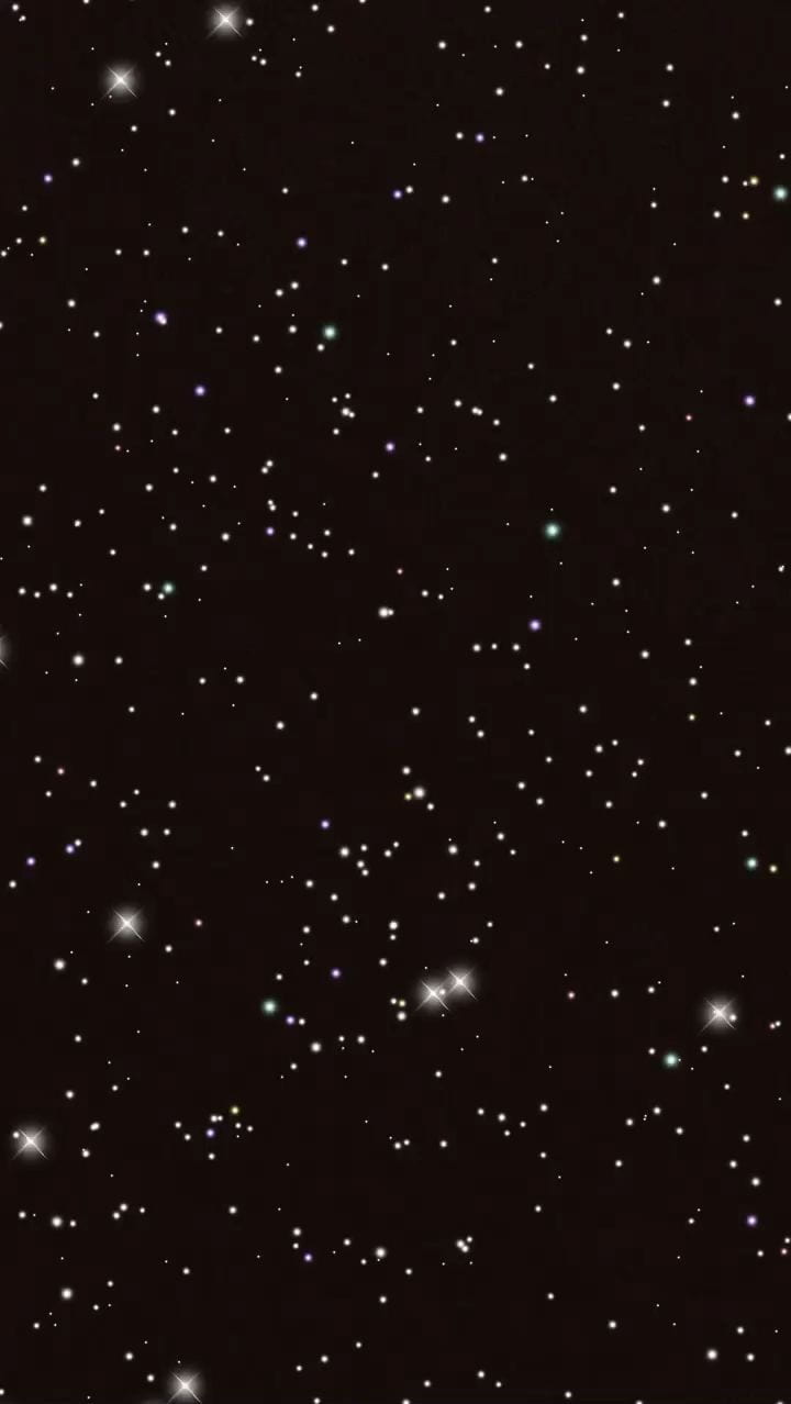
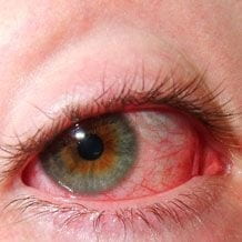
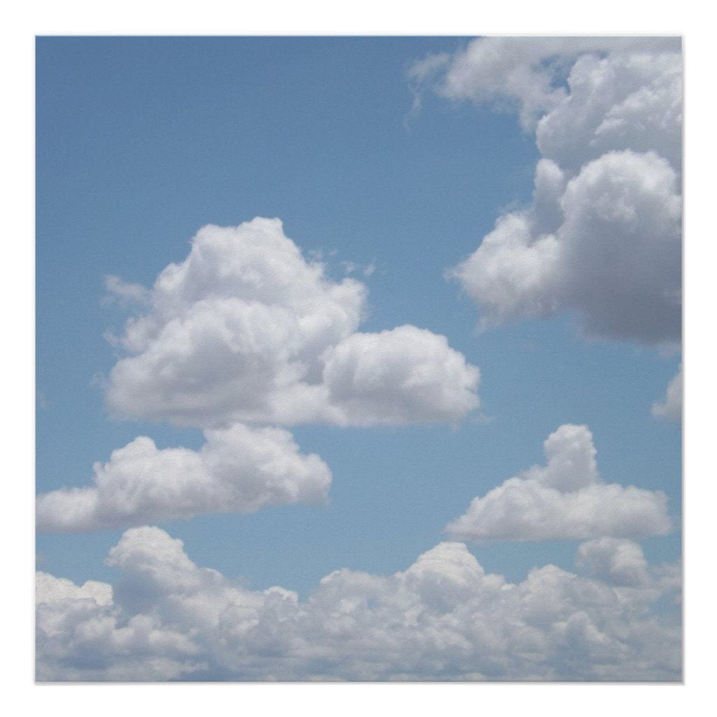
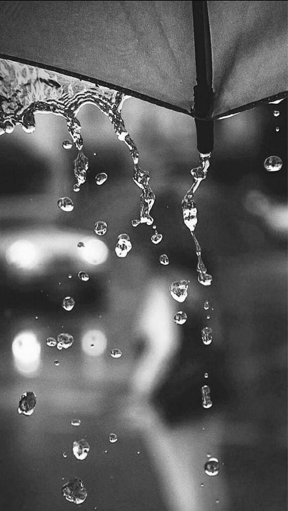
The first part of this project, we were put into groups and told to gather 100 images in a shared Pinterest board of either a point, line or plane. My group chose the theme of point and then collected many images of fruits, eyes, raindrops etc…
Here are some examples of the images we gathered;

After this, individually, we had to choose 9 photos from the board and create a narrative using them and present them on instagram.
The narrative I chose to create is called, ‘Raindrop’s Journey’ in which the images I’ve chosen tell the cycle of a raindrop falling from sky to ground.
From the group-gathered images, I’ve chosen;


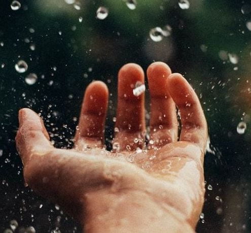
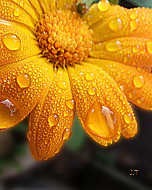


I’m going to start off with the sun in the sky, then some clouds gathering in the sky. The rain then starts to fall through the sky, landing on windows and umbrellas. The raindrop the falls into the hand of the person holding the umbrella, then onto the grass under them. The raindrop falls on a flower in the grass, then the leaf and finally the ground. Where it will condensate and appear in the clouds again, continuing the cycle.
My first thought to rework these images to both fit into to the ‘point’ theme and also create consistency is to open them in adobe illustrator.
I plan to first minimise all the elements of the images. For example for the first image, the sun, I strip away the clouds in the sky and choose inly one shade of blue for the background. The sun will be created using a circle and lines for its beams of light.
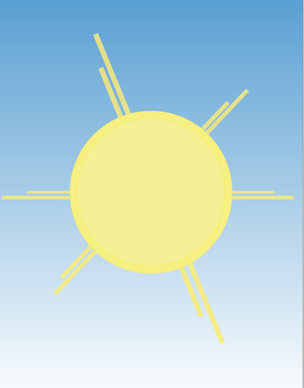
This is what I’ve designed so far.
I tried to get across the ‘point’ element with the big circle shape used for the sun but kept the beams that are seen in the photo but simplifying them.
I think this could maybe be too simplistic but it does emphasise the point element which I feel was apart of the task.
I think I could’ve added more detail to the image without taking away from the ‘point’ part of the task.

For this recreation I took the main shape of the clouds shown in the image and redrew them, with a shaded section at the top of the cloud to both show depth and emphasise the ‘point’.
I like this recreation a little better because I added some stylised elements to it on my own, however I still feel it is maybe too oversimplified.

To make the third image, I needed to show the clouds producing rain so I took the recreation of the second image I made and added my own raindrops to it.
I think this shows a more realism approach to ‘point’ by softening the circle shape to a more ovalur form.
I think the image maybe doesn’t look very consistent as the raindrops are more realistic while the cloud and sky remain very simplistic.

The image I was recreating was a picture of rain on a window which looked like rain falling from the sky, which is why I chose it however this was a very difficult image for me to recreate.
I decided to simplify the background and just choose one shade of blue to be the background of the image. I then had to change the shape of the rain to make it look like it was falling from the sky instead of just on the window.
I like how the shape of some of the drops came out but I don’t think that they look like they’re falling from the sky but i’m not sure how I would change this if I did it again. I think if I chose a better image to recreate it might have been easier or worked the background more to help it blend in.

When recreating this image I outlined the umbrella and shaded them. To show the rain in the image I recreated the shape of raindrops I had falling from the sky previously- to retain some some consistency.
I think this is an improvement on the previous images as I have made the raindrops less simplistic but I also shaded the umbrella, giving it more depth and creating a bit more consistency between the two elements .
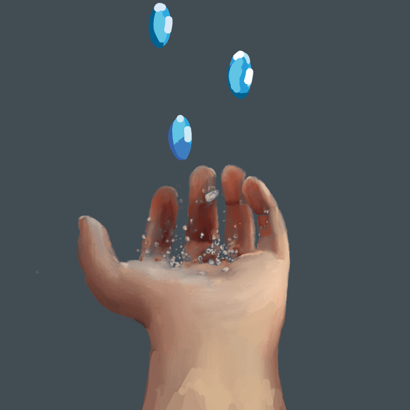
For this recreation I tried to go more realistic with the hand form as I found it hard to simplify it while still making it understandable quite difficult. I kept the same sort of shape for the raindrops to make it feel like the rain was almost travelling through the images.
I think this recreation is fairly successful but the contrast between the cartoonish raindrops and the more realistic hand, offsets it slightly and I think this could have been done better. I could have simplified the hand more or rendered the raindrops more to make the image much more consistent.

I decided to take a different approach with the next three recreations by digitally painting them on an ipad using ‘procreate’.
Even though this image looks a bit different to the previous images I think it is definitely and improvement.
The raindrops are prominent and really emphasise the ‘point’ for the task, while remaining consistent with the flower in the background.
I like this recreation too as again the raindrops are very circular- for ‘point’- but also not too oversimplified.
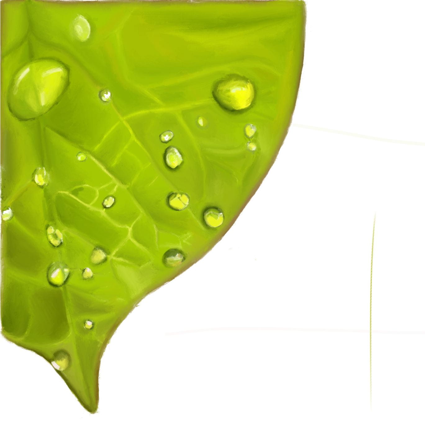
This drawing took quite a lot of time to paint as there’s a lot of hidden detail in the vains of the leaf to add depth. I do think it came out very well despite the fact that there isn’t a solid block background like the other images which takes away from the overall consistency of the project.

The final image for this project was a recreation of the rain falling on the ground image.
I’m probably most proud of this drawing as it is still simplified because of the solid colour background. I also kept small waves on the ground simple, using minimal colours to paint them to not draw attention away from the raindrop.
The most prominent raindrop in this is very circular which I feel really emphasises the ‘point’ element. There are other smaller raindrops around the image to add more detail but they have less shading to not draw away from the main raindrop.
Final Thoughts
I think there are many points about this project that I could improve upon. The main one is that I think there should be more overall consistency within the project and if I had spent more time on it I would have redone a few of the first few. When I started this project I had never used Adobe Illustrator for – which is what I used for this project- so my minimal skills in this app are quite obvious and I think with the experience I have now I could do a better job overall.
I think the last few images were done well and I can be proud of them but I wish I could feel the same about all of them. However I learned the importance of real time organisation which could have really helped me with this project