Task:
For this assignment we were tasked with developing two skill sets based on a concept from Luigi Serafini’s Codex Seraphinianus which we could research and explore the pipeline of.
For this task, I choose to look into 3D modelling and concept art. I wanted to explore the use of 3D models to aid in efficiency when creating concept art for projects alongside the various pipelines stages different artists use when employing the use of 3D models when creating concept art.
Research:
Pipeline
To begin this project I looked into various different concept artists who use 3D models when creating concept art and what different steps they take as each artist has a different order and process for each stage.
View this post on Instagram
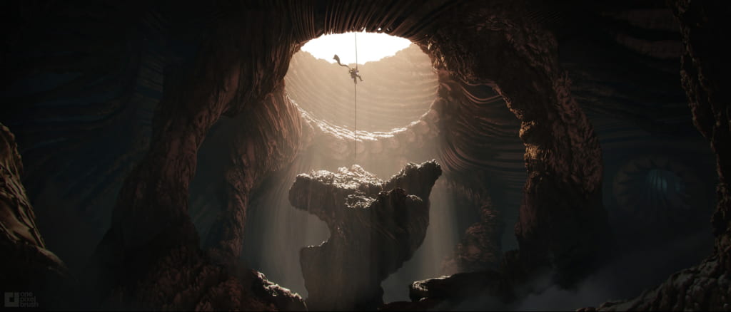
Environment / Design – One Pixel Brush
Creating Painterly Concept Art Using 3D Tools (80.lv)
After looking into the pipeline further I found that it could be broken down into 3 key stages. The first stage is the creation of thumbnails either for the rough framing and layout of the piece of concept they are creating or some ideas for props or building designs that will later be used in the final concept art. The second stage involves the modelling of the environment or prop that will be used so that the artist can get the correct perspective and lighting when it comes time to render the model from the 3D software that they used. Lastly, the third stage involves taking the screenshot and putting it into a drawing software where they paint and draw on top it in the style they are trying to achieve.
Based on my research I find that the third stage is where the pipeline varies the most as each different artist has a different style that they are creating for different purposes so I’ll have to narrow down what pipelines to reference when creating my outcome for this project.
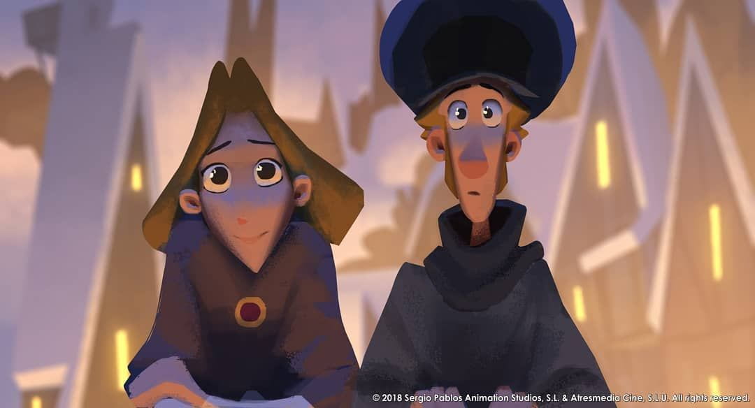
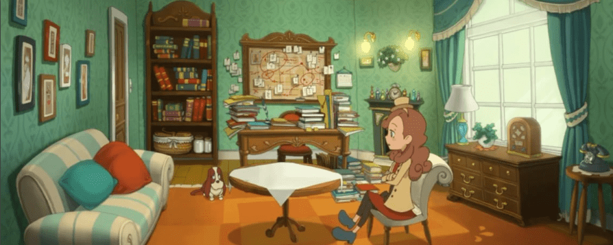
Concept Art from Films and Games
After looking into the pipeline I found some pieces of concept art from game and film that I liked the style of, the textures or the colours and used these to create samples of what my finalised concept art could look like.


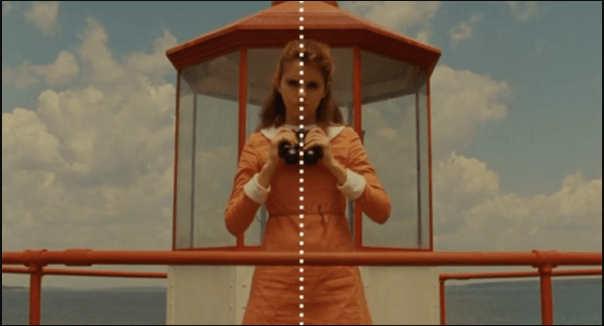
Cinematography
When choosing what concept from the Codex I wanted to create I knew I wanted to create a piece of concept art that was visually appealing but with an uncanny undertone. Through research, I found that symmetrical shots create a feeling of balance but can appear uncanny if it’s a space that people would normally be present in but are missing, sometimes referred to as a liminal space. I also knew I wanted a low angle with a wide angle lens like a fish eye lens or 12mm lens to create a sense of distortion to the concept art which would further the creepy feeling I wanted to go for.


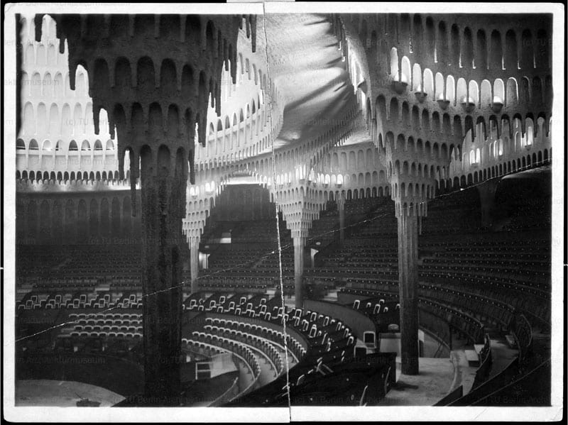
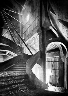
Architecture & Urban Design
To emphasise the eerie feeling I wanted the environment to have, I looked into sharp and pointed shape language in buildings and found that Gothic architecture best fits the look I wanted to achieve. I loved the thin, pointed and detailed aspects of Gothic architecture and I feel it pairs well with the distortion I wanted the concept art to have that is often seen in German expressionism. I also knew I wanted the city to have a unique floor plan and layout, something symmetrical to match with the framing I want. I like the look of having a central point of interest from which the rest of the city builds out from so that is something I’ll be trying when placing the buildings for the final piece of concept art.


Process:
Thumbnails & Modelling
To begin this project I knew I wanted to focus on environments within the Codex and was able to narrow it down to 3 ideas so I created a thumbnail for each of the different environments.

After feedback from the tutors I decided to go with concept 3 and started to create a block out of the environment in Blender.

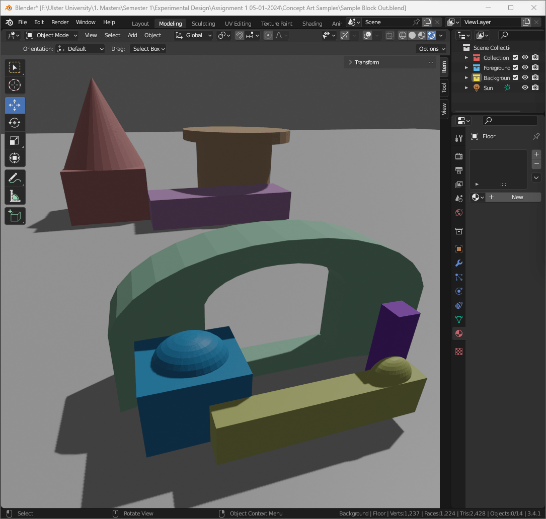
This blockout followed the thumbnail closely but the scale was off and didn’t give that feeling of grandeur and distortion to the environment I was aiming for so I scrapped that blockout and started from scratch again this time more closely following the Codex to gage the scale better and using a viewport set to a 12mm lens to that I could create the framing and composition that I wanted more accurately.


Style Samples
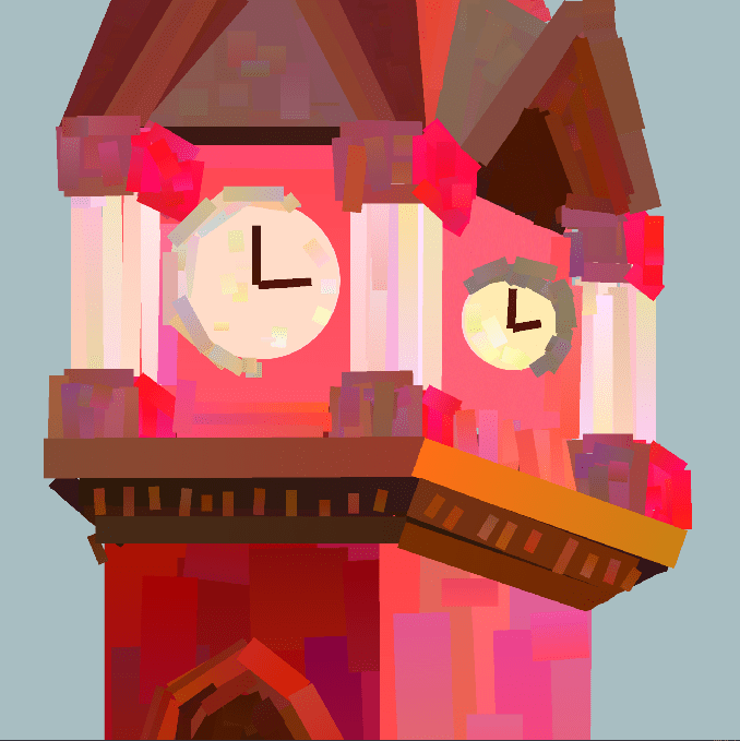
After modelling the parts that I needed for the environment I created a style guide for how I wanted the overall concept art to look. I referenced the concept art I had researched earlier and created 3 style samples using the clock tower model as a base to paint on top of, this gave me a brief introduction to what it would be like to follow the concept art pipeline that I researched.

Heavypaint
After a talk with Henry, our tutor, he prompted me to look into a software called HeavyPaint which was a system more focused on painting in thick blocky shapes which allowed me to focus more on the form and shapes when creating a sample rather than the details.
After watching a few tutorials on how to use the system I found it to be fun and easy to work in but it had a bit of a learning curve when it came to painting in the block shapes. Overall I enjoyed my experience with the system as I was able to create a sample that reminded me of the Spider Verse art style with the bold colours and the blocky shapes but I decided I wanted to stick more closely to the style of the Codex for my final piece.
Style Guide
Based on these samples, I liked the coloured pencil look as it more closely resembles the style of the Codex as well as adds a nice bit of texture to the otherwise flat painting. Next I focused on creating a style guide based around the coloured pencil sample I made which broke down each stage that I needed to do to recreate that same look with a few improvements. Later when creating the final painting I added a coloured pencil texture layer to further enhance the texture I wanted.

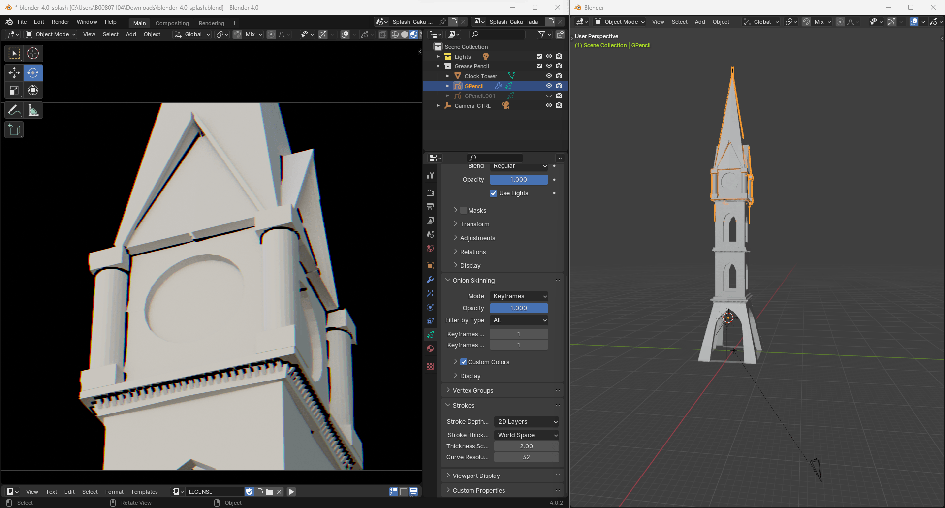
Grease Pencil
Once I decided on an art style, Henry informed me of the tool grease pencil that has been updated in Blender 4.0 as I wanted to add outlines when painting so I gave grease pencil a try.
I liked the outcome of the tests but it would have taken a lot more research and fine tuning to get it to a stage where it looked the way I wanted it too so I decided to stick with drawing the outlines in Procreate but it was a fun experiment that I will look into further in the future.


Environment Layout
Now that I had a clear plan of what I wanted the style of my concept art to look and how to achieve it I moved onto laying out the framing of my concept art in Blender. Using the models of buildings I made earlier I tried a few different layouts for the city referencing different unique urban layouts that I had researched earlier but none of these worked so I instead used some shapes from the Codex as floor plans which I liked a lot better. When adding bulk to the floor plans Henry gave me the idea of treating the colours like a topographic map which I did with a few adjustments to create a better composition in my camera view.


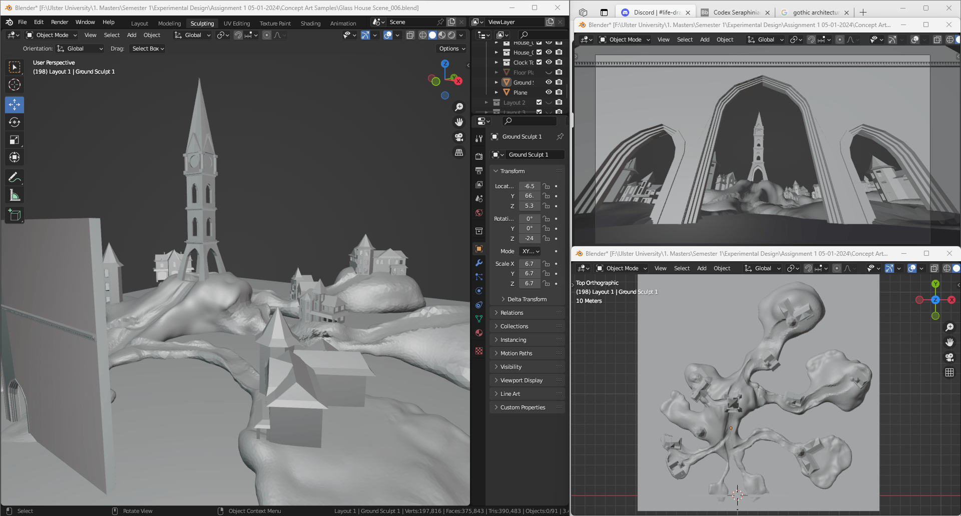
Based on my research on various urban layouts I knew that I liked the idea of everything coming out from a central point and I found that the third floor plan was just what I was looking for, it’s not symmetrical but it feels balanced with the various plots of land reaching from the centre.
After finalising the layout for the floor plan I moved onto arranging and tweaking the placement of the buildings to create the balanced framing that I wanted by adding buildings that weren’t the same but took up the same amount of space so that the composition felt balanced. I also wanted to evoke the feeling of a liminal space with its claustrophobic and tall buildings that loom overhead and wide open floor space which should create an eerie feeling for a viewer.
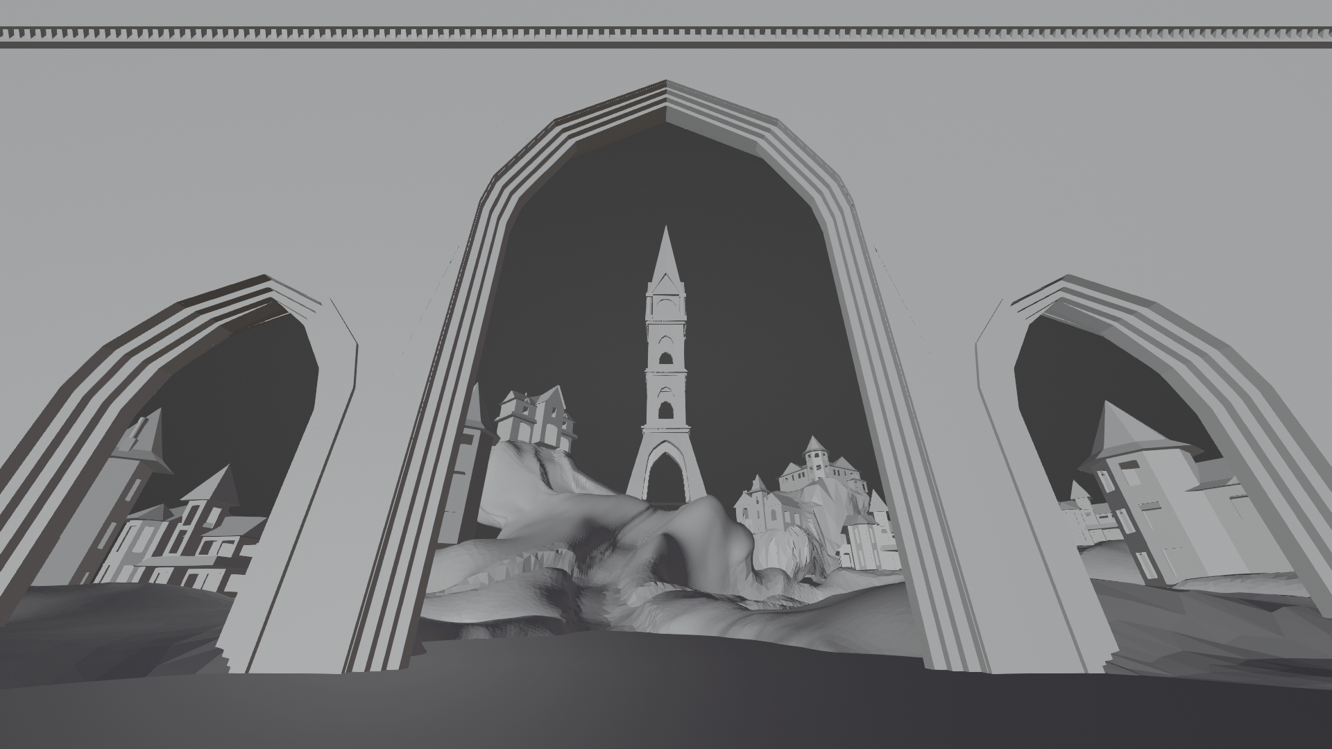
Lighting
Finally once I was happy with the layout and framing of the environment I added in some lighting. I tried a few different combinations of light sources when testing what look I wanted to go for as I knew I wanted strong shadows that German Expressionism commonly have but I also wanted it to be bright like in the Codex so I decided that the fourth lighting looked like a good inbetween with few but sharp shadows while also being bright enough that you could still see the details of the houses like the windows and doors.


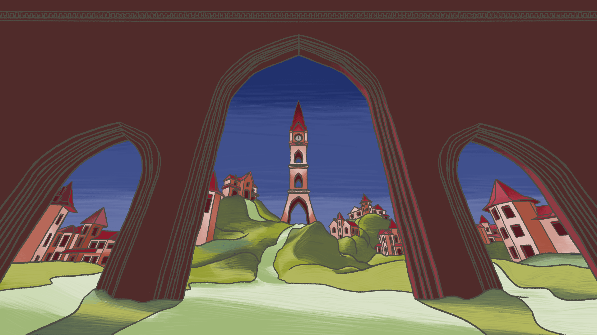
Painting
Once I was happy with the model I rendered the final image and moved it into Procreate, my drawing software of choice for this project. To begin, I added the rendered image and started drawing the outlines on top following my style guide then I added the flat colours, next were the shadows and highlights then the texture lines to make it look more like coloured pencil and finally I added the overlays to blend the colours and a coloured pencil texture to emphasise the grainy look that pencils often have. Once I was happy I added some glowing lights from the windows and exported the final image.


Result:

Overall, I am happy with how my final piece of concept art came out. It was an interesting learning experience as I worked through the pipeline and fixed some problems that I encountered along the way as there is no one way that concept art can be done. Looking back at this project I feel like I should have pushed the contrast of the foreground, middle ground and background more as well as created more harsher shadows to emphasise the German Expressionism look I was trying to go for as well as pushed the distortion of the overall environment more. Due to the research I did about framing and composition, I feel that my overall composition for my final piece came out balanced and somewhat symmetrical which invokes the uncanny feeling I was going for as well as the pencil texture and brushes does make it look more like it came from the Codex which I really like.
In conclusion, I feel like this project went well, my time management was good even though I believe that I lingered on some parts of the pipeline a little too long but I like the outcome as it conjures the feelings of uncanniness I wanted it to as well as matching the style of the Codex.