The Design Sprint
Paul started this week’s lecture by briefly explaining what a design sprint is, as well as showing us a video of The Google Ventures Design Sprint. We were also given the website to look to, in case we wanted to learn more about them.
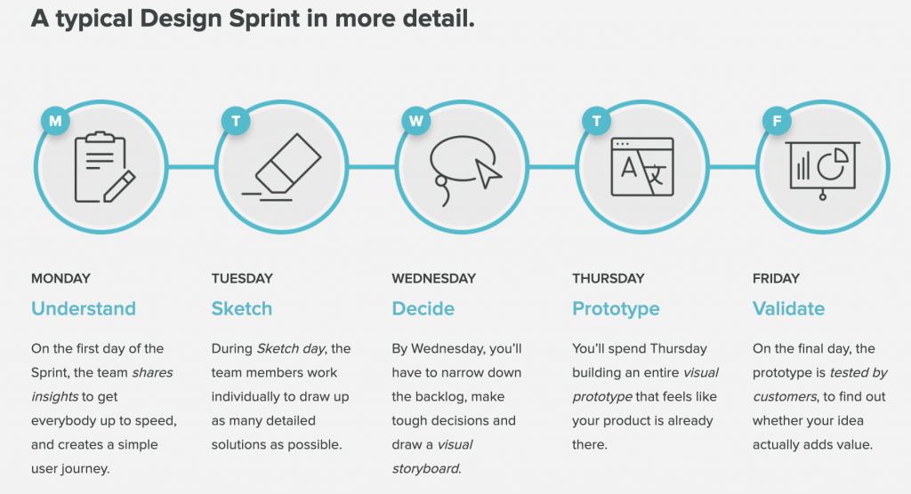
When looking to the website, I found this really useful little graphic about what a Design Sprint entails:

Six Steps to a Sprint
Paul gave us six easy steps to follow when conducting a design sprint, they are as follows:
- Understand
- Define
- Ideation
- Decide
- Prototype
- Validate
We were also told to focus on four design principles whilst conducting a design sprint:
- Effortless
- Insightful
- Attentive
- Humble
Once you pick your target audience for the design, it’s time to begin the sprint.
Conducting Our Own Design Sprint
We were then split into groups, and had five hours to do a design sprint as a team. For this, we had to come up with a digital product for easing the pressure of A&E. We were given some things that may affect a patient in the waiting room of A&E.
So, how might we reduce the stress for patients in A&E?
How might we ease their mind about waiting times?
How might we save time?
What information do patients and Doctors need?
The first thing we did was create an empathy map to try and understand our users, and the things they say, think, do, and feel whilst in A&E. This was a great way to start out sprint as it allowed us to think about how we may help ease their anxieties whilst they are in A&E.
Doing this also allowed us to think about how to help anyone who is feeling impatient. Knowing that there is always such a long wait for A&E can deter people from actually going – or deter someone from accompanying them.

We then moved on to creating a user journey map, so we could easily see the journey of a person in A&E. This also allowed us to come up with some more features that we could add to our digital product (after coming up with things for the “opportunities” section).
I find user journey maps are another really great way to put yourself in the shoes of the user, and understand their mindset throughout every step of their journey to the solution. This always results in a richer, more considered user experience and design.

How Might We Solve These Problems?
After understanding our users, we outlined our main understandings of them on post-its, as well as moving on to the next two stages.
DEFINE:
We wanted to come up with an app that will give patients peace of mind, as well as ease any anxiety that they may be feeling in A&E.
IDEATION:
During the ideation phase, we each took a few sticky notes, and scribbled down a few ideas. After this, we had three votes each, and chose the ideas that we liked the best (this was the decision phase). We decided on an app that gives patients continuous updates on their place in the waiting queue, as well as any test results, or upcoming tests. This would ease the anxieties of not knowing what is wrong soon enough, as well as being unsure as to whether or not you will need to be admitted to a hospital ward.
Here is a photograph of us going through the first three stages that Paul outlined (understand, define, ideate):

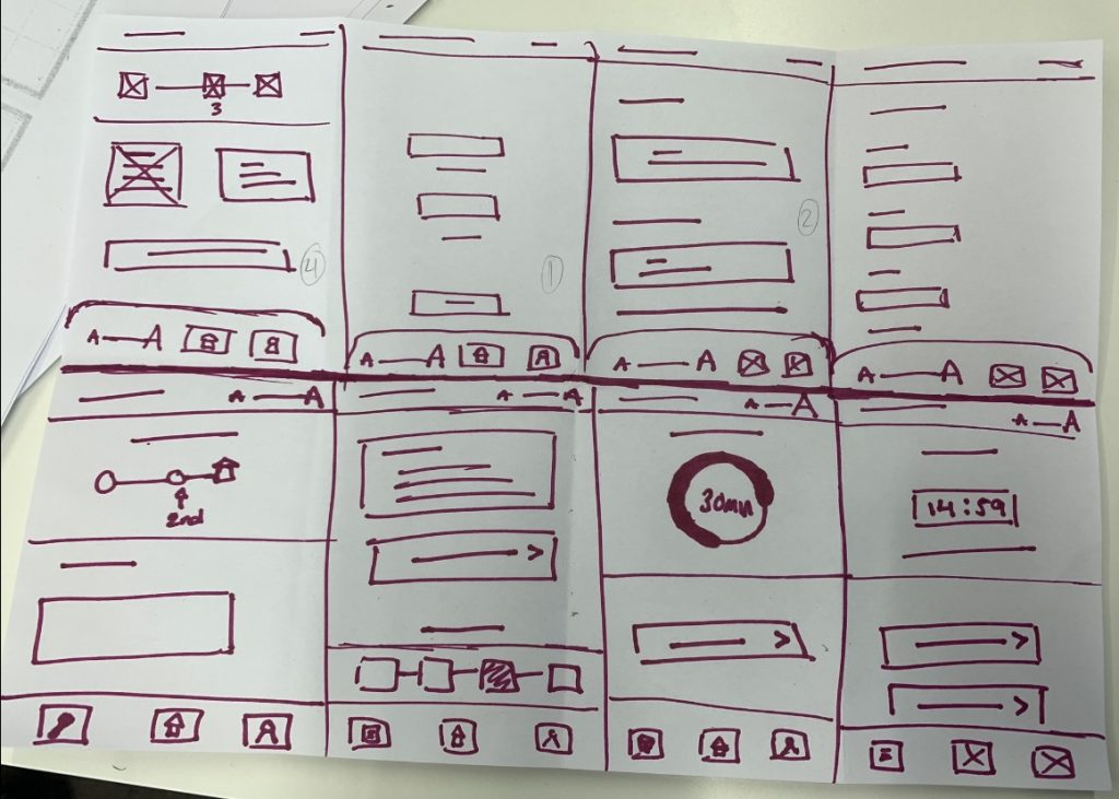
After the agreeing on an idea to go forward with, we each did some Crazy 8’s and drew up some wireframes of possible screens that we may include. Here is an image of my Crazy 8’s:

I tend to find Crazy 8’s quite stressful, however, they are very good for getting your ideas flowing. This way, we could group everyone’s together, and choose certain elements from each that we liked the most to include in the final outcome.
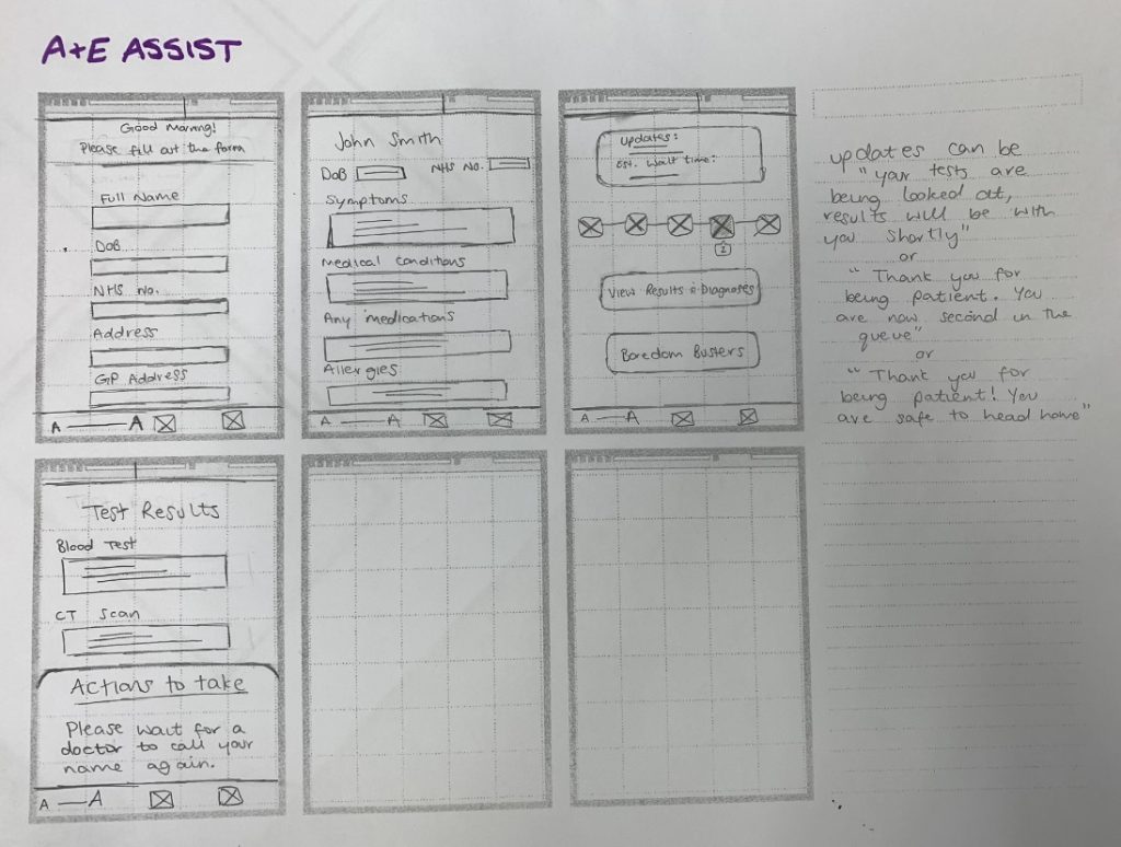
Once we chose what we wanted our screens to look like, I drew them out (a lot neater this time) onto wireframe paper.

We wanted our app to be as easy to use as possible, with options to increase text size, as well as having a home screen with just a few tile buttons. This would make it accessible to users of many different ages, as well as users who may have visual impairments or moderate learning difficulties. You would get a push notification of any updates, in the event that your phone was locked. This could also save battery life, seeing as a person could be sitting in A&E for quite some time. Giving the Doctors access to sending test results straight to the patient’s app would also help in saving the staff’s time as well – as they wouldn’t have to discuss this with every patient.
Thoughts:
I found this week to be very fun! I really enjoyed this process, and it has definitely helped me further my understanding of the UX process. I think it also put into perspective for me, just how fast we are able to come up with a solution within a team – so long as we all put our heads together and focus on the task at hand. I’d really like to try out a full, five day design sprint in the future, creating a full working prototype by the end of it.

Leave a Reply