PlantCo
After our lecture this week, we were split into groups to design an app for the PlantCo Smart Plant Pot.
The Brief
As a companion for the smart plant pot, you are required to design a smartphone application which will allow the user to keep track of:
- Plant Guide/Identification
- Plant Recommendations
- Moisture, Light, Nutrient Levels
- Temperature
- Plant Location
Your app should include:
- Home Screen
- Add a Plant
- Plant Care
- Check Moisture Levels
As with any UX design task, we needed to start by understanding our users, and how they may navigate their way through this type of app. So, we begun by making a user flow diagram. This was also useful in letting us know what we might need to include on each screen, as well as any potential extra screens that we find that the app might need.

We thought that it might be beneficial to also have the option to record the distance that the plant would be from a source of sunlight, as well as the temperature of the room. This would be important because different plant species require different amounts of sunlight. Some may also require more heat than others. With this information given, the smart plant pot app could give suggestions about changes to make to the environment that the plant is in so that it can thrive better. We thought that this could be done via a simple onboarding questionnaire once a new plant has been added.
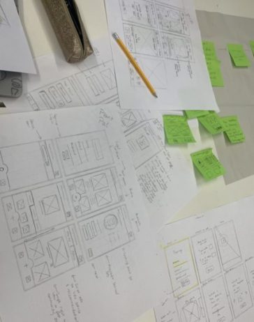
Sketching Wireframes
We then each took a piece of grid paper and sketched out six possible screens for the app. Having all of us draw out some of our own ideas gave us lots of features and layout options to choose from and combine. Here are my six initial sketches:

I sketched out some quick ideas for a log-in screen, a home screen showing an overview of all the registered plants and smart pots. I also drew a screen for pairing the pot to the app and one for adding a new plant. Finally, I sketched a screen displaying a detailed overview of one specific plant/pot, and its temperature and water needed. This would be accessed by clicking on the image of said plant on the home screen. Finally, I thought having a community screen could be a good addition as it would allow for more experienced plant parents to share their plant care tips.
Combining Our Ideas
After this, we discussed our own ideas within the group, and then I quickly scribbled down a few ways that we could combine some of them. This was a good way to take the best features from each person’s screens and see what we could do with them. I really enjoyed this part, as I love working in a team, and find it very interesting to see what other people com up with!

Finalising Our Screens
It was now time to sketch our final wireframes, before pitching our idea to the class. We called our app “Plant Pal”, as we thought this sounded very friendly and inviting.

(Moving left to right)
The first screen is the sign-up/log-in screen. We thought it would be less to tap through if we combined this process into one.
The next screen is the home screen/plant overview. On this screen, have each plant as their own tile, with a picture of the plant and its name and short bio. We also included a navigation bar on this screen where you can easily press the “+” button to add a new plant, this would then take you to the next two screens consecutively.
The third screen, then, is the bluetooth smart plant pot pairing. The gif of a plant would grow more leaves as the phone searches for a plant pot in range. Below this, there is a list of available nearby smart plant pots to pair with the app. As well as that, we have a few steps beside the loading gif to explain how to follow the pairing process. Once you tap the next button, you’d be taken to the fourth screen.
The fourth screen is where you choose a plant to add. For this, we thought we’d give the users the option between searching for a plant, as well as using the camera option on the navigation bar to scan your plant if you aren’t too sure of the exact species name.
Then the fifth screen is a detailed overview of a specific plant. This would automatically be displayed after adding a new plant, however, it is also accessible via the home screen. We chose to lay this out with an image of the plant at the top, along with its species (or chosen) name. Below that are three tabs displaying the necessary plant care and advice.
The final screen is the community screen. On here, we have two sections where you can either view other users plant stories, as well as their advice. Again, with this, we included the add button to the navigation bar so it is easily accessible at all times whilst on this screen.
Thoughts:
I am really happy with how our final app design came together. I find that working in team like this for designing something in a short period of time is really beneficial because everyone comes up with different ideas. These ideas can then be combined and chosen from.
This activity also allowed me to refine my wireframing and user flow diagramming skills – which will be very useful for moving forward with my healthcare digital product.
Leave a Reply