Content Curation
This week we learnt all about content curation. Where content comes rom, what good content is, and how to properly organise content for the best outcome.
Where does content come from?
Content can be given to us by clients, self-generated, or found on places like Wikipedia.
Client Content
This content comes directly from a client for their website or project. It allows us to include exactly what they want and need to be included.
Self-generated Content
Self-generated content is that which we may post on things like our blogs, social media (e.g. Instagram), as well as what we produce for deliverables.
What is Content Curation?
Content curation is sorting through the content that is on a website or product, and then presenting it in a meaningful manner.
Find -> Organise -> Share content
Why is Content Curation Valuable?
Since there is so much content nowadays, creating high quality content is a lot more valuable before. It will help the content stand out against that of competitors, and set it apart from the rest. Finding the content and then making sense of it, requires time, attention, and focus so if you can do it well, it’s valuable.
Benefits of Content Curation Include:
- Allows you to become an expert
- Easier than creating your own content
- Show you’re focussed
- Grow your network
- Get more business
- Stay informed
The Basic Principles of Content Curation
Good content is…
- Appropriate
- Useful
- User-centred
- Clear
- Consistent
- Concise
- Supported
User and Job Stories
A user story is a way to pin down exactly what you need to do. It’s about asking questions and getting the answers.
For example:
As a [person in a particular role]
I want to [preform an action or find something out]
so that [I can achieve my goal of…]
My own User Story examples:
As a [recruiter]
I want to [be able to easily access and view case studies/projects done by a student]
So I can [potentially recruit them].
As an [IXD/design student]
I want to [view other portfolios]
So that I can [get inspired].
As a [potential client/recruiter]
I want to [easily gain access to contact info.]
So that I can [contact the creator easily].
As a [recruiter]
I want to [see research, planning and process]
So that I can [understand the thinking behind the final product].
The best content has a purpose.
Acceptance Criteria (i.e. Conductions of Satisfaction)
When something works. IF everything works and is usable, then your job is done. Think User Acceptance Testing.
The Three C’s of Acceptance
- Card – Written description of the story for planning
- Conversation – Discuss your ideas with others
- Confirmation – Work towards agreement and record the agreement as a set of tests.
Visual Grammar
Creates firm foundations of how you design user experiences.
Tips
- Simplify as much as possible – focus on the essentials
- What can you do with the constraints?
- Focus on re-using elements and minimising visual complexity
Language and Typography
Working hand-in-hand, both are just as important. It’s important to start by defining the language that underpins your design.
What is the message and how would you like it to be communicated? Think of voice and tone.
Questions you should be asking
- Who are you? (as an individual or business)
- What are your values?
- What is your mission and purpose?
- What do you hope to achieve?
- How will we know if you’re successful?
With the answers to these questions, we can define the language to underpin our designs. This language should be defined in both levels of a microcopy, and macrocopy. Both aid and improve user experience.
Macrocopy – Words can help set a tone of voice, as well as establish and reinforce the personality of a brand when used in a considered manner.
Microcopy – Words can satisfy a functional requirement by aiding and improving design interactions.
Words should reflect the brand values and be consistent. They should also serve a purpose, and be understandable.
Your Visual Grammar Should:
- Optimise legibility, through the appropriate choices of typefaces
- Improve accessibility, by considering contrast between foreground and background
- Improve usability, through a considered typographic hierarchy
Strong typographic hierarchy is very important. It has a clear structure, and makes the journey through the site easily. It guides how you read the content.
Tips
- Develop brand dictionary at the start of a project. Make sure the language matches. What can you do with constraints?
- Ensure every page has a clear call-to-action. Help users easily find that they need to find.
- When considering typography, less is more
Narrative Design
We need to understand how stories work in order to tell them effectively. We create experiences and, like stories, they unfold over time.
Consider pacing. Too much information too fast can be overwhelming. We need to understand the rhythm of how narrative design should work. Think about how you want people to navigate through the site. You want your site to excite users and capture their attention.
The Best Order for Content:
- Critical information
- Background and Context
- Nice to have
We Need to:
- Start with necessary information
- Provide additional content that is useful, but not critical
- Close with the ‘nice to have’ information
Tips for Narrative Design
- Put thought into how content is structured and grouped logically
- What is the most important thing that I want people to see here?
- What is the story you are telling about the project?
Once you think about these things, you can create your own brand guidelines using visual grammar.
Crazy 8’s
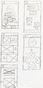
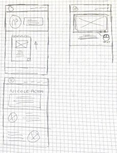
After our lecture, we moved onto the ‘crazy 8’s’. During this exercise we quickly sketched eight wireframe, considering visual grammar. We were allowed one minute for each wireframe.
I thought this exercise was a lot of fun, and it really helped me challenge my creativity.
I also found it quite stressful… It’s hard to get ideas drawn that quickly 😤, and I ran out of time for the last one.
Here are my crazy 8’s:


Leave a Reply