Seeing as we are building a brand and looking to create our own wordmarks, I wanted to have a look at some typefaces on Adobe Fonts for ideas.
The tone of voice I am thinking of for my brand will be along the lines of creative, out of the box, welcoming, unique, and bold.
I thought of how the typeface I choose should somewhat mirror these ideas, and so I took the tone of voice into consideration when looking at what Adobe Fonts had to offer.
I typed my name into the ‘Sample Text’ bar and screenshotted some typefaces that stood out to me the most:
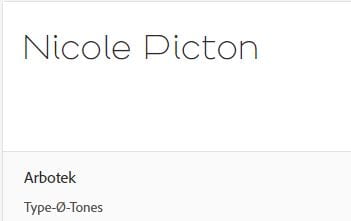
Arbotek – I liked this one because of how consistent and clear it is. I also really like how the letter ‘P’ looks in comparison to other typefaces that use similar rounded edges and fine lines.
BC Alphapipe – I thought this typeface looked quite fun and unique. The ‘e’ and ‘P’ stood out to me the most because the line joining the letter is broken.
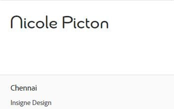
Chennai – I liked this typeface quite a lot. I thought the bubbly edges and completely arched ‘n’ seem really fun and playful. I also liked how clean and readable it is.
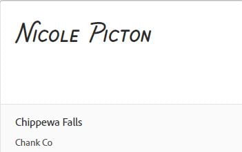
Chippewa Falls – I thought this typeface seemed a bit more elegant and professional, andI like the bold lettering and curled ‘N’, however I’m not too sure about the fact that the letters are inconsistently italic.
Como – Simple, clean, yet still seemed to have an element of fun with the rounded edges.
Dazzle Unicase – I really loved the unique form of the ‘c’, as well as how sonsistently sized and bold the letters in this typeface are. However, I’m not too sure how much I like the fact that it, by default, uses a mixture of upper and lowercase letters. For example, how the ‘e’ is lowercase and the rest of the text is uppercase. But, I did type this sample text as “Nicole Picton”, so perhaps, if I decided on all uppercase lettering, there’d be an option for that.
FF Cocon – This typeface, to me, is bold and playful. The rounded, yet sharp, edges and finials reminded me of leaves and nature. This coincides nicely with my bio.
Omnium – Just like with ‘BC Alphapipe’, I liked how the letter ‘e’ appears to not join up with itself, I think this adds something creative and unique to the typeface. I also love the fun forms of both the upper and lowercase ‘n’.
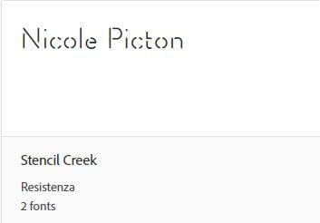
Stencil Creek- I thought this typeface really stood out as different to me, however, I want my work to be clearly understandable and readable to all, and this typeface may not be right for that.
I am going to continue looking to other sources for different typefaces that may better suit my tone of voice.


Leave a Reply