On week 5 we received a critique on our typeface specimens.
Pauline suggested that I should make a few changes to one of my three initial designs and use that as my final.
These changes included:
- Type “Baskerville” up the side.
- Try removing the shadow from the “Q”.
- Remove triangle from the left corner.
- Play around with scale.
- Add in some text with the history of the typeface.
- Frame the typeface specimen into an iPad mock-up.
I followed these instructions, adding a slight twist to some of the ideas laid out to me.
In doing so, I came up with a couple of versions re-doing two of my initial ideas.
The first one I changed was the third shown in my “My Three Favourite Ideas” post. With this design, I employed the use of Fibonacci’s sequence for the spacing, and I changed a few other elements. For example, I ended up using grey for the “1757” that runs up the side, and I moved the text reading “Baskerville” to the right-hand side also. However, I placed this text in front of the numbers. As well as this, I resized the “Q” and added in some history.
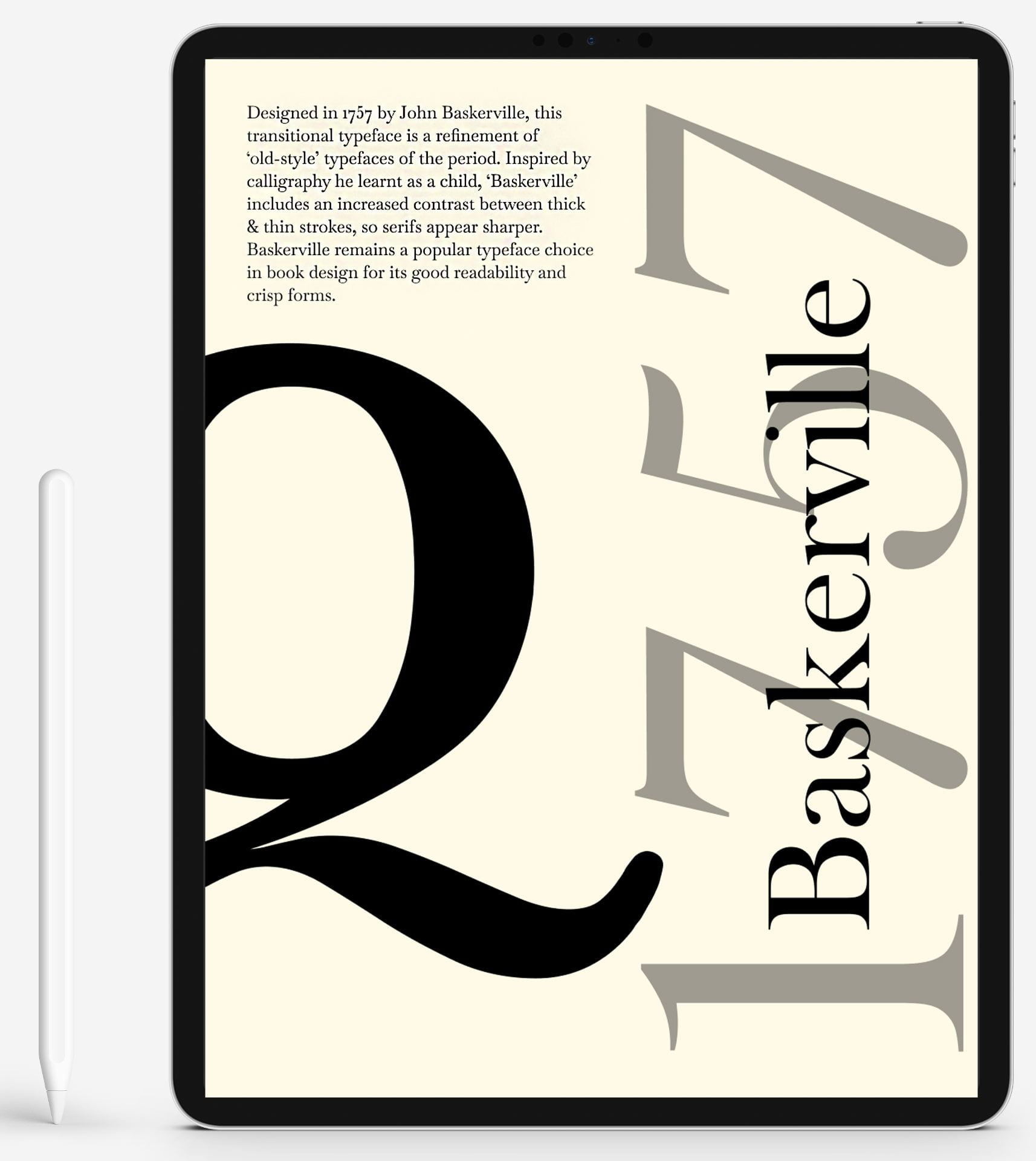
I decided that I wasn’t too sure about how I had scaled the “Baskerville” text, so I enlarged it and added a bit more spacing between the letters. This made it span from the number “1” right to the edge of the final “7”.
I personally much prefer how this looks. One thing that is bothering me, however, is that the block of text that includes the history of the typeface, seems to appear blurry when placed onto the iPad mock-up. This is an issue I hope to iron out soon.

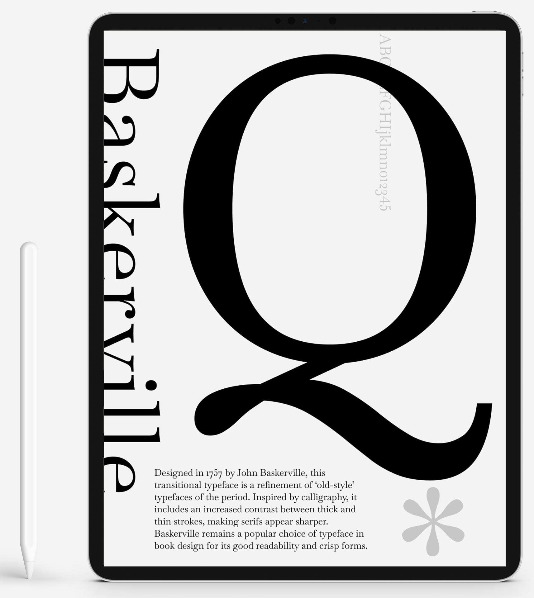
I also made changes to the design that Pauline liked the most. This is the one she gave me suggestions for on what changes to make.
I started off by removing the shadow from the “Q”, and I also scaled it up quite a bit. Then, taking more of Pauline’s advice, I wrote “Baskerville” up the left-hand side of the design, however, I made it hang off the edge slightly. I personally really like the effect that this gives.
I also, again, added the history of the typeface to the bottom of the design. As well as this, I removed most of the characters that I had written from the alphabet, and moved where I had placed it originally.
I wanted to make this design more minimalistic than the one I had originally come up with, and I think I achieved this successfully.
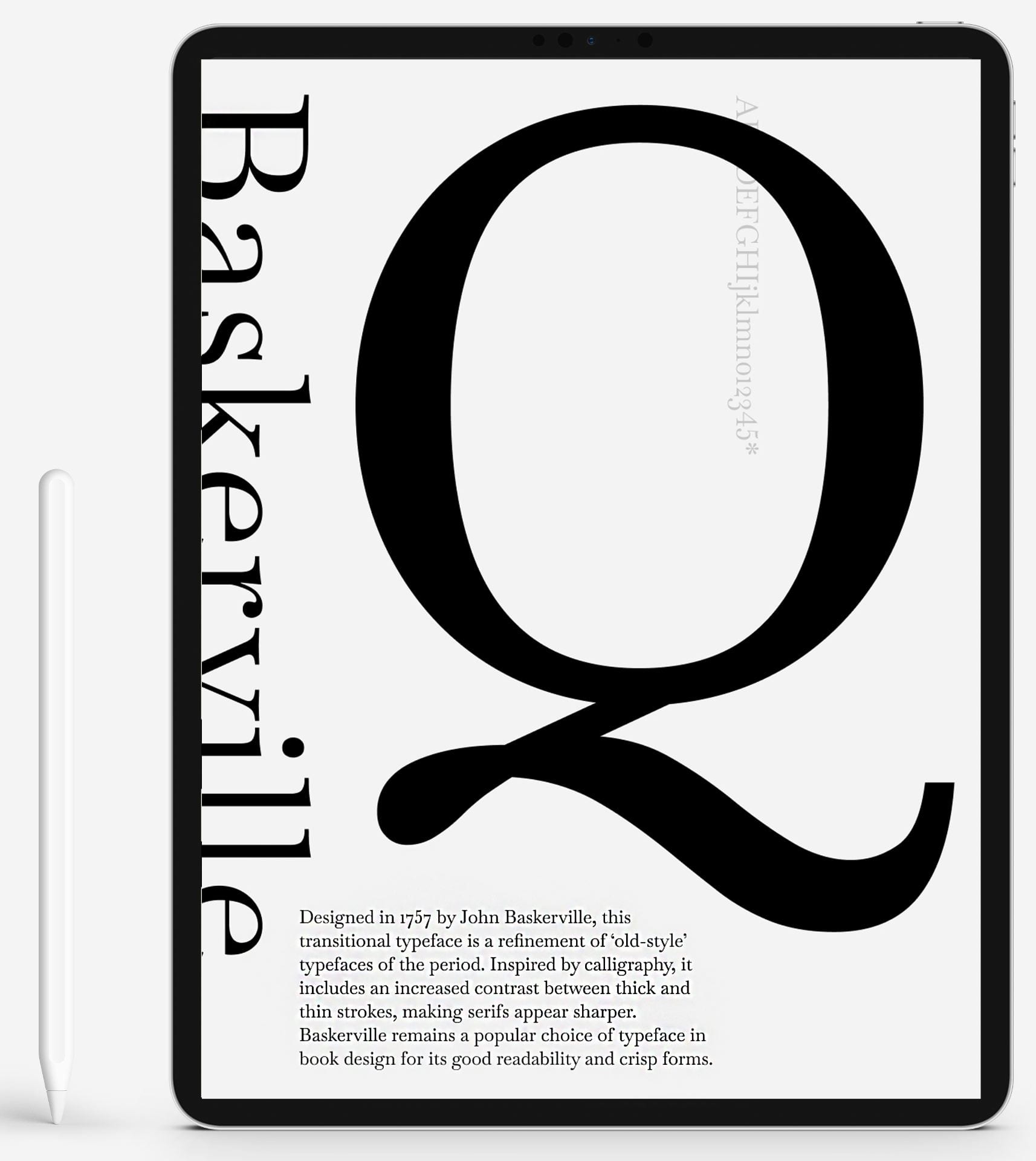
I tested out adding a grey asterisk right below the tail of the “Q” to add something extra to this space. Because of this, I removed the asterisk from the characters that are placed behind the “Q” as well.
I really like the curved edges of the asterisk in the Baskerville typeface, and it is something I wanted to include in my typeface specimen from the beginning.